Ecosyste.ms: Awesome
An open API service indexing awesome lists of open source software.
https://github.com/malerba118/react-handoff
React library POC to turn apps into visual editors
https://github.com/malerba118/react-handoff
Last synced: 3 months ago
JSON representation
React library POC to turn apps into visual editors
- Host: GitHub
- URL: https://github.com/malerba118/react-handoff
- Owner: malerba118
- Created: 2020-08-10T21:12:20.000Z (over 4 years ago)
- Default Branch: master
- Last Pushed: 2020-08-16T23:10:22.000Z (over 4 years ago)
- Last Synced: 2024-08-05T20:31:56.150Z (7 months ago)
- Language: TypeScript
- Homepage: https://codesandbox.io/s/async-night-7kyrq?file=/src/App.tsx
- Size: 254 KB
- Stars: 13
- Watchers: 2
- Forks: 0
- Open Issues: 0
-
Metadata Files:
- Readme: README.md
Awesome Lists containing this project
README
# react-handoff
This is a react library POC that bakes into any app a minimal visual editor that enables designers and developers to work in parallel on production code.
## In a nutshell
With this library, **this**:
```tsx
function App() {
return (
New
{property.beds} beds • {property.baths} baths
{property.title}
{property.formattedPrice}
/ wk
{property.reviewCount} reviews
);
}
```
will give you **[this](https://codesandbox.io/s/async-night-7kyrq?file=/src/App.tsx)**:

## How does it work?
This app works similar to the way that theme providers work. By centralizing prop defaults and overrides in a json file and providing them across the app, we can allow components to consume the values they need from the configuration via designated keys. In this demo, `controls.json`
contains all of the values configured via the visual editor.
To set up the code, we first need to call `init`, passing in our defaults and an indication of the environment we're running in (because we don't want editor functionality to show up in prod).
```tsx
import { init } from "./react-handoff";
import defaults from "./controls.json";
const { createControls, ControlsProvider } = init(defaults, {
allowEditing: process.env.NODE_ENV === "development"
});
```
Once, we've initialized, we need to wrap our app in the `ControlsProvider`.
```tsx
```
The `ControlsProvider` allows the `controls.json` values to be accessed anywhere in the app. The `ControlsProvider` also renders the editor sidebar and the active element indicator.
Next we can use `createControls` to define our editors input fields (similar to the way storybook knobs work).
```tsx
import { select } from "./react-handoff/fields";
const useControls = createControls({
key: "Image",
definitions: {
objectFit: select(["fill", "contain", "cover"])
}
});
```
This may seem mysterious, but `select` actually just returns a react component, so you can pass any key/val pair as a definition as long as the key is a string and the value is a component that adheres to the following component interface.
```tsx
type Field = ComponentType<{
value: T;
onUpdate: (value: T) => void;
}>
```
Lastly, we have to consume our `useControls` hook.
```tsx
interface ControlledImageProps extends ImageProps {
controlsKey: string;
}
const ControlledImage: FC = ({
controlsKey,
objectFit,
...otherProps
}) => {
const { attach, values } = useControls({
subkey: controlsKey,
passthrough: {
objectFit
}
});
return (
);
};
```
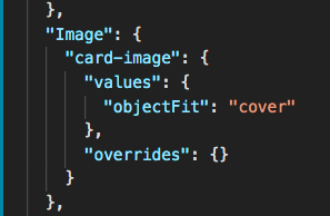
An instance of the `ControlledImage` component would look for the key: `'Image'` and subkey: `controlsKey` in the `controls.json`.
```tsx
// This would have access to values located at
// controlsJson['Image']['card-image']
```
Internally, the `ControlledImage` component has access to the `values` and `overrides` that live at this location in the `controls.json`.
If the passthrough value for `objectFit` is defined when invoking `useControls`, then that value will be passed through to the returned `values` object. However, if the passthrough value for `objectFit` is `undefined` then the value located at `controlsJson['Image']['card-image'].values.objectFit` will be used as a default value. Furthermore, even if the passthrough value for `objectFit` is defined, it can be overriden by checking the "Important" checkbox via the editor controls.
The `attach` method returned from `useControls` takes in an `HTMLElement` and listens to resize/click events on it. Every time a resize happens, the new dimensions of the active element are propagated to the globally rendered active element indicator (that dashed teal box). This way we can observe the app without polluting it with extra layers of dom crap.
I've only built out a few controls options on a few chakra-ui components, but you can see how it could be extended to all of chakra-ui and other component libraries/custom components as well.
This pattern allows developers to develop and designers to design all at once with all of the power of libraries such as chakra-ui.
## Running locally
```bash
yarn install
yarn start
```