https://github.com/mantoufan/yzhanreactresponsivecontent
A powerful and flexible React component for creating responsive content with automatic media query generation. 为响应式内容自动生成媒体查询
https://github.com/mantoufan/yzhanreactresponsivecontent
media-queries nextjs responsive seo ssr yzhan1kb
Last synced: about 1 year ago
JSON representation
A powerful and flexible React component for creating responsive content with automatic media query generation. 为响应式内容自动生成媒体查询
- Host: GitHub
- URL: https://github.com/mantoufan/yzhanreactresponsivecontent
- Owner: mantoufan
- License: mit
- Created: 2024-09-21T16:13:43.000Z (almost 2 years ago)
- Default Branch: main
- Last Pushed: 2024-10-01T06:21:12.000Z (almost 2 years ago)
- Last Synced: 2025-04-13T05:13:20.990Z (about 1 year ago)
- Topics: media-queries, nextjs, responsive, seo, ssr, yzhan1kb
- Language: TypeScript
- Homepage: https://mantoufan.github.io/yzhanReactResponsiveContent/
- Size: 75.2 KB
- Stars: 72
- Watchers: 2
- Forks: 2
- Open Issues: 0
-
Metadata Files:
- Readme: README.md
- License: LICENSE
Awesome Lists containing this project
README
# yzhan-react-responsive-content


[](https://github.com/mantoufan/yzhanReactResponsiveContent/blob/main/LICENSE)

A powerful and flexible React component for creating responsive content with automatic media query generation.
为响应式内容自动生成媒体查询.
# Why you need it instead of conditional rendering
- SSR / SSG / ISG: Conditional rendering requires device width, unavailable on the server
- SEO: Conditionally rendered content may be missed by crawlers
# Demo
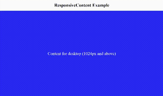
[Demo Link](https://mantoufan.github.io/yzhanReactResponsiveContent/)
## Features
- **Server-side rendering**: Works out of the box with SSR, no client-side rendering required.
- **Flexible content definition**: Accept a `set` prop similar to `srcSet`, allowing you to define content for different breakpoints easily.
- **Versatile content types**: Supports various content types including strings, HTML tags, React components, null values, and even lists of React nodes.
- **Performance optimized**: Uses pure CSS for control, automatically generating and removing media queries without global CSS pollution.
- **Customizable display property**: Set the display property to match your layout needs (block, flex, grid, inline, inline-block, etc.).
- **SEO-friendly**: Allows web crawlers to index content for both desktop and mobile versions simultaneously.
- **Smart wrapper handling**: Reuses existing wrapper layers when present, avoiding unnecessary DOM nesting and preserving existing style selectors.
## Installation
Install the package using npm:
```bash
npm install yzhan-react-responsive-content
```
Or using yarn:
```bash
yarn add yzhan-react-responsive-content
```
## Usage
Here's a basic example of how to use the `ResponsiveContent` component:
```jsx
import ResponsiveContent from "yzhan-react-responsive-content";
function MyComponent() {
return (
);
}
```
In this example:
- Content will display as follows:
- 'Mobile Content' for screen widths up to 320px
- 'Tablet Content' for screen widths between 321px and 768px
- 'Desktop Content' for screen widths above 768px
### Advanced Usage
You can use more complex content types, including React components. When using React components or elements, remember to provide a unique `key` prop to each one:
```jsx
import ResponsiveContent from "yzhan-react-responsive-content";
function MyComponent() {
return (
Mobile specific content,
320,
],
[Tablet optimized view, 768],
[
,
],
]}
display="flex"
/>
);
}
```
Note: When using React components or elements in the `set` prop, always provide a unique `key` prop to each one. This helps React efficiently update and re-render the content.
## API
### Props
- `set: Array<[ReactNode | null, number?]>`: An array of tuples. Each tuple contains the content to display and an optional breakpoint width. When using React components or elements as content, remember to provide a unique `key` prop to each one.
- `display?: 'block' | 'flex' | 'grid' | 'inline' | 'inline-block'`: The CSS display property to use for the content. Defaults to 'block'.
## Contributing
Contributions are welcome! Please feel free to submit a Pull Request.
## License
This project is licensed under the MIT License.