Ecosyste.ms: Awesome
An open API service indexing awesome lists of open source software.
https://github.com/markteekman/sunnyside-agency-landing-page
Frontend Mentor challenge "Sunnyside Agency Landing Page" using CSS Flexbox and Grid, Accessibility best practices, CSS Animations and the JavaScript IntersectionObserver. Includes a sticky navigation and a revealing footer.
https://github.com/markteekman/sunnyside-agency-landing-page
accessibility astro css-animations css-grid flexbox html5 intersection-observer javascript scss wcag
Last synced: 1 day ago
JSON representation
Frontend Mentor challenge "Sunnyside Agency Landing Page" using CSS Flexbox and Grid, Accessibility best practices, CSS Animations and the JavaScript IntersectionObserver. Includes a sticky navigation and a revealing footer.
- Host: GitHub
- URL: https://github.com/markteekman/sunnyside-agency-landing-page
- Owner: markteekman
- Created: 2021-10-22T17:43:58.000Z (over 3 years ago)
- Default Branch: master
- Last Pushed: 2021-11-21T13:06:41.000Z (about 3 years ago)
- Last Synced: 2024-12-17T22:45:02.707Z (about 2 months ago)
- Topics: accessibility, astro, css-animations, css-grid, flexbox, html5, intersection-observer, javascript, scss, wcag
- Language: Astro
- Homepage: https://markteekman.github.io/sunnyside-agency-landing-page/
- Size: 2.28 MB
- Stars: 2
- Watchers: 2
- Forks: 0
- Open Issues: 0
-
Metadata Files:
- Readme: README.md
Awesome Lists containing this project
README
# Frontend Mentor - Sunnyside agency landing page solution
This is a solution to the [Sunnyside agency landing page challenge on Frontend Mentor](https://www.frontendmentor.io/challenges/sunnyside-agency-landing-page-7yVs3B6ef). Frontend Mentor challenges help you improve your coding skills by building realistic projects.
## Table of contents
- [Overview](#overview)
- [The challenge](#the-challenge)
- [Extra challenges](#extra-challenges)
- [Screenshot](#screenshot)
- [Links](#links)
- [My process](#my-process)
- [Built with](#built-with)
- [What I learned](#what-i-learned)
- [Continued development](#continued-development)
- [Useful resources](#useful-resources)
- [Author](#author)
## Overview
### The challenge
Users should be able to:
- View the optimal layout for the site depending on their device's screen size.
- See hover states for all interactive elements on the page.
### Extra challenges
As a bonus I want to achieve the following extra challenges:
- The page must be accessible according to WCAG 2.1 standards, things like color contrast, skip links, clear element focus, keyboard navigation support and necessary aria attributes.
- I want to add minimal animations to the page, such as a toggle animation on the responsive menu and transforms on various content on the page using the IntersectionObserver.
- As a bonus challenge I want to make the navigation sticky when you scroll past the hero section and scroll back up.
- And as another bonus challenge I want to add a revealing effect on the footer, so that it seems like it's sliding into view from behind the rest of the page.
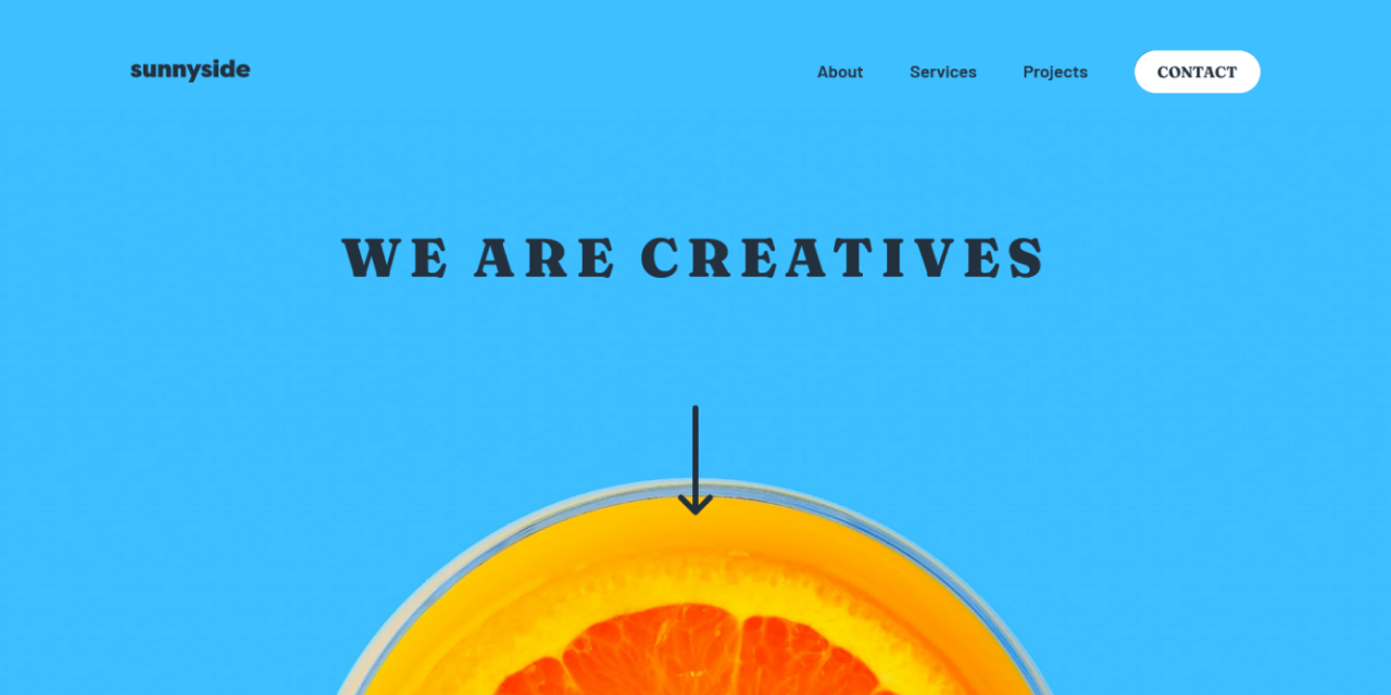
### Screenshot
### Links
- [Solution URL](https://www.frontendmentor.io/solutions/astro-wcag-accessibility-sticky-navigation-revealing-footer-DCMEQTsiX)
- [Live Site URL](https://markteekman.github.io/sunnyside-agency-landing-page/)
## My process
### Built with
- Semantic HTML5 markup
- CSS custom properties
- Flexbox
- CSS Grid
- Mobile-first workflow
- WCAG 2.1 best practices
- CSS Animations
- JavaScript IntersectionObserver API
- [Astro](https://astro.build) - Astro Static Site Generator
- [Accessible Astro Starter](https://github.com/markteekman/accessible-astro-starter) - My own starter template for Astro
### What I learned
- I learned that when mapping colors in SCSS, if you use an actual color name (such as yellow instead of dark-yellow), you need to either use them as strings or map keys:
```scss
$colors: (
primary: (
yellow: hsl(194, 100%, 80%), // not how you do it
"yellow": hsl(194, 100%, 80%), // should be quoted
// ...
),
neutral-clr: (
// ...
),
);
```
- I've used the new CSS `aspect-ratio` property before, but with this challenge I found out just how easy it makes things. For example I'm using a `display-grid` for the content and image tiles below the hero section. Now without `ascpect-ratio` it's quite a hassle to have the image stay true to it's box. There are ways of course, but by just adding `ascpect-ratio: 4 /3` to the image tiles, it simply stretches out in the grid cell.
```scss
.image-tile {
width: 100%;
height: 100%;
aspect-ratio: 4 / 3;
// ...
}
```
- For this one I wanted to add a hover zoom effect on the four images in the footer, which I'd never done before, turns out it's quite simple by just setting the initial `background-size` to 100% and change that value to say 120% on zoom with a transition on the `background-size` (eventually I removed this from the final build):
```scss
.image-tile
// ...
background-size: 100%;
transition: background-size 0.2s ease-in-out;
&:hover {
background-size: 110%;
}
}
```
- I learned how to 'fake' a delay in a CSS Animation, seeing as this is not possible by default. I did this for example with the arrow down animation. It's a 3s animation that goes from 0% to 15%. The remaining 85% is the delay (which comes down to 3 / 100 * 85 = 2.55s delay).
```scss
svg {
animation: fade-down 3s infinite alternate ease-in-out;
}
@keyframes fade-down {
0% {
opacity: 0;
transform: translateY(-2rem);
}
15% {
opacity: 1;
transform: translateY(0);
}
}
```
- I learned how to add a pulsating micro interaction to the button in the menu. It makes use of the same animation delay technique like the arrow down SVG:
```scss
.call-to-action {
// ...
animation: pulse 5s infinite;
}
@keyframes pulse {
10% {
box-shadow: 0 0 0 10px rgba(#19536b, 0);
}
11% {
box-shadow: 0 0 0 0 rgba(#19536b, 0);
}
}
```
- I learned how to easily add a revealing footer. It's quite simple using `z-index` and `position: sticky`:
```scss
main {
// ...
position: relative;
z-index: 1;
}
footer {
// ...
position: sticky;
z-index: 0;
bottom: 0;
left: 0;
width: 100%;
}
```
- I used the `object-fit: cover` CSS property for the first time on images and found it super useful!
```scss
img {
object-fit: cover;
height: 100%;
}
```
### Continued development
- Nothing at the moment.
### Useful resources
- [Intersection Observer API](https://developer.mozilla.org/en-US/docs/Web/API/Intersection_Observer_API) - The MDN documentation on how to use the Intersection Observer API.
- [Intersection Observer Example](https://codepen.io/markteekman/pen/jOyXKpE) - An example I made in a CodePen of how to use the Intersection Observer.
- [CSS Animation Delay](https://allurewebsolutions.com/repeat-css3-animation-with-delay) - This article explains how to 'fake' an delay in an infinite CSS Animation loop.
- [Slideout Footer](https://css-tricks.com/the-slideout-footer/) - This CSS Tricks article explains how to implement a revealing footer using `position: sticky`.
## Author
- [Personal Website](https://www.markteekman.nl)
- [Frontend Mentor Profile](https://www.frontendmentor.io/profile/markteekman)
- [LinkedIn Page](https://nl.linkedin.com/in/markteekman)
- [GitHub Projects](https://github.com/markteekman)
- [NPM Packages](https://www.npmjs.com/~markteekman)
- [CodePen Creations](https://codepen.io/markteekman)