https://github.com/martenzander/postcss-mesh
Mesh – The powerful Grid System for PostCSS
https://github.com/martenzander/postcss-mesh
column grid grid-layout grid-system gutter layout postcss postcss-plugin scss
Last synced: 3 months ago
JSON representation
Mesh – The powerful Grid System for PostCSS
- Host: GitHub
- URL: https://github.com/martenzander/postcss-mesh
- Owner: martenzander
- License: mit
- Created: 2017-05-03T18:20:30.000Z (about 9 years ago)
- Default Branch: master
- Last Pushed: 2019-07-13T10:39:17.000Z (about 7 years ago)
- Last Synced: 2025-09-05T02:52:03.156Z (11 months ago)
- Topics: column, grid, grid-layout, grid-system, gutter, layout, postcss, postcss-plugin, scss
- Language: JavaScript
- Homepage: https://www.postcss-mesh.org
- Size: 753 KB
- Stars: 6
- Watchers: 1
- Forks: 1
- Open Issues: 2
-
Metadata Files:
- Readme: README.md
- Changelog: CHANGELOG.md
- License: LICENSE
Awesome Lists containing this project
README

Mesh
The powerful Grid System for PostCSS


Table of contents
- [About Mesh](#about-mesh)
- [Getting Started](#getting-started)
- [Installation](#installation)
- [Grid Setup](#grid-setup)
- [SCSS](#scss)
- [HTML](#html)
- [Unique Selling Points](#unique-selling-points)
- [Responsive Gutter](#responsive-gutter)
- [Gutter On Outside](#gutter-on-outside)
- [Mobile First || Desktop First](#mobile-first--desktop-first)
- [Unlimited Breakpoints](#unlimited-breakpoints)
- [Property Overwrite](#property-overwrite)
- [Custom Class Names](#custom-class-names)
- [Excluding](#excluding)
- [Components](#components)
- [Container](#container)
- [Void](#void)
- [Column](#column)
- [Offset](#offset)
- [Pull](#pull)
- [Push](#push)
- [Nesting](#nesting)
- [Ordering](#ordering)
- [Properties](#properties)
## About Mesh
There are a lot of different grid systems already out there and most of them are pretty good. But ☝️ none of them is offering the whole bandwidth of possible options. E.g. I wanted to switch between a `flex`, `inline-block` or `float` based grid as well as I wanted to be able to overwrite certain parameters like [gutter](#properties) or [column-count](#properties) breakpoint wise. That is how I came up with the idea to create my very own grid compiler and Mesh was born 🎉🎉🎉.
## Getting Started
### Installation
```console
$ npm i postcss-mesh
```
### Grid Setup
#### SCSS
Mesh is based on @-rules. To initiate a new grid use `@mesh-grid`. All breakpoints for a grid should be nested within the respective grid declaration. See the example below for a simple grid setup with bootstrap standards.
```css
@mesh-grid {
column-count: 12;
compile: true;
container-width: 100%;
display-type: float;
gutter-on-outside: true;
gutter: 30px;
name: mesh;
query-condition: min-width;
responsive-gutter: false;
@mesh-viewport-sm {
container-width: 540px;
viewport: 576px;
}
@mesh-viewport-md {
container-width: 720px;
viewport: 768px;
}
@mesh-viewport-lg {
container-width: 960px;
viewport: 992px;
}
@mesh-viewport-xl {
container-width: 1140px;
viewport: 1200px;
}
}
```
#### HTML
```html
// This markup is a two column grid with equal widths // for all defined breakpoints.
```

## Unique Selling Points
#### Responsive Gutter
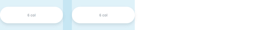
Set the [responsive-gutter](#properties) property to `true` to scale the gutter as your [container](#container) grows. This makes your grid less static and more fluid. To make this feature work you have to set a `viewport` context even in your default settings of the grid.
_This feature inherits the gutter size for the first nested level only._
```css
// This set up uses 375px as context.
// If your screen is 375px wide the gap
// between your columns should be exact 30px.
// If your screen gets bigger, the gap scales up.
// If your screen gets smaller, the gap scales down.
@mesh-grid {
viewport: 375px;
gutter: 30px;
responsive-gutter: true;
}
```
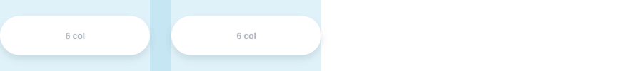
Regular Gutter
Responsive Gutter
#### Gutter On Outside
Allows you to toggle the [container's](#container) padding which is based on the [gutter](#properties) size.
```css
// true || false
// default: true
@mesh-grid {
gutter-on-outside: true;
}
```
#### Mobile First || Desktop First
You can decide if your default viewport is a desktop one or a mobile one using the [query-condition](#properties) property. This property takes `min-width` or `max-width` as an argument. If set to `min-width` your default viewport will be a mobile one. As soon as your screen's width hits the next bigger width defined in all of your breakpoints, it snaps to the related breakpoint.
```css
// min-width || max-width
// default: min-width
@mesh-grid {
query-condition: min-width;
}
```
#### Unlimited Breakpoints
Bootstrap comes with five predefined breakpoints (Extra small _<576px_, Small _≥576px_, Medium _≥768px_, Large _≥992px_, Extra Large _≥1200px_). These breakpoints have proved its worth over time. But nevertheless, sometimes your design requires more individual breakpoints. In this case Mesh is your best friend. With Mesh you can define as many or as less custom breakpoints as you want using the `@mesh-viewport-VIEWPORTNAME`-@-rule where `VIEWPORTNAME` is the viewport's ID. The ID is used in the viewport specific classes. E.g. `@mesh-viewport-lg` results in `.mesh-column-lg`-classes.
```css
// this is how you would define a standard large bootstrap breakpoint
// properties "container-width" & "viewport" are required
@mesh-viewport-lg {
container-width: 960px;
viewport: 992px;
}
```
#### Property Overwrite
Property Overwrite allows you to overwrite some properties breakpoint wise, e.g. `gutter`. Learn more about properties [here](#properties).
```css
// default: 30px
@mesh-viewport-lg {
gutter: 30px;
}
```
#### Custom Class Names
Overwrite the default classNames to keep them unique, short or both. See the [properties list](#properties) for the whole range of naming properties.
```CSS
// this changes all selectors containing "column"
// e.g. ".mesh-column-1" to ".mesh-col-1"
@mesh-grid{
naming-column: col;
}
```
#### Excluding
It's a fact: Most projects don't use the whole bandwith of available column-spans. This leads to many lines of unused CSS in the final bundle. Thanks to this feature it is possible to exclude certain column-spans for certain [components](#components) viewport wise.
```CSS
// this how you would exclude ".mesh-column-1" & ".mesh-column-2"
@mesh-grid{
exclude-columns: 1,2;
}
```
You can also `exclude-pushes`, `exclude-pulls` & `exclude-offsets`. See the [properties list](#properties) for the whole range of excluding properties.
## Components
Mesh's compiled Grid is made of three basic components and three transform components. The basic components describe the `.mesh-container`, `.mesh-void` & `.mesh-column` classes. These components are necessary to set up a very basic grid. The transform components describe the `.mesh-offset`, `.mesh-pull` & `.mesh-push` classes. These components are necessary to transform a [column](#column) within your grid and should be added to a column component only. Using transform components you can reorder your columns.
### Container
The container is the most outer component of a grid instance. It sets up the maximum width of the grid and should not be nested.
```html
```
### Void
The void component is the equivalent to Bootstrap's `row` component and voids its parent's [gutter](#gutter). The only immediate child of a void component should be a [column](#column).
```html
```
### Column
The column component is where you can put your content. All columns should be an immediate child of a [void](#void) component. Replace `x` with a number between 1 and your given column-count.
```html
```
### Offset
The offset component will add a margin to the respective [column](#column) to create an even bigger gap between two columns. Using the component like below will offset the column about the width of a single column.
```html
```
### Pull
The pull component will reposition the respective [column](#column) from the right. Using the component like below will pull the column about the width of a single column to the left.
```html
```
### Push
The push component will reposition the respective [column](#column) from the left. Using the component like below will push the column about the width of a single column to the right.
```html
```
## Nesting
Of course you can also nest your [columns](#column).
```html
```

## Ordering
Sometimes you have to switch position of certain [columns](#column) breakpoint wise. Using [push](#push) and [pull](#pull) components you can shift your columns.
```html
```

## Properties
Mesh is based on a bunch of properties you can adjust to your needs. Some of them are overwriteable in each defined breakpoint. See the table below to get an overview of what Mesh is offering.
PropertyDescriptionOptionsOverwrite
column-align
Aligns all columns at the top, middle or bottom of a void.
top || middle || bottom
yes
column-count
Defines how many columns fit in one void.
number
yes
compile
If set to false Mesh won't compile classes of the current grid.
true || false
no
container-base-width-unit
Defines the container's width unit.
% || vw
yes
container-width
Defines the container's max-width property for current viewport.
px || %
yes
debug
If set to true Mesh generates excluded classes and extends the style with debug-property of debug-value
true || false
no
debug-property
A valid CSS Property for debug style extension.
e.g. border
no
debug-value
A value for the given debug-property.
e.g. 1px dotted red
no
display-type
Defines if the grid is inline-block, float or flex based.
inline-block || float || flex
no
exclude-columns
Given integers define spans to exclude from column classes.
int, int
yes
exclude-offsets
Given integers define spans to exclude from offset classes.
int, int
yes
exclude-pulls
Given integers define spans to exclude from pull classes.
int, int
yes
exclude-pushes
Given integers define spans to exclude from push classes.
int, int
yes
gutter
Sets the gap between columns.
px
yes
gutter-on-outside
If set to false the container won't have a padding.
true || false
yes
name
Sets the grid's name and adjusts the component's class prefix.
string
no
naming-column
Given string replaces column in all generated selectors.
string
no
naming-container
Given string replaces container in all generated selectors.
string
no
naming-offset
Given string replaces offset in all generated selectors.
string
no
naming-pull
Given string replaces pull in all generated selectors.
string
no
naming-push
Given string replaces push in all generated selectors.
string
no
naming-void
Given string replaces void in all generated selectors.
string
no
query-condition
Using this property you can decide if you want the compiled styles to be mobile first or desktop first.
min-width || max-width
no
responsive-gutter
If set to true the gutter scales as the container grows.
true || false
yes
use-name-prefix
If set to false Mesh won't use the grid's name as a class prefix.
true || false
no
viewport
Defines the screen's width at which a new media-query should be initiated.
px
yes