https://github.com/martyan/react-customizable-progressbar
Customizable circular progress bar component for React :doughnut:
https://github.com/martyan/react-customizable-progressbar
circular component progressbar react
Last synced: 3 months ago
JSON representation
Customizable circular progress bar component for React :doughnut:
- Host: GitHub
- URL: https://github.com/martyan/react-customizable-progressbar
- Owner: martyan
- License: mit
- Created: 2018-11-23T18:25:09.000Z (over 7 years ago)
- Default Branch: master
- Last Pushed: 2025-12-27T14:56:43.000Z (6 months ago)
- Last Synced: 2026-01-01T09:50:41.282Z (6 months ago)
- Topics: circular, component, progressbar, react
- Language: TypeScript
- Homepage: https://martinjuzl.com/react-customizable-progressbar
- Size: 1.49 MB
- Stars: 64
- Watchers: 1
- Forks: 20
- Open Issues: 0
-
Metadata Files:
- Readme: README.md
- Changelog: CHANGELOG.md
- License: LICENSE
Awesome Lists containing this project
README
# react-customizable-progressbar
Customizable circular SVG progress bar component for React
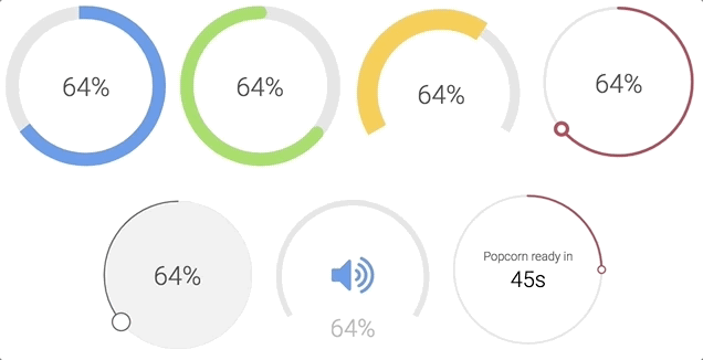
Check examples or generator to play around with all props
### Installation
```bash
npm install --save react-customizable-progressbar
```
or
```bash
yarn add react-customizable-progressbar
```
### Usage
```jsx
import ProgressBar from 'react-customizable-progressbar';
;
```
### Props
| Name | Type | Default | Description |
| ----------------------- | -------- | ------------- | ---------------------------------------------------- |
| `radius` (required) | `number` | `100` | Progress bar radius |
| `progress` (required) | `number` | `0` | Progress value (out of `steps`) |
| `steps` | `number` | `100` | Total steps |
| `cut` | `number` | `0` | Angle of the circle sector |
| `rotate` | `number` | `-90` | Progress rotation |
| `strokeWidth` | `number` | `20` | Stroke width |
| `strokeColor` | `string` | `'indianred'` | Stroke color |
| `strokeLinecap` | `string` | `'round'` | Stroke line cap |
| `transition` | `string` | `'0.3s ease'` | Transition |
| `trackStrokeWidth` | `number` | `20` | Track stroke width |
| `trackStrokeColor` | `string` | `'#e6e6e6'` | Track stroke color |
| `trackStrokeLinecap` | `string` | `'round'` | Track stroke line cap |
| `trackTransition` | `string` | `'1s ease'` | Track transition |
| `pointerRadius` | `number` | `0` | Pointer radius |
| `pointerStrokeWidth` | `number` | `20` | Pointer stroke width |
| `pointerStrokeColor` | `string` | `'indianred'` | Pointer stroke color |
| `pointerFillColor` | `string` | `'white'` | Pointer fill color |
| `initialAnimation` | `bool` | `false` | Initial animation |
| `initialAnimationDelay` | `number` | `0` | Initial animation delay |
| `inverse` | `bool` | `false` | Inverse |
| `counterClockwise` | `bool` | `false` | Counter-clockwise |
| `children` | `node` | `null` | Children - pass anything to show inside progress bar |
| `className` | `string` | `''` | Progress bar class name |
### Styles
```css
.RCP {
}
.RCP__track {
}
.RCP__progress {
}
.RCP__pointer {
}
```
You can use these default indicator styles to center it both horizontally and vertically:
```css
.your-indicator {
display: flex;
justify-content: center;
text-align: center;
position: absolute;
top: 0;
width: 100%;
height: 100%;
margin: 0 auto;
user-select: none;
}
```
### Run examples locally
```bash
npm install
npm run dev
```