https://github.com/matplotlib/mplfinance
Financial Markets Data Visualization using Matplotlib
https://github.com/matplotlib/mplfinance
candlestick candlestick-chart candlestickchart finance intraday-data market-data matplotlib mplfinance ohlc ohlc-chart ohlc-data ohlc-plot ohlcv trading-days
Last synced: about 1 year ago
JSON representation
Financial Markets Data Visualization using Matplotlib
- Host: GitHub
- URL: https://github.com/matplotlib/mplfinance
- Owner: matplotlib
- License: other
- Created: 2019-12-05T16:32:32.000Z (over 6 years ago)
- Default Branch: master
- Last Pushed: 2024-08-08T17:23:11.000Z (almost 2 years ago)
- Last Synced: 2025-05-13T02:22:12.953Z (about 1 year ago)
- Topics: candlestick, candlestick-chart, candlestickchart, finance, intraday-data, market-data, matplotlib, mplfinance, ohlc, ohlc-chart, ohlc-data, ohlc-plot, ohlcv, trading-days
- Language: Python
- Homepage: https://pypi.org/project/mplfinance/
- Size: 83.3 MB
- Stars: 4,003
- Watchers: 96
- Forks: 660
- Open Issues: 170
-
Metadata Files:
- Readme: README.md
- Contributing: CONTRIBUTING.md
- License: LICENSE
- Code of conduct: CODE_OF_CONDUCT.md
Awesome Lists containing this project
- awesome-systematic-trading - mplfinance - commit/matplotlib/mplfinance/master)  | Python | - Financial Markets Data Visualization using Matplotlib (Visualization / TimeSeries Analysis)
- awesome-python-tools - mplfinance
- awesome-quant - github.com/matplotlib/mplfinance
- Awesome_AI4Finance - mplfinance
- awesome-quant - mplfinance - matplotlib utilities for the visualization, and visual analysis, of financial data. (Python / Visualization)
- awesome-quant-cn - mplfinance - - 使用matplotlib对金融市场数据可视化 (可视化)
- awesome-systematic-trading - mplfinance - with-python](https://img.shields.io/badge/Made%20with-Python-1f425f.svg) | (Visualization / Cryptocurrencies)
- awesome-quant - matplotlib/mplfinance - 08-08 · license NOASSERTION (Data and Feeds)
README
[](https://github.com/matplotlib/mplfinance/actions/workflows/mplfinance_checks.yml)
# mplfinance
matplotlib utilities for the visualization, and visual analysis, of financial data
## Installation
```bash
pip install --upgrade mplfinance
```
- mplfinance requires [matplotlib](https://pypi.org/project/matplotlib/) and [pandas](https://pypi.org/project/pandas/)
---
## **⇾ [Latest Release Information](https://github.com/matplotlib/mplfinance/releases) ⇽**
#### ⇾ **[Older Release Information](https://github.com/matplotlib/mplfinance/blob/master/RELEASE_NOTES.md)**
---
- **[The New API](https://github.com/matplotlib/mplfinance#newapi)**
- **[Tutorials](https://github.com/matplotlib/mplfinance#tutorials)**
- **[Basic Usage](https://github.com/matplotlib/mplfinance#usage)**
- **[Customizing the Appearance of Plots](https://github.com/matplotlib/mplfinance/blob/master/markdown/customization_and_styles.md)**
- **[Adding Your Own Technical Studies to Plots](https://github.com/matplotlib/mplfinance/blob/master/examples/addplot.ipynb)**
- **[Subplots: Multiple Plots on a Single Figure](https://github.com/matplotlib/mplfinance/blob/master/markdown/subplots.md)**
- **[Fill Between: Filling Plots with Color](https://github.com/matplotlib/mplfinance/blob/master/examples/fill_between.ipynb)**
- **[Price-Movement Plots (Renko, P&F, etc)](https://github.com/matplotlib/mplfinance/blob/master/examples/price-movement_plots.ipynb)**
- **[Trends, Support, Resistance, and Trading Lines](https://github.com/matplotlib/mplfinance/blob/master/examples/using_lines.ipynb)**
- **[Coloring Individual Candlesticks](https://github.com/matplotlib/mplfinance/blob/master/examples/marketcolor_overrides.ipynb)** (New: December 2021)
- **[Saving the Plot to a File](https://github.com/matplotlib/mplfinance/blob/master/examples/savefig.ipynb)**
- **[Animation/Updating your plots in realtime](https://github.com/matplotlib/mplfinance/blob/master/markdown/animation.md)**
- **⇾ [Latest Release Info](https://github.com/matplotlib/mplfinance/releases) ⇽**
- **[Older Release Info](https://github.com/matplotlib/mplfinance/blob/master/RELEASE_NOTES.md)**
- **[Some Background History About This Package](https://github.com/matplotlib/mplfinance#history)**
- **[Old API Availability](https://github.com/matplotlib/mplfinance#oldapi)**
This repository, `matplotlib/mplfinance`, contains a new **matplotlib finance** API that makes it easier to create financial plots. It interfaces nicely with **Pandas** DataFrames.
*More importantly, **the new API automatically does the extra matplotlib work that the user previously had to do "manually" with the old API.*** (The old API is still available within this package; see below).
The conventional way to import the new API is as follows:
```python
import mplfinance as mpf
```
The most common usage is then to call
```python
mpf.plot(data)
```
where `data` is a `Pandas DataFrame` object containing Open, High, Low and Close data, with a Pandas `DatetimeIndex`.
Details on how to call the new API can be found below under **[Basic Usage](https://github.com/matplotlib/mplfinance#usage)**, as well as in the jupyter notebooks in the **[examples](https://github.com/matplotlib/mplfinance/blob/master/examples/)** folder.
I am very interested to hear from you regarding what you think of the new `mplfinance`, plus any suggestions you may have for improvement. You can reach me at **dgoldfarb.github@gmail.com** or, if you prefer, provide feedback or a ask question on our **[issues page.](https://github.com/matplotlib/mplfinance/issues/new/choose)**
---
## Basic Usage
Start with a Pandas DataFrame containing OHLC data. For example,
```python
import pandas as pd
daily = pd.read_csv('examples/data/SP500_NOV2019_Hist.csv',index_col=0,parse_dates=True)
daily.index.name = 'Date'
daily.shape
daily.head(3)
daily.tail(3)
```
(20, 5)
Open
High
Low
Close
Volume
Date
2019-11-01
3050.72
3066.95
3050.72
3066.91
510301237
2019-11-04
3078.96
3085.20
3074.87
3078.27
524848878
2019-11-05
3080.80
3083.95
3072.15
3074.62
585634570
...
Open
High
Low
Close
Volume
Date
2019-11-26
3134.85
3142.69
3131.00
3140.52
986041660
2019-11-27
3145.49
3154.26
3143.41
3153.63
421853938
2019-11-29
3147.18
3150.30
3139.34
3140.98
286602291
After importing mplfinance, plotting OHLC data is as simple as calling `mpf.plot()` on the dataframe
```python
import mplfinance as mpf
mpf.plot(daily)
```
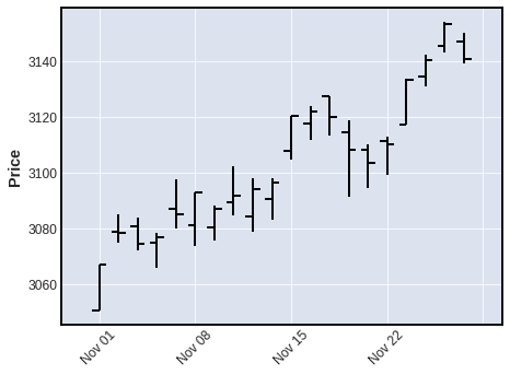
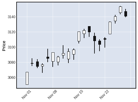
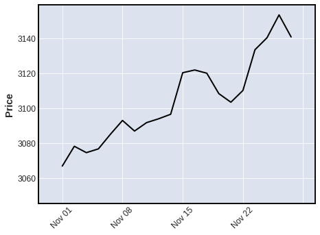
The default plot type, as you can see above, is `'ohlc'`. Other plot types can be specified with the keyword argument `type`, for example, `type='candle'`, `type='line'`, `type='renko'`, or `type='pnf'`
```python
mpf.plot(daily,type='candle')
```
```python
mpf.plot(daily,type='line')
```
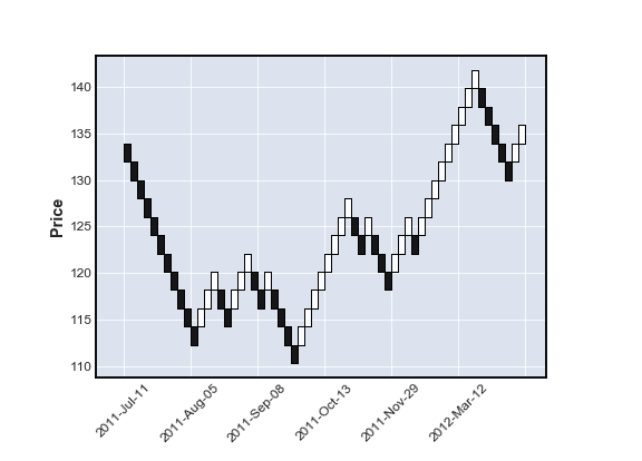
```python
year = pd.read_csv('examples/data/SPY_20110701_20120630_Bollinger.csv',index_col=0,parse_dates=True)
year.index.name = 'Date'
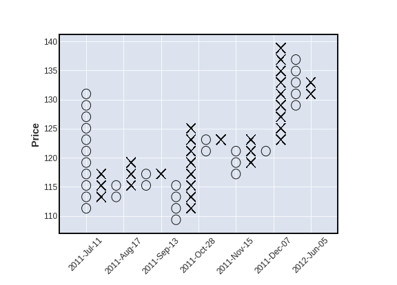
mpf.plot(year,type='renko')
```
```python
mpf.plot(year,type='pnf')
```
---
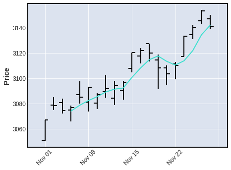
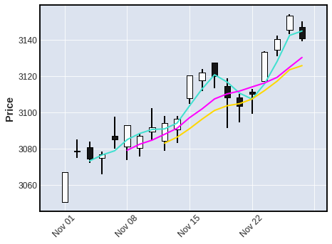
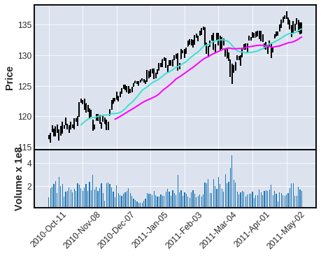
We can also plot moving averages with the `mav` keyword
- use a scalar for a single moving average
- use a tuple or list of integers for multiple moving averages
```python
mpf.plot(daily,type='ohlc',mav=4)
```
```python
mpf.plot(daily,type='candle',mav=(3,6,9))
```
---
We can also display `Volume`
```python
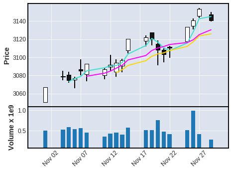
mpf.plot(daily,type='candle',mav=(3,6,9),volume=True)
```
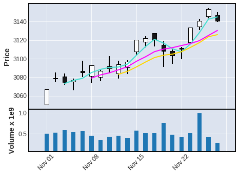
Notice, in the above chart, there are no gaps along the x-coordinate, even though there are days on which there was no trading. ***Non-trading days are simply not shown*** (since there are no prices for those days).
- However, sometimes people like to see these gaps, so that they can tell, with a quick glance, where the weekends and holidays fall.
- Non-trading days can be displayed with the **`show_nontrading`** keyword.
- Note that for these purposes **non-trading** intervals are those that ***are not represented in the data at all***. (There are simply no rows for those dates or datetimes). This is because, when data is retrieved from an exchange or other market data source, that data typically will *not* include rows for non-trading days (weekends and holidays for example). Thus ...
- **`show_nontrading=True`** will display all dates (all time intervals) between the first time stamp and the last time stamp in the data (regardless of whether rows exist for those dates or datetimes).
- **`show_nontrading=False`** (the default value) will show ***only*** dates (or datetimes) that have actual rows in the data. (This means that if there are rows in your DataFrame that exist but contain only **`NaN`** values, these rows *will still appear* on the plot even if **`show_nontrading=False`**)
- For example, in the chart below, you can easily see weekends, as well as a gap at Thursday, November 28th for the U.S. Thanksgiving holiday.
```python
mpf.plot(daily,type='candle',mav=(3,6,9),volume=True,show_nontrading=True)
```
---
We can also plot intraday data:
```python
intraday = pd.read_csv('examples/data/SP500_NOV2019_IDay.csv',index_col=0,parse_dates=True)
intraday = intraday.drop('Volume',axis=1) # Volume is zero anyway for this intraday data set
intraday.index.name = 'Date'
intraday.shape
intraday.head(3)
intraday.tail(3)
```
(1563, 4)
Open
Close
High
Low
Date
2019-11-05 09:30:00
3080.80
3080.49
3081.47
3080.30
2019-11-05 09:31:00
3080.33
3079.36
3080.33
3079.15
2019-11-05 09:32:00
3079.43
3079.68
3080.46
3079.43
...
Open
Close
High
Low
Date
2019-11-08 15:57:00
3090.73
3090.70
3091.02
3090.52
2019-11-08 15:58:00
3090.73
3091.04
3091.13
3090.58
2019-11-08 15:59:00
3091.16
3092.91
3092.91
3090.96
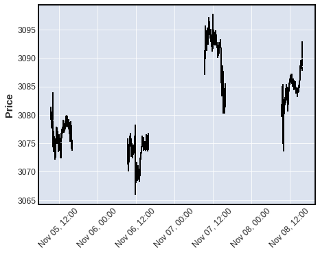
The above dataframe contains Open,High,Low,Close data at 1 minute intervals for the S&P 500 stock index for November 5, 6, 7 and 8, 2019. Let's look at the last hour of trading on November 6th, with a 7 minute and 12 minute moving average.
```python
iday = intraday.loc['2019-11-06 15:00':'2019-11-06 16:00',:]
mpf.plot(iday,type='candle',mav=(7,12))
```
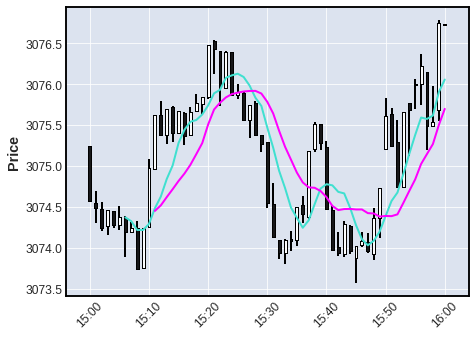
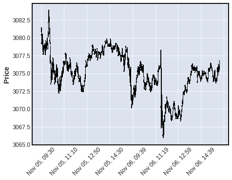
The "time-interpretation" of the `mav` integers depends on the frequency of the data, because the mav integers are the *number of data points* used in the Moving Average (not the number of days or minutes, etc). Notice above that for intraday data the x-axis automatically displays TIME *instead of* date. Below we see that if the intraday data spans into two (or more) trading days the x-axis automatically displays *BOTH* TIME and DATE
```python
iday = intraday.loc['2019-11-05':'2019-11-06',:]
mpf.plot(iday,type='candle')
```
---
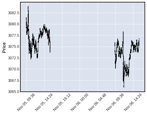
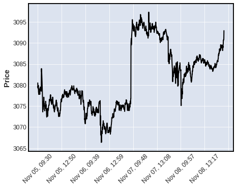
In the plot below, we see what an intraday plot looks like when we **display non-trading time periods** with **`show_nontrading=True`** for intraday data spanning into two or more days.
```python
mpf.plot(iday,type='candle',show_nontrading=True)
```
---
Below: 4 days of intraday data with `show_nontrading=True`
```python
mpf.plot(intraday,type='ohlc',show_nontrading=True)
```
---
Below: the same 4 days of intraday data with `show_nontrading` defaulted to `False`.
```python
mpf.plot(intraday,type='line')
```
---
Below: Daily data spanning across a year boundary automatically adds the *YEAR* to the DATE format
```python
df = pd.read_csv('examples/data/yahoofinance-SPY-20080101-20180101.csv',index_col=0,parse_dates=True)
df.shape
df.head(3)
df.tail(3)
```
(2519, 6)
Open
High
Low
Close
Adj Close
Volume
Date
2007-12-31
147.100006
147.610001
146.059998
146.210007
118.624741
108126800
2008-01-02
146.529999
146.990005
143.880005
144.929993
117.586205
204935600
2008-01-03
144.910004
145.490005
144.070007
144.860001
117.529449
125133300
...
Open
High
Low
Close
Adj Close
Volume
Date
2017-12-27
267.380005
267.730011
267.010010
267.320007
267.320007
57751000
2017-12-28
267.890015
267.920013
267.450012
267.869995
267.869995
45116100
2017-12-29
268.529999
268.549988
266.640015
266.859985
266.859985
96007400
```python
mpf.plot(df[700:850],type='bars',volume=True,mav=(20,40))
```
For more examples of using mplfinance, please see the jupyter notebooks in the **[`examples`](https://github.com/matplotlib/mplfinance/blob/master/examples/)** directory.
---
## Some History
My name is Daniel Goldfarb. In November 2019, I became the maintainer of `matplotlib/mpl-finance`. That module is being deprecated in favor of the current `matplotlib/mplfinance`. The old `mpl-finance` consisted of code extracted from the deprecated `matplotlib.finance` module along with a few examples of usage. It has been mostly un-maintained for the past three years.
It is my intention to archive the `matplotlib/mpl-finance` repository soon, and direct everyone to `matplotlib/mplfinance`. The main reason for the rename is to avoid confusion with the hyphen and the underscore: As it was, `mpl-finance` was *installed with the hyphen, but imported with an underscore `mpl_finance`.* Going forward it will be a simple matter of both installing and importing `mplfinance`.
**With this new ` mplfinance ` package installed, in addition to the new API, users can still access the old API**.
The old API may be removed someday, but for the foreseeable future we will keep it ... at least until we are very confident that users of the old API can accomplish the same things with the new API.
To access the old API with the new ` mplfinance ` package installed, change the old import statements
**from:**
```python
from mpl_finance import
```
**to:**
```python
from mplfinance.original_flavor import
```
where `` indicates the method you want to import, for example:
```python
from mplfinance.original_flavor import candlestick_ohlc
```