Ecosyste.ms: Awesome
An open API service indexing awesome lists of open source software.
https://github.com/mattrothenberg/react-comparison-slider
A keyboard accessible "before & after" component for React ⬅️➡️
https://github.com/mattrothenberg/react-comparison-slider
accessibility image react slider
Last synced: 3 months ago
JSON representation
A keyboard accessible "before & after" component for React ⬅️➡️
- Host: GitHub
- URL: https://github.com/mattrothenberg/react-comparison-slider
- Owner: mattrothenberg
- License: other
- Created: 2021-07-18T00:02:11.000Z (over 3 years ago)
- Default Branch: main
- Last Pushed: 2021-10-14T22:13:38.000Z (over 3 years ago)
- Last Synced: 2023-03-01T00:01:54.633Z (almost 2 years ago)
- Topics: accessibility, image, react, slider
- Language: TypeScript
- Homepage: https://react-comparison-slider.vercel.app
- Size: 531 KB
- Stars: 33
- Watchers: 1
- Forks: 3
- Open Issues: 0
-
Metadata Files:
- Readme: README.md
- License: LICENSE
Awesome Lists containing this project
README
# react-comparison-slider
[](https://badge.fury.io/js/react-comparison-slider)
https://react-comparison-slider.vercel.app/
React Comparison Slider is a fully customizable component for building bespoke, keyboard-accessible "before & after" sliders for the web. You bring the content and the visuals, and it'll handle the heavy lifting.


## Installation
```
yarn add react-comparison-slider
```
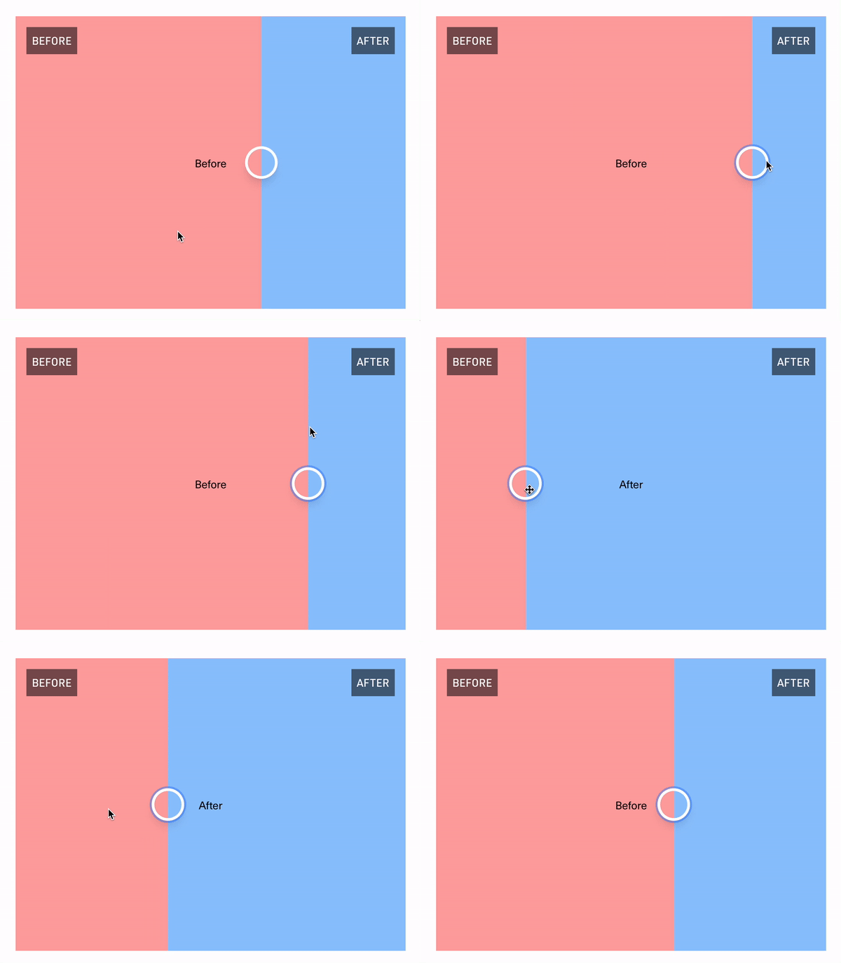
## The "Hello World" example
The key ingredients to this component are:
1. `aspectRatio`, expressed either numerically as a fraction (e.g., `16/9`), or as a string (e.g., `"16x9"` or `"16:9"`). Providing an aspect ratio ensures that the before and after "images" (or HTML elements, whatever you decide to provide) line up with one another.
2. `itemOne` of type `React.ReactNode` or function as a child `({value}) => React.ReactNode`
3. `itemTwo` of type `React.ReactNode` or function as a child `({value}) => React.ReactNode`
4. `defaultValue`, if you'd like to use the component in an uncontrolled fashion
5. `orientation`, where you can pass either `vertical` or `horizontal`. Horizontal sliders are the default.
```tsx
import { ComparisonSlider } from 'react-comparison-slider';
export const HelloWorldExample = () => {
return (
}
itemTwo={
}
aspectRatio={16 / 9}
orientation="horizontal"
/>
);
};
```
## Customization
React Comparison Slider does ship with some **very** lightweight styling, but encourages you to bring your own styling (BYOS)™️. Customization is handled via a set of render props that expose all of the underlying components for your needs. There is a total of 4 of these visual elements
```ts
// For adding a "bar" above the handle (or to the left, if in "vertical" orientation)
handleBefore?: React.ReactNode;
// For adding a "bar" below the handle (or to the right, if in "vertical" orientation)
handleAfter?: React.ReactNode;
// For customizing the slider handle itself. Note that `ComparisonSliderHandleProps` exposes an `isFocused` prop that you can use to style the handle when it has keyboard focus.
handle?: (props: ComparisonSliderHandleProps) => React.ReactNode;
```
### `handleBefore` and `handleAfter`
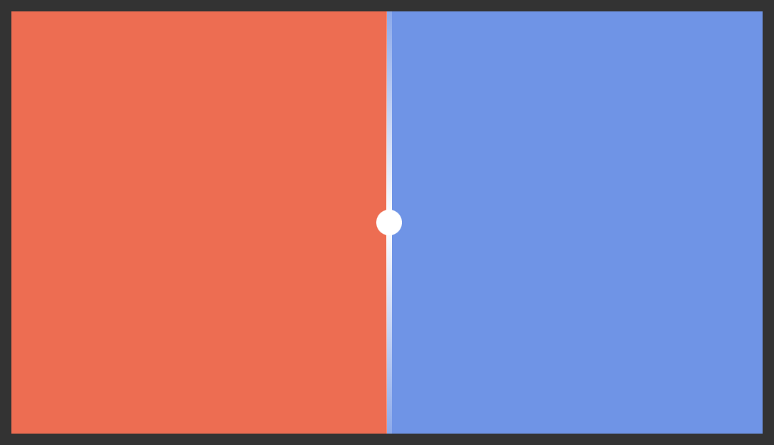
These props allows you to add visual indicators such as a scrubbing bar to the slider handle itself. In the example below, we add a thin white bar above and below the handle as shown in the screenshot below.
```tsx
import { ComparisonSlider } from 'react-comparison-slider';
export const CustomHandleDecorations = () => {
return (
}
itemTwo={
}
aspectRatio={16 / 9}
handleBefore={
}
handleAfter={
}
handle={({ isFocused }) => {
return (
);
}}
/>
);
};
```

### `handle`
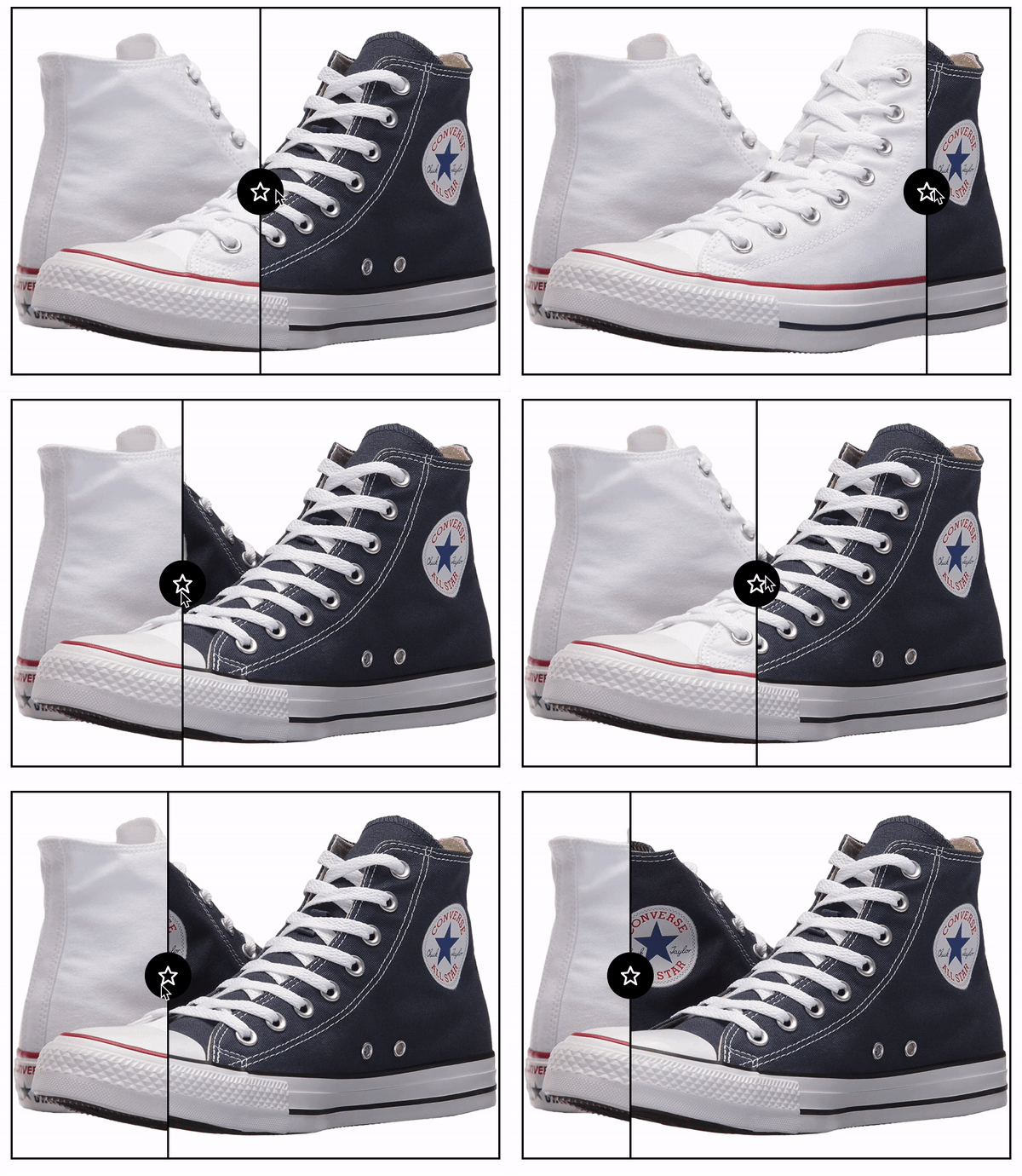
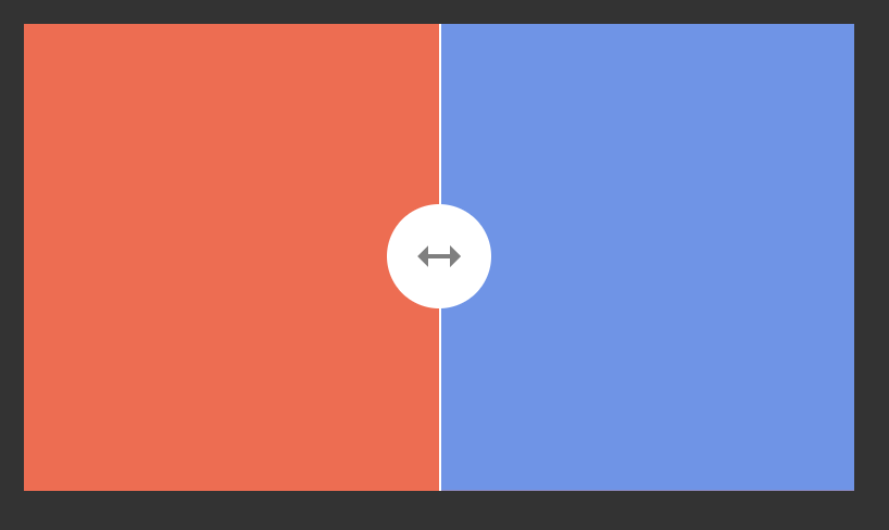
Of course, you can fully style the handle itself. You can make it bigger, add an icon, add fancy shadows...
```tsx
import { ComparisonSlider } from 'react-comparison-slider';
export const CustomHandle = () => {
return (
}
itemTwo={
}
aspectRatio={16 / 9}
handle={({ isFocused }) => {
return (
);
}}
/>
);
};
```

## The API
Below is a high-level interface definition for the component. Note that because this component can be used in both a controlled and uncontrolled fashion, the first three props – `value`, `defaultValue`, and `onChange` are actually totally dynamic. That is to say, if you provide a `defaultValue` you won't be asked for `value` or `onChange`. In fact, you'll get a compilation error if you try to use them. Conversely, if you provide `value` and `onChange`, you won't be asked for `defaultValue` and will error out accordingly if you provide it.
```ts
value?: number;
onValueChange?: (value: number) => void;
defaultValue?: number;
// The "first" item in the viewport.
itemOne:
| React.ReactNode
| (({ value }: { value: number }) => React.ReactNode);
// The "second" item in the viewport.
itemTwo:
| React.ReactNode
| (({ value }: { value: number }) => React.ReactNode);
// The...aspect ratio.
aspectRatio: number | string;
// Decoration that appears above (or to the left of, depending on orientation) the handle.
handleBefore?: React.ReactNode;
// Decoration that appears below (or to the bottom of, depending on orientation) the handle.
handleAfter?: React.ReactNode;
// Handle component
handle?: (props: ComparisonSliderHandleProps) => React.ReactNode;
// Whether the slider is vertical or horizontal 😋
orientation?: 'vertical' | 'horizontal';
// Whether only the handle itself should be interactive
onlyHandleDraggable?: boolean;
```