https://github.com/maxmarcon/live_select
Dynamic (multi)selection field for LiveView
https://github.com/maxmarcon/live_select
component daisyui dropdown-menus elixir form-input liveview multiselect tailwindcss web-forms
Last synced: 4 months ago
JSON representation
Dynamic (multi)selection field for LiveView
- Host: GitHub
- URL: https://github.com/maxmarcon/live_select
- Owner: maxmarcon
- License: apache-2.0
- Created: 2022-06-18T21:58:48.000Z (about 4 years ago)
- Default Branch: main
- Last Pushed: 2025-11-28T11:49:05.000Z (7 months ago)
- Last Synced: 2025-11-30T18:10:41.465Z (7 months ago)
- Topics: component, daisyui, dropdown-menus, elixir, form-input, liveview, multiselect, tailwindcss, web-forms
- Language: Elixir
- Homepage: https://hex.pm/packages/live_select
- Size: 8.31 MB
- Stars: 243
- Watchers: 4
- Forks: 58
- Open Issues: 18
-
Metadata Files:
- Readme: README.md
- Changelog: CHANGELOG.md
- License: LICENSE
Awesome Lists containing this project
README
# LiveSelect
[](https://hex.pm/packages/live_select)
[](https://hexdocs.pm/live_select)
[](https://github.com/maxmarcon/live_select/actions/workflows/elixir.yml)
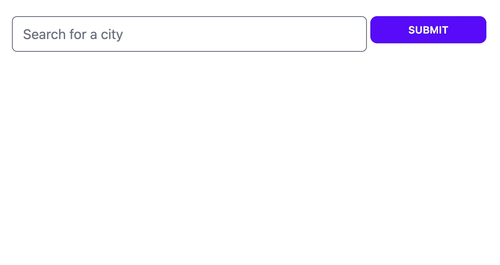
Dynamic (multi)selection field for LiveView.
`LiveSelect` is a LiveView component that implements a dynamic selection field with a dropdown. The content of the
dropdown is filled by your LiveView as the user types. This allows you to easily create an
interface for search-like functionalities with type-ahead. `LiveSelect`s features include:
* Single as well as multiple selection
* Options to configure the behaviour, such as minimum number of characters that trigger an update or the maximum number of selectable options
* Default styles for daisyUI and tailwindcss, which are fully customizable and can be completely overridden if needed
* Ability to customize the rendered HTML for dropdown entries and tags using slots.
### [Try it in the showcase app](https://live-select.fly.dev/) 🔬
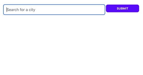
### Single selection (single mode)
### Multiple selection (tags mode)
### Multiple selection (quick_tags mode)

## Usage Example 🧭
_Template:_
```elixir
<.form for={@form} phx-change="change">
<.live_select field={@form[:city_search]} />
```
**NOTE:** If your form is implemented in a LiveComponent, add `phx-target={@myself}`, like this:
```elixir
<.live_select field={@form[:city_search]} phx-target={@myself} />
```
_In the LiveView or LiveComponent that's the target of your form events:_
```elixir
@impl true
def handle_event("live_select_change", %{"text" => text, "id" => live_select_id}, socket) do
cities = City.search(text)
# cities = [
# {"New York City", [-74.00597,40.71427]},
# {"New Kingston", [-76.78319,18.00747]},
# ...
# ]
send_update(LiveSelect.Component, id: live_select_id, options: cities)
{:noreply, socket}
end
@impl true
def handle_event(
"change",
%{"my_form" => %{"city_search_text_input" => city_name, "city_search" => city_coords}},
socket
) do
IO.puts("You selected city #{city_name} located at: #{city_coords}")
{:noreply, socket}
end
```
Refer to the [module documentation](https://hexdocs.pm/live_select/LiveSelect.html) for the details, and
check out the [cheatsheet](https://hexdocs.pm/live_select/cheatsheet.html) for some useful tips.
## Installation 📦
To install, add this to your dependencies:
```elixir
[
{:live_select, "~> 1.0"}
]
```
## Javascript hooks 🪝
`LiveSelect` relies on Javascript hooks to work. You need to add `LiveSelect`'s hooks to your live socket.
`LiveSelect` distributes its Javascript code (a single file) in the same way as LiveView, by including an
npm package as part of its hex package.
To include `LiveSelect`'s hooks, add this to your `app.js` file:
```javascript
import live_select from "live_select"
// if you don't have any other hooks:
let liveSocket = new LiveSocket("/live", Socket, {params: {_csrf_token: csrfToken}, hooks: live_select})
// if you have other hooks:
const hooks = {
MyHook: {
// ...
},
...live_select
}
let liveSocket = new LiveSocket("/live", Socket, {params: {_csrf_token: csrfToken}, hooks})
```
### If you're using Webpack or another NPM-based builder
If you're using an npm-based builder such as Webpack, you will need to add `LiveSelect` to the list of your dependencies in your `package.json` (just as you did with LiveView):
```js
{
"dependencies": {
"phoenix": "file:../deps/phoenix",
"phoenix_html": "file:../deps/phoenix_html",
"phoenix_live_view": "file:../deps/phoenix_live_view",
"live_select": "file:../deps/live_select" // <-- add this line, and add an extra "../" if you're in an umbrella app
}
}
```
And then run `npm install` from your `assets` folder. You will also need to run `npm install --force live_select`
whenever you update the `LiveSelect` hex package in order to get the latest JS code.
## Styling 🎨
`LiveSelect` supports 3 styling modes:
* `tailwind`: uses standard tailwind utility classes (the default)
* `daisyui`: uses [daisyUI](https://daisyui.com/) classes.
* `none`: no styling at all.
The choice of style is controlled by the `style` option
in [live_select/1](https://hexdocs.pm/live_select/LiveSelect.html#live_select/1).
`tailwind` and `daisyui` styles come with sensible defaults which can be selectively extended or completely overridden.
Refer to the [Styling section](https://hexdocs.pm/live_select/styling.html) for further details.
> ⚠️ **Attention**
>
> Please note the different paths for a standalone or umbrella app.
### tailwind v3
If you're using `tailwind` or `daisyui` styles, you need to add one of the following lines to the `content` section in
your `tailwind.config.js`:
```javascript
module.exports = {
content: [
//...
'../deps/live_select/lib/live_select/component.*ex', // <-- for a standalone app
'../../../deps/live_select/lib/live_select/component.*ex' // <-- for an umbrella app
]
//..
}
```
### tailwind v4
If you are using `tailwind v4+` and are not using a `tailwind.config.js` file you instead need to add the relevant `@source` directive to your `app.css` file:
```css
@source "../../deps/live_select/lib/live_select/component.*ex" /* for a standalone app */
@source "../../../../deps/live_select/lib/live_select/component.*ex" /* for an umbrella app */
```
## Showcase app 🎪
The repository includes a showcase app that you can use to experiment with the different options and parameters
for `LiveSelect`.
The showcase app is available [here](https://live-select.fly.dev/).
To start the showcase app locally, simply run:
```
mix setup
PORT=4001 mix phx.server
```
from within the cloned repository. The app will be available at http://localhost:4001. The showcase app allows you to
quickly experiment with options and styles, providing an easy way to fine tune your `LiveSelect` component. The app also
shows the messages and events that your `LiveView` receives. For each event or message, the app shows the function head
of the callback that your LiveView needs to implement in order to handle the event.
## Contribute 🤝
Contributions are very welcome! However, if you want do add a new feature please discuss it first by creating an issue so we can all agree that it's needed.
Also, it's important to add a test that covers it. If you don't know how to write the test or need guidance,
I'm happy to help.
Use `mix test` to run the entire test suite, which is subdivided into 3 main files:
* `test/live_select/component_test.exs` - everything that can be tested by rendering the component statically
* `test/live_select_test.exs` - tests for `single` mode that require a running LiveView
* `test/live_select_tags_test.exs` - tests for `tags` mode that require a running LiveView
* `test/live_select_quick_tags_test.exs` - tests for `quick_tags` mode that require a running LiveView
Tests that require a LiveView use the showcase app as the parent LiveView.
## Roadmap 🛣️
- [X] Add `package.json` to enable `import live_select from "live_select"`
- [X] Make sure component classes are included by tailwind
- [X] Enable custom styling
- [X] Rename LiveSelect.render to live_select
- [X] Customizable placeholder
- [X] Enable configuration of styles in the showcase app
- [X] Add support for vanilla tailwind styles
- [X] Enable multiple selection mode
- [X] Expose as function component (and drop LV 0.17 support)
- [X] Add cheatsheet
- [X] Additional multiple selection mode
- [ ] Add section to document testing strategies