https://github.com/maxsans/react-diamond
A React component library for creating diamond-shaped containers
https://github.com/maxsans/react-diamond
react react-diamond scss
Last synced: about 1 month ago
JSON representation
A React component library for creating diamond-shaped containers
- Host: GitHub
- URL: https://github.com/maxsans/react-diamond
- Owner: maxsans
- License: mit
- Created: 2024-10-07T09:47:02.000Z (over 1 year ago)
- Default Branch: master
- Last Pushed: 2024-12-03T08:03:40.000Z (over 1 year ago)
- Last Synced: 2025-04-03T20:33:41.920Z (about 1 year ago)
- Topics: react, react-diamond, scss
- Language: SCSS
- Homepage:
- Size: 10.7 KB
- Stars: 0
- Watchers: 1
- Forks: 0
- Open Issues: 0
-
Metadata Files:
- Readme: README.md
- License: LICENSE
Awesome Lists containing this project
README
#  `react-diamond`
[](https://badge.fury.io/js/react-diamond)
A React component library for creating diamond-shaped containers with lazy-loaded images and customizable styles.
[Demo](https://react-diamond.sinead.fr/)


### Content
- Installation
- Usage
- Customization
- Demo
- Notes
### Installation
```bash
yarn add react-diamond@lastest
```
### Usage
#### DiamondContainer
| Property | Type | Description | Default |
| -------- | -------------------- | --------------------------------------------------- | ------- |
| `items` | `Array` | Array of items to display in the diamond containers | `[]` |
#### DiamondItem
| Property | Type | Description |
| --------- | ---------- | ----------------------------------------- |
| `title` | `string` | Title of the item |
| `onClick` | `function` | Function to call when the item is clicked |
| `image` | `string` | URL of the image to display |
### Customization
You can customize the appearance of the diamond containers using CSS variables:
| Variable | Description |
| -------------------------- | ---------------------------------- |
| `--borderColorDiamond` | Color of the diamond border |
| `--textColorDiamond` | Color of the text |
| `--backgroundColorDiamond` | Background color behind the images |
### Example
```tsx
import React from "react";
import Diamond from "react-diamond-container";
import img1 from "path/to/img1.png";
import img2 from "path/to/img2.png";
const items = [
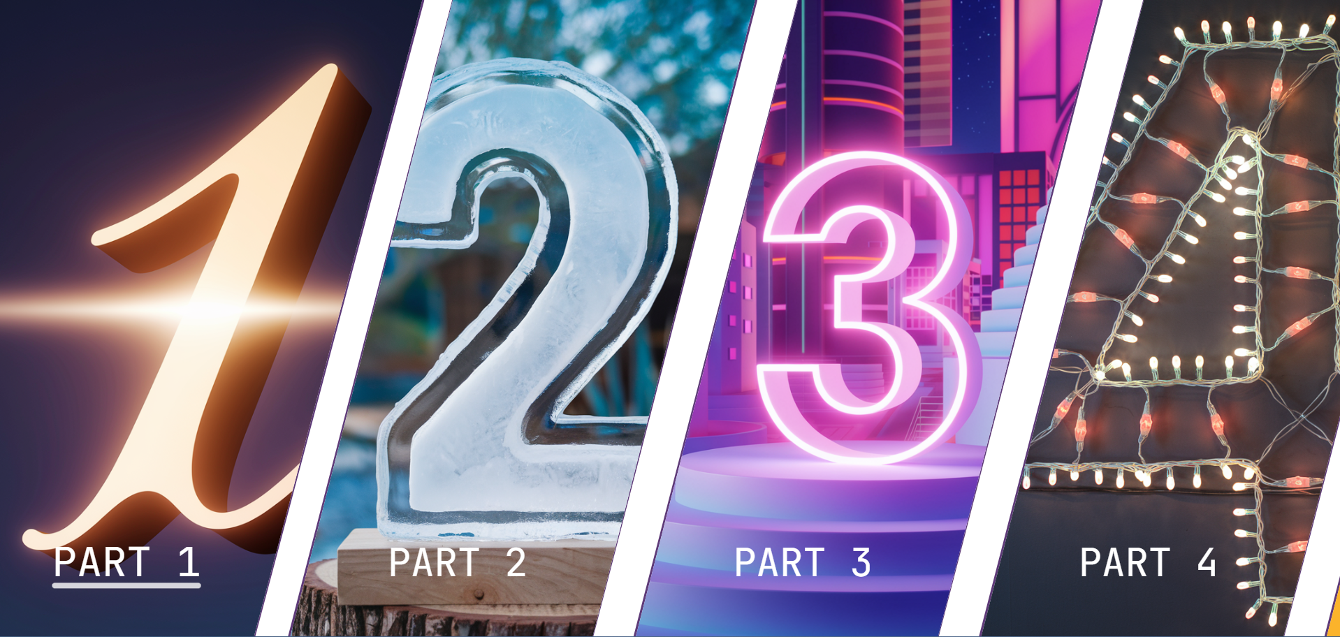
{
title: "Part 1",
onClick() {
alert("Part 1 clicked");
},
image: img1,
},
{
title: "Part 2",
onClick() {
alert("Part 2 clicked");
},
image: img2,
},
// Add more items as needed
];
const App = () => (
);
export default App;
```
Tip: For a better experience, if you want the component in full screen, deactivate the scroll bar.
```scss
body {
overflow: auto;
}
/* Firefox */
@supports (-moz-appearance: none) {
body {
scrollbar-width: none;
}
}
/* WebKit (Chrome, Safari) */
@media screen and (-webkit-min-device-pixel-ratio: 0) {
body::-webkit-scrollbar {
width: 0;
}
}
```
Tip: Add this link to your `index.html` for the font family.
```html
```
### Demo
Check out the [demo](https://react-diamond.sinead.fr/) to see the component in action. You can fount the code source at [template](https://github.com/maxsans/template-react-diamond)
### Notes
- The library is available only for React.
- The layout changes from horizontal to vertical on mobile devices.
- Single item layouts are also supported.
- Images are lazy-loaded for performance optimization.
- Continuous improvements and updates are being made.