https://github.com/mdbootstrap/bootstrap-max-width
Responsive Max Width built with Bootstrap 5. Learn how to make a container or an element max width within its parent.
https://github.com/mdbootstrap/bootstrap-max-width
bootstrap bootstrap5 bootstrap5-template respon responsive responsive-design size sizing
Last synced: 6 months ago
JSON representation
Responsive Max Width built with Bootstrap 5. Learn how to make a container or an element max width within its parent.
- Host: GitHub
- URL: https://github.com/mdbootstrap/bootstrap-max-width
- Owner: mdbootstrap
- License: mit
- Created: 2022-06-13T13:48:01.000Z (about 4 years ago)
- Default Branch: main
- Last Pushed: 2022-06-15T10:17:38.000Z (about 4 years ago)
- Last Synced: 2025-11-30T19:02:40.545Z (8 months ago)
- Topics: bootstrap, bootstrap5, bootstrap5-template, respon, responsive, responsive-design, size, sizing
- Language: SCSS
- Homepage: https://mdbootstrap.com/docs/standard/extended/max-width/
- Size: 935 KB
- Stars: 0
- Watchers: 3
- Forks: 1
- Open Issues: 0
-
Metadata Files:
- Readme: README.md
- License: LICENSE
Awesome Lists containing this project
README
Responsive Max Width built with Bootstrap 5. Learn how to make a container or an element max width within its parent.
Check out [Bootstrap Max Width Documentation](https://mdbootstrap.com/docs/standard/extended/max-width/) for detailed instructions & even more examples.
## Examples
Width utilities are generated from the utility API in `_utilities.scss`. Predefined classes support `25%`, `50%`, `75%`, `100%`, and `auto` by default. In order to make an element take the entire width of its parent add a `.w-100` class to it.
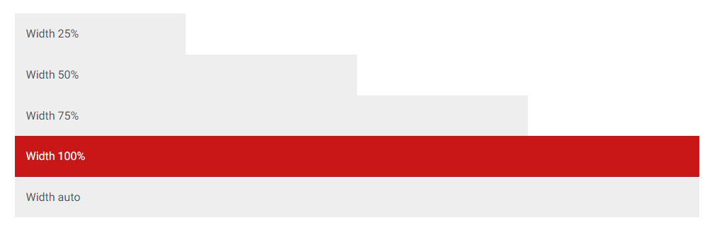
```html
Width 25%
Width 50%
Width 75%
Width 100%
Width auto
```
You can also use `max-width: 100%;` utilities as needed.
```html

```
## Max width relative to viewport
You can also use utilities to set the width and height relative to the viewport with the `vw` (viewport width) values.
```html
Min-width 100vw
Width 100vw
```
## How to use?
1. Download MDB 5 - free UI KIT
2. Choose your favourite customized component and click on the image
3. Copy & paste the code into your MDB project
[▶️ Subscribe to YouTube channel for web development tutorials & resources](https://www.youtube.com/MDBootstrap?sub_confirmation=1)
___
## More extended Bootstrap documentation
- Bootstrap Address Form
- Bootstrap Avatar
- Bootstrap Back To Top Button
- Bootstrap Carousel Slider with Thumbnails
- Bootstrap Chat
- Bootstrap Code Blocks
- Bootstrap Comments
- Bootstrap Comparison Table
- Bootstrap Credit Card Form
- Bootstrap Drawer
- Bootstrap Nested Dropdown
- Bootstrap FAQ component / section
- Bootstrap Gallery
- Bootstrap Hamburger Menu
- Bootstrap Invoice
- Bootstrap Jumbotron
- Bootstrap Login Form
- Bootstrap Maps
- Bootstrap Media Object
- Bootstrap Mega Menu
- Bootstrap Multiselect
- Bootstrap News Feed
- Bootstrap Offcanvas
- Bootstrap Order Details
- Bootstrap Page Transitions
- Bootstrap Payment Forms
- Bootstrap Product Cards
- Bootstrap Profiles
- Bootstrap Quotes
- Bootstrap Registration Form
- Bootstrap Expanding Search Bar
- Bootstrap Shopping Carts
- Bootstrap Side Navbar
- Bootstrap Sidebar
- Bootstrap Social Media Icons & Buttons
- Bootstrap Square Buttons
- Bootstrap Survey Form
- Bootstrap Testimonial Slider
- Bootstrap Testimonials
- Bootstrap Textarea
- Bootstrap Timeline
- Bootstrap To Do List
- Bootstrap Video Carousel / Gallery
- Bootstrap Weather
- Bootstrap Dark Mode
- Bootstrap Padding
- Bootstrap Modal Methods
- Bootstrap Modal Size
- Bootstrap Modal Backdrop
- Bootstrap Table Filter
- Bootstrap Card Deck
- Bootstrap Logo
- Bootstrap Popup
- Bootstrap Hero
- Bootstrap Select Dropdown
- Bootstrap Labels
- Bootstrap Dialog
- Bootstrap Screen Sizes
- Bootstrap Dropdown Button
- Bootstrap Widgets