https://github.com/mdbootstrap/bootstrap-screen-sizes
Responsive Screen Sizes built with Bootstrap 5. Check default pixel widths for different screen sizes supported by Bootstrap 5 responsiveness features.
https://github.com/mdbootstrap/bootstrap-screen-sizes
bootstrap bootstrap5 responsive screen size sizes
Last synced: 5 months ago
JSON representation
Responsive Screen Sizes built with Bootstrap 5. Check default pixel widths for different screen sizes supported by Bootstrap 5 responsiveness features.
- Host: GitHub
- URL: https://github.com/mdbootstrap/bootstrap-screen-sizes
- Owner: mdbootstrap
- License: mit
- Created: 2022-06-13T13:50:50.000Z (about 4 years ago)
- Default Branch: main
- Last Pushed: 2022-06-15T10:26:32.000Z (about 4 years ago)
- Last Synced: 2025-02-07T08:50:15.469Z (over 1 year ago)
- Topics: bootstrap, bootstrap5, responsive, screen, size, sizes
- Language: SCSS
- Homepage: https://mdbootstrap.com/docs/standard/extended/screen-sizes/
- Size: 937 KB
- Stars: 0
- Watchers: 5
- Forks: 1
- Open Issues: 0
-
Metadata Files:
- Readme: README.md
- License: LICENSE
Awesome Lists containing this project
README
Responsive Screen Sizes built with Bootstrap 5. Check default pixel widths for different screen sizes supported by Bootstrap 5 responsiveness features.
Check out [Bootstrap Screen Sizes Documentation](https://mdbootstrap.com/docs/standard/extended/screen-sizes/) for detailed instructions & even more examples.
Bootstrap supports six default viewport widths. These presets can be changes or expanded upon, if you’re using our source Sass files.
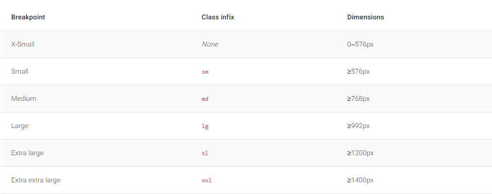
Each width is a multiple of 12. They are adjusted to the most common device viewport sizes.
Make sure to check out the main [Breakpoints](https://mdbootstrap.com/docs/standard/layout/breakpoints/) documentation for more customization options & media queries.
```scss
$grid-breakpoints: ( xs: 0, sm: 576px, md: 768px, lg: 992px, xl: 1200px, xxl: 1400px );
```
## How to use?
1. Download MDB 5 - free UI KIT
2. Choose your favourite customized component and click on the image
3. Copy & paste the code into your MDB project
[▶️ Subscribe to YouTube channel for web development tutorials & resources](https://www.youtube.com/MDBootstrap?sub_confirmation=1)
___
## More extended Bootstrap documentation
- Bootstrap Address Form
- Bootstrap Avatar
- Bootstrap Back To Top Button
- Bootstrap Carousel Slider with Thumbnails
- Bootstrap Chat
- Bootstrap Code Blocks
- Bootstrap Comments
- Bootstrap Comparison Table
- Bootstrap Credit Card Form
- Bootstrap Drawer
- Bootstrap Nested Dropdown
- Bootstrap FAQ component / section
- Bootstrap Gallery
- Bootstrap Hamburger Menu
- Bootstrap Invoice
- Bootstrap Jumbotron
- Bootstrap Login Form
- Bootstrap Maps
- Bootstrap Media Object
- Bootstrap Mega Menu
- Bootstrap Multiselect
- Bootstrap News Feed
- Bootstrap Offcanvas
- Bootstrap Order Details
- Bootstrap Page Transitions
- Bootstrap Payment Forms
- Bootstrap Product Cards
- Bootstrap Profiles
- Bootstrap Quotes
- Bootstrap Registration Form
- Bootstrap Expanding Search Bar
- Bootstrap Shopping Carts
- Bootstrap Side Navbar
- Bootstrap Sidebar
- Bootstrap Social Media Icons & Buttons
- Bootstrap Square Buttons
- Bootstrap Survey Form
- Bootstrap Testimonial Slider
- Bootstrap Testimonials
- Bootstrap Textarea
- Bootstrap Timeline
- Bootstrap To Do List
- Bootstrap Video Carousel / Gallery
- Bootstrap Weather
- Bootstrap Dark Mode
- Bootstrap Padding
- Bootstrap Modal Methods
- Bootstrap Modal Size
- Bootstrap Modal Backdrop
- Bootstrap Table Filter
- Bootstrap Card Deck
- Bootstrap Logo
- Bootstrap Popup
- Bootstrap Max Width
- Bootstrap Select Dropdown
- Bootstrap Hero
- Bootstrap Labels
- Bootstrap Dialog
- Bootstrap Dropdown Button
- Bootstrap Widgets