https://github.com/mdocui/mdocui
Generative UI for LLMs using Markdoc {% %} tag syntax
https://github.com/mdocui/mdocui
ai generative-ui llm markdoc react streaming ui-components
Last synced: 3 months ago
JSON representation
Generative UI for LLMs using Markdoc {% %} tag syntax
- Host: GitHub
- URL: https://github.com/mdocui/mdocui
- Owner: mdocui
- License: mit
- Created: 2026-03-27T10:53:14.000Z (3 months ago)
- Default Branch: main
- Last Pushed: 2026-04-01T13:31:03.000Z (3 months ago)
- Last Synced: 2026-04-03T04:04:30.591Z (3 months ago)
- Topics: ai, generative-ui, llm, markdoc, react, streaming, ui-components
- Language: TypeScript
- Homepage: https://mdocui.github.io
- Size: 249 KB
- Stars: 3
- Watchers: 0
- Forks: 0
- Open Issues: 0
-
Metadata Files:
- Readme: README.md
- License: LICENSE
Awesome Lists containing this project
README


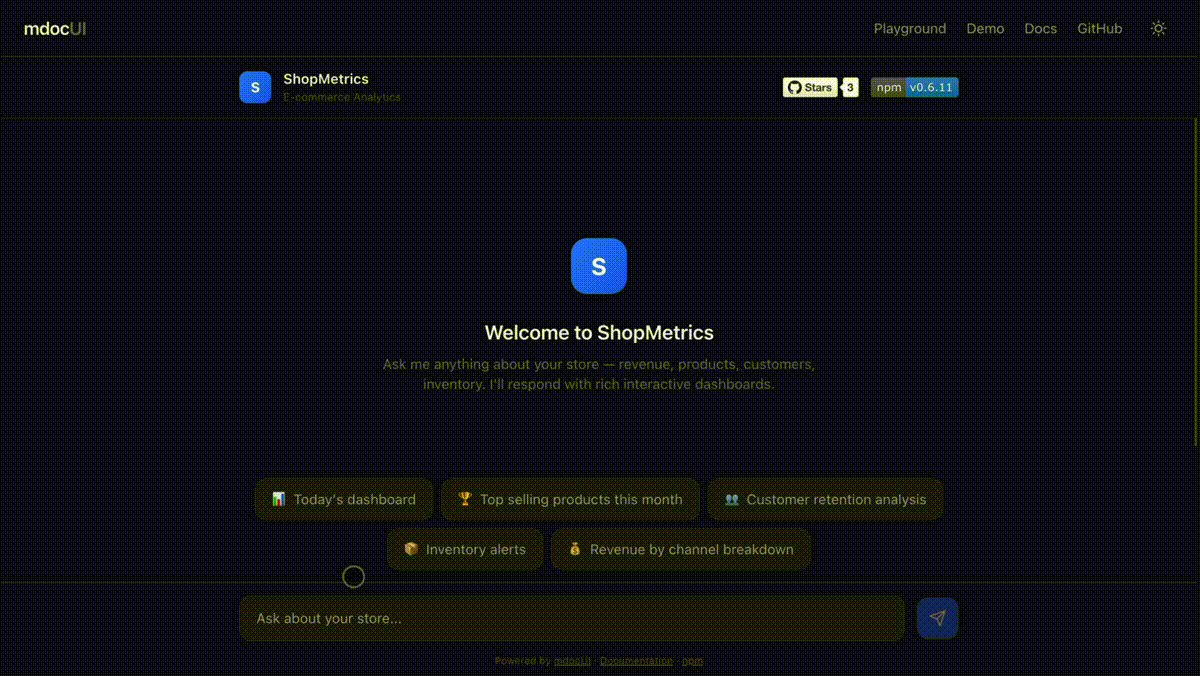
  Documentation · Live Demo · npm


> **Alpha** -- mdocUI is under active development. The API may change between minor versions. We follow [semver](https://semver.org/) and will reach 1.0 once the API stabilizes.

Generative UI library for LLMs using Markdoc `{% %}` tag syntax inline with markdown prose.

LLMs write natural markdown **and** drop interactive UI components in the same stream — charts, buttons, forms, tables, cards, and more. No custom DSL to learn, no JSON blocks, no JSX confusion.

**Key features:** built-in prose rendering, component merging, CLI scaffolder, error boundaries, streaming animations, shimmer placeholders, prop validation, context data passthrough, and configurable prompt verbosity.


```

The Q4 results show strong growth across all segments.

{% chart type="bar" labels=["Jan","Feb","Mar"] values=[120,150,180] /%}

Revenue grew **12%** quarter-over-quarter.

{% callout type="info" title="Action Required" %}

Review the pipeline before end of quarter.

{% /callout %}

{% button action="continue" label="Show by region" /%}

{% button action="continue" label="Export as PDF" /%}

```

## Syntax: Markdown + Markdoc Tags

mdocUI combines two syntaxes in a single stream:

- **[Markdown](https://commonmark.org/)** -- the universal prose format created by John Gruber (2004), standardized by [CommonMark](https://github.com/commonmark/commonmark-spec). Handles headings, bold, italic, lists, links, code blocks -- everything an LLM already knows how to write.

- **[Markdoc](https://github.com/markdoc/markdoc) `{% %}` tags** -- the tag syntax from Stripe's Markdoc framework (2022, MIT). Markdoc extends Markdown with `{% %}` custom tags for structured content.

mdocUI borrows **only the `{% %}` tag syntax** from Markdoc. We do not use Markdoc's parser, runtime, compiler, schema system, or config layer. We built our own streaming parser from scratch, purpose-built for token-by-token LLM output.

### Tag forms

Self-closing (no body):

```

{% tagname attr="value" /%}

```

With body content:

```

{% tagname attr="value" %}

Body content here -- can include markdown or nested tags.

{% /tagname %}

```

### Why `{% %}` works for streaming

The character sequence `{%` never appears in normal prose, standard markdown, or fenced code blocks. This makes it a reliable delimiter that a character-by-character streaming parser can detect without ambiguity -- no lookahead, no backtracking, no fragile heuristics.

The LLM writes both markdown **and** component tags in the same response. The parser separates them into prose nodes and component nodes as tokens arrive.

## Why mdocUI?

| Approach | Prose? | Components? | Streaming? | Token efficient? |

|----------|--------|-------------|------------|------------------|

| Plain markdown | Yes | No | Yes | Yes |

| OpenUI Lang | No | Yes | Yes | Yes |

| JSON blocks in markdown | Yes | Yes | Fragile | No |

| JSX in markdown | Yes | Yes | Fragile | No |

| **mdocUI** | **Yes** | **Yes** | **Yes** | **Yes** |

Markdoc's `{% %}` delimiters are unambiguous — they never appear in normal prose or code, making streaming parsing reliable.

## Packages

| Package | Description | Status |

|---------|-------------|--------|

| [`@mdocui/core`](packages/core) | Streaming parser, tokenizer, component registry, prompt generator | Alpha |

| [`@mdocui/react`](packages/react) | React renderer, 24 default components, `useRenderer` hook | Alpha |

| [`@mdocui/cli`](packages/cli) | Scaffold, generate system prompts, preview | Alpha |

## Quick Start

```bash

pnpm add @mdocui/core @mdocui/react

```

### 1. Generate a system prompt

`generatePrompt()` merges two layers into one prompt: the **library layer** (tag syntax, component signatures, composition rules — auto-generated from the registry) and your **app layer** (preamble, domain rules, examples). You never write syntax docs manually.

```typescript

import { generatePrompt } from '@mdocui/core'

import { createDefaultRegistry, defaultGroups } from '@mdocui/react'

const registry = createDefaultRegistry()

const systemPrompt = generatePrompt(registry, {

  preamble: 'You are a helpful assistant.',

  groups: defaultGroups,

})

// Pass systemPrompt to your LLM

```

### 2. Render streamed output

```tsx

import { useRenderer } from '@mdocui/react'

import { Renderer, defaultComponents, createDefaultRegistry } from '@mdocui/react'

const registry = createDefaultRegistry()

function Chat() {

  const { nodes, isStreaming, push, done } = useRenderer({ registry })

  // Call push(chunk) as tokens arrive from LLM

  // Call done() when stream ends

  // useRenderer batches renders to at most one per frame (~60fps) automatically

  return (

     {

        if (event.action === 'continue') {

          sendMessage(event.label)

        }

      }}

      onError={(event) => {

        console.error(`Component ${event.componentName} failed:`, event.error)

      }}

    />

  )

}

```

### 3. Handle actions and errors

Every interactive component fires through a single `onAction` callback:

```typescript

onAction={(event) => {

  switch (event.action) {

    case 'continue':

      // Send event.label as a new user message

      break

    case 'submit:formName':

      // event.formState has all field values

      break

    case 'open_url':

      // event.params.url has the URL

      break

  }

}}

```

Catch component rendering errors with `onError`:

```typescript

onError={(event) => {

  console.error(`${event.componentName} failed to render:`, event.error)

  // event.props contains the props that caused the error

}}

```

## Custom Components

Every component receives `ComponentProps` and can be swapped:

```typescript

interface ComponentProps {

  name: string

  props: Record

  children?: React.ReactNode

  className?: string

  onAction: ActionHandler

  isStreaming: boolean

}

```

### Override specific components

```tsx

import { defaultComponents, Renderer } from '@mdocui/react'

const myComponents = {

  ...defaultComponents,

  button: MyButton,     // swap just the button

  card: MyShadcnCard,   // use your shadcn card

}

```

### Tailwind / className support

Pass per-component classes via `classNames`:

```tsx

```

### Bring your own components entirely

```tsx

const shadcnComponents = {

  button: ({ props, onAction }) => (

     onAction({ type: 'button_click', action: props.action, label: props.label, tagName: 'button' })}>

      {props.label}


  ),

  card: ({ props, children }) => (

    {props.title}{children}

  ),

}

```

## Architecture

| Layer | Role |

|-------|------|

| **Tokenizer** | Character-by-character lexer, tracks `IN_PROSE` / `IN_TAG` / `IN_STRING` states |

| **StreamingParser** | Buffers incomplete tags, merges prose, emits `ASTNode[]` |

| **ComponentRegistry** | Validates tag names and props via Zod schemas |

| **Renderer** | Maps AST nodes to React components with error boundaries and animations |

The core is framework-agnostic. `@mdocui/react` is one adapter — Vue, Svelte, and Angular adapters can follow the same pattern.

## Available Components

### Layout

`stack` `grid` `card` `divider` `accordion` `tabs` `tab`

### Interactive

`button` `button-group` `input` `textarea` `select` `checkbox` `toggle` `form`

### Data

`chart` `table` `stat` `progress`

### Content

`callout` `badge` `image` `code-block` `link`

All components render theme-neutral semantic HTML with `data-mdocui-*` attributes. They use `currentColor` and `inherit` — no hardcoded colors. They adapt to any light or dark theme automatically. Style them with CSS, Tailwind `classNames`, or swap in your own components entirely.

## Development

```bash

# Install

pnpm install

# Build all packages

pnpm build

# Run tests

pnpm test

# Lint

pnpm lint

# Run playground

pnpm playground

```

## Contributing

Contributions are welcome! See [CONTRIBUTING.md](CONTRIBUTING.md) for the full guide.

1. Fork the repo

2. Create a feature branch (`git checkout -b feature/my-change`)

3. Make your changes with tests

4. Run `pnpm test && pnpm lint`

5. Open a pull request

## For AI Agents

- [SKILL.md](SKILL.md) — implementation guide for AI coding agents

- [llms.txt](https://mdocui.github.io/llms.txt) — machine-readable project summary for LLM crawlers

**Install as a Claude Code skill:**

Project-level (current project only):

```bash

mkdir -p .claude/skills/mdocui

curl -o .claude/skills/mdocui/SKILL.md https://raw.githubusercontent.com/mdocui/mdocui/main/SKILL.md

```

Personal (available in all your projects):

```bash

mkdir -p ~/.claude/skills/mdocui

curl -o ~/.claude/skills/mdocui/SKILL.md https://raw.githubusercontent.com/mdocui/mdocui/main/SKILL.md

```

Then invoke with `/mdocui` in Claude Code.

## Roadmap

**Renderers**

- `@mdocui/vue` — Vue 3 renderer

- `@mdocui/svelte` — Svelte 5 renderer

- `@mdocui/solid` — SolidJS renderer

**Integrations**

- `@mdocui/nextjs` — App Router helpers, RSC-safe imports, route handler template

- `@mdocui/vercel-ai` — Vercel AI SDK `useChat` to `useRenderer` bridge

**Developer tools**

- `@mdocui/devtools` — browser panel for AST inspection, parse meta, streaming state

- VS Code extension — syntax highlighting and autocomplete for `{% %}` tags

**Milestone**

- v1.0.0 — stable API, frozen component props, CHANGELOG

Have an idea? [Open a suggestion issue](https://github.com/mdocui/mdocui/issues/new?labels=enhancement&title=Suggestion:+).

## License

[MIT](LICENSE)