https://github.com/messeb/msprogressslider
The MSProgressSlider extends the UISlider with a second value
https://github.com/messeb/msprogressslider
Last synced: 10 months ago
JSON representation
The MSProgressSlider extends the UISlider with a second value
- Host: GitHub
- URL: https://github.com/messeb/msprogressslider
- Owner: messeb
- License: mit
- Created: 2016-03-05T08:02:16.000Z (over 10 years ago)
- Default Branch: master
- Last Pushed: 2024-03-29T21:57:17.000Z (about 2 years ago)
- Last Synced: 2025-08-12T11:51:00.853Z (10 months ago)
- Language: Swift
- Homepage:
- Size: 85 KB
- Stars: 5
- Watchers: 2
- Forks: 0
- Open Issues: 1
-
Metadata Files:
- Readme: README.md
- License: LICENSE
Awesome Lists containing this project
README
# MSProgressSlider
[](https://travis-ci.org/messeb/MSProgressSlider)
[](http://cocoapods.org/pods/MSProgressSlider)
[](http://cocoapods.org/pods/MSProgressSlider)
[](http://cocoapods.org/pods/MSProgressSlider)
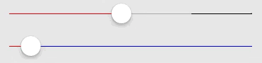
The `MSProgressSlider` extends the `UISlider` with a second value, `progressValue`. This value is displayed as a line behind the value line.
It can be used to show a loading progress.
## Usage
To run the example project, clone the repo, and run `pod install` from the Example directory first.
You can configure the progress over `progressValue`, like the `value`
```
let progressSlider = MSProgressSlider()
progressSlider.minimumValue = 0.0
progressSlider.maximumValue = 1.0
progressSlider.progressValue = 0.5
progressSlider.value = 0.25
```
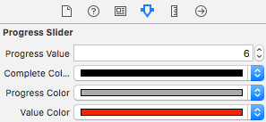
### UI
The colors can be configured with `UIAppearance` protocol properties
* completeColor
* progressColor
* valueColor
and over the Interface Builder via IBInspectable
## Installation
MSProgressSlider is available through [CocoaPods](http://cocoapods.org). To install
it, simply add the following line to your Podfile:
```ruby
pod "MSProgressSlider"
```
## Author
messeb
## License
MSProgressSlider is available under the MIT license. See the LICENSE file for more info.