https://github.com/nerwyn/material-rounded-theme
Material Design 3 Colors and Components in Home Assistant
https://github.com/nerwyn/material-rounded-theme
hacs hacs-theme homeassistant homeassistant-themes lovelace-ui material-design material-design-3 material-you material-you-3
Last synced: 3 months ago
JSON representation
Material Design 3 Colors and Components in Home Assistant
- Host: GitHub
- URL: https://github.com/nerwyn/material-rounded-theme
- Owner: Nerwyn
- License: apache-2.0
- Created: 2023-10-07T02:11:27.000Z (almost 2 years ago)
- Default Branch: main
- Last Pushed: 2025-03-28T17:57:34.000Z (4 months ago)
- Last Synced: 2025-03-28T18:47:58.724Z (4 months ago)
- Topics: hacs, hacs-theme, homeassistant, homeassistant-themes, lovelace-ui, material-design, material-design-3, material-you, material-you-3
- Language: TypeScript
- Homepage:
- Size: 27.2 MB
- Stars: 186
- Watchers: 3
- Forks: 11
- Open Issues: 3
-
Metadata Files:
- Readme: README.md
- License: LICENSE
Awesome Lists containing this project
README
[](https://github.com/nerwyn/material-rounded-theme/releases)
[](LICENSE)
[](https://github.com/hacs/default)
[](https://github.com/Nerwyn)

[](https://github.com/Nerwyn/material-rounded-theme/commits/main)
[](https://community.home-assistant.io/t/material-rounded-a-google-material-you-inspired-theme/623242)
[](https://www.buymeacoffee.com/nerwyn)
[](https://my.home-assistant.io/redirect/hacs_repository/?repository=material-rounded-theme&owner=Nerwyn&category=Plugin)
# Material You and Material Rounded - Material Design 3 Themes for Home Assistant
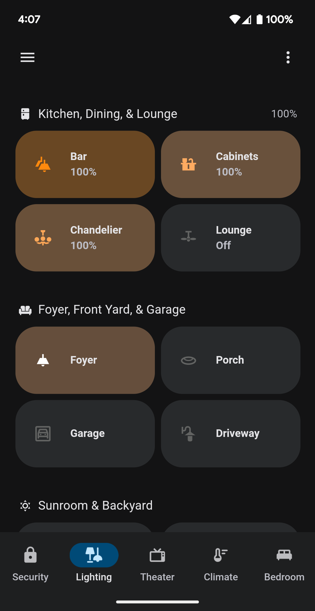
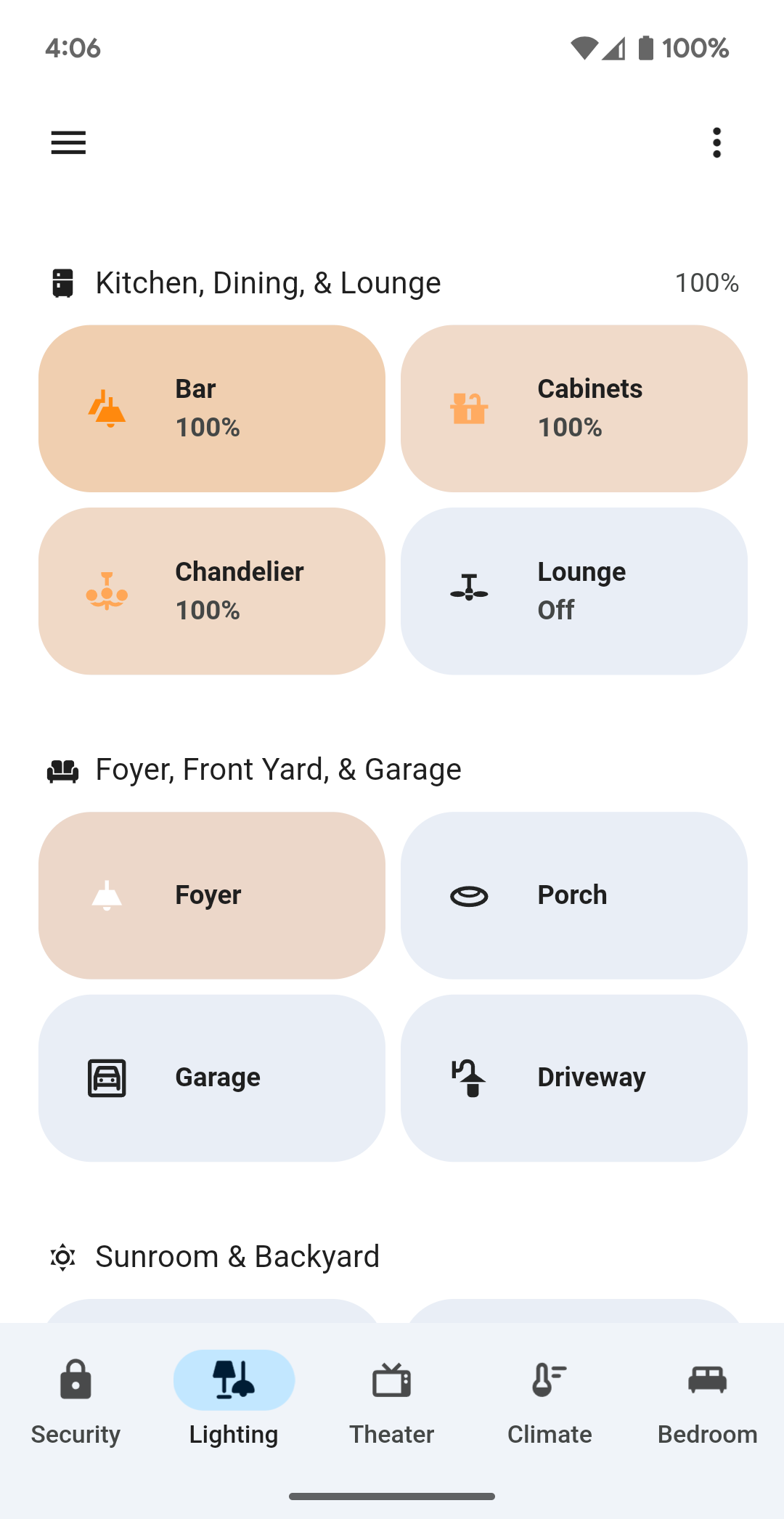
Themes for Home Assistant influenced by Google apps and Material Design 3 by Google on Android.
Both themes implement Material Design 3 redesigns of elements when possible using [card-mod](https://github.com/thomasloven/lovelace-card-mod). If you have card-mod installed and do not the component redesigns, use the "No Mod" versions of this theme. If you want partial card-mod component modifications you must modify and recompile the theme yourself as described [at the end of the README](#developing-modifying-and-building-the-theme).
Don't like the blue accents? You can choose a different Material You base color! [See below for more](#material-you-colors). Requires an additional JS resource script. Does not require card-mod.
This theme also includes "Transparent Card" versions with transparent card backgrounds. It also includes separate light and dark versions of all themes for niche use cases. These variations are combined into many different versions of the theme.
## Material You - A Fully Featured Implementation of Material Design 3
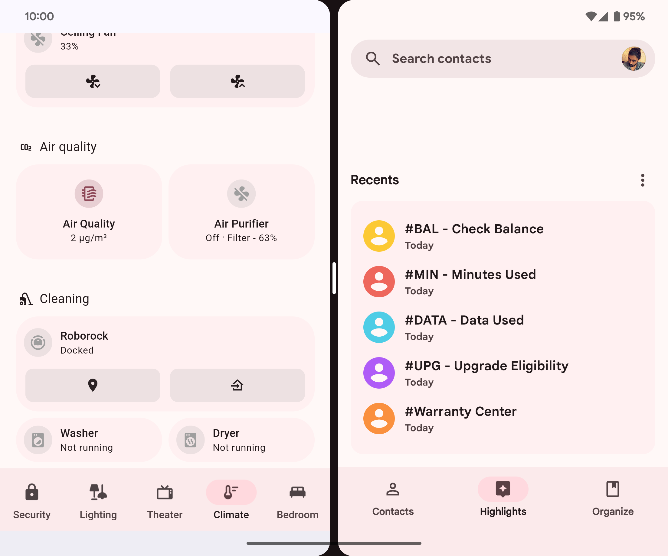
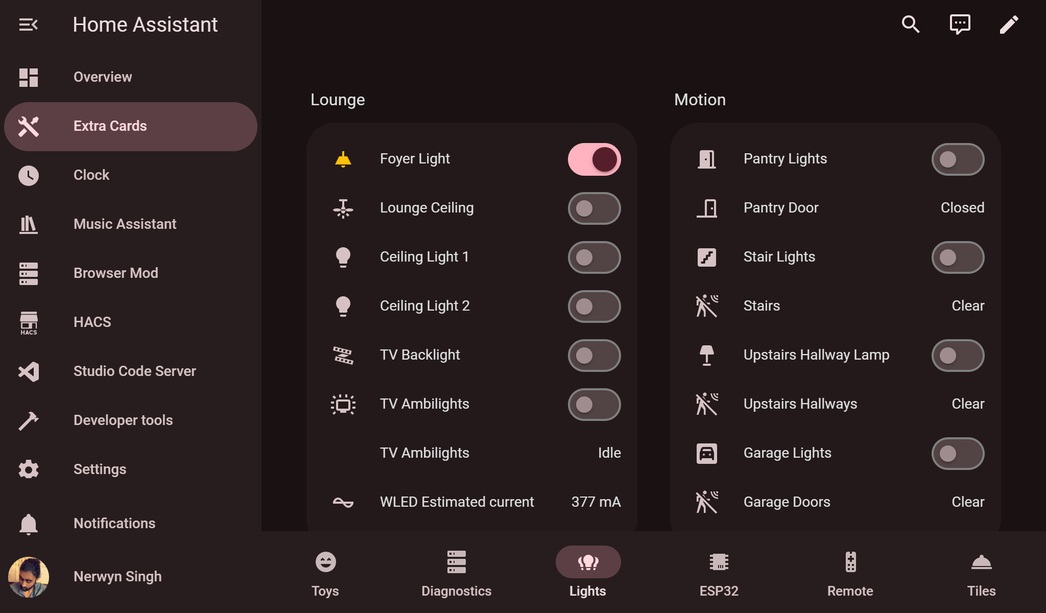
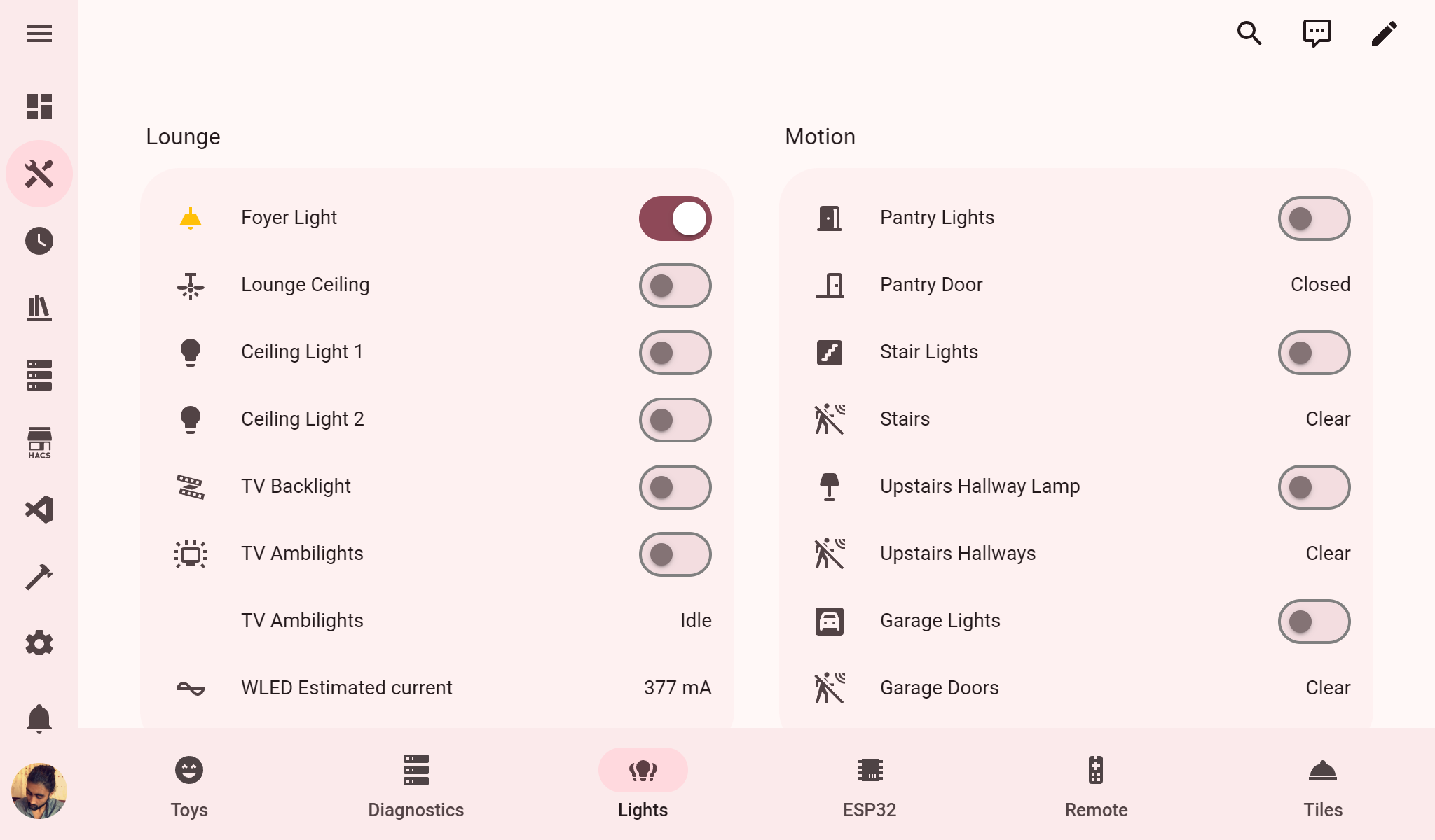
The full color version of the theme. This theme aims to match the styling of Material Design 3 (also known as Material You) Google apps on Android like Phone, Contacts, Messages, Photos, Drive, and now Google Home. Everything has been updated to use colors generated using [Material Color Utilities](https://github.com/material-foundation/material-color-utilities) following the [Material Design 3 guidelines](https://m3.material.io/). Supports custom user colors for virtually all of Home Assistant. If no user base color is provided the themes defaults to a shade of blue.
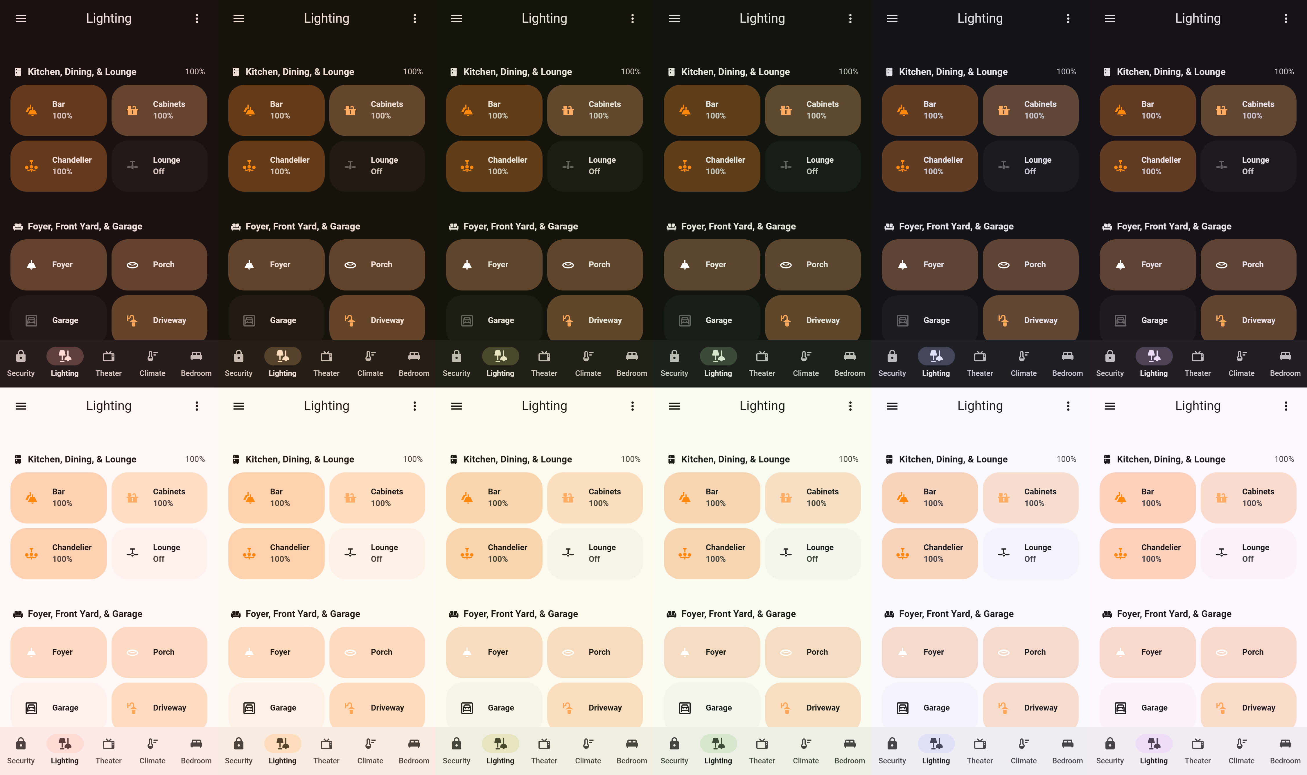
### Compared to Google Home
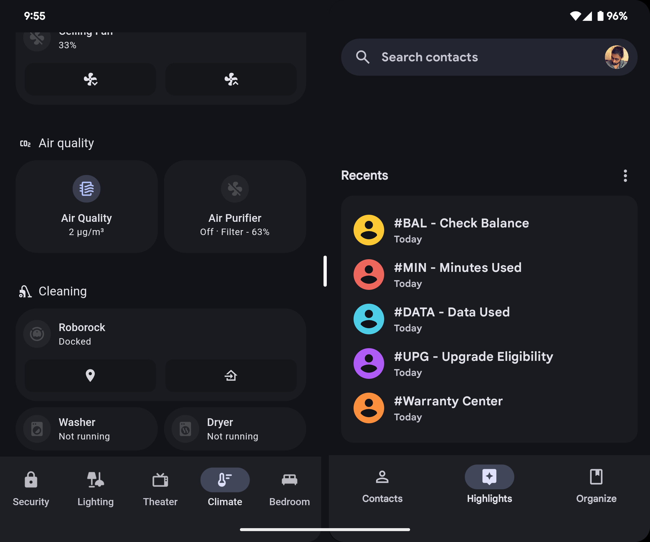
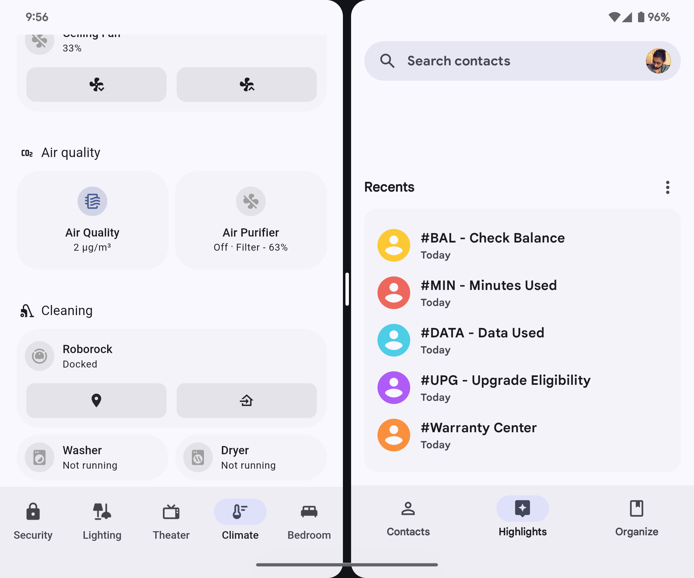
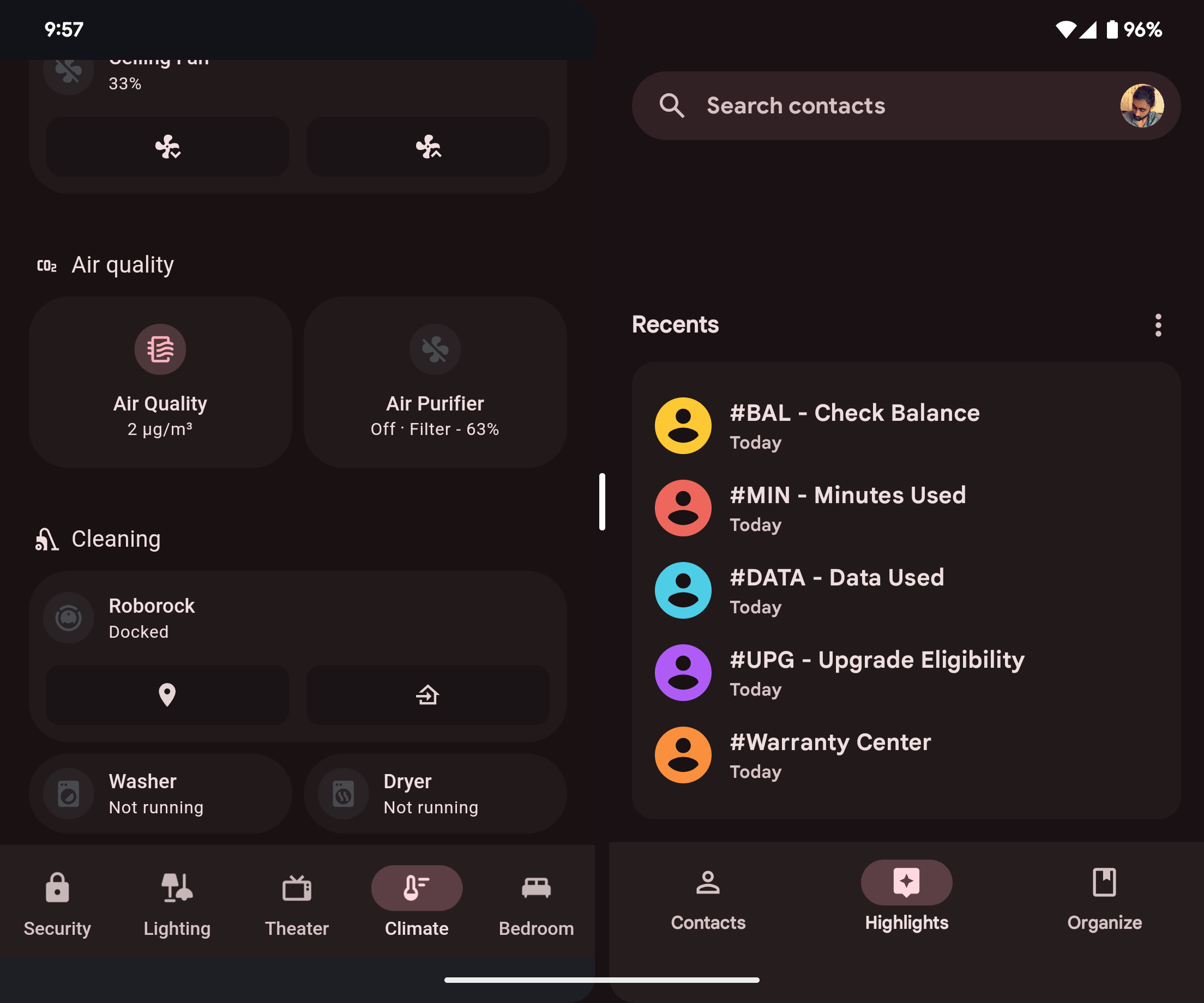
### Updated Material You Components
## Material Rounded - In the Style of the Google Home App Pre 2025 Material You Update
The original legacy version of the theme. This theme aims to match the styling of the Google Home app before Material You color theming was implemented in 2025. It uses a neutral palette with blue accent colors. It supports custom user colors, but just for primary, accent, and certain redesigned element colors.
## Installation
1. Navigate to HACS (install from [here](https://hacs.xyz/) if you do not have it yet).
2. Navigate to `Frontend`.
3. Click `+ EXPLORE & DOWNLOAD REPOSITORIES` and search for `Material Rounded Theme`.
4. Open this repository in HACS and click `DOWNLOAD`.
5. (Optional) Install [card-mod](https://github.com/thomasloven/lovelace-card-mod) from HACS to take advantage of the Material You components and colors [described below](#material-you-components-powered-by-card-mod).
6. Refresh your browser or close and open your app.
7. Navigate to your Profile, and select one of the `Material You` or `Material Rounded` theme variants.
- **If you set the theme at the view level, it will not style the view tabs. The view tabs are outside of the view.**
8. (Optional) Follow the [instructions below](#material-you-colors) for installing the companion Material You Color JavaScript module resource.
## Material You Colors
This theme supports Material You color theming! This requires an additional JavaScript module resource which can either be downloaded from this repository or used using a CDN URL. To install the script to your Home Assistant instance:
### (Optional) Download JavaScript Module Resource Locally in Home Assistant
While the module should be cached in browser after first use, you can download it locally to ensure that Material You Color theming works offline.
1. Download the module from this repository [here](https://github.com/Nerwyn/material-rounded-theme/blob/main/dist/material-rounded-theme.js).
2. Upload this module to your Home Assistant instance, preferable in the `config/www` folder.
- Your `configuration.yaml` file is found in the `config` folder. If the `www` folder does not exist create it. More information about the configuration folder can be found [here](https://www.home-assistant.io/docs/configuration/#to-find-the-configuration-directory).
**Remember!** You must update your local copy of this module manually as update are made. Release notes will call out JavaScript module changes.
### Add the Module as a Resource
1. Navigate to a dashboard and then click `🖉 Edit dashboard` > `⋮ Open dashboard menu` > `Manage resources`.
2. Click `+ ADD RESOURCE`.
3. In the `URL` field enter the path to the resource file.
- `/local/material-rounded-theme.js` if downloaded to your Home Assistant instance.
- `https://cdn.jsdelivr.net/gh/nerwyn/material-rounded-theme@main/dist/material-rounded-theme.js` if using the CDN version.
4. Select `Resource Type` `JavaScript module`.
5. Click `CREATE`.
6. Hard refresh (`CTRL` + `F5`) your browser or clear app/browser cache to ensure the new resource loads correctly.
### (Optional) Add the Module as a Frontend Module
Adding this module as a frontend module will cause it to load sooner, prevent the intitial flash of the default color, and possibly fix issues with Home Assistant resources not loading on non-dashboard pages.
1. Open your `configuration.yaml` (see above for information about the configuration folder).
2. Add the file URL to `frontend` `extra_module_url`, adding the `frontend` and `extra_module_url` keys if they do not exist, and adding to them if they do.
```yaml
frontend:
extra_module_url:
- /local/material-rounded-theme.js # Or the CDN URL listed above
```
3. Restart Home Assistant.
### Create a Template Sensor Helper
Once the JavaScript module resource has been added, create a helper template sensor named `Material Rounded Base Color` (this name is used for all themes in this project) that returns the hex code of your preferred base color. The theme colors will be calculated using [Material Color Utilities](https://github.com/material-foundation/material-color-utilities).
1. Navigate to `Settings` > `Devices & services` > ` Helpers`.
2. Click `+ CREATE HELPER`.
3. Click `Template`.
4. Click `Template a sensor`.
5. Name the sensor `Material Rounded Base Color`. The sensor entity ID should be `sensor.material_rounded_base_color`.
6. Enter your Material You base color as a hex code, e.g. `238636`, `#db4437`, `#fff`. You can also use a template to read a hex code from the state or attribute of a different entity, like `{{ states("sensor.pixel_fold_accent_color") }}`.
7. Click `SUBMIT`.
You can also choose user specific colors by creating a sensor named `Material Rounded Base Color Your Name`, with your name being your person name as it appears on the [Home Assistant people page](http://homeassistant.local:8123/config/person). The sensory entity ID should be something like `sensor.material_rounded_base_color_john_doe`. Alternatively, you can use your user ID as found on the [Home Assistant users page](http://homeassistant.local:8123/config/users) when you click on a user. In this case the sensor entity ID should be something like `sensor.material_rounded_base_color_f8866a924fc94c4d8abde860584afd05`.
#### Home Assistant Android App Color Sensor
If you are using the Home Assistant Android companion app, you can enable the accent color sensor in the companion app settings to use your phone's Material You accent color as the theme base color:
1. Navigate to `Settings` > `Companion app`.
2. Click `Manage sensors.`
3. Scroll down to the section titled `Dynamic color` and click `Accent color`.
4. Toggle `Enable sensor` on. It should now return your phone's Material You base color as a hex code.
Then create a base color template sensor as described above, and use a template to return the state of your companion app accent color sensor.
## Material You Components, Powered By Card Mod
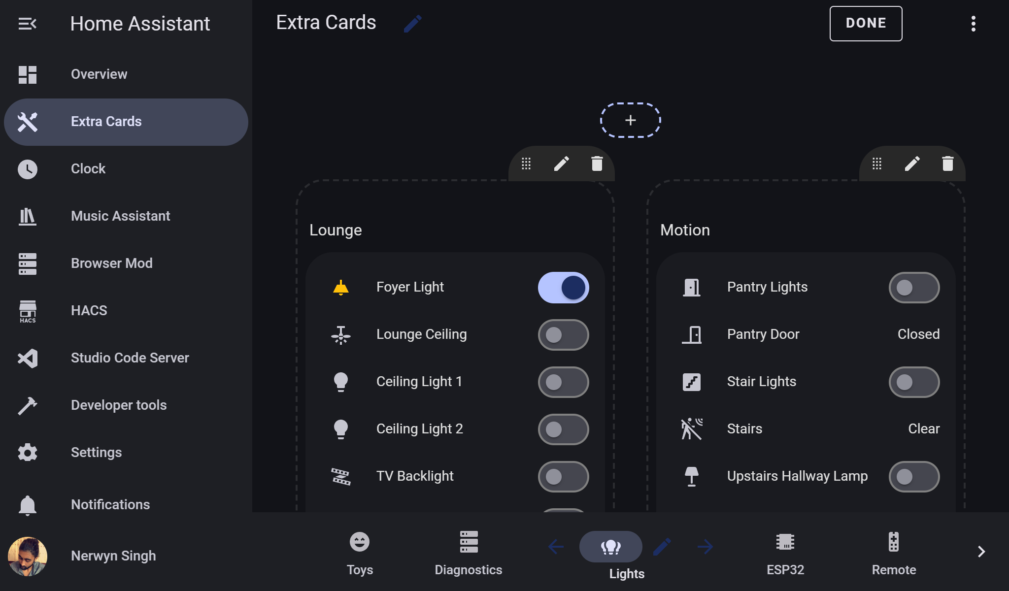
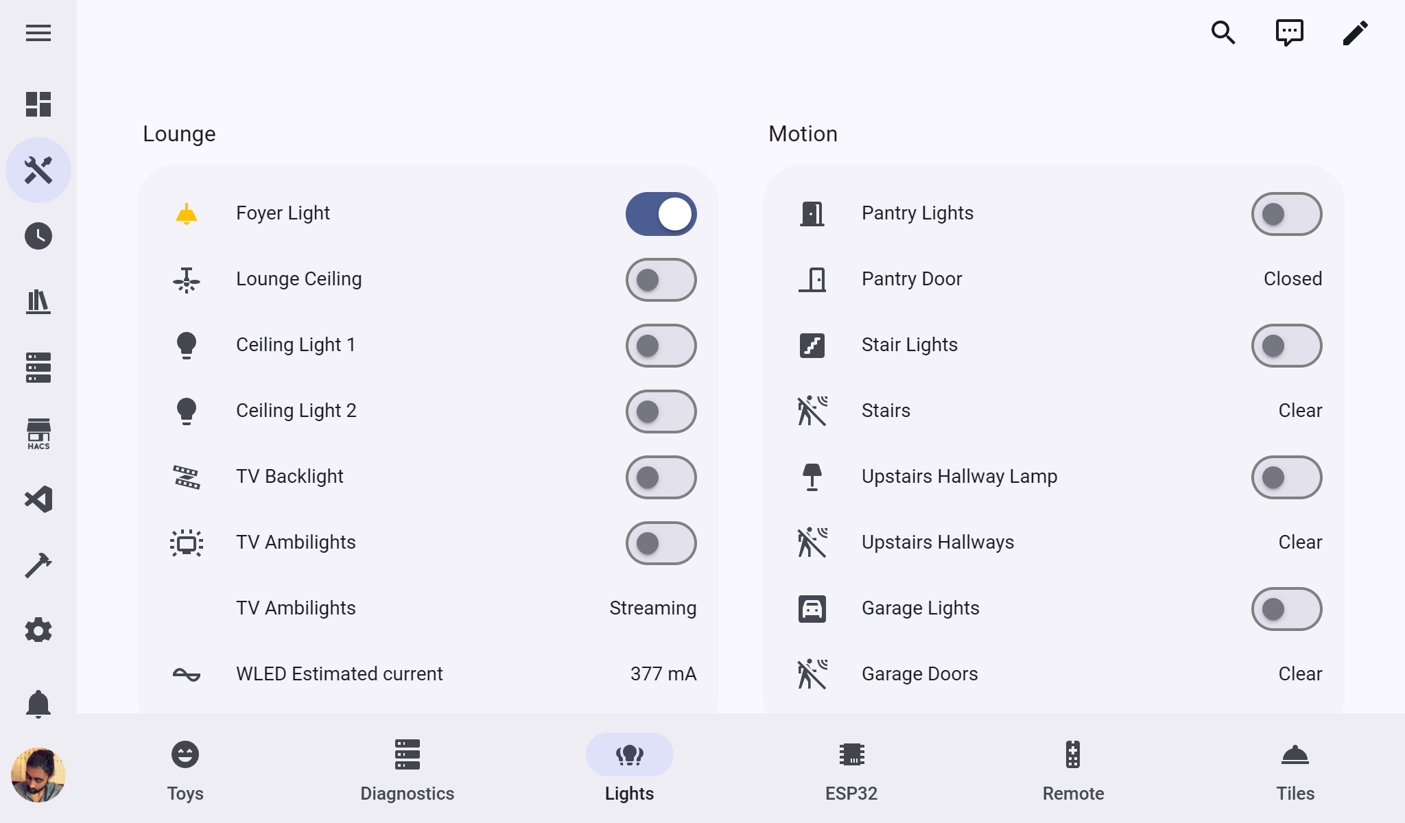
This theme is super-charged by [card-mod](https://github.com/thomasloven/lovelace-card-mod)! Using card-mod many components have received Material You design upgrades.
### Navigation
Redesigns the toolbar and sidebar buttons to follow Material You navigation component guidelines.
#### [Top App Bar](https://m3.material.io/components/top-app-bar/overview)
- Retains the sidebar toggle and dashboard menu (small width screens) or action items (large width screens) from the navigation toolbar header in a top app bar.
- Non-view buttons appear at top of screen near their original locations.
- Adds the current view title to the center.
- Height increased to 64px.
- Disappears when user is not scrolled to the top of the view.
- Use a variant color for trailing buttons and edit mode.
#### [Navigation Bar](https://m3.material.io/components/navigation-bar/overview)
- Converts the toolbar header view tabs bar into a navigation bar footer.
- Removes the default selection bar and ripple.
- Spaces the view icons evenly along the entire toolbar.
- While evenly spacing the icons should (and previously) be done by making their parent a flexbox, their parent is within a shadow-root which the view tabs are slotted into. Modifying this parent element with card-mod is possible but it is slow and inconsistent. A tab count and width calculation method is used instead, which is much faster and more consistent.
- Adds view names below the view icons.
- Increase font weight of current view tab name.
- Highlights the current view with a colored icon and background behind the icon.
- Transition animation on view icon background when selected.
- [State layers](https://m3.material.io/foundations/interaction/states/state-layers) on hover, focus, and press.
#### [Navigation Drawer](https://m3.material.io/components/navigation-drawer/overview)
Desktop sidebar expanded and mobile.
- Icon and background of current page now uses primary and accent colors.
- Transition animation on view icon background when selected.
- Badge background color removed and color set to same as icon and text.
- Increase font weight of current page name.
- [State layers](https://m3.material.io/foundations/interaction/states/state-layers) on hover, focus, and press.
#### [Navigation Rail](https://m3.material.io/components/navigation-rail/overview)
Desktop sidebar collapsed.
- Background of current page now uses primary and accent colors.
- Current view icon background is a circle to match Material You example of a navigation rail menu without labels.
- Badge colors changed to material design error colors (red).
- [State layers](https://m3.material.io/foundations/interaction/states/state-layers) on hover, focus, and press.
### [Switches](https://m3.material.io/components/switch/overview)
- Track now encompasses thumb.
- Removes the default ripple in favor of a thumb that changes size when used.
- Uses material design colors for the switch thumb, track, and outline.
- [State layers](https://m3.material.io/foundations/interaction/states/state-layers) on hover, focus, and press.
### Views
- Adds an 82px margin to the bottom of the view for the navigation bar when it is present.
- The navigation bar is not present on subviews and single view dashboards.
- This padding is also removed in kiosk mode.
- Add card button of classic lovelace views updated to better match the [extended FAB specification](https://m3.material.io/components/extended-fab/overview).
- The add card button is within a shadow-root and does not style consistently. If the button does not appear it is likely underneath the navigation bar, and should appear if you refresh the page while still in edit mode.
- Increase `--ha-sections-view-row-gap` to 18px, which is also used for the column gap on mobile displays to match Google Home app.
If you do not want these changes, use the "No Mod" versions of the theme. If you only want some of these changes, you will have to modify and recompile the theme yourself.
## Similar Projects and Credits
### Big Slider Card
Use [Big Slider Card](https://github.com/nicufarmache/lovelace-big-slider-card) to create Google Home style button/slider cards for light entities. Use the following style settings to match the screenshots:
```yaml
colorize: true
show_percentage: true
bold_text: true
height: 88
```
And for lights that do not have brightness control:
```yaml
color: sandybrown
show_percentage: false
bold_text: true
height: 88
max: 0
```
### Material Symbols
Check out [Material Symbols](https://github.com/beecho01/material-symbols) to use updated material icons as shown in the screenshots!
### Graphite Theme
This theme was initially modified from [Graphite theme](https://github.com/TilmanGriesel/graphite), as it was my favorite Home Assistant theme on HACS before I created this one. Therefore, it may contain some legacy variables from it.
### LCARS Theme
The [Star Trek LCARS theme](https://github.com/th3jesta/ha-lcars) for Home Assistant also uses a JavaScript module resource for advanced theme modification, and I used it as a basis for getting started on my Material You color theming JavaScript module.
## Developing, Modifying, and Building The Theme
Due to the multiple versions and complexity of this theme, I have split it into multiple CSS and yaml files and created a Python git pre-commit build pipeline to compile all of the files into a single Home Assistant theme file. You can either run this build pipeline by making a git commit (after setting up githooks and not to the main repo, of course) running the file `build.sh`, or running the `pre-commit.py` Python file.
Twelve versions of a theme are created per base theme (24 total) - with card mod, without card mod, transparent cards with card mod, transparent cards without card mod, and a separate light and dark version of each. The no card mod versions of theme have the `card-mod-theme` fields removed and will have no design upgrades, but do use user defined colors. The separate light and dark versions of the theme are if you need to explicitly set a device to use light or dark mode without the Home Assistant built in theme mode options.
Any files under common that end in `.yaml` are treated as `card-mod-*-yaml` fields in the themes, and files ending in `.css` contain the actual card-mod CSS. Different overall version of the `theme.yaml` file are included in separate folders, such as `material_rounded` and `material_you`. CSS files are copied into the card-mod yaml fields using jinja templates, allowing for repetitive styles that go in different shadow roots to all source from the same file.