https://github.com/nextcloud-libraries/nextcloud-dialogs
Nextcloud dialog helpers https://npmjs.org/@nextcloud/dialogs
https://github.com/nextcloud-libraries/nextcloud-dialogs
dialogs javascript-library nextcloud nextcloud-plugin
Last synced: 6 months ago
JSON representation
Nextcloud dialog helpers https://npmjs.org/@nextcloud/dialogs
- Host: GitHub
- URL: https://github.com/nextcloud-libraries/nextcloud-dialogs
- Owner: nextcloud-libraries
- License: agpl-3.0
- Created: 2019-06-18T13:53:20.000Z (about 7 years ago)
- Default Branch: main
- Last Pushed: 2026-01-12T04:51:20.000Z (7 months ago)
- Last Synced: 2026-01-13T03:35:45.389Z (7 months ago)
- Topics: dialogs, javascript-library, nextcloud, nextcloud-plugin
- Language: TypeScript
- Homepage: https://nextcloud-libraries.github.io/nextcloud-dialogs/
- Size: 18 MB
- Stars: 18
- Watchers: 2
- Forks: 5
- Open Issues: 23
-
Metadata Files:
- Readme: README.md
- Changelog: CHANGELOG.md
- License: LICENSE
- Authors: AUTHORS.md
Awesome Lists containing this project
README
# @nextcloud/dialogs
[](https://api.reuse.software/info/github.com/nextcloud-libraries/nextcloud-dialogs) [](https://www.npmjs.com/package/@nextcloud/dialogs)
Nextcloud dialog helpers
## Installation
```
npm i -S @nextcloud/dialogs
```
### Version compatibility
| `@nextcloud/dialogs` | maintained | `@nextcloud/vue` dependency | Nextcloud server version |
|----------------------|------------|-----------------------------|----------------------------|
| 7.x | ✅ | 9.x (Vue 3)¹ | Nextcloud 31 and newer |
| 6.x | ✅ | 8.x | Nextcloud 29, 30, 31, 32 |
| 5.x | ❌ | 8.x | Nextcloud 28, 29, 30 |
| 4.2+ | ❌ | 7.12² | Nextcloud 25, 26, 27, 27.1 |
| 4.1 | ❌ | *any* | *any up to Nextcloud 30* |
¹: In version 7.x the `@nextcloud/vue` dependency is moved to `dependencies` so you can also use this library
with an old version of `@nextcloud/vue` in your app dependencies if your app still uses Vue 2.
Note that this might increase the bundled app size.
If your app also already uses `@nextcloud/vue` version 9.x and Vue 3 then the bundle size will not increase.
²: Since version 4.2 this package provides a Vue.js based file picker, so this package depends on `@nextcloud/vue`.
## Usage
### General
The styles for the components (Toasts and FilePicker) are provided in the `style.css` file.
So make sure that the `@nextcloud/dialogs/style.css` file is included in your app to make sure that the toasts or FilePicker have a proper styling applied.
```js
import '@nextcloud/dialogs/style.css'
```
### Toasts
```js
import { showMessage, showInfo, showSuccess, showWarning, showError } from '@nextcloud/dialogs'
import '@nextcloud/dialogs/style.css'
```
If you using `@nextcloud/dialogs >= 4.0` you don't need any svg or scss loader in you projects anymore.
There are different toast styles available, that are exposed in separate functions:
```
showMessage('Message without a specific styling')
showInfo('Information')
showSuccess('Success')
showWarning('Warning')
showError('Error')
```
There are several options that can be passed in as a second parameter, like the timeout of a toast:
```
showError('This is an error shown without a timeout', { timeout: -1 })
```
A full list of available options can be found in the [documentation](https://nextcloud-libraries.github.io/nextcloud-dialogs/).
### FilePicker
To spawn the FilePicker provided by the library you have to use the *FilePickerBuilder*.
The *FilePickerBuilder* is included in the main entry point of this library, so you can use it like this:
```js
import { getFilePickerBuilder } from '@nextcloud/dialogs'
const filepicker = getFilePickerBuilder('Pick plain text files')
.addMimeTypeFilter('text/plain')
.addButton({
label: 'Pick',
callback: (nodes) => console.log('Picked', nodes),
})
.build()
// You get the file nodes by the button callback, but also the pick yields the paths of the picked files
const paths = await filepicker.pick()
```
## Development
### Testing
For testing all components provide `data-testid` attributes as selectors, so the tests are independent from code or styling changes.
### Test selectors
`data-testid` | Intended purpose
----------------------|-----------------
`select-all-checkbox` | The select all checkbox of the file list
`file-list-row` | A row in the file list (`tr`), can be identified by `data-filename`
`row-checkbox` | Checkbox for selecting a row
`row-name` | Name of the row / file
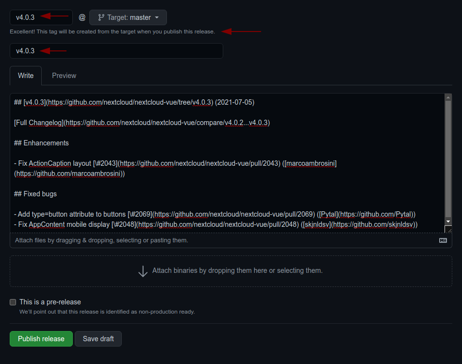
### 📤 Releasing a new version
- Pull the latest changes from `main` or `stableX`
- Checkout a new branch with the tag name (e.g `v4.0.1`): `git checkout -b v`
- Run `npm version patch --no-git-tag-version` (`npm version minor --no-git-tag-version` if minor).
This will return a new version name, make sure it matches what you expect
- Generate the changelog content from the [release](https://github.com/nextcloud-libraries/nextcloud-dialogs/releases) page.
Create a draft release, select the previous tag, click `generate` then paste the content to the `CHANGELOG.md` file
1. adjust the links to the merged pull requests and authors so that the changelog also works outside of GitHub
by running `npm run prerelease:format-changelog`.
This will apply this regex: `by @([^ ]+) in ((https://github.com/)nextcloud-libraries/nextcloud-dialogs/pull/(\d+))`
Which this as the replacement: `[\#$4]($2) \([$1]($3$1)\)`
2. use the the version as tag AND title (e.g `v4.0.1`)
3. add the changelog content as description
- Commit, push and create PR
- Get your PR reviewed and merged
- Create a milestone with the follow-up version at https://github.com/nextcloud-libraries/nextcloud-dialogs/milestones
- Move all open tickets and PRs to the follow-up
- Close the milestone of the version you release
- Publish the previously drafted release on GitHub