https://github.com/nguyenanhtuan1912/tunangn-react-modal
Use to show message by using Dialog, snackbar or to show side in React
https://github.com/nguyenanhtuan1912/tunangn-react-modal
modal modal-dialog react snackbar typescript
Last synced: 7 months ago
JSON representation
Use to show message by using Dialog, snackbar or to show side in React
- Host: GitHub
- URL: https://github.com/nguyenanhtuan1912/tunangn-react-modal
- Owner: NguyenAnhTuan1912
- License: mit
- Created: 2023-07-27T01:22:07.000Z (about 2 years ago)
- Default Branch: main
- Last Pushed: 2023-10-19T07:58:16.000Z (about 2 years ago)
- Last Synced: 2025-02-18T17:53:51.661Z (8 months ago)
- Topics: modal, modal-dialog, react, snackbar, typescript
- Language: TypeScript
- Homepage:
- Size: 54.7 KB
- Stars: 2
- Watchers: 1
- Forks: 0
- Open Issues: 0
-
Metadata Files:
- Readme: README.md
- License: LICENSE
Awesome Lists containing this project
README
# tunangn-react-modal
Use to show message by using Dialog, snackbar or to show side in React. You can use this package easily to manage your dialog, snackbar or side. Ensure for privacy!! Dialog, side and snackbar only show (in screen or in DOM Tree) if they are opened.
## Live demo
See more examples in [live demo](https://stackblitz.com/edit/stackblitz-starters-azcqhw?file=src%2Findex.tsx).
## Note
- This will not cause unexpected re-renders to other components when you open modal item(s). (Only the modal react component re-render)
- This package contains default items that you just use them to solve many cases.
- I use typescript in all examples.
## Install
You can install it by:
```js
npm install tunangn-react-modal
```
Import to `App.jsx` or `App.tsx` and open default `dialog`:
```jsx
import { TunangnModal, dialog } "tunangn-react-modal";
export default function App() {
return (
dialog({ title: "My first dialog" })}>Open my dialog
)
}
```
## How to use?
I will show you how to use TunangnModal in this article.
An default modal item always has 4 components:
- __Header__ has `title` and `x` button (optional).
- __Body__ has `content`.
- __Footer__: depend on type of Modal Item, the __Footer__ will has difference children. Firstly, I want to talk about `title` and `content`.
- __Container__: wrap all components above.
### Table of Contents
- [tunangn-react-modal](#tunangn-react-modal)
- [Live demo](#live-demo)
- [Note](#note)
- [Install](#install)
- [How to use?](#how-to-use)
- [Table of Contents](#table-of-contents)
- [TunangnModal](#tunangnmodal)
- [Modal Item Data](#modal-item-data)
- [Modal Item Properties (Default and Customized)](#modal-item-properties-default-and-customized)
- [Dialog](#dialog)
- [Side](#side)
- [Snackbar](#snackbar)
- [Customize your own Tunangn Modal Item](#customize-your-own-tunangn-modal-item)
### TunangnModal
This is the Modal React Component that you __have to__ place it in `App` Component. There are 3 default modal items, you can use all of them immediately with
`dialog`, `side` and `snackbar` from `tunangn-react-modal`.
TunangnModal has 3 properties:
- canUseWhiteBG: Will white background or black background be used?.
- className: (don't recommend) replace the default class name. If you replace the default class name, make sure you have suitable style because the default
inline style will be unapply.
- items: if you want to custom you own modal items, you can use this properties.
`items` is an object contains options to assign modal item to list. Its properties:
| Name | Type | Description |
| :------------ | :------------ | :------------ |
| type | `MITypes` | Use to modify the title of modal item. |
| placeOn (__Only for Side__) | `SidePlaces \| undefined` | Where is side placed? |
| position (__Only for Snackbar__) | `SnackbarPositions \| undefined` | What is position of snackbar? |
| duration (__Only for Snackbar__) | `number \| null \| undefined` | How long does snackbar last? If you want to disable the auto-close behaviour, you can assign `null` to this option. |
| clearDefaultInlineStyle | `boolean \| undefined` | Clear default inline stlyes. You can use the default class name to style the UI component for Modal Item. __Note__: this option will not work if you use `element` as Function Component or using this option if you want to write css to the default class name. |
| className | `string \| undefined` | Class name of item's container. This will be based class name for other ui element components. You don't need `clearDefaultInlineStyle` to clear the default inline style, because the default inline style will be cleared if `className` option is assigned. __Note__: this option will not work if you use `element` as Function Component or using this option if you just want to modify UI Element with your own css |
| element | `((props: CustomizedModalItemProps) => JSX.Element) \| undefined` | Use this option if you want to create you own modal item. |
### Modal Item Data
__Note__: You cannot use these properties in your own customized modal item.
When you open an dialog with `dialog` function, an side with `side` function or an snackbar with `snackbar` function. You can pass an object
to this function, an this object is `data` of Modal Item, the data that you want to modify the content of modal item. Each modal item always
has `title` and `content`, so you can pass an object with `title`, `content` properties to modify the default modal item.
```ts
{
title?: string | JSX.Element,
content?: string | JSX.Element
}
```
All default modal items have same data:
| Name | Type | Description |
| :------------ | :------------ | :------------ |
| title | `string \| JSX.Element \| undefined` | Use to modify the title of modal item. |
| content | `string \| JSX.Element \| undefined` | Use to modify the content of modal item. |
### Modal Item Properties (Default and Customized)
Modal Item Data is a part of Modal Item Properties. Including:
- `close`: a function that you can use to close the modal item. Sometime, you will need to pass a result to this function. It returns
a result object. The result object:
```ts
{
isAgree: boolean,
data?: any,
message?: string
}
```
- `item`: an object contains properties and methods of modal item:
| Name | Type | Description |
| :------------ | :------------ | :------------ |
| name | `string` | Name of Modal Item. |
| type | `string \| JSX.Element \| undefined` | Use to modify the content of modal item. |
| placeOn (__Only for Side__) | `SidePlaces \| undefined` | Where is side placed? |
| position (__Only for Snackbar__) | `SnackbarPositions \| undefined` | What is position of snackbar? |
| duration (__Only for Snackbar__) | `number \| null \| undefined` | How long does snackbar last? If you want to disable the auto-close behaviour, you can assign `null` to this option. |
| getData | `getData(): T` | Use to get data from `open` function. |
- `utils`: an object contains helper functions to support the modal item has behaviour almost like default one.
| Name | Type | Description |
| :------------ | :------------ | :------------ |
| getContainerStyle | `(style?: React.CSSProperties \| undefined) => React.CSSProperties` | [__Recommend__] Use to get container style. You can pass your custom style to this function, your style will override the default one. |
| runAnimation | `MITypes \| undefined` | Type of Modal Item. |
### Dialog
__Note__: You cannot use these properties in your own customized modal item.
I will show a dialog and open another dialog depend on `result.isAgree`. Firstly, import `dialog` from `tunangn-react-modal`, `dialog` receive a data object contains `title`, `content` and its own properties:
| Name | Type | Description |
| :------------ | :------------ | :------------ |
| cancelBtnLabel | `string \| JSX.Element \| null \| undefined` | Use to set label for cancel button of dialog. You can hide this button by assign `null`. |
| agreeBtnLabel | `string \| JSX.Element \| null \| undefined` | Use to set label for agree button of dialog. You can hide this button by assign `null`. |
Let's show a dialog
```jsx
import { TunangnModal, dialog } "tunangn-react-modal";
let dialogTitle =
Terms and Conditions *
;
export default function App() {
return (
<>
{
dialog({
title: dialogTitle,
content: (
Please read carefully:
Item 1
Item 2
Item 3
Item 4
Item 5
)
})
.then(result => {
if(result.isAgree) {
dialog({ title: dialogTitle, content: "You accepted our terms and conditions.", cancelBtnLabel: null })
} else {
dialog({ title: dialogTitle, content: "You unaccepted :(", agreeBtnLabel: null })
}
})
}}>Open default dialog
>
)
}
```
You can see in the example above, there are 2 dialog with difference content will be showed depend on `result.isAgree`. And I will hide cancel button with agreed dialog, hide agree button with canceled dialog.
__Result__
Open dialog
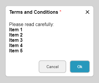
Trying agree
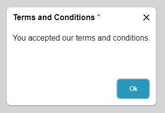
Trying cancel
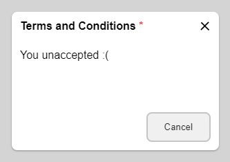
### Side
__Note__: You cannot use these properties in your own customized modal item.
Side doesn't have its own properties.
I wil show left-side (default) with `title` and `content` has 10 images.
Let's show a side
```jsx
import { TunangnModal, side } "tunangn-react-modal";
let sideTitle =
photo_libraryImages
;
export default function App() {
const [imageUrls, setImageUrls] = React.useState>([]);
React.useEffect(() => {
let promises = Array(10).fill(0).map(i => fetch("https://picsum.photos/200/300"));
Promise.all(promises).then(responses => {
let urls: string[] = [];
responses.forEach(response => {
urls.push(response.url);
});
setImageUrls(urls);
});
}, []);
return (
<>
{
side({
title: sideTitle,
content: (
{
imageUrls.length > 0 ?
imageUrls.map((url, index) => {
return 
}) :
There aren't images.
}
)
})
}}>Open images side
>
)
}
```
10 images are response, but the side will not be re-render. I think you have the answer, so you need to customize you own side. I will show you in the last example!!!
__Result__
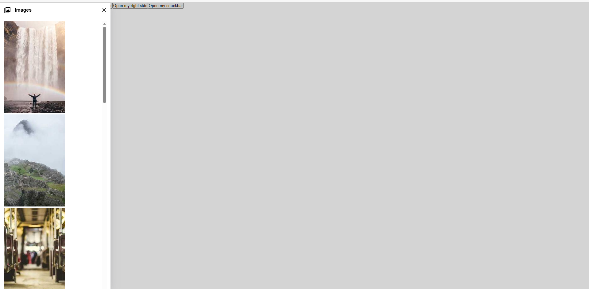
I re-open the side to see 10 images.
### Snackbar
__Note__: You cannot use these properties in your own customized modal item.
Snackbar has 1 property:
| Name | Type | Description |
| :------------ | :------------ | :------------ |
| color | `string \| undefined` | Use to modify the background color of header. |
I will show 4 various snackbar with various `title` and `content`.
```jsx
import { TunangnModal, snackbar } "tunangn-react-modal";
let successSnackbar = {
title: check_circle,
content: "You action is performed successfully.",
color: "success"
};
let errorSnackbar = {
title: error,
content: "There is an error.",
color: "error"
};
let warningSnackbar = {
title: warning,
content: "Your requesting data will cause an unexpected side effect!!! ",
color: "warning"
};
let otherSnackbar = {
title: attach_money,
content: "You payment is processed.",
color: "#a8329b"
};
export default function App() {
return (
<>
{
snackbar(successSnackbar);
}}>Open snackbar
>
)
}
```
__Result__
The success snackbar

The error snackbar

The waring snackbar

The other snackbar

### Customize your own Tunangn Modal Item
I will build a small profile right-side with:
- Username, user's avatar.
- Use css.
- Remove almost inline styles.
- Fetch data (images).
I will create a file in `src/components/profile/Profile.tsx`:
```tsx
export default function Profile(props: CustomizedModalItemProps) {
// Ref of container
const profileRef = React.useRef(null);
const data = props.item.getData() as any;
props.item.getData
const [imageUrls, setImageUrls] = React.useState>([]);
const [user, setUser] = React.useState();
React.useEffect(() => {
let promises = Array(10).fill(0).map(i => fetch("https://picsum.photos/300"));
// Get user
getUser(data.userId).then(user => setUser(user));
// Resolve images
Promise.all(promises).then(responses => {
let urls: string[] = [];
responses.forEach(response => {
urls.push(response.url);
});
setImageUrls(urls);
});
// Use container's ref to perform animation when profile is showed.
props.utils.runAnimation!(profileRef.current!);
}, []);
return (
{
user
? (
<>

{user.name}
>
)
: There isn't user.
}
props.close({ isAgree: false })}>close
{ user?.bio }
Shortcuts
{
sideBodyContent.shortcuts.map((shortcut, index) => (
{
shortcut.map(article => (
{article.icon}
{upperCaseFirstChar(article.name)}
))
}
))
}
Images
{
imageUrls.length > 0 ?
imageUrls.map((url, index) => {
return 
}) :
There aren't images.
}
)
}
```
Then import `Profile.tsx` to `App.tsx` and use it:
```jsx
import { TunangnModal, openTMI } "tunangn-react-modal";
import Profile, { openSideProfile, profileSideName } from "./components/profile/Profile";
// Assign user id. There are 2 userids: user-01 and user-02
let userId = "user-02";
export default function App() {
return (
<>
openSideProfile(userId)}>account_circle
>
)
}
```
__Result__
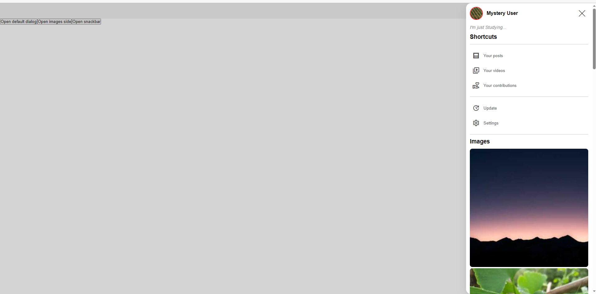
You can see the source in the live demo [above](#live-demo)