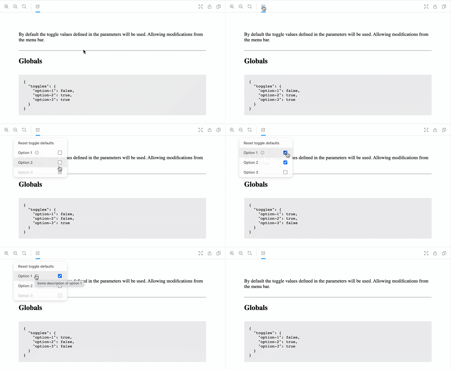
https://github.com/nickofthyme/storybook-addon-toggles
List of options toggles
https://github.com/nickofthyme/storybook-addon-toggles
Last synced: 4 months ago
JSON representation
List of options toggles
- Host: GitHub
- URL: https://github.com/nickofthyme/storybook-addon-toggles
- Owner: nickofthyme
- License: mit
- Created: 2023-05-18T23:33:36.000Z (over 2 years ago)
- Default Branch: main
- Last Pushed: 2023-05-27T01:31:38.000Z (over 2 years ago)
- Last Synced: 2025-06-17T14:04:37.960Z (5 months ago)
- Language: TypeScript
- Size: 693 KB
- Stars: 0
- Watchers: 1
- Forks: 0
- Open Issues: 0
-
Metadata Files:
- Readme: README.md
- Changelog: CHANGELOG.md
- License: LICENSE
Awesome Lists containing this project
README
# Storybook Addon Toggle
This addon is used to add a list of user defined global toggles that are accessible and customizable at the story level. All options are explained below, see [Parameters](#parameters) section below.
Test it out at https://nickofthyme.github.io/storybook-addon-toggles/

## Compatibility
This version is compatible with storybook version `>6.x`.
As of storybook `6.3.0` global parameters are synced with the url as query search params ([storybookjs/storybook#15056](https://github.com/storybookjs/storybook/pull/15056)). As such this will lock-in the default global and be persisted between stories. If you want to avoid this behavior you should use `storybook@~6.2.0`.
## Installation
### yarn
```sh
yarn add -D storybook-addon-toggles
```
### npm
```sh
npm i -D storybook-addon-toggles
```
## Getting started
Once installed, add this addon to the `addons` array in storybooks `main.js` file:
```jsx
// main.js
module.exports = {
addons: [
'storybook-addon-toggles'
],
};
```
See the [storybook documentation](https://storybook.js.org/docs/addons/using-addons/) for more information.
## Parameters
The parameters for this plugin are under the `toggles` key and are defined below.
```tsx
export interface Parameters {
/**
* Ignores global values in url params
*
* @default true
*/
ignoreQueryParams?: false;
/**
* Toggle options
*/
options: ToggleOptions[];
/**
* Toggle default overrides from story level
*/
overrides: Record;
/**
* Enabled clearing all toggles to default values
*
* @default true
*/
clearable?: boolean;
/**
* Addon is disabled at story level
*
* @default false
*/
disabled?: boolean;
/**
* Override icon used in toolbar
* See https://github.com/storybookjs/storybook/blob/release/6.2/lib/components/src/icon/icons.tsx
*
* @default 'form'
*/
icon?: IconsProps['icon'];
/**
* A callback that will be executed when the toggles change
*/
onChange?: (Toggles?: Toggles) => void;
}
```
The `ToggleOptions` type is defined below.
```tsx
export type ToggleKey = string;
export type ToggleValue = boolean
export type Toggles = Record;
export interface ToggleOptions {
/**
* id of the toggle
*/
id: T;
/**
* Title of the toggle in Selector UI
*/
title?: string;
/**
* Description of the toggle, shows in title on hover
*/
description?: string;
/**
* Default value
*/
defaultValue: ToggleValue;
/**
* Disable toggle by boolean or list of dependent toggles
*/
disabled?: boolean | Toggles;
}
```
## Configuration
### Global level
You can configure the toggles at the global level in the storybook `preview.(ts|js)` file as demonstrated below.
```tsx
// preview.ts
import type { TogglesParameter } from 'storybook-addon-toggles';
type Parameters = TogglesParameter & {
// other global types
};
export const parameters: Parameters = {
toggles: {
ignoreQueryParams: false,
icon: 'form',
options: [
{
id: 'option-1',
title: 'Option 1',
description: 'Some description of option 1',
defaultValue: false,
},
{
id: 'option-2',
title: 'Option 2',
defaultValue: true,
},
{
id: 'option-3',
title: 'Option 3',
defaultValue: true,
disabled: {
"option-2": false
}
},
],
}
};
```
### Story level
All properties defined in `TogglesParameter` are capable of being overridden at the story level. However, it is only advisable to override some of the parameters to prevent defining parameters that could negatively affect the addon behavior across all stories. The acceptable properties include `overrides`, `options`, `disabled`, `ignoreQueryParams` and `clearable`. The `BackgroundStoryParameter` type is a helper that should be used to limit what properties are overridden at the story level.
```tsx
// story.stories.tsx
import type { StoryTogglesParameter } from 'storybook-addon-toggles';
const Example = () => Hello!;
Example.parameters = {
toggles: {
overrides: {
'option-1': false,
}
}
} as StoryTogglesParameter;
```
## Usage of globals context
### Storys
Each story is rendered with two parameters, the first is the `args` from `Story.bind(myArgs)`, the second is the `StoryContext`. The `StoryContext` gives us direct access to the globals.
```tsx
// story.stories.tsx
const Example = (args, context) => {
return Value of Option 1: ${context.globals.toggles['option-1']}
};
```
### Decorators
Global storybook [`Decorators`](https://storybook.js.org/docs/react/writing-stories/decorators#global-decorators) can be used for a multitude of things. As such it is important to have access to the toggles inside the decorators. This is the primary reason for chosing to use `globals` to maintain the state of the toggles.
Below is a simple example of how you could access the toggles via the `context.globals`.
```tsx
// preview.tsx
import React from "react";
import type { DecoratorFunction } from "@storybook/addons";
import type { TogglesGlobals } from 'storybook-addon-toggles';
const Decorator: DecoratorFunction = (Story, context) => {
const globals = context.globals as TogglesGlobals;
const toggles = globals.toggles; // object of all toggle values
return (
// Toggle values
{JSON.stringify(toggles, null, 2)}
);
};
export const decorators = [Decorator];
```
See a full example of this in [`.storybook/Decorator.tsx`](.storybook/Decorator.tsx).
> Globals are currently not correctly initialized by storybook, meaning they *always* return `{}` as the initial value. To correct this, we update globals with the default/initial toggles once the `SET_STORIES` event is emitted, if they differ.
## Framework Support
| [React](https://reactjs.org/) |
|:-:|
| :white_check_mark: |