https://github.com/noalvo/wireguide
Styleguide for low-fidelity paper prototyping 📄 and wireframing 📐.
https://github.com/noalvo/wireguide
guidelines prototyping styleguide wireframing
Last synced: 6 months ago
JSON representation
Styleguide for low-fidelity paper prototyping 📄 and wireframing 📐.
- Host: GitHub
- URL: https://github.com/noalvo/wireguide
- Owner: NOALVO
- License: mit
- Created: 2018-03-08T03:29:03.000Z (over 8 years ago)
- Default Branch: master
- Last Pushed: 2018-03-16T00:55:54.000Z (over 8 years ago)
- Last Synced: 2025-05-13T14:51:04.525Z (about 1 year ago)
- Topics: guidelines, prototyping, styleguide, wireframing
- Homepage:
- Size: 808 KB
- Stars: 5
- Watchers: 2
- Forks: 0
- Open Issues: 1
-
Metadata Files:
- Readme: README.md
- License: LICENSE
Awesome Lists containing this project
README
# wireguide
Styleguide for low-fidelity paper prototyping and wireframing.
> _The key words "MUST", "MUST NOT", "REQUIRED", "SHALL", "SHALL NOT", "SHOULD", "SHOULD NOT", "RECOMMENDED", "MAY", and "OPTIONAL" in this document are to be interpreted as described in [RFC 2119](https://www.ietf.org/rfc/rfc2119.txt)._
### 1. Objectives
1.1. These guidelines are supposed to be used by any product owner, manager, designer or developer intended to illustrate visual representations of computer software or internet pages, a.k.a. prototyping or wireframing.
1.2. These guidelines SHOULD be used to represent low-fidelity wireframes, which means that rounded borders, shadows, gradients, images, icons, animations or any complex form of graphics SHOULD NOT be used.
### 2. Pen 🖊
2.1. _SHOULD_. Prefer using thin/sharp hydrographic pens or ballpoint pens. Avoid thick pens and markers.
2.2. _MUST NOT_. Don't use pencils or automatic pencils in order to avoid poor visibility wireframes.
2.3. _MUST_. Use black, blue, red, green and orange colors to draw elements, attending to the following rules below. When you don't have green or orange color, you MUST replace orange by red and green by black. When you don't have blue, red or black, well... you could not make a comprehensive wireframe.
### 3. Black elements 🖤 Containers
3.1. _MUST_. Use the **black** color for general lines, containers and borders. In all, but not limited to, the following cases:
- Divs
- Panels
- Headers
- Navigation bars (both vertical and horizontal)
- Menus (tabs, navs, pills, dropdowns)
- Tables
- Text
- Images
- Modal dialogs
3.2. _MUST_. For **navigation bars**, when the bar is prefixed by a trademark or logo, include the word `LOGO` at the beggining of the bar.

3.3. _MUST_. **Modal dialogs** must include close button (`×`) at the top-right corner.

3.4. _MUST_. **Images** must be represented by a square with an x mark touching its corners.

3.5. _SHOULD_. For **tables** and **general containers** that includes repeatable elements, draw only the first line of element and include three vertical dots at the middle of container.

3.6. _SHOULD_. For **tables** and **general containers** that is supposed to be taller than wireframe bounds, DO NOT finish the container with a bottom side line, and apply a three vertcial dashes following each horizontal side of container.

3.7. _SHOULD_. For **tables** and **general containers** that is supposed to be wider than wireframe bounds, DO NOT finish the container with a bottom side line, and apply a three horizontal dashes following each vertical side of container.

### 4. Blue elements 💙 Features
4.1. _MUST_. Use the **blue** color to describe the content, origin and destination of features.
4.2. _MUST_. Define a **reference code** for each feature with a letter, starting from `A` to `Z`.

4.3. _SHOULD NOT_. Prefer omiting control labels and instead use the reference code described in 4.2.
4.4. _MUST_. Build a "**Table of Features**" including the reference code and the main details of each in a usable free space of the wireframe. If there is no free space in the wireframe, use the back of the sheet to make it.

4.5. _MUST_. When referencing features in Table of Features specified by item 4.4, **use `"` to describe their labels**.

4.6. _MUST_. When referencing features in Table of Features specified by item 4.4, **use `→` to indicate the destination of the feature**, like, but not limited to, opening dialogs and changing pages.

4.7. _MUST_. When referencing features in Table of Features specified by item 4.4, **use `←` to indicate the origin of the feature**, like, but not limited to, pages e other features, and also the source of labels, like, but not limited to APIs and internal funcions.

### 5. Red elements ❤️ Modifiers
5.1. _MUST_. Use the **red** color to indicate special behaviors of features.
5.2. _MUST_. Mark read-only, blocked and disabled controls with an "block" sign.

5.3. _MUST_. Mark elements and controls affected by user roles (privileges elevation) with a (`△`). Elements marked both with 5.2 and this marking will be considered not read-only if the role is satisfied. Indicate more details of the privilege and control behavior in the Table of Features.

5.4. _MUST_. Mark elements and controls that contains or triggers AJAX loaders with an horizontal three-dot.
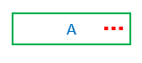
5.5. _MUST_. Mark elements and controls that are repeatable by some iteration with a vertical three-dot. Indicate more details of the iteration in the Table of Features.

### 6. Green elements 💚 Controls
6.1. _MUST_. Draw **input/text boxes** with just an horizontal line. DO NOT draw inputs as a rectangle, as they may be confused with a button.

6.2. _MUST_. Draw **buttons** as rectangles, including **image buttons**. For buttons that have a cancel/abort/close behavior include a times character (`×`) aligned to center.
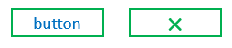
6.3. _MUST_. Draw **checkboxes** as squares with a checkmark inside.

6.4. _MUST_. Draw **radio buttons** as circles with a dot inside.

6.5. _MUST_. Draw **dropdown menus** writing the "Dropdown" word, followed by a feature reference code (as described in 4.2), and, followed by a black triangle ponting down (`▼`).

6.5.1. _MUST_. For the menu panel, draw it as a black container (as described in 3.1), but make a diagonal (northwest to souteast) line at the top-right corner of the container.
6.5.2. _MUST_. Include an underline at the beggining of each dropdown menu item.
6.5.3. _MUST_. Include a black triangle pointing right (`▶︎`) at the end of each dropdown item which activates another dropdown menu.
6.6. _MUST_. Put a dashed border at the bottom of **hyperlinks**.

6.7. _MUST_. Draw **sliders** as an horizontal line with a black filled circle on it.

6.8. _MUST_. Draw **switches** as two rectancles (one filled and the other not) together.

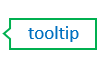
6.9. _MUST_. Draw **tooltips** as rectangles shaped with a left-chevron at the left side.
6.10. _MUST_. Draw **progress bars** as two long rectangles (one filled and the other not) together. Place a `%` inside the white rectangle, as this drawing may be confused with switches.

### 7. Orange elements 💛 Illustrations and layout to be determined
7.1. _SHOULD_. Draw proposals of text and illustrations that have to be officially determined with the orange color.

### 8. Grids and browser bounds
8.1. _SHOULD_. Use simple grids to draw containers and parts of pages.

8.2. _SHOULD_. Use "browser" grids to draw pages and elements disposed inside a page.

8.3. _SHOULD_. Use "tablet" and "mobile" grids to represent responsive adjusted desktop wireframes, or, if your wireframe is for a product that focus a specific plaform.
8.4. _SHOULD_. Use [Sneakpeekit](http://sneakpeekit.com/) to print paper grids described by 8.1, 8.2 and 8.3.
### 9. Digitalizing
9.1. _SHOULD_. Use [CamScanner]() to digitalize wireframes, applying "Lighten" or "Magic Color" filter.