https://github.com/north/north
Design and development standards to align and guide your project.
https://github.com/north/north
Last synced: 7 months ago
JSON representation
Design and development standards to align and guide your project.
- Host: GitHub
- URL: https://github.com/north/north
- Owner: north
- License: mit
- Created: 2013-11-08T15:00:48.000Z (over 12 years ago)
- Default Branch: master
- Last Pushed: 2016-01-07T16:43:56.000Z (over 10 years ago)
- Last Synced: 2024-10-09T21:11:34.488Z (over 1 year ago)
- Language: CSS
- Homepage: http://pointnorth.io
- Size: 2.62 MB
- Stars: 4,851
- Watchers: 240
- Forks: 286
- Open Issues: 28
-
Metadata Files:
- Readme: README.md
- Changelog: CHANGELOG.md
- Contributing: CONTRIBUTING.md
- License: LICENSE
Awesome Lists containing this project
- awesome-github-repos - north/north - Design and development standards to align and guide your project. (CSS)
README
North
====================
**Align and Guide Your Project**
North is a set of standards and best practices for developing modern web based properties. Included are standards and best practices for all aspects of a project, from kick off through development. North encourages an agile, content-first, approach to product development and a mobile-first, in-browser, system based approach to design and development.
North is meant to be a living document. Standards and best practices change, and as they do and have been vetted, North will grow and change with them. North is versioned using [SEMVER](http://semver.org/) in order to provide a way to specify what version of North is being followed for any given project. The easiest way to ensure these standards are tracked as part of your project is to pull in North as a [Bower](http://bower.io/) dependency.
```bash
bower install north --save-dev
```
*Currently open to review, [v0.4.0](https://github.com/Snugug/north/releases/tag/v0.4.0) is a preview version of North. Once the review period is over, a branch for the current major version will be made. Contributions are more than welcome, as long as the [Contribution Guidelines](https://github.com/Snugug/north/blob/master/CONTRIBUTING.md) are followed.*
# Table of Contents
1. [Development Process](#development-process)
* [Roles and Responsibilities](#roles-and-responsibilities)
* [Product Owner](#product-owner)
* [Project Manager](#project-manager)
* [Designer](#designer)
* [Developer](#developer)
* [Quality Assurance](#quality-assurance)
* [Leads](#leads)
* [Agile Scrum](#agile-scrum)
* [User Stories](#user-stories)
* [Benefit Statement](#benefit-statement)
* [Requirements](#requirements)
* [Size and Value](#size-and-value)
* [Backlog](#backlog)
* [Iterations](#iterations)
* [Version Control](#version-control)
* [Feature Branches](#feature-branches)
* [Tags and Releases](#tags-and-releases)
* [Preprocessed Languages](#preprocessed-languages)
* [Brooks's Law](#brookss-law)
2. [Content Strategy](#content-strategy)
* [Project Vision](#project-vision)
* [User Personas](#user-personas)
* [Content Inventory](#content-inventory)
* [Content Audit](#content-audit)
* [Content Modeling](#content-modeling)
* [Information Architecture](#information-architecture)
3. [Visual Design](#visual-design)
* [Website Needs](#website-needs)
* [Consistency and Predictability](#consistency-and-predictability)
* [Complexity and Complication](#complexity-and-complication)
* [Grids](#grids)
* [Parts of a Grid](#parts-of-a-grid)
* [Symmetric Grids](#symmetric-grids)
* [Asymmetric Grids](#asymmetric-grids)
* [Custom Grids](#custom-grids)
* [Compound Grids](#compound-grids)
* [Ratio Based Grids](#ratio-based-grids)
* [Spiral Based Grids](#spiral-based-grids)
* [Anti Patterns](#anti-patterns)
* [Dark Patterns](#dark-patterns)
* [Signal to Noise Ratio](#signal-to-noise-ratio)
* [Plugins](#plugins)
* [Outdated User Experience Patterns](#outdated-ux-patterns)
* [Design in Browser](#design-in-browser)
* [Parallel Design](#parallel-design)
* [Mobile First](#mobile-first)
* [Pair Design](#pair-design)
* [Sketching](#sketching)
* [Rapid Prototyping](#rapid-prototyping)
* [Style Prototyping](#style-prototyping)
* [Style Tiles](#style-tiles)
* [Style Guide](#style-guide)
* [Component Guide](#component-guide)
* [Layout Guide](#layout-guide)
4. [Responsive Web Design](#responsive-web-design)
* [Future Friendly](#future-friendly)
* [Device Detection](#device-detection)
* [Progressive Enhancement](#progressive-enhancement)
* [Feature Detection](#feature-detection)
* [Graceful Degradation](#graceful-degradation)
* [Advertising](#advertising)
* [Resolution Independence](#resolution-independence)
* [Media Queries](#media-queries)
* [Iconography](#iconography)
* [Images](#images)
* [Design Constraints](#design-constraints)
* [One Code base](#one-code-base)
* [HTML Source Order Cannot Change](#html-source-order-cannot-change)
* [No Hiding Content](#no-hiding-content)
* [Design and Content Performance](#design-and-content-performance)
5. [Performance](#performance)
* [Testing and Grading Performance](#testing-and-grading-performance)
* [Payload Performance](#payload-performance)
* [Page Performance](#page-performance)
* [Front End Optimizations](#front-end-optimizations)
* [Critical Optimizations](#critical-optimizations)
* [Recommended Optimizations](#recommended-optimizations)
* [Experimental Optimizations](#experimental-optimizations)
6. [Website Building Blocks](#website-building-blocks)
* [General Coding Syntax](#general-coding-syntax)
* [Markup](#markup)
* [HTML Semantics](#html-semantics)
* [Accessibility](#accessibility)
* [RDFa](#rdfa)
* [Viewport Meta Tag](#viewport-meta-tag)
* [Styling](#styling)
* [Base Browser Styling](#base-browser-styling)
* [Components](#components)
* [Layouts](#layouts)
* [Aspects](#aspects)
* [Elements](#elements)
* [States](#states)
* [CSS Naming Conventions](#css-naming-conventions)
* [Sass and Compass](#sass-and-compass)
* [Mixin/Extend Pattern](#mixinextend-pattern)
* [Partial Structure](#partial-structure)
* [Enhanced and Degraded Styling](#enhanced-and-degraded-styling)
* [Variable Naming](#variable-naming)
* [Interaction](#interaction)
* [Style and Syntax](#style-and-syntax)
* [Libraries, Plugins, and Frameworks](#libraries-plugins-and-frameworks)
7. [Tools and Resources](#tools-and-resources)
* [North Sass Plugin](#north-sass-plugin)
* [Generator North](#generator-north)
* [Intake Center](#intake-center)
8. [License and Acknowledgements](#license-and-acknowledgements)
# Development Process
Much like [visual design](#visual-design), the process of developing a product has changed as the understanding of the medium being worked in has changed from an extension of print design to its own entity. Whereas in print design a final product was always the deliverable and designs for that product would be handed from one role to another without back and forth communication, the web requires a new process better suited for the complex and interactive nature of the final product.
Often referred to as *waterfall*, the old method of a static page being created by a designer, approved by a product owner, and then handed off to developers without further communication does not produce results in the best interests of anyone involved. The product owner doesn't see the final product until it is all finished and ready for launch, much too late to make any significant corrections or alter the path of the project.
Instead, a more *agile* process, where product owners, designers, and developers all work in conjunction with one another to build value in a product throughout its development cycle, is needed. One where a small amount of work and constant feedback between all parties can build a large project out of small parts. One where the final project may not have every bell and whistle hoped for, but rather has an array of features that fulfill the maximum potential of the cost of development based on business and user needs. This is a large change in the way most individuals and organizations have done this type of work in the past, but by sticking to this process, a better product will be built in the long run, and those involved in the building will not be exhausted or burnt out by the process.
There are many different agile methodologies that all fulfill the same purpose of building projects in a more collaborative environment with constant communication between all roles involved in a project. The Scrum methodology described below is one such methodology that has found much success across many teams and organizations.
## Roles and Responsibilities
In any given project, there are a variety of roles that each play a part in the success of a project. The following is a list of the basic roles required to accomplish a project. Some individuals may fall into multiple categories, that's okay. The key is that each role has certain responsibilities and these roles need to have members throughout the entire development process, ideally with each role filled by the [same individuals](#brookss-law) for the duration of a project. Projects work best when the total number of individuals are kept to a minimum (but that is not to say that it is better to have one of each, rather make sure that there aren't too many individuals on a project at once).
### Product Owner
Either the individual who directly owns the product or company the product is being developed for, or a designated representative for the product or company who has been given direct permission to make decisions for the product being developed. This individual needs to be able to make decisions on their own without consulting others, acts as a fully involved individual in the lifecycle of a project, and must understand and be able to fully articulate the [vision](#project-vision) of the project. They are responsible for prioritizing the [backlog](#backlog) of, determining [requirements](#requirements) for, and assisting in writing [user stories](#user-stories). There should only be a single product owner per project.
### Project Manager
The individual in charge of ensuring the product cycle is being kept on track. They take charge in managing expectations of product owners, ensuring that designers and developers are able to deliver what they have [committed to](#commitment) during a [sprint](#iterations), and working with the product owner to ensure there are enough defined, consumable, prioritized [user stories](#user-stories) to work on for the upcoming [iterations](#iterations). Project managers often run [scrums](#scrum) if there is not a dedicated person to do so. There should only be a single project manager per project.
### Designer
There are two types of [designs](#visual-design) that need to happen during a typical product lifecycle: user interface design, the look and feel of a product; and user experience design, how users interact with the product. User experience designers should be working with [rapid prototypes](#rapid-prototyping) to flush out interaction patterns and create rough flows, where user interface designers should be working with [style prototypes](#style-prototyping) to determine the look and feel of components that are developed by user experience designers' work. Both should work closely with developers. User experience designers should take their cues and be part of the creation process of a product's [content strategy](#content-strategy).
### Developer
Much like designers, there are two types of developers: front end developers and back end developers. Front end developers primarily deal with what is actually put in front of users, in the case of web projects the [HTML](#markup), [CSS](#styling), and [JavaScript](#interaction), whereas backend developers primarily work on the systems needed to store, retrieve, and manipulate the data on the server side (what users do not see). Both types of developers need to work together to create the final product that will be consumed by the user. Front end developers will spend a lot of time working with designers to ensure the final product meets their expectations while still being workable and [performant](#performance) based on the realities of the medium being developed for. Because of this close working relationship, front end developers often straddle the line between designer and developer and should be given the leeway to do so.
### Quality Assurance
Individuals working on quality assurance (QA) ensure that new code created during a [sprint](#iterations) matches the [requirements](#requirements) of the [user story](#user-stories) and does not break the functionality already in place from previous sprints. QA needs to understand how functionality may differ across platforms (on the web, [browsers and devices](#progresive-enhancement)) and work with developers when this is unclear. No code should be [released](#tags-and-releases) until QA has given sign off.
### Leads
It is often useful, although not necessary, for an individual Designer, Developer, or QA member be designated as a lead for each discipline. This can take the form of a Lead Designer, Lead Developer, and lead QA, or it can be more specific, taking the form of Lead Visual Designer, Lead UX Designer, Lead Front End Developer, Lead Back End Developer, Lead Functional QA, Lead Cross Browser QA, etc…. No matter how it is divided, leads all share the same extra responsibilities; leads are responsible for and have final say over direction (and if appropriate, architecture) for their discipline, communicating that direction to and mentoring the other individuals in their discipline, and communicating and explaining that direction to the product owner and project manager.
## Agile Scrum
### User Stories
A user story describes work that needs to be done for a feature of a particular product. User stories contain [benefit statements](#benefit-statement), [requirements](#requirements), [a size, and a value](#size-and-value). [Project Managers](#project-manager) and [product owners](#product-owner) should work together to create the basics of a user story ([benefit statements](#benefit-statement), [requirements](#requirements), [value](#size-and-value); often called a **stub**), flush out [requirements](#requirements) with a [user experience designer](#designer), and work with the team to ensure stories are [sized](#size-and-value). Once all of these items are complete, a user story is considered **defined**. Once a product owner has prioritized them in the [backlog](#backlog), they are considered **consumable**. It behooves teams to have enough user stories defined and consumable to cover the current [iteration](#iterations) and one to two iterations in the future at any given time.
When determining what user stories to stub out first, it is important to look to the [content strategy](#content-strategy) of a product. [Content types](#content-modeling) that are most valuable should have their features prioritized when it comes to creating user stories. The [information architecture](#information-architecture) will also assist in determining what features are needed and therefore what user stories should be generated. Features based off of content strategy should have the value of their content types associated to them in order to provide insight into overall value being generated by a given feature.
#### Benefit Statement
Benefit statements describe why a feature is important to be built based on [user personas](#user-personas) and business needs. Useful in helping to determine value for a feature and can thus help in organizing the [backlog](#backlog), benefit statements are written in the form *As [persona], I want [desire] so that [rationale].*
#### Requirements
The functional requirements of a user story are based on the desired user experience of a feature and should be thorough enough to be completed by a [designer](#designer) or [developer](#developer) without additional question. An example of incomplete requirements would be "Create a photo gallery". On the other hand, "Create a rotating display that holds five items, paginates with swipe or mouse click, draws in an image from the Image content type displayed at a 16:9 ratio with the title and short description and can resize fluidly, ordered by most recent item" is much more thorough and can be built and designed without further input.
#### Size and Value
The size of a story is how much effort it will take to complete based on a relative scale of other similar features built, whereas value is a relative determination of how aligned with business needs a given feature is. Both size and value should be a [Fibonacci number](http://en.wikipedia.org/wiki/Fibonacci_sequence).
> Out of the first six numbers of the Fibonacci sequence, four are prime. This limits the possibilities to break down a task equally into smaller tasks to have multiple people work on it in parallel. Doing so could lead to the misconception that the speed of a task could scale proportionally with the [number of people working on it](#brookss-law). The 2^n series is most vulnerable to such a problem. The Fibonacci sequence in fact forces one to re-estimate the smaller tasks one by one.
>
> [KillerInsect, StackOverflow](http://stackoverflow.com/questions/9362286/why-is-the-fibonacci-series-used-in-agile-planning-poker/9377005#9377005)
This applies not only to tasks, but to value as well. One very popular technique for estimating sizes (and can likewise be applied to value) is [planning poker](http://en.wikipedia.org/wiki/Planning_poker). Planning poker is a consensus-based technique where team members secretly estimate what they believe size or value should be and all estimates are revealed at once. This is done to avoid the cognitive basis of [anchoring](http://en.wikipedia.org/wiki/Anchoring) where the first number spoken aloud sets the precedent for subsequent estimates. After the reveal, the team discusses their reasoning for their estimates, eventually coming to a consensus on the estimate. If the team cannot come to a consensus on estimates, the largest estimate is usually used. When planning, each team member's estimate holds equal weight, regardless of whether they are a [lead](#leads) or not.
For sizes, any size above 21 is usually too much to work on in a single iteration and the work should be split into smaller pieces and an epic, or overarching story, should be created. Size is not just based on development difficulty; it includes difficulty for all [team members](#roles-and-responsibilities) that would work on a feature for an iteration, including design and QA. Size should also account for risk, which could increase size for features that otherwise require little actual work to do. The size of a story should be agreed upon by consensus by all team members working on a feature. Sizing should happen throughout an [iteration](#iterations).
Value should be determined for each aspect that provides value, generally not to exceed 13 per aspect. A determination of how closely each [benefit statement](#benefit-statement) aligns with the [vision statement](#vision-statement) should always be included, with additional aspects such as importance in [information architecture](#information-architecture) or metrics for the feature or content type.
### Backlog
The backlog is the list of prioritized user stories that have not been worked on yet. It is up to the [product owner](#product-owner) to prioritize the user stories in the backlog. Prioritizing the backlog allows the [team](#roles-and-responsibilities) to know what the most important items are to work on and therefore what to size. Product owners should use each user story's value as a guide. While they do not need to explicitly order the backlog based on the value of each user story, the value provides an unbiased look at each feature in the overall scheme of the build, so it should be used to guide decisions on backlog priority.
### Iterations
Work should be divided up into 2 week iterations. Each iteration represents a set of user stories that [designers](#designer), [developers](#developer), and [QA](#quality-assurance) have agreed that they can accomplish in that period of time based on how much time each individual has available (often called **capacity**, measured not in hours but in unitless numbers similar to size and value) and how difficult each user story is. Each two week iteration is often referred to as a **sprint**.
Once a day during each sprint, all [team members](#roles-and-responsibilities) should get together, either by phone, in person, or both, to quickly discuss progress so far. These meetings are called **scrum** meetings. During these meetings, [designers](#designer), [developers](#developer), and [QA](#quality-assurance) give a quick overview of what they have accomplished, what they are going to accomplish, if anything is impeding their progress (often called **blockers**), and arrange to meet with individuals that can help to lift those blockers. Scrum meetings should be fast, no more than 15 minutes, and should not include the writing of stories or prolonged discussion; follow-up meetings are encouraged.
Towards the end of each iteration the team should come together to determine what stories to work on for the next iteration. This is called **commitment**. When determining capacity, remember to take into account meetings an individual may need to take part in, including time spent sizing user stories and this, and the acceptance, meeting.
At the end of each iteration, the team should come together to present the work they have accomplished to the product owner. At this time, the work done should be compared to the stories committed to. For each story committed to, if what was produced matches the [requirements](#requirements) laid out in the story, the [product owner](#product-owner) should accept the story as complete. If the result was not what was expected by the product owner but meets all requirements as laid out in the story, the product owner should still accept the story and create a new story for changes. If all stories are complete and accepted, the iteration passes; if not, the iteration fails. It is OKAY to fail an iteration, it just means estimations were off and need to be adjusted for the next iteration.
## Version Control
All projects, no matter how big, no matter how small, should be put under a [version control system](http://en.wikipedia.org/wiki/Version_control) (VCS) before work begins on the project. Introducing version control early and enforcing its use will ensure a solid understanding of where code comes from in a project and eliminates the need for user-centric naming conventions such as `item-final.js`, `item-final-really.js`, `item-really-really-final.js`. It makes it easy to track how an item has changed over time and roll changes back if need be. Using version control systems also allows gates to be put up to allow for processes to be put in place before an item becomes finalized.
The version control system of choice is [Git](http://en.wikipedia.org/wiki/Git_(software)), allowing for a fully decentralized VCS that is designed for non-linear, distributed development. It has very strong safeguards against corruption of the chain of changes and can version just about any file type that can be thrown at it. It is open source and works across all major platforms. For a full introduction to Git, see the freely-available [Pro Git](http://git-scm.com/book) book.
### Feature Branches
When developing using Git, there should be one canonical branch, usually called `master`. No developer should ever commit code directly into `master`; instead, each developer should branch off of `master` named after the feature they are working (usually from a [user story](#user-stories)) and develop in that branch. These are called **feature branches**. Feature branches should only contain one feature. When a feature is complete, a request to merge that branch into `master` should take place (in [GitHub](https://github.com/) parlance, a *pull request*). At that point, a developer who did not write the code should review the request and make sure it meets the development standards of the group and, primarily, that it works. Assuming it meets all of the basic requirements, it should be merged by the reviewing developer. A [continuous integration system](http://en.wikipedia.org/wiki/Continuous_integration) can assist greatly in this merge request process by automating most of it, including running tests against the developed code. At no point should a developer merge their own code into `master`.
GitHub has created a fantastic visualization of [this process flow](http://guides.github.com/overviews/flow/) as part of their [GitHub Guides](http://guides.github.com/) documentation.
### Tags and Releases
When a section of work has been completed (usually after a [sprint](#sprint)), whatever code is ready to be released (the current state of `master`, usually after quality assurance testing has taken place) should be tagged for release. Tags should be created using [SEMVER](http://semver.org/) versioning and should begin with the letter **v**. A single designated member of the team, usually the Lead Developer (when using a [continuous delivery system](http://en.wikipedia.org/wiki/Continuous_delivery), it should take care of this), should create the tag and push it to each Git remote. They should then release that tag (and only that tag) into production.
### Preprocessed Languages
When working with preprocessed languages, such as [Sass](#sass-and-compass), the compiled output should be ignored through Git's `.gitignore` file (in the case of Sass, compiled CSS should be ignored). If not using a [continuous delivery system](http://en.wikipedia.org/wiki/Continuous_delivery), the member of the team designated to [tag and release](#tags-and-releases) the code should force add the compiled output into the repository and commit that in (they should absolutely be the only ones to do this). If using a continuous delivery system, compiling preprocessed languages should be part of the build step and absolutely no compiled code should be put under version control.
## Brooks's Law
> Nine women can't make a baby in one month.
>
> *Fred Brooks*
[Brooks's Law](http://en.wikipedia.org/wiki/Brooks's_law), which was coined in Fred Brooks's 1975 book [The Mythical Man-Month](http://en.wikipedia.org/wiki/The_Mythical_Man-Month), states that "adding manpower to a late software project makes it later". The law, while described even by Brooks as an oversimplification, captures two factors of a general rule of software development (as from the Wikipedia article):
1. It takes some time for the people added to a project to become productive. Brooks calls this the "ramp up" time. Software projects are complex engineering endeavors, and new workers on the project must first become educated about the work that has preceded them; this education requires diverting resources already working on the project, temporarily diminishing their productivity while the new workers are not yet contributing meaningfully. Each new worker also needs to integrate with a team composed of multiple engineers who must educate the new worker in their area of expertise in the code base, day by day. In addition to reducing the contribution of experienced workers (because of the need to train), new workers may even have negative contributions – for example, if they introduce bugs that move the project further from completion.
2. Communication overheads increase as the number of people increases. The number of different communication channels increases rapidly with the number of people. Everyone working on the same task needs to keep in sync, so as more people are added they spend more time trying to find out what everyone else is doing.
To combat these issues with large and expanding teams, those individuals involved with a project, from [project managers](#project-manager) to [product owners](#product-owner) to [designers](#visual-designer) and [developers](#developer), should remain as constant as possible throughout each major [release](#tags-and-releases) of a project. They should each stay on a project for the duration of a project, from the kick off of a project to a major release. The team should be kept small and flexible and communication channels between all involved should be open and available throughout the duration of a project.
# Content Strategy
Content strategy is the process by which content is analyzed, sorted, constructed, and placed. Users come to a site for its content first and foremost, so it is the most important part of a site. Before any discussion of [design](#visual-design) or [development](#website-building-blocks), an understanding of a [product owner's](#product-owner) content is imperative in order to produce not only an effective website, but lay an effective foundation for any and all future endeavors, from apps to ads to printed material. The entirety of a finished product is determined by this initial step, from what content actually is put onto pages to what [components](#components) get built to what the final site [looks like](#visual-design).
The following examples [are available](http://pointnorth.io/downloads/global-news-org.intake) as an [Intake Center](#intake-center) export. To view them in Intake Center, download the `.intake` file and import it.
## Project Vision
Before knowing what content will best serve a site, and therefore what features will best serve the content, a goal for the project should be decided upon. This can be accomplished by writing a **Vision Statement**, and should be the first content strategy deliverable. Vision statements should answer the following questions:
* Who will use, buy, or consume the product?
* Who is the target customer?
* Who will administer and maintain the product?
* What needs will the product address?
* What attributes are critical to success?
* How does the product compare with existing products?
* What are the unique selling points?
Vision statement provide a single grounding point for all decisions needed to create a successful product. The following is an example vision statement for a made-up news organization:
> In order to provide for a well-informed electorate who want to stay up-to-date and relate to high quality relevant worldwide news and information on an ever growing array of platforms, our editorial team will utilize an easy-to-use platform that can be accessed from any device from across the world to quickly and effortlessly update and create news stories.
## User Personas
User personas are a tool to distill different types of people who may interact with a product into caricatures in order to work with the different types of people effectively. *[Product owner](#product-owner)*, *editor*, and *user* personas should be built for each product, with additional user personas or expanded base user personas as needed. In order to create user personas, interviews (ideally in person one-on-one or focus groups) should be conducted with different types of users in order to get a statistically relevant overview of each user type. The creation of user personas can happen in parallel along with the creation of a product's [vision statement](#vision-statement), [content inventory](#content-inventory), and [content audit](#content-audit).
User persona research should begin with a hypothesis of what the various final user types will be and what those user types wants and needs are. These hypotheses should be based on analytics of the current site (if available) and demographic information of target audience. Analytics will provide insight into what is important to users, but not why. Similarly, demographic information will provide insight into who to start with, but not necessarily describe everyone who may use a product.
Once rough sketches of starting user types are determined, it is time for interviews. Ask users questions such as:
* What do you find most valuable about the existing product and similar, including competitors' products?
* Is anything of value is missing from the existing product and the similar products?
* How do you most often access the product?
* What are the pain points?
* What is the target demographic information?
Interview not only users that meet the starting user types, but users from outside those initial types as it may come to light that users outside of the initial types actually make use of the product. Once all user interviews have been finished, it is time to create final user personas.
When creating user personas, do not fall into the trap of assigning stereotypes to personas, such as that 'young adults only know how to write through text message shorthand' or that '[mobile users](#mobile-first) are rushed and distracted'. Personas should be generated based on statistical analysis of the interviews performed. Take all of the information gathered from all of the interviews and, based on analysis, break up the results into similar groups of people. What should divide users into similar groups are significant areas where multiple users use the product in similar ways, not small differences (or potentially even seemingly large differences like demographic). User personas are about how users *use* a product and what they expect from it. Finally, create a profile representing each group to be used as a final user persona. Each profile should contain the following information:
* Name
* Description of typical use of the product
* Motivator for use of the product (primary, secondary, tertiary needs)
* Pain points with the product
## Content Inventory
A content inventory takes an objective, broad strokes look at content that is currently available. If content is not currently available, create a content inventory based on perceived content needs. Built as a spreadsheet, it can include both intrinsic (title, owner, last updated) and analytics (page views, rank, notes) data. Content inventories are not just about pages or screens but rather the different pieces, or chunks, that go into making those larger items. Content is not just about long blobs of text; content is also images, videos, charts, forms, and any other form of information a user may want. It is important to understand that not every single piece of content available must be inventoried, but rather there are enough representative pieces to get a holistic view of each type of content available. By inventorying all the different types of content as well as the chunks that make up the content, a deep understanding of the content can be achieved that will make [modeling the content](#content-modeling) easier.
When building content inventories, it's often convenient to include limits for each widget or content chunk. Each item can have multiple limits, each separated by a space. The most prevalent limit (often character count) can have its type excluded. Other types include total number of items and dimensions. The following are some useful shorthand for describing limits:
* `*` - Required
* `(0)` - Soft limit, when a known limit isn't known, but a known minimum is
* `000x00` - Dimensions. Width before height
* `^foo` - Begins with (in this case, foo)
* `bar$` - Ends with (in this case, bar)
* `.jpg|png` - Multiple options (in this case either jpg or png file extensions)
## Content Audit
A content audit provides a first look at what content is available and how it is written as a way of sussing out if what is currently available is worth keeping, editing, or removing. Ask the following questions about the content and content types gathered from a [content inventory](#content-inventory).
* Is the content too long, too short, or just right? Can longer content be cut into shorter chunks and still make sense?
* Is the copy wordy? Does it ramble? Can it be cleaned up without losing its meaning?
* Does each page or chunk get to the point quickly?
* Is content even broken up into chunks?
* Is the content relevant and important?
After asking these questions of the content, do a **Gap Analysis** of the content. All content should fall into one of four categories:
* **Keep** as-is
* **Revise** and edit to tighten up copy and content types
* **Delete** because it's irrelevant, not useful, or outdated
* **Create New** where new business goals don't meet existing content. New content types may be gleaned from needs discovered in [user interviews](#user-personas).
## Content Modeling
A content model is an overview of the different types of content available for the product. Each type of content is modeled to include its attributes (what make it up, its chunks). A good content model includes both visible and structural attributes. Analyze the [content inventory](#content-inventory) and [content audit](#content-audit) to determine final content types. A content type per variation in content type is not necessarily needed, some attributes may be required, some not. It is important in a content model to emerge with a holistic understanding of each type of content and each content type's attributes in order to effectively build out any presentation. [Presentations deprecate](http://globalmoxie.com/jhc/prez/mobile-myths.pdf), but content lives on, so it is important for the content to be modeled to be reusable across any presentation and not contain [presentation-specific](#device-detection) attributes (such as iPhone Title or Desktop Image). Each content type modeled should contain the following information:
* **Title** of the content type
* **Description** of the content type
* **Benefit Statement** written in the form of *As [persona], I want [desire] so that [rationale]* (similar to [user stories](#user-stories)). The persona comes from the compiled [user personas](#user-personas). Each content type can have multiple benefit statements for multiple personas.
* **Value** of the content type. This is used to aid in creating a [backlog](#backlog) during the development process. Determine a [value](#size-and-value) for the aspects of the content. A determination of how closely each benefit statement aligns with the [vision statement](#vision-statement) should always be included. Additional aspects could include advertising revenue, page rank, page views, and resources requires to build versus value built (which if included, should be counted as negative value)
* **Attributes** that make up the content type. Each attribute should that attribute's data limits, such as character limit or date format.
* **Relationships** that the content type has to other types of content.
The following is an example of two content types related to the example [vision statement](#vision-statement).
```
## Article
Description:
* Short to long form text with possible accompanying images of recent factual stories
Benefits:
* As a reader, I want the most up-to-date information about the state of the world so that I stay an informed citizen
* As a site owner, I want to increase traffic to our site during peak news stories so that we enhance our standing as a world leading news source
Value
* Reader benefit statement: 13
* Site Owner benefit statement: 3
* Nett Ad Revenue: 8
* Total Value: 24
Attributes:
* Title
* Total: 1
* Required: true
* Type: text input
* Character Limit: 127
* Description: A descriptive title of the content
* Body
* Total: 1
* Required: true
* Type: long text input
* Character Limit: false
* Description: Long Form text box of main content
* Author
* Total: 1
* Required: true
* Type: reference (person)
* Description: Author who wrote article
* Published Date
* Total: 1
* Required: true
* Type: datestamp
* Formatting: mm/dd/yyyy hh:mm
* Description: Date, including hour and minute, of when article was published
* Summary
* Total: 1
* Required: true
* Type: text input
* Character Limit: 200
* Description: Summary of article
* Primary Image
* Total: 1
* Required: false
* Type: reference (image)
* Description: Primary image for article
* Related Images
* Total: multiple
* Required: false
* Type: reference (image)
* Minimum: 0
* Maximum: 5
* Description: Images related to article
* Related Human Interest Story
* Total: multiple (no limit)
* Required: false
* Type: reference (human interest story)
* Minimum: 0
* Maximum: 3
* Description: Related Human Interest Story
* Taxonomy
* Total: multiple
* Required: true
* Type: reference (term)
* Minimum: 1
* Maximum: 5
* Description: Taxonomy allows content types to be related to each other in a meta sense
Relationships
* Person
* Image
* Term
## Human Interest Story
Description
* Short to long form text with primary media of emotional stories
Benefits:
* As a reader, I want to connect to the people effected by events in the world so that I can identify more closely with those events
* As a site owner, I want to provide additional engagement opportunities to readers so that I can reduce bounce rate and increase ad revenue
Value:
* Reader benefit statement: 8
* Site Owner benefit statement: 8
* Nett Ad Revenue: 3
* Total Value: 19
Attributes:
* Title
* Total: 1
* Required: true
* Type: text input
* Character Limit: 127
* Description: A descriptive title of the content
* Body
* Total: 1
* Required: true
* Type: long text input
* Character Limit: false
* Description: Long Form text box of main content
* Author
* Total: 1
* Required: true
* Type: reference (person)
* Description: Author who wrote article
* Published Date
* Total: 1
* Required: true
* Type: datestamp
* Formatting: mm/dd/yyyy hh:mm
* Description: Date, including hour and minute, of when article was published
* Summary
* Total: 1
* Required: true
* Type: text input
* Character Limit: 200
* Description: Summary of article
* Primary Media
* Total: 1
* Required: true
* Type: reference (image, video, audio)
* Description: Primary media for article
* Related Media Gallery
* Total: 1
* Required: false
* Type: reference (media gallery)
* Description: Related media gallery
* Taxonomy
* Total: multiple
* Required: true
* Type: reference (term)
* Minimum: 1
* Maximum: 5
* Description: Taxonomy allows content types to be related to each other in a meta sense
Relationships
* Person
* Image
* Video
* Audio
* Media Gallery
* Term
```
## Information Architecture
Information architecture (IA) is a process that determines what pieces of what content gets used when, where, and why. Each presentation (native app, web site, etc…) has its own IA, but each should share the same underlying content.
Architectures should be constructed so that the [most valuable content](#content-modeling) is most prominent, with less valuable content less prominent. When devising architectures, make sure they are [consistent and predictable](#consistency-and-predictability). They should be [comprehensible](#complexity-and-complication), [uncluttered](#signal-to-noise-ratio), and follow the [hierarchy of website needs](#website-needs). Like with [visual design](#visual-design), pictures are not requirements; architectures should be sketched in outlines and [HTML](#design-in-browser). Determine why content items should be where they are and how they interact with each other; don't just start drawing pictures or playing with cutouts. One important thing to keep in mind when creating IAs, the [product owner](#product-owner) is not the audience. Lean upon what [users](#user-personas) actually want.
While building out an IA, the product's [content model](#content-modeling) may need to be revised. When building IAs, especially when the content model needs to be revised, keep the following rules of thumb in mind.
* **Truncation is not a content strate…**
* Content that is truncated is usually not written for summary or reuse
* Truncated content usually doesn't contain [trigger words](#consistency-and-predictability)
* Never truncate headlines
* Always provide summaries for long copy
* Provide alternative copy when needed
* **Build systems of content**
* Content isn't always one-size-fits-all, allow for different sizes and styles of content attributes
* Small, medium, large images
* Short and long human readable and SEO friendly headlines
* *DO NOT* build content for [specific contexts](#device-detection) such as iPhones, Androids, Tablets, or Desktops
* **Content should be easy to navigate**
* Don't paginate long pieces of content unnecessarily
* Make it easy to navigate to sections in long pieces of content
* Always provide enough context for a user to make their own navigation decisions
* A user with location services might not exclusively want location-based information
* Provide plenty of [trigger words](#consistency-and-predictability)
* Keep navigation uncluttered
* More than 5 main navigation categories gets hard to scan
* Only provide secondary navigation when absolutely necessary
* Try to avoid having more than three levels of navigation
* If navigation gets cluttered, stop and rework to make the architecture more [comprehensible](#complexity-and-complication)
* Think about if headlines can be used as links, or if alternative copy should be used
* **Content should be available**
* Don't restrict content, especially [based on device](#device-detection)
* Provide [alternative formats of content](#progressive-enhancement) if one format can't be made available, such as through device capabilities or business needs
* Do not store content as HTML, but rather as raw attributes that can be presented in multiple ways. This is especially true for tabular data and images related to long copy
* Make all content available and in a way best suited for the display at hand
# Visual Design
[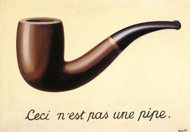](http://en.wikipedia.org/wiki/The_Treachery_Of_Images)
As the web comes into its own as a medium and the [rituals of print design](http://snugug.github.io/designing-the-modern-web/#/ritual) are cast off, websites can no longer be designed in the same tools built for print design. Websites have interaction, states change, items come in and out. The [differences in browsers](#progressive-enhancement) force designs to change based on capabilities available. Even something as simple as screen size is not static. As [Brad Frost put it](https://twitter.com/brad_frost/status/195241868383092736), "You can't articulate fluidity on paper." The reality of the web has always been that a single, static bitmap representation of a page isn't what a final site will be, it's just taken the push of [responsive web design](#responsive-web-design) to bring the web into its own as a medium. In order to accommodate for the fluidity and flexibility of the medium of the web, new tools and techniques are needed to create a site's look and feel.
> The control which designers know in the print medium, and often desire in the web medium, is simply a function of the limitation of the printed page. We should embrace the fact that the web doesn’t have the same constraints, and design for this flexibility. But first, we must 'accept the ebb and flow of things.'
>
> *John Allsopp, “[A Dao of Web Design](http://alistapart.com/article/dao)”*
The first big change is moving away from designing pages. **The page metaphor is killing the web**. By thinking in pages instead of systems of design, design gets focused on the wrong thing; the big picture look and feel as opposed to the content; what a user actually comes to a site for. Designing reusable [components](#components) and [layouts](#layouts) instead of pages allow for a more modular design, providing better flexibility and a more consistent user interface (UI) and user experience (UX).
The second big change is moving to [in-browser design](#design-in-browser), utilizing [rapid prototyping](#rapid-prototyping) and [style prototyping](#style-prototyping) as well as the web's [building blocks](#website-building-blocks) to build designs, not the static graphic design tools many clients and designers are use to. It's a big change, but it needs to happen in order to progress past thinking of web pages as extensions of printed material and create truly web-first experiences.
## Website Needs
In much the same vein of [Maslow's hierarchy of needs](http://en.wikipedia.org/wiki/Maslow's_hierarchy_of_needs), there is a hierarchy of needs for websites as well. In Maslow's hierarchy, there is a core set of fundamental needs that humans must be met in order to achieve [self-actualization](http://en.wikipedia.org/wiki/Self-actualization) and realize their full potential. Maslow's hierarchy is as follows, from most fundamental to self-actualization:
1. **Physiological** - Basic core needs for survival. In humans this includes breathing, food, water, and sleep.
2. **Safety** - A sense of security. In humans this include personal and financial security as well as health and well-being.
3. **Belonging** - A need to be an accepted member of a group. In humans this includes family, friendship, and intimacy.
4. **Esteem** - Respect and evaluation of self. In humans this includes confidence and respect by and of others.
5. **Self-Actualization** - To become the most one can be. In humans this includes morality, creativity, and problem solving.
This hierarchy can be applied to websites as well.
1. **Physiological** - Basic core needs for survival. For websites, this is [content](#content-strategy) and navigation.
2. **Safety** - A sense of security. For websites, this is [information architecture](#information-architecture) and [predictability](#consistency-and-predictability).
3. **Belonging** - A need to be an accepted member of a group. For websites, this is [performance](#performance) and [progressive enhancement](#progressive-enhancement); accepting to any and all who come to the site.
4. **Esteem** - Respect and evaluation of self. For websites, this is content-first [branding](#style-tiles).
5. **Self-Actualization** - To become the most one can be. For websites, this is all additional bells and whistles to make a site stand out and be individual, from design flair and animations to interactions, advertising, and social integration.
As with Maslow's hierarchy of needs as it relates to humans, a website's base needs must be fulfilled in order for self-actualization to occur. If any step negatively affects a step below it, that needs to be rethought. Self-actualization cannot have a negative impact on esteem, belonging, safety, or physiological needs, and so on.

## Consistency and Predictability
Users really like consistency in their design. Consistency and predictability in design allow users to feel safe and confident as they navigate. It reduces cognitive load for the user, allowing them to focus on the content of a site. This means that, when designing, instead of designing pages, component based systems should be designed and pieces of those systems reused to build pages throughout the site. Titles, button names, menu items, and other interaction related copy should be filled with trigger words, words that inspire users to act as the outcome is obvious. [Grids](#grids) go a long way in ensuring that a layout is consistent. Having a consistent and predictable design means that when something does not follow the predefined pattern that it will stand out. Some ways to promote consistency and predictability include:
* Use [components](##components) of the same [aspect](#aspects) consistently and in roughly the same place.
* Use as few [layouts](#layouts) as possible, especially complex layouts.
* Create new aspects sparingly.
* Don't change components based on what layout they are in.
* Avoid design decisions that are not made by designers with knowledge of the system created, including user-generated styling.
* Don't try and outsmart a user; let them choose what they would like to do.
* Do not hide content based on screen size or [device](#device-detection). Users want all content, give them all content.
## Complexity and Complication
With a want to reduce often the Siren's cry of usability studies, a lot of emphasis has been recently put on the need to reduce complexity of interaction on sites. Complexity, however, is not the issue; it is complication. As [Josh Clark puts it](http://globalmoxie.com/jhc/prez/mobile-myths.pdf), there is a difference between complexity and complication:
* **Complexity** - The richness of content and its experience
* **Complication** - The difficulty of using and navigating content
Where the challenge lies is in creating complex but comprehensible systems. Having a strong [content strategy](#content-strategy) and interfaces that are [consistent and predictable](#consistency-and-predictability) are the first steps to creating complex but comprehensible systems. Build rich and complex interaction up from small and easy to comprehend [components](#components) instead of attempting to build large complex monoliths all at once. Draw upon humans' natural, rich tradition of story telling and conversation to assist in reducing complication in a complex system.
For generations, humans have used conversation to pass down stories and learn about the world. Leverage this tradition. Instead of providing all information at once, allow a user to explore through the content, inviting conversation with them. This is often referred to as **Progressive Disclosure**. Respond to users as they ask for more information, don't throw it all at them at once. Focus on one item at a time and push secondary items off to the sides, waiting for user interaction. Just as clarity will always trump density, tap or click quality will always trump quantity.
## Grids
Grids should be utilized to keep order on a page. As described in [Responsive Grids](http://snugug.github.io/responsive-grids/#/), grids enforce proportion and constraint on a design and provide order and structure to information. Ideally a grid is specific to the content and design of a site, as it should be an extension of both.
> Grids do not exist in a vacuum. They exist in relation to the content. We never start with a grid. We start with an idea which is then translated into a form, a structure.
> *Linda van Deursen*
Grid Systems (Twitter Bootstrap, Zurb Foundation) flow content in a generic way that may be usable, but are not recommended as they neither an extension of a site's content nor its design.
Instead of using generic grids, [content-out layouts](http://alistapart.com/article/content-out-layout) are recommended. Grid Frameworks such as [Singularity](https://github.com/team-sass/singularity), [Susy](https://github.com/ericam/susy), and [Gridset App](https://gridsetapp.com/) (paid service) are excellent as they provide the flexibility needed to create complex and robust content-out responsive grids.
Grids are primarily used in [layouts](#layouts) in CSS.
The following grid examples are based on the Singularity Grid Framework.
### Parts of a Grid
There are three parts that make up a grid; they are the columns, the gutters, and the gutter style:
* **Columns** - An individual section of a grid. Columns that are based on relationships between each other work best for content-out responsive grids and being able to create these types of columns are one of the hallmarks of a Grid Framework. Columns that are all equally sized are generic and what are usually found in Grid Systems.
* **Grids** - Grids are a collection of columns. When attaching items to a grid, they are either attached to a whole column or multiple columns. If attached to multiple columns, the total span includes all of the gutters spanned.
* **Gutters** - Gutters are the whitespace between each column. Content is never snapped to a gutter, and each gutter is the same width. Gutters can fluid in relation to column width or fixed (either a fixed value or a fixed percentage).
* **Gutter Styles** - Gutters can either be placed opposite each column with the last column not receiving a gutter (`|C|G|C|G|C|`) or split in half with each column getting one half of a gutter's width on either side, including the first and last columns (`|g|C|g|C|g|C|g`).
### Symmetric Grids
The most common type of grid is a symmetric grid, and usually what is defined by Grid Systems. A symmetric grid is defined as a grid where each column is the same size. The most common type of symmetric grid is the 12 column symmetric grid. Symmetric grids have a tendency to constrain creativity in negative ways mostly due to the fact that design then starts with the grid instead of with the content. There is also an interesting mix of freedom and constraint in symmetric grids that, when used to lay out content on anything other than a column-by-column basis (4 columns, 4 identically sized pieces of content), provides enough flexibility to allow designs to meander.

### Asymmetric Grids
Unlike the common symmetric grid, the uncommon asymmetric grid provides for interesting design constraints allowing for content-out layouts and design by having columns that are different sizes from each other. This allows for grids and design to align without the providing wiggle room to break a design. There are four types of asymmetric grids: custom, compound, ratio based, and spiral based. [Singularity Extras](https://github.com/team-sass/singularity-extras) provides an easy way to create these different kinds of asymmetric grids for use in Singularity.
#### Custom Grids
Custom asymmetric grids are asymmetric grids where column sizes are determined by the designer. Any set of columns of differing sizes can be used to create an asymmetric grid. This example shows a split gutter grid with columns in relation of `1 4 1`.

#### Compound Grids
Compound grids are asymmetric grids that are created by overlaying two or more symmetric grids on top of each other to create a new asymmetric grid. The example shows a 3-4 compound grid, where a 3 column symmetric and a 4 column symmetric grid are overlaid to create a 6 column asymmetric grid. Why not simply use a 12 column grid? With this compound grid, spans are constrained to multiples of 1/4 and 1/3, meaning that a span of 5/12 or 7/12 could not happen. The top section shows the final compound grid, with the middle section showing the grid split into thirds and bottom section showing the grid split into quarters.

#### Ratio Based Grids
Ratio based grids are grids where each column is based on a ratio of the previous column. This allows for interesting constraints, such as allowing the ratios for vertical rhythm (font size, line height) to also be used for horizontal rhythm (the grid).

#### Spiral Based Grids
Spiral based grids are similar to ratio based grids in that they are likewise based on a ratio, but instead of each column getting progressively larger or smaller, the columns are determined based on parallel lines running through a spiral that degrades based on the ratio. Twitter for a time [used a golden ratio based spiral design](http://mashable.com/2010/09/29/new-twitter-golden-ratio/).

## Anti Patterns
Anti patterns are patterns, many times common patterns, that even if popular, should be avoided as they go against either best user intentions, best technological intentions, best business intentions, or a combination of all three. There are three big places where anti patterns tend to pop up, these are:
* [Dark Patterns](#dark-patterns)
* [Signal to Noise Ratio](#signal-to-noise-ratio)
* [Outdated UX Patterns](#outdated-ux-patterns)
As Brad Frost brilliantly put it in his Death to Bullshit talk ([slides](http://www.slideshare.net/bradfrostweb/death-to-bullshit), [video](https://www.youtube.com/watch?v=nE0CRMm59BY)), not using anti patterns comes down to one thing: respecting the user. While visual beauty is important, if the content and functionality is not there, what is being built is not useful. If what is being built does not work for the user, it does not work for business. As Josh Clark puts it, **presentations deprecate**.
### Dark Patterns
Dark patterns are UX patterns that are anti user. They include patterns such as ads disguised or inserted into content, using misdirection or trick questions to trick users into doing something, forcing users to disclose personal information (such as connecting to a social network) to do basic tasks, or preventing users from continuing because of something covering the screen. The [dark patterns library](http://darkpatterns.org/) has a large and growing list of dark patterns with examples to see what should be avoided.
### Signal to Noise Ratio
Signal to noise ratio (SNR or S/N) is a measure of what is being looked for (signal) to the background it is against (noise). If there is too much noise, the signal gets lost. In web design, signal is the content and noise is the chrome or extra items around the content. When designing sites, the goal is to have as high a signal to noise ratio as possible (lots of signal, little noise). This is not to say that there should be no chrome around content, but rather that the ratio is kept in check so the content is the most prominent piece of a design. Steven Bradley has a great writeup titled [What's The Signal to Noise Ratio Of Your Design](http://www.vanseodesign.com/web-design/signal-to-noise-ratio/) that goes in depth about how to improve the SNR in a design. In addition, there is a terrific Flickr photo set called [Noise-to-Noise Ratio](http://www.flickr.com/photos/merlin/sets/72157622077100537/) containing screenshots of websites that get SNR wrong and what is presented is mostly only noise.
### Plugins
More and more browsers and devices are shipping without plugin (Flash, Silverlight, ActiveX, etc…) support, so designs or functionality that rely upon plugins should be reconsidered. No mobile devices (iOS, Android, BlackBerry, Windows Phone) ship with any plugin support, and an increasing number of desktop computers and browser ship with either plugins [disabled by default](http://blog.mozilla.org/futurereleases/2013/09/24/plugin-activation-in-firefox/) or simply [not installed by default](http://daringfireball.net/2010/10/apple_no_longer_bundling_flash_with_mac_os_x). Any designs or functionality that, for business reasons and business reasons only, require a plugin, [progressive enhancement](#progressive-enhancement) should be used to provide that design or functionality across all browsers.
### Outdated UX Patterns
Just like how presentations deprecate, so do UX patterns. There are a plethora of outdated UX patterns currently being used that do not suit users or business well and their usage should be ceased. The following list is by no means comprehensive, but should be used as a guide (along with in-person testing and analytics) to determine if patterns being used should be updated.
* **Carousels** - Consistently put on landing pages, carousels have been found [time and time again](http://shouldiuseacarousel.com/) to not be effective with only the first item getting any meaningful traction.
* **Large Background Images** - Large background images add a large amount of weight to a page for very little actual gain. Any user whose screen is generally smaller than 1024px will absolutely not see the background image. Small screens simply don't have the screen real estate to display content and background images.
* **Hover States for Additional Information** - Hiding additional information exclusively in hover states precludes that information from being accessible to users without fine pointers.
* **Mega Menus** - Mega menus became popular for providing infinitely nested menus or, in the worst cases, micro sites for each menu. These create complexity issues for uses are particularly hard to navigate without fine pointers.
* **Mega Footer** - Usually thought of as a boon to search engine optimization (SEO) or a place to stick long lists of secondary navigation, large footers with links and/or tertiary content are hard for most users to follow as they tend to not be conducive to [how users read](http://www.nngroup.com/articles/f-shaped-pattern-reading-web-content/) and become absolutely unwieldy for anything other than large screen sizes. Instead, if the content in those footers is important, it should be made prominent. If secondary navigation is important, make it as usable as primary navigation, just in the footer. Google's own [SEO Guidelines](https://support.google.com/webmasters/answer/35291?hl=en) suggest that the best way to improve search engine optimization is good content.
* **Large Sticky Headers/Footers** - Sticky headers or footers (headers or footers that do not scroll with the page but rather stay put in their position) aren't necessarily bad in and of themselves, it's when they are large and take up a lot of screen real estate (regardless of the size of the screen). Having both sticky headers and sticky footers significantly reduces screen real estate and should likewise be avoided.
* **Text In/As Images** - Text that is part of an image makes that text inaccessible to screen readers without the proper `alt` attributes and becomes hard to read (in most cases, impossible) if that image is resized, which happens often in responsive web design. Text that is an image, such as is common in font replacement techniques like [cufón](http://cufon.shoqolate.com/generate/), have the same potential `alt` attribute issues, remove the ability for that text to be selected, hurt the accessibility of that text by making it be displayed to the screen reader as an image, and remove the fluidity of that text to have its line length/size changed easily as is common with responsive web design. For the later, use [web fonts](http://en.wikipedia.org/wiki/Web_typography) and [CSS3 Fonts](http://www.w3.org/TR/css3-fonts/) instead.
* **Text Over Images** - Placing text over images should be avoided for variable length text as the combination of the two has a tendency to produce unexpected results and has a high likelihood of obscuring important parts of the image or overrunning and potentially covering the entire image if not well controlled. This later is especially likely to happen if a user changes their default text size. When images are small, covering the entirety of an image becomes very likely.
* **Accordions and Tabs** - While fine if used for their designated purpose, accordions and tab panes used to contain sub-pages hide navigation and content which is bad for user experience and are generally hard to make work in a responsive manner.
* **Overlays** - Overlays are a UX pattern popular for everything from insertional to modal content or interaction. Overlays, while seemingly a boon for user experience, wind up creating countless issues for users without keyboards, fine pointers, who resize their browser, or generally would like to exit one without going forward through the user interface.
* **App-Like Interfaces** - While some app-like interface patterns can be transitioned to the web (such as the drawer slide out menu), websites are not apps the design conventions of native apps for a given platform should not be used to mimic their look and feel on the web. Examples of this happening include [jQuery Mobile](http://jquerymobile.com/) and mimicking iOS headers/bottom icon based navigation.
* **Back Buttons** - Popularized by iOS, back buttons have become popular especially with designed that try to mimic app-like interfaces. Don't use them. Every browser has a native, easily accessible, well integrated back button; one that behaves better than any that could or should be built.
* **Page Preloaders** - Users want to get to a site's content as quickly as possible. If instead of providing it a preloader is put up that is designed to halt a user from getting content until every piece that makes up that content is available, a user is likely to [leave and not come back](#performance)
* **Social Integration** - While social integration is often seen as a great boon, more often than not the plethora of third party logos scattered throughout a page make a site look more like NASCAR than a finely crafted brand. While the effect of this hasn't been thoroughly researched yet, there is one truth; social integration provides free advertising for those social networks and ties the site's branding to those social networks, for better or worse.
* **Buttons** - Social share buttons are one of the worst additions one can make to a site. Besides being [terrible](http://zurb.com/article/883/small-painful-buttons-why-social-media-bu) for [performance](http://lastdropofink.co.uk/market-places/the-true-cost-of-adding-social-buttons/) (findings suggest that they bloat load times enough to break ideal and maybe even maximum [page load times](#payload-performance)), they have a tendency to add lots of clutter to a page; Facebook, Twitter, and Google+ for the page, the article, the gallery, and each image at a given URL? As pointed out by [Oliver Reichenstein](http://ia.net/blog/sweep-the-sleaze/), users who use these social networks already know how to find content and certainly know how to share URLs. In fact, Smashing Magazine removed Facebook buttons from their site and traffic from Facebook increased because [users shared the content organically instead](https://twitter.com/smashingmag/status/204955763368660992). As stated in Oliver's article, and reinforced (humorously) by [Matthew Inman](http://theoatmeal.com/comics/facebook_likes), the best way to increase social traffic to a site is to have good content that people organically want to share, not to have social media buttons.
* **Login** - While less harmful than social share buttons, social login buttons should be approached with a similar amount of caution, but for different reasons. Social login buttons put security into the hands of a 3rd party and tie users to that 3rd party; if either go down or are compromised for any reason, there is nothing that can be done by a site owner. They also have the possibility of increasing cognitive load by making a user remember which method they used to log in last time. Finally, as MailChimp found out [after they added, then removed social login](http://blog.mailchimp.com/social-login-buttons-arent-worth-it/), that improving failed login attempts is more about good error handling and content than adding social login.
* **Content Pagination** - Users are very comfortable scrolling vertically on a page and have a tendency to get frustrated when content is paginated unnecessarily. Only paginate content if it is absolutely necessary, and even then provide users a way of viewing the full contents on a single page.
* **Content Insertionals** - Seen often in article views, content insertionals are usually links to other tangentially related content in-between paragraphs as a stand-alone paragraph or as non-hyperlink "links" in an article that produce a hover or click modal of other, likewise tangentially related content. These items take the user's attention and prevent them from being immersed in the content.
* **Auto Play Media** - Auto playing media, audio or video, is something a user never likes to see. The choice to play media should be triggered explicitly by the user.
* **Non User Triggered Actions** - When actions take place that are disruptive to the user that the user did not trigger, it takes them out of being immersed in the content. Examples of non-disruptive, non user triggered actions that are OK are infinite pagination or bringing in a next article flag at the bottom of an article. Examples of disruptive non user triggered actions include loading content above where the user is, pushing the page down, and refreshing a gallery of images as a user is browsing them.
* **Infinite Pagination** - Infinite pagination that truly is infinite should be reconsidered for a more measured approach where two to four pages are automatically loaded with additional loads being triggered by user interaction.
* **Missing Navigational Trails** - While it may look nice or be trendy to have URL schemas or breadcrumbs that provide a general sense of where a user is, users much prefer to explicitly know where they are on a site. A URL constructed to be `site.com/show-name` provides no context to the user as to where they are on a site.
* **Unexplained Merged Functionality** - Merged functionality, like Amazon's [Buy now with 1-Click](http://www.amazon.com/gp/help/customer/display.html?nodeId=468482), can be a big win for user experience, but any merged functionality must be explained. Registering for a website does not necessarily mean a user would like to sign up for that website's newsletter, so they shouldn't be. Logging in with Facebook to comment doesn't necessarily mean a user would like all of their browsing activity pushed to Facebook.
## Design in Browser
**Photoshop is not a web design tool.** It's even in the name; *photo*shop. All static website drawings (often called mockups, mocks, comps) are nothing more than a representation, many times a fairly inaccurate one, of what a site may look like when finally built. In the world of the fluid and flexible web, [a pixel is not a pixel](http://alistapart.com/article/a-pixel-identity-crisis/), in fact, **pixel perfect does not exist**.
> Guess what. The web's not a laser printer.
>
> *Karen McGrane*
To combat these inaccuracies, instead of designing websites in static graphic design tools, design should take place with the tools of the web; [HTML](#markup), [CSS](#styling), and [JavaScript](#interaction). This goes for both UI and UX design. UX should be sussed out utilizing [rapid prototyping](#rapid-prototyping) and UI utilizing [style prototyping](#style-prototyping). By doing so, what gets signed off on by the client is work that inherently conforms to the realities of the web as opposed to a picture that may or may not. In addition, by designing in browser, how design choices affect [performance](#performance) can be readily seen allowing for performance to be part of the design process, not an afterthought.
Designing in browser also allows for creative opportunities that would otherwise be missed by designing in static drawing environments. From hover states to animation, text shadowing and drawing with CSS, there are many places where actually working in the medium of the web affords greater creative control and creative expression than simply working in static single-state environments. When building [responsive sites](#responsive-web-design), designs should be built [mobile first](#mobile-first) which simply cannot be done in static environments.
Because design decisions will need to be made throughout the lifespan of a project, the designers (both UI and UX) responsible for the design of a site need to be part of the full lifecycle of a project and cannot simply hand off initial designs and walk away from a project when development starts.
### Parallel Design
When designing in browser, the process of design changes from a purely visual one to a combined team effort. The following roles are involved in the visual design process. Like in the general [roles and responsibilities](#roles-and-responsibilities), these roles may be filled by the same person, and should be the same set of individuals throughout the duration of a project. This process is for designing and implementing a project simultaneously:
* The [product owners](#product-owner) and [project managers](#project-manager) help to prioritize what gets designed and what the requirements of the design should be.
* The [designers](#designer) do the visual and user experience design. During the transition phase before all of a team's designers can code and work in browser, designers are divided into *visual designers* and *production designers*. Visual designers are designers who cannot code and work directly in browser, and production designers are those who can.
* The [developers](#developer) do the production development work. There are two types of developers involved in this, *back end developers* and *front end developers*. Back end developers generally work with server side languages and front end developers on the client side languages (although this depends on the actual implementation).
* The [qa members](#quality-assurance) test the work developed to ensure it works as expected.
1. **Story** - The product owners, project managers, visual and production designers, front and back end developers, and QA members agree upon the requirements for a given item. In Agile Scrum, this is a [user story](#user-stories). Each story should be for a single [component](#components), a single [layout](#layouts), or placing components and layouts together. The story should be based on the project's [information architecture](#information-architecture) and should include information about where content is coming from based on the project's [content models](#content-modeling).
2. **HTML** - The visual and production designers and front and back end developers agree upon the [markup](#markup) to use for the story they are working on, including the [classes](#css-naming-conventions) that will be used. The markup used needs to work for both the [in-browser design](#style-prototyping) and the implementation. [Rapid prototyping](#rapid-prototyping) can be employed to suss out the markup.
3. **Design** - The visual and production designers work on creating the look, feel, and [interaction](#interaction) for the story. This can be done at the same time as development.
4. **Development** - The front and back end developers work together in the actual implementation of the project to output the agreed upon markup. This can be done at the same time as design.
5. **Cross-browser QA** - The visual and production designers and QA team ensures that the in-browser design works cross-browser to the best of the browser's capabilities. What features any given browser supports, and therefore what features should be supported, can be referenced using [Can I Use…](http://caniuse.com/). This happens after a story's design is complete and is part of that story's design cycle.
6. **Feature QA** - The front and back end developers and QA team ensure that the implementation has the correct markup and the content is being drawn from the correct places. They also make sure story related code functions properly. This happens after a story's development is complete and is part of that story's design cycle.
7. **Integration** - The visual and production designers and the front and back end developers work together to integrate the in-browser design with the implementation, resolving any issues that may arise.
8. **Regression QA** - The visual and production designers, front and back end developers, and QA team ensure that the in-browser design have been fully integrated into the implementation and that no previous work has broken by doing so.

### Mobile First
Mobile first is a term used to describe designing and building sites from a minimal base first. At its core, mobile first is about [progressive enhancement](#progressive-enhancement), but on a site-wide, design-up. But it's more than just a mobile device (in fact, it's [not about devices at all](#device-detection)), mobile first is really an attempt to describe design and development in a content-centric way. As [Jeffery Zeldman puts it](http://skimbox.co/blog/an-event-apart-sf-recap-the-message-is-the-medium):
> It's not about mobile first (or just small screen first) - it's about content first. But it happens that thinking about what works for mobile does work for other things as well.
Instead of thinking about mobile first as designing for a mobile device first, think of it as using mobile as a focusing lens. Luke Wroblewski has a phrase he uses when [describing this lens](http://alistapart.com/article/organizing-mobile): **One Eye, One Thumb**.
> Mobile devices require software development teams to [focus on only the most important data and actions](http://www.lukew.com/ff/entry.asp?870) in an application. There simply isn't room in a 320 by 480 pixel screen for extraneous, unnecessary elements. You have to prioritize.
>
> So when a team designs mobile first, the end result is an experience focused on the key tasks users want to accomplish without the extraneous detours and general interface debris that litter today's desktop-accessed Web sites. That's good user experience and good for business.
Using mobile as a focusing lens will also help to inform a site's [information architecture](#information-architecture) and help to create [complex, but not complicated](#complexity-and-complication) interfaces. It is important to keep in mind that larger screens do not mean that the learnings gained by the mobile lens can be tossed away simply because there is more screen real estate. The goal is to improve the UX for *all* sizes of a site, not just the small version. Do not give in to the desire to fill up whitespace on larger screens with additional, unneeded items simply because there is more room that should be filled.
### Pair Design
One proven method of transitioning design teams from designing in bitmap tools to designing in browser is to pair designers with front end developers in a method similar to [pair programming](http://en.wikipedia.org/wiki/Pair_programming). With pair design, the front end developer acts as hands and the designer acts as the eyes. The two then work together to create a design. As this is happening, the developer should encourage the designer to write code and the designer should encourage the developer to give input into the design and suggest technical solutions to design challenges or decisions.
During this process, it is also helpful for front end developers to create reusable patterns in CSS (especially around creating functions and mixins in [Sass](#sass-and-compass)) and explain to and work with the designer to enhance these patterns, allowing the designer to get comfortable writing pattern-based code. This also lays the foundation for rapid iteration of a design idea.
Eventually, the designer should be allowed to take over full responsibility of coding and designing with the front end developer moving on to focus their efforts on [semantics](#html-semantics), [accessibility](#accessibility), and [JavaScript](#interaction).
### Sketching
While designing in browser is the standard to achieve for, many times a designer will want to work out design ideas outside of browser. This may include a static graphic design tool, pencil and paper, tablet sketching app, or anything else a designer may find handy. This is encouraged! However, what is produced through these design sessions should be considered sketches and should not be a deliverable to be signed off on by the client. A picture is not a requirement statement. They are not useful to those building the final site as they are not an accurate representation of what will be built to the [product owner](#product-owner)s and fail to capture the nuance actually required to produce what is being sketched. Pictures are nothing more than a good idea; they are not requirements until they are [prototyped](#rapid-prototyping), and prototypes are not production ready until they are [built to be so](#component-guide). Pictures and sketches are great ways to come up with ideas, but final sign off can only happen in browser.
## Rapid Prototyping
Rapid prototyping is a technique used to quickly create example interactions, styles, or flows. Traditionally done through code, although [paper prototyping](http://alistapart.com/article/paperprototyping) would fall under rapid prototyping, rapid prototypes are meant for demonstration purposes. Built as stand-alone projects to demonstrate a single purpose, they are used to demonstrate an idea or suss out a UI or UX problem. They also are a great tool for experimenting different options quickly. When finished, rapid prototypes can be used to create production ready code (once all steps for production ready code, including cross-browser testing, have been completed).
## Style Prototyping
Style prototyping is a technique used to create a typical instance of a design from which a final site can be assembled. A style prototype is a combination of a [style tile](#style-tiles), [style guide](#style-guide) a [component guide](#component-guide), and a [layout guide](#layout-guide). A tool for generating style prototypes, happily called [Style Prototypes](https://github.com/team-sass/generator-style-prototype), is a [Yeoman](http://yeoman.io/) generator for quickly and easily creating style prototypes and includes a [content strategy](#content-strategy) and a color guide as well as the standard set of items for a style prototype. It also is set up to create a Compass extension out of the prototype in order to drop the styling in to a project easily.
### Style Tiles
To quote the [style tiles site](http://styletil.es/):
> Style Tiles are a design deliverable consisting of fonts, colors and interface elements that communicate the essence of a visual brand for the web.
The main idea behind style tiles is that moodboards are too vague to get a real sense of look and feel and mockups are too precise, with clients and designers futzing over pixel-level precision instead of overall look and feel. Style tiles provide an abstracted but precise way of getting look and feel across that exists between the two extremes. They provide the core set of design decisions needed for a responsive site, fonts, coloring, and font size relations, without creating pages. When done in browser, it becomes trivial to see how these decisions work across browsers, devices, and operating systems. This is especially helpful for fonts which [render differently pretty much everywhere](http://blog.typekit.com/2010/10/05/type-rendering-on-the-web/). Style tiles also lay the groundwork for [style guides](#style-guide), and components from the [component guide](#component-guide) can be easily brought in to get a larger view of how style decisions affect components.
### Style Guide
A style guide is the core set of styling for each element on a page. It is the combined [base browser styling reset](#base-browser-styling) and the [base component](#base-component) styling, so it may be referred to as either the base guide or element guide as well. Items styled in the style guide should be contained under the `.base--STYLED` class as basic styling should not bleed outside of that class. Each element in a style guide should include the markup required to create it as well as the styling applied to allow for easy reference and self documentation.
### Component Guide
A component guide is a listing of each [component](#components) for a project, grouped by component, with a rendered display of each aspect utilizing each of the component's elements. Accompanying each aspect display should be the markup and styling used. Each component group should include a listing of available elements, the available extendable classes, mixins, and variables. If a component has JavaScript associated with it, the JavaScript filename should be included along with the source code.
### Layout Guide
A layout guide is a listing of each [layout](#layouts) for a project, grouped by layout, with a rendered display of each aspect utilizing each of the layout's elements. Accompanying each aspect display should be the markup and styling used. Each layout group should include a listing of available elements, the available extendable classes, mixins, and variables. If a component has JavaScript associated with it, the JavaScript filename should be included along with the source code. Layout guides should not include components in their display, but should rather use placeholder components (generally, a grey box).
# Responsive Web Design
> 'Responsive' is not a line item. It's Design.
>
> *Jason Pamental*
[Responsive Web Design](http://alistapart.com/article/responsive-web-design) (RWD) is an approach to design that, as [Brad Frost](http://bradfrostweb.com/blog/web/responsive-web-design-missing-the-point/) eloquently puts it, attempts to "…create functional (and hopefully optimal) user experiences for a growing number of web-enabled devices and contexts." Users don't care if a site is responsive or not, what users care about is that all content is available, navigable, and predictable at the same place regardless of what device they choose to access a given site from. They care that it is fast, reliable, and accessible. [Performance](#performance) is of the utmost importance. This is especially true for mobile, where a [57% of users will abandon a site after waiting 3 seconds for a page to load](http://www.strangeloopnetworks.com/web-performance-infographics/) and 80% of those users will not return. So RWD is not about making a design squish to fit phones, tablets, and desktops; it is really a methodology to deliver content in a compelling and performant manner regardless of how a user chooses to access that content.
When starting projects, RWD should not be a line item, something to throw on at the end or not included. Responsive web design should be the standard for all projects from the beginning.
## Future Friendly
The methodology of RWD is a methodology of creating sites that are [Future Friendly](http://futurefriend.ly/). The core tenets of being future friendly are as follows:
1. Acknowledge and embrace unpredictability.
2. Think and behave in a [future-friendly way](http://futurefriend.ly/thinking.html).
* We can't be all things to **all** devices.
* Create meaningful content and services.
* Design services and information architecture [content](http://adactio.com/journal/4523/) and [mobile](http://www.lukew.com/ff/entry.asp?933) first
* Design content models to be used across presentations (website, apps, APIs, etc…)
* Design content models around standards to be interoperable. Focus on its long term integrity
* Having well-structured content is essential to art direction. Structure and store content accordingly
3. Help others do the same.
The set of suggestions from the Future Friendly manifesto that should not be followed as written are those dealing with device categorization and [device detection](#device-detection). The sentiment is correct, enhance any given device with a user experience that is tailored to its capabilities, but that should be done using [progressive enhancement](#progressive-enhancement) and [feature detection](#feature-detection) instead. Creating enhanced experiences this way, and encouraging users to take advantage of those enhanced experiences (as opposed to forcing them upon users based on their user agent string) allows for a more sustainable and future looking approach to delivering these experiences.
## Device Detection
#### Don't Do It.
Device detection is a bad and unsustainable practice. Relying upon current knowledge, device detection is a method of identifying a device based on its [User Agent String](http://en.wikipedia.org/wiki/User_agent). This is a poor method of identification in and of itself; it is based on current knowledge, meaning that lists need to be maintained and can only be updated after a device has been released, making said lists consistently out of date. Additionally, if used for categorizing devices, for instance into phone, tablet, and desktop devices, it requires subjective determinations that may or may not reflect the realities of the actual device and its user, and itself pushes lists out of date and can create divergent lists. Oh, and user agent strings can (and often times, especially on the mobile web, do) be faked to emulate the user agent string of another device and/or browser. It should go without saying that using user agent strings to determine and pivot on browsers and browser versions should also not be done.
Device detection extends to choices made when designing sites as well, not just user agent strings. Common examples of non user agent string device detection include mimicking iOS native app visual styling and user experience patterns on the web, constraining designs to "phone", "tablet", and "desktop" sizes (or "small", "medium", and "large"), choosing media queries and breakpoints based on "common" device sizes, and making assumptions about features based on screen size (such as small screens have touch capabilities).
The reason device and/or browser detection was used in the past, and some still believe it has a place in a modern web development workflow, is because it is often used as a means to make guesses at the features available to work with or at the stereotypical expected user behavior. Unfortunately, it is a pretty terrible tool for doing both. On the feature side, there is a widely accepted best practice of using [progressive enhancement](#progressive-enhancement) and [feature detection](#feature-detection) to "ask" a browser what features are available and enhance the experience with those features. This approach means that a web page can adapt to what is actually available in a way that works across all past, present, and future devices in a way that is much more reliable and hardy than device detection. On the expected user behavior side, as [Josh Clark points out](http://globalmoxie.com/jhc/prez/mobile-myths.pdf):
> Any time you say somebody won't want that on their phone, you're wrong.
and
> If it's not good for the mobile user, it's not good for any user. We're the same people.
While talking about mobile, the point is as follows: users are the same regardless of the device they choose to use. Assuming a user has a different set of wants or needs exclusively based on the fact a user agent string says they are using a tablet device will always be wrong. Bring personal experience into decision making; when browsing a website on your phone, are your wants and needs there all that different than when you do so on a desktop computer?
> Mobile users want to see our menu, hours, and delivery number. Desktop users definitely want this 1MB .png of someone smiling at a salad.
>
> *Mat Marquis*
## Progressive Enhancement
Take away what we can't know: screen size, device capabilities, concurrent activities, depth of focus, purpose of visit.
> Take away the make believe. Take away what we can't know. They're fantasies.
>
> *Jason Pamental*
Since about 2003, [Progressive Enhancement](http://alistapart.com/article/understandingprogressiveenhancement) has been a technique that has been used to create sites that work across any and all browsers and devices, from screen readers and search engine spiders to the most bleeding edge alpha browsers on the highest end computers. The technique can be boiled down fairly simply: start with content that is richly marked up with semantic HTML and layer on everything else, from styling to interactions, after. By building websites content and markup first, it allows everything from the most sparse browser to the most robust one (and everything in between) to get an experience that works well for their capabilities.
When building sites, they should always be built content first. Once the content is built, each enhancement that is added, from styling to interaction, should be added with this in mind. A good experience needs to be available to all users; do not design pages for the most cutting-edge browsers, design for the content.
### Feature Detection
Progressive Enhancement isn't regulated to broad features like all styling or all interactions, but can and should be done on a feature-by-feature level as well. The best way to determine what level of support a given browser has is to ask it. The most widely used feature detection library is [Modernizr](http://modernizr.com/). Modernizr is a tool built and maintained by some of the leading minds in web development today, and should be considered the go-to solution for feature detection.
Where feature detection based progressive enhancement differs from standard progressive enhancement is that where standard progressive enhancement is concerned with the whole site and the overall user experience, feature detection based progressive enhancement is generally based around a single user experience enhancement, such as a flexbox powered layout or a location based enhancement to search.
When adding in feature-specific enhancements, they should only be loaded in if that feature is available in a given browser. This should be done asynchronously. This provides a site with two levels of progressive enhancement, the core set of content to shared feature set and experience, followed by additional enhancements for feature-specific experience enhancements. Modernizr's [load](http://modernizr.com/docs/#load) option allows for asynchronous loading of resources, especially useful when used in conjunction with Modernizr feature tests.
### Graceful Degradation
Whereas progressive enhancement starts with content and enhances up the experience until a full web page is built, graceful degradation starts with a completed web page built to support the newsiest and most capable browsers and ensure the experience is passable in less capable browsers. While progressive enhancement is always the preferred route to take by default, there are times in projects where graceful degradation can be an approach worth considering, for instance when it comes to [polyfilling](http://remysharp.com/2010/10/08/what-is-a-polyfill/) support for HTML5's semantic tags for browsers that do not support them or providing styling that would be constrained to media queries to browsers that likewise do not support them.
## Advertising
Advertising on responsive sites is hard. Most ads are still sold fixed size and fixed position, with even more still being sold for only desktop or only mobile. When building responsive sites, these notions need to fall away as there is no longer a distinction between desktop and mobile, a design is a single fluid continuum.
Fortunately, some advertising companies, such as Google, have started to offer [responsive ad units](https://support.google.com/adsense/answer/3213689?hl=en) that should be used. If asynchronous responsive ad units are not available, the following best practices should be followed:
* **Device Specific Ads** - Do not do [device detection](#device-detection) to place ads sold for "mobile" or "desktop". Instead, even though it goes against the device detection best practice, determine a screen size that constitutes the switch between "mobile" and "desktop", then swap ads based on that size instead. Work with ad sales to stop selling ads targeted to devices and instead sell general advertising.
* **Asynchronous Ads** - A [performance](#performance) best practice, do not load ads in-line, load them asynchronously
* **Background Ads** - Ads that are placed outside of the content area of a page, such as background ads or rail ads, encounter all of the same issues as [large background images](#outdated-ux-patterns) do and should be avoided for the same reason.
## Resolution Independence
Unlike when designing for print, there is an ever growing array of resolutions, both pixel density and available viewable area, that a single design may show up on, and designs must be made to accommodate these varying resolutions. This huge swatch of resolutions that need to be taken into account can be extremely daunting to work with if a d