https://github.com/nysamnang/react-native-alert-pro
The Pro Version of React Native Alert (Android & iOS)
https://github.com/nysamnang/react-native-alert-pro
alert alert-pro awesome-alert box confirm dialog modal popup react-native-alert sweet-alert
Last synced: 12 months ago
JSON representation
The Pro Version of React Native Alert (Android & iOS)
- Host: GitHub
- URL: https://github.com/nysamnang/react-native-alert-pro
- Owner: nysamnang
- License: mit
- Created: 2019-01-25T13:28:12.000Z (over 7 years ago)
- Default Branch: master
- Last Pushed: 2023-01-03T19:28:03.000Z (over 3 years ago)
- Last Synced: 2025-05-27T22:16:06.663Z (about 1 year ago)
- Topics: alert, alert-pro, awesome-alert, box, confirm, dialog, modal, popup, react-native-alert, sweet-alert
- Language: JavaScript
- Homepage:
- Size: 1.97 MB
- Stars: 79
- Watchers: 2
- Forks: 15
- Open Issues: 19
-
Metadata Files:
- Readme: README.md
- License: LICENSE
Awesome Lists containing this project
README
# react-native-alert-pro
[](//npmjs.com/package/react-native-alert-pro)
[
](//npmjs.com/package/react-native-alert-pro)
[](https://travis-ci.org/nysamnang/react-native-alert-pro)

- Super lightweight component
- Smooth animation
- Beautiful
- Use method instead of state
- Work like a Pro
- Customize whatever you like
- Support all orientations
- Support both Android and iOS
| iOS | Android |
| :-------------------------------------------------------------------------------------------------------: | :-------------------------------------------------------------------------------------------------------: |
| 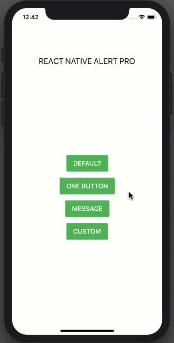 | 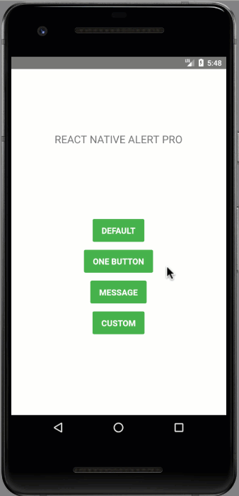 |
## Installation
```
npm i react-native-alert-pro --save
```
### or
```
yarn add react-native-alert-pro
```
## Example
```jsx
import React, { Component } from "react";
import { StyleSheet, View, TouchableOpacity, Text } from "react-native";
import AlertPro from "react-native-alert-pro";
class Example extends Component {
render() {
return (
REACT NATIVE ALERT PRO
this.AlertPro.open()}
style={styles.button}
>
CUSTOM
{
this.AlertPro = ref;
}}
onConfirm={() => this.AlertPro.close()}
title="Delete confirmation"
message="Are you sure to delete the entry?"
textCancel="Cancel"
textConfirm="Delete"
customStyles={{
mask: {
backgroundColor: "transparent"
},
container: {
borderWidth: 1,
borderColor: "#9900cc",
shadowColor: "#000000",
shadowOpacity: 0.1,
shadowRadius: 10
},
buttonCancel: {
backgroundColor: "#4da6ff"
},
buttonConfirm: {
backgroundColor: "#ffa31a"
}
}}
/>
);
}
}
const styles = StyleSheet.create({
container: {
flex: 1,
alignItems: "center",
backgroundColor: "#fff"
},
title: {
fontSize: 20,
marginTop: 120
},
buttonContainer: {
flex: 1,
alignItems: "center",
justifyContent: "center",
backgroundColor: "#FFFFFF"
},
button: {
backgroundColor: "#4EB151",
paddingVertical: 11,
paddingHorizontal: 17,
borderRadius: 3,
marginBottom: 15
},
text: {
color: "#FFFFFF",
fontSize: 16,
fontWeight: "600"
}
});
export default Example;
```
### Dynamic AlertPro
```jsx
renderItem = (item, index) => (
this[AlertPro + index].open()} />
{
this[AlertPro + index] = ref;
}}
title={`AlertPro-${index}`}
onConfirm={() => this[AlertPro + index].close()}
/>
);
```
## Props
| Prop | Type | Description | Default |
| ---------------- | -------- | -------------------------------------------------------- | -------------------------- |
| title | string | AlertPro's title | "Do you want to continue?" |
| message | string | AlertPro's message | "" |
| showCancel | boolean | Show a Cancel button | true |
| showConfirm | boolean | Show a Confirm button | true |
| textCancel | string | Text display on Cancel button | "No" |
| textConfirm | string | Text display on Confirm button | "Yes" |
| closeOnPressMask | boolean | Close AlertPro when press on mask (The empty space area) | true |
| closeOnPressBack | boolean | Press back android to close Bottom Sheet (Android only) | true |
| useNativeDriver | boolean | Allowing native code to perform the animation | false |
| customStyles | object | Custom style to AlertPro | {} |
| onCancel | function | Event on Cancel button | null |
| onConfirm | function | Event on Confirm button | null |
| onClose | function | Callback function when AlertPro has closed | null |
### Available Custom Style
```jsx
customStyles: {
title: {...}, // AlertPro's title
message: {...}, // AlertPro's message
mask: {...}, // The empty space area
container: {...}, // AlertPro container
buttonCancel: {...}, // Cancel button
buttonConfirm: {...}, // Confirm button
textCancel: {...}, // Cancel button's Text
textConfirm: {...} // Confirm button's Text
}
```
## Methods
| Method Name | Description |
| ----------- | -------------- |
| open | Open AlertPro |
| close | Close AlertPro |
## Note
Always set `ref` to `AlertPro` and call each method by using `this.AlertPro.methodName()` like example above.
## Give me a Star
If you think this project is helpful just give me a ⭐️ Star is enough because i don't drink coffee :D
## License
This project is licensed under the MIT License - see the [LICENSE.md](https://github.com/nysamnang/react-native-alert-pro/blob/master/LICENSE) file for details
## Author
Made with ❤️ by [NY Samnang](https://github.com/nysamnang).