https://github.com/obaidurrehman/ng-drag-drop
Drag & Drop for Angular - based on HTML5 with no external dependencies. :tada:
https://github.com/obaidurrehman/ng-drag-drop
angular angular-components angular2 angular4 angular5 drag-drop draggable droppable
Last synced: 8 months ago
JSON representation
Drag & Drop for Angular - based on HTML5 with no external dependencies. :tada:
- Host: GitHub
- URL: https://github.com/obaidurrehman/ng-drag-drop
- Owner: ObaidUrRehman
- License: mit
- Created: 2016-10-19T12:44:39.000Z (about 9 years ago)
- Default Branch: master
- Last Pushed: 2022-07-07T03:42:12.000Z (over 3 years ago)
- Last Synced: 2025-04-03T16:14:15.375Z (8 months ago)
- Topics: angular, angular-components, angular2, angular4, angular5, drag-drop, draggable, droppable
- Language: TypeScript
- Homepage:
- Size: 1.61 MB
- Stars: 240
- Watchers: 17
- Forks: 125
- Open Issues: 75
-
Metadata Files:
- Readme: README.md
- Changelog: CHANGELOG.md
- Contributing: CONTRIBUTING.md
- License: LICENSE
- Code of conduct: CODE_OF_CONDUCT.md
Awesome Lists containing this project
README
# Angular Drag & Drop
## :warning: Discontinuation Notice
Almost 2 years ago I created this component to support HTML native drag drop in Angular. At that time there were a handful of libraries & they did not had the features I wanted. Today, with the release of Angular 7 & the CDK's drag drop component we finally have a much better alternative for this component.
Please use [Angular CDK's drag drop](https://material.angular.io/cdk/drag-drop/overview).
[](https://join.slack.com/t/ng-drag-drop/shared_invite/MjM5ODY5MDUyODY1LTE1MDUyOTk0OTMtNjFhZmJiOTE2Zg)
[](https://www.npmjs.com/package/ng-drag-drop)
[](https://www.npmjs.com/package/ng-drag-drop)
[](https://travis-ci.org/ObaidUrRehman/ng-drag-drop)
[](https://www.codacy.com/app/orehman/ng-drag-drop?utm_source=github.com&utm_medium=referral&utm_content=ObaidUrRehman/ng-drag-drop&utm_campaign=Badge_Grade)
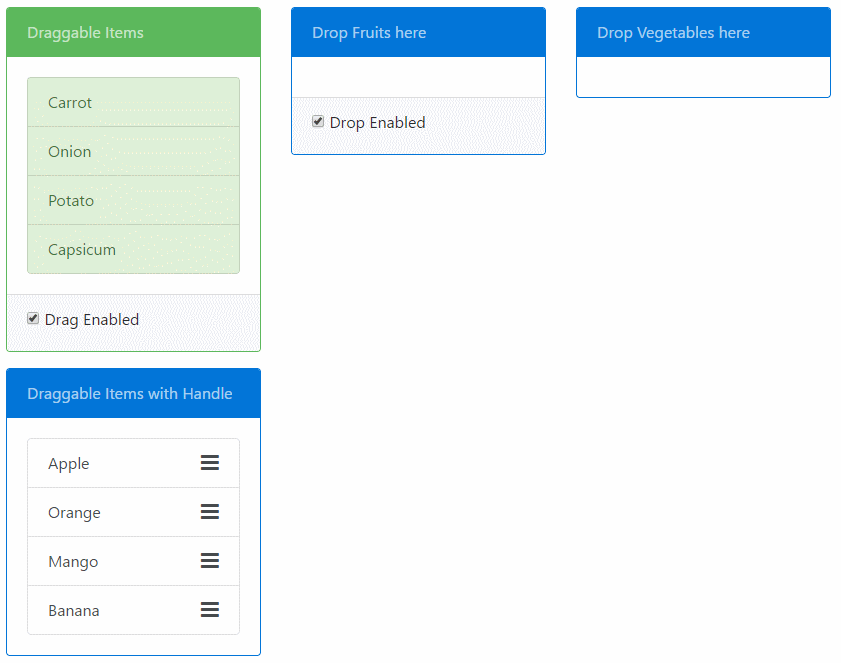
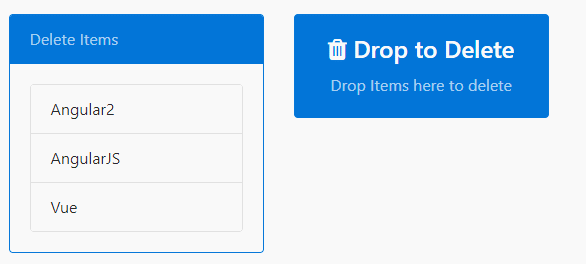
Drag & Drop for [Angular](http://angular.io), based on HTML5 with no external dependencies. Provides `draggable` & `droppable` directives. Features:
* Transfer data from `draggable` to `droppable`.
* Restrict drop based on drag-drop scopes.
* Restrict drag to happen from either drag handles or the entire element.
* Add custom drag Helper Image
* Ability to add custom visual cue styles.
# Content
1. [Demo](#demo)
2. [Installation](#installation)
3. [Usage](#usage)
4. [Limitations](#limitations)
5. [Development](#development)
6. [API Doc](#api-doc)
7. [Tips and Tricks](#tips-and-tricks)
# Demo
Check out the [Plunker demo](http://plnkr.co/edit/2bjGgzWnbFrciEiCKLew?p=preview).
The [demo folder](https://github.com/ObaidUrRehman/ng-drag-drop/tree/master/demo) of the repository contains the same demo as Plunkr that uses SystemJS. To run that demo do an `npm install` in that folder followed by `npm start` to serve the demo app.
# Installation
```js
npm install ng-drag-drop --save
```
# Usage
### Import default styles
Import `style.css` into your index.html. It has a set of default styles that will be applied upon drag operations. This is totally optional and you can modify the styles as per your need. See the [Adding visual cues](#adding-visual-cues) Section.
```html
```
### Update SystemJS config
If you use SystemJS as your module loader then you will need to update the config to load the `ng-drag-drop` module.
```js
System.config({
map: {
'ng-drag-drop': 'node_modules/ng-drag-drop'
},
packages: {
'ng-drag-drop': { main: 'index.js', defaultExtension: 'js' },
}
});
```
### Import `NgDragDropModule`
You need to import the `NgDragDropModule` in the module of your app where you want to use it.
```js
import { NgModule } from '@angular/core';
import { BrowserModule } from '@angular/platform-browser';
import { DemoComponent } from "./components/demo-component";
import { NgDragDropModule } from 'ng-drag-drop';
@NgModule({
imports: [
BrowserModule,
NgDragDropModule.forRoot()
],
declarations: [DemoComponent],
bootstrap: [DemoComponent]
})
export class AppModule {}
```
### Use the `draggable` & `droppable` directives
Place the `draggable` directive on an element that you want to be draggable. The following example makes the
List item draggable:
```html
- Coffee
- Tea
- Milk
```
Similarly use the `droppable` directive on an element where you want to drop `draggable`:
```html
Drop items here
```
### Restrict Drop based on Scopes
You can use the `dragScope` & `dropScope` property on `draggable` and `droppable` respectively to restrict user from dropping a `draggable` element into a `droppable`.
The Scope properties can be string, an Array of string (to indicate multiple scope) or a function. The scopes must match in both to indicate compatible drag-drop zones.
In the following example, only the `draggable` with the `drink` dropScope can be dropped on the first `droppable` and both `drink` and `meal` can be dropped in the second one.
```html
- Coffee
- Tea
- Biryani
- Kebab
...
```
```html
Only Drinks can be dropped in the above container
Both Meal and Drinks can be dropped in the above container
```
### Drop Scope as Functions
The `DropScope` of the `droppable` can be a function whose return value will determine if drop is allowed.
This can be useful to implement complex logic that is otherwise not possible with string or array of string.
```html
Only those items are droppable for which the `isDropAllowed()` function returns true
```
Here is how the function is defined in the component:
```js
export class MyComponent {
val = 500;
isDropAllowed = (dragData: any) => {
return dragData > this.val;
}
}
```
Notice how the function is defined as an [Arrow Function](https://www.typescriptlang.org/docs/handbook/functions.html). You need to do this so the
lexical scope of `this` is preserved. You also get the `dragData` in the parameter so you can compare it with whatever you want.
If `DropScope` is a function, it can also return an `Observable`, which needs to later resolve to `true` or `false`. This can help in cases when
you need to check asynchronously (eg: via http) whether the drop is allowed.
```js
export class MyComponent {
val = 500;
isDropAllowed = (dragData: any) => {
// Resolves to true or false after 1 second
return Observable.of(dragData > this.val).delay(1000);
}
}
```
### Transfer Data via Drag Drop
You can transfer data from the `draggable` to the `droppable` via the `dragData` property on the `draggable` directive.
The data will be received in the `(onDrop)` event of the `droppable`:
```js
import {Component} from '@angular/core';
@Component({
selector: 'app',
template: `
Transfer Data via Drag Drop
- {{item.name}}
`
})
export class AppComponent {
items = [
{name: "Apple", type: "fruit"},
{name: "Carrot", type: "vegetable"},
{name: "Orange", type: "fruit"}];
onItemDrop(e: any) {
// Get the dropped data here
this.droppedItems.push(e.dragData);
}
constructor() { }
}
```
### Drag Handle
Drag Handle can be defined for a `draggable` item which will restrict drag of the element unless the item is dragged from the specified element.
The handle should be a valid selector string. Example:
```html
Not Draggable by list item but by the handle only.
```
### Drag Helper Image
By default when an element is dragged, a translucent image is generated from the drag target. This image is generated automatically and varies with browser. A custom image can be used if desired. Pass the url of the image to `[dragImage]` on the `draggable` directive.
```html
Not Draggable by list item but by the handle only.
```
__Compatibility:__ This only works on Chrome & Firefox. Not supported on Edge.
### Adding visual cues
Both the `draggable` & `droppable` directives take a bunch of inputs that let you apply class on various events. You can find the list below. Another thing you can do is clone the `style.css` that comes with this package and customize it as per your requirement.
__Draggable Directive__
1. [dragHandleClass](#draggable-directive)
2. [dragClass](#draggable-directive)
3. [dragTransitClass](#draggable-directive)
__Droppable Directive__
1. [dragOverClass](#droppable-directive)
2. [dragHintClass](#droppable-directive)
Here is how a custom class is applied to a draggable element:
```html
Drop items here
```
# Limitations
This library uses [Native Html5 drag & drop API](https://developer.mozilla.org/en-US/docs/Web/API/HTML_Drag_and_Drop_API) to accomplish what it does. Because of this, certain aspects are not customizable and some UI behaviour is browser specific.
So if you were to see the demo under Edge or Chrome/Firefox you'll see that these browsers show a different behaviour when an Item is being dragged. Simlarly Edge does not let you set a custom dragImage while others do. Another major issues is that we can't control the opacity of the ghost element of item being dragged.
To overcome these issues we'll need to implement our own drag drop functionality instead of relying on the Native Html API which at this point in time, is beyond the scope of this component. Libraries like [Dragula](http://valor-software.com/ng2-dragula/), [JQuery Draggable](https://jqueryui.com/draggable/), [Interact.js](http://interactjs.io/) to name a few, can provide you with alternatives.
## Touch Support
HTML5 Drag drop is not touch supported but you can use the [DragDropTouch](https://github.com/Bernardo-Castilho/dragdroptouch) Polyfill.
# Development
To start the dev flow on your system, follow these steps:
1. `npm install` on the root of this repo.
2. `npm install` in the demo folder. This is where the demo app resides. Sort of a test & play yard for ng-drag-drop package.
3. Next you need to sym-link your package with the demo folder so your changes to the package are reflected in the demo app. Please remember the demo and the package are seperate apps & the demo app does not get published to npm. To link run `npm link` on the root of the repo followed by `npm link ng-drag-drop` in demo folder. You can read more about `npm link` [here](https://docs.npmjs.com/cli/link).
4. Finally run `npm run dev` at the root. This will open up the demo app in browser.
5. Now you can make changes to the actual component or the demo app and debug. Please note that changing the code of demo app will autoreload the browser but you'll need to manually refresh the page if you change the component code.
__Note:__ The steps are a bit involved at this time and will be simplified to an npm script in later releases.
# API Doc
### Draggable directive
### Attributes
| Name | Type |Default Value |Description |
|:-------|:----------|:-------------|:-----------|
| `dragData` | `any` | `null` | The data that will be avaliable to the droppable directive on its `onDrop()` event. |
| `dragScope` | `string | Array` | `'default'` | Defines compatible drag drop pairs. Values must match with `droppable.dropScope`. |
| `dragClass` (previously `dragOverClass`) | `string` | `'drag-border'` | CSS class applied on the draggable that is applied when the item is being dragged. |
| `dragTransitClass` | `string` | `'drag-transit'` | CSS class applied on the drag helper translucent element clone. |
| `dragHandleClass` | `string` | `'drag-handle'` | The CSS class applied to a draggable element. If a dragHandle is defined then its applied to that handle element only. By default it is used to change the mouse over pointer. |
| `draghandle` | `string` | `null` | The selector that defines the drag Handle. If defined drag will only be allowed if dragged from the selector element. |
| `dragImage` | `string` | `null` | The url to image that will be used as custom drag image when the draggable is being dragged. |
| `dragEnabled` | `boolean` | `true` | Defines if drag is enabled. `true` by default. |
### Events
| Name | Parameters |Description |
|:-------|:------------|:-----------|
| `onDragStart` | e: DOM event | Event fired when Drag is started |
| `onDrag` | e: DOM event | Event fired while the element is being dragged |
| `onDragEnd` | e: DOM event | Event fired when dragged ends |
For more information on Drag DOM Events: [Drag Event](https://developer.mozilla.org/en-US/docs/Web/API/DragEvent)
### Droppable directive
### Attributes
| Name | Type |Default Value |Description |
|:-------|:----------|:-------------|:-----------|
| `dropScope` | `string | Array` | `'default'` | Defines compatible drag drop pairs. Values must match with `draggable.dragScope` |
| `dragOverClass` | `string` | `'drag-over-border'` | CSS class applied on the droppable element when the item is being dragged over valid drop target. |
| `dragHintClass` | `string` | `'drag-hint-border'` | CSS class applied on this droppable when a compatible draggable item is being dragged. This can be used to visually show allowed drop zones. |
| `dropEnabled` | `boolean` | `true` | Defines if drop is enabled. `true` by default. |
### Events
| Name | Parameters |Description |
|:-------|:------------|:-----------|
| `onDragEnter` | e: DOM event | Event fired when Drag dragged element enters a valid drop target. |
| `onDragOver` | e: DOM event | Event fired when an element is being dragged over a valid drop target. |
| `onDragLeave` | e: DOM event | Event fired when a dragged element leaves a valid drop target. |
| `onDrop` | e: `DropEvent` | Event fired when an element is dropped on a valid drop target. |
# Tips And Tricks
### Change cursor to "move" or "copy" when Ctrl-key is pressed/released
In Chrome and Edge (Windows 10 - not tested in other browser/OS), when you drag an element, the cursor changes to "move" whether or not you press the Ctrl-key.
Fortunately, it's easy to change this behavior.
On the draggable element, you bind to the events "onDragStart", "onDragOver", "onDragLeave", and manipulate the cursor in the bound method of the component.
So, in the template :
```html
```
And in the *.ts file :
```js
onItemDragStart(event) {
event.dataTransfer.dropEffect = event.ctrlKey ? 'copy' : 'move';
}
onItemDragOver(event) {
event.dataTransfer.dropEffect = event.ctrlKey ? 'copy' : 'move';
}
onItemDragLeave(event) {
event.dataTransfer.dropEffect = event.ctrlKey ? 'copy' : 'move';
}
```
In the droppable element, here's how you find if the Ctrl-key is pressed or not :
In the template :
```html
```
In the component's *.ts file :
```js
onItemDrop(event) {
const isCopy = event.nativeEvent.ctrlKey;
// do something with the dropped item
}
```
# License
MIT