https://github.com/open-wc/api-viewer-element
API documentation and live playground for Web Components. Based on Custom Elements Manifest format
https://github.com/open-wc/api-viewer-element
custom-elements lit-element webcomponents
Last synced: about 1 year ago
JSON representation
API documentation and live playground for Web Components. Based on Custom Elements Manifest format
- Host: GitHub
- URL: https://github.com/open-wc/api-viewer-element
- Owner: open-wc
- License: mit
- Created: 2019-10-21T18:32:03.000Z (over 6 years ago)
- Default Branch: master
- Last Pushed: 2025-04-10T07:17:44.000Z (over 1 year ago)
- Last Synced: 2025-05-10T10:37:54.873Z (about 1 year ago)
- Topics: custom-elements, lit-element, webcomponents
- Language: TypeScript
- Homepage: https://api-viewer.open-wc.org
- Size: 3.09 MB
- Stars: 275
- Watchers: 10
- Forks: 29
- Open Issues: 18
-
Metadata Files:
- Readme: README.md
- Changelog: CHANGELOG.md
- Contributing: CONTRIBUTING.md
- License: LICENSE.md
- Code of conduct: CODE_OF_CONDUCT.md
Awesome Lists containing this project
README
# <api-viewer>
API documentation and live playground for Web Components. Based on [custom elements manifest](https://github.com/webcomponents/custom-elements-manifest) JSON format.
```html
```
[Documentation →](https://api-viewer.open-wc.org/docs/guide/intro/)
[Live Demo →](https://api-viewer.open-wc.org/docs/examples/api-viewer/)
[ ](https://api-viewer.open-wc.org)
[ ](https://api-viewer.open-wc.org)
## Features
- [API docs viewer](https://api-viewer.open-wc.org/docs/guide/writing-jsdoc/)
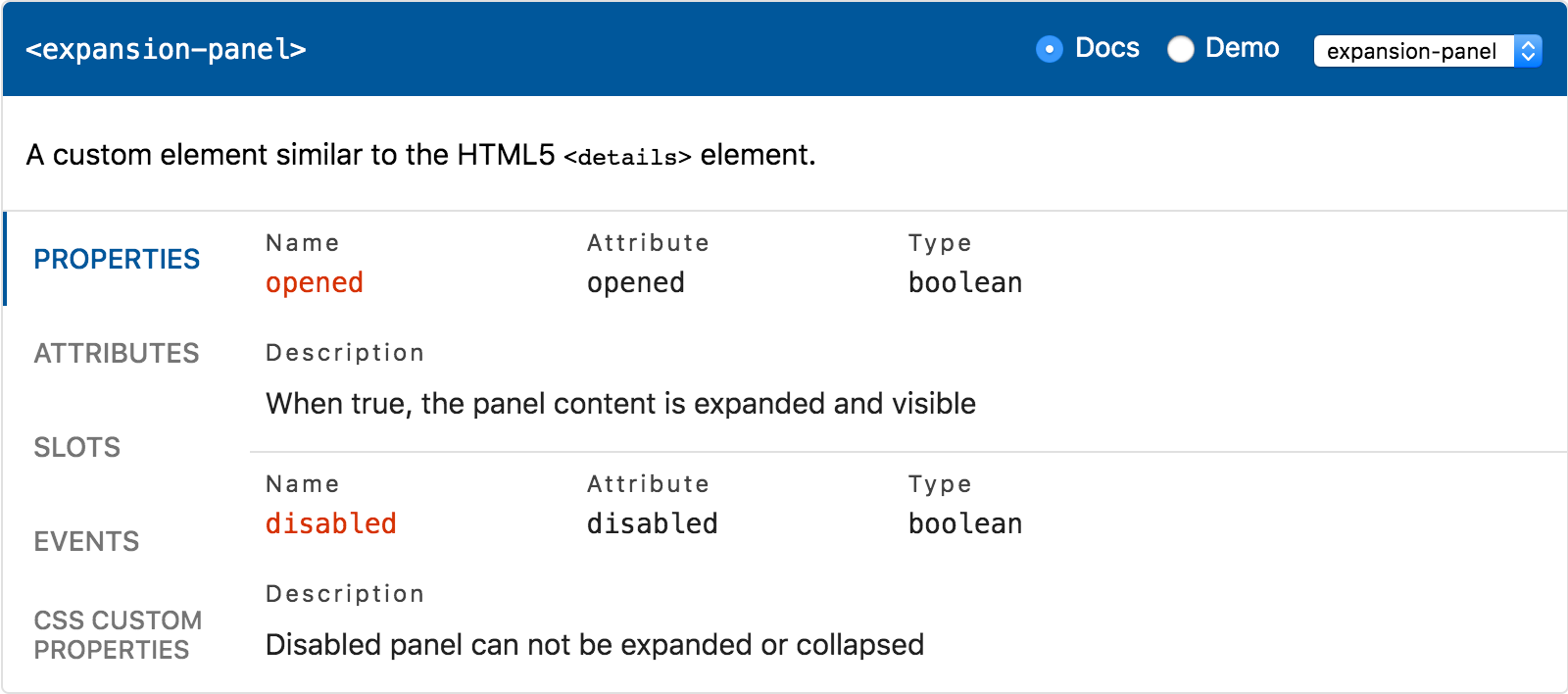
- [Properties](https://api-viewer.open-wc.org/docs/guide/writing-jsdoc/#properties) - JS properties publicly exposed by the component.
- [Attributes](https://api-viewer.open-wc.org/docs/guide/writing-jsdoc/#attributes) - HTML attributes (except those that match properties).
- [Events](https://api-viewer.open-wc.org/docs/guide/writing-jsdoc/#events) - DOM events dispatched by the component.
- [Slots](https://api-viewer.open-wc.org/docs/guide/writing-jsdoc/#slots) - Default `` and / or named slots, if any.
- [CSS Custom Properties](https://api-viewer.open-wc.org/docs/guide/writing-jsdoc/#css-custom-properties) - Styling API of the component.
- [CSS Shadow Parts](https://api-viewer.open-wc.org/docs/guide/writing-jsdoc/#css-shadow-parts) - Elements that can be styled using `::part()`.
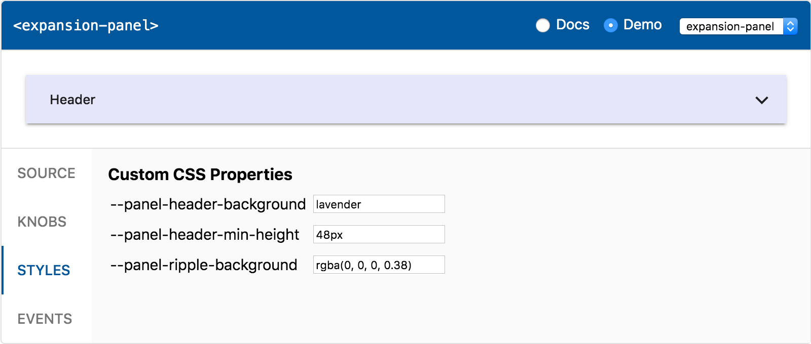
- [Live playground](https://api-viewer.open-wc.org/docs/guide/using-demo/)
- [Source](https://api-viewer.open-wc.org/docs/guide/using-demo/#source) - Code snippet matching the rendered component.
- [Knobs](https://api-viewer.open-wc.org/docs/guide/using-demo/#knobs) - Change properties and slotted content dynamically.
- [Styles](https://api-viewer.open-wc.org/docs/guide/using-demo/#styles) - Change values of the custom CSS properties.
- [Event log](https://api-viewer.open-wc.org/docs/guide/using-demo/#events) - Output the events fired by the component.
- [Templates](https://api-viewer.open-wc.org/docs/api/templates/) - Provide additional HTML to be shown.
## Install
```sh
npm install api-viewer-element
```
Check out the [Getting Started](https://api-viewer.open-wc.org/docs/guide/intro/#usage) guide.
## Usage
The following web components are available:
- [``](https://api-viewer.open-wc.org/docs/api/elements/#api-viewer-element)
- [``](https://api-viewer.open-wc.org/docs/api/elements/#api-docs-element)
- [``](https://api-viewer.open-wc.org/docs/api/elements/#api-demo-element)
## Contributing
### Install dependencies
```sh
yarn
```
### Run demo in browser
```sh
yarn dev
```
Open http://127.0.0.1:8000
### Run the docs locally
```sh
yarn start
```
Open http://127.0.0.1:8000
### Build the docs site
```sh
yarn dist
```
## Acknowledgements
- Big thanks to [@thepassle](https://github.com/thepassle) for creating Custom Elements Manifest Analyzer, that this project is built upon.
- Big thanks to [@runem](http://github.com/runem) for creating [Web Component Analyzer](https://github.com/runem/web-component-analyzer) used in older versions of API Viewer.
- Big thanks to [Modern Web](https://modern-web.dev) for [Web Dev Server](https://modern-web.dev/docs/dev-server/overview/) and [Rocket](https://rocket.modern-web.dev) used for the documentation website.
- Thanks to [@bahrus](https://github.com/bahrus) for [wc-info](https://github.com/bahrus/wc-info), a similar web component that served as a source of inspiration for me.
- The `@api-viewer/tabs` web component is based on [tabs example](https://github.com/GoogleChromeLabs/howto-components/tree/master/elements/howto-tabs) from [HowTo: Components](https://developers.google.com/web/fundamentals/web-components/examples) project.
- The visual appearance is largely inspired by older version of [Vuetify](https://vuetifyjs.com/en/getting-started/quick-start) API documentation.