https://github.com/osameh15/input-dialog
A beautiful, zero-dependency input dialog module for Nuxt 3 and Nuxt 4 — no Vuetify or icon-font required. Drop it in, call useInputDialog().promptText(...), await the typed value.
https://github.com/osameh15/input-dialog
front-end inputdialog modern-design nuxt nuxt3 nuxt4 nuxtjs typescript vue vue3 vuejs
Last synced: 21 days ago
JSON representation
A beautiful, zero-dependency input dialog module for Nuxt 3 and Nuxt 4 — no Vuetify or icon-font required. Drop it in, call useInputDialog().promptText(...), await the typed value.
- Host: GitHub
- URL: https://github.com/osameh15/input-dialog
- Owner: osameh15
- License: mit
- Created: 2026-04-28T16:13:46.000Z (about 2 months ago)
- Default Branch: main
- Last Pushed: 2026-05-21T21:23:02.000Z (22 days ago)
- Last Synced: 2026-05-22T06:52:40.358Z (22 days ago)
- Topics: front-end, inputdialog, modern-design, nuxt, nuxt3, nuxt4, nuxtjs, typescript, vue, vue3, vuejs
- Language: Vue
- Homepage: https://www.npmjs.com/package/nuxt-input-dialog
- Size: 4.2 MB
- Stars: 2
- Watchers: 0
- Forks: 0
- Open Issues: 0
-
Metadata Files:
- Readme: README.md
- Contributing: docs/contributing.md
- License: LICENSE
Awesome Lists containing this project
README
# nuxt-input-dialog
[](https://github.com/osameh15/input-dialog/actions/workflows/ci.yml)
[](./LICENSE)
A beautiful, zero-dependency input dialog module for **Nuxt 3 and Nuxt 4** — no Vuetify or icon-font required. Drop it in, call `useInputDialog().promptText(...)`, await the typed value.
- 🎨 **Polished look** — dark radial gradient, colored borders per type, decorative top icon, blurred backdrop
- 🧩 **Standalone** — no Vuetify, no MDI, no extra CSS framework
- ⚡️ **Auto-mounted** — no boilerplate, just call `useInputDialog().promptText('Rename', 'New name')`
- 🎯 **Promise-based API** — `await dialog.promptText(...)` returns the value or `null`; `show()` returns `{ action, values }`
- 🧠 **Fully typed** — written in TypeScript with full IntelliSense
- 📝 **7 field types** — `text`, `password`, `email`, `number`, `textarea`, `select`, `autocomplete`
- ✅ **Validation rules** — `(value) => true | string`, runs on blur and on submit
- 🔍 **Smart autocomplete** — type a value not in the list to "Create new", with optional path-formatting (auto trailing slash) or custom formatter
- 🔘 **1 / 2 / 3 button layouts** — default Cancel/Submit or custom buttons with named actions
- ⌨️ **Keyboard friendly** — `Enter` submits, `Esc` cancels, focus moves to first field on open and is restored on close
- 🔤 **Modern typography** — bundled **Shabnam** for Persian/Arabic + **Inter** for Latin (both opt-out)
- 🌐 **Auto RTL** — dialogs containing Arabic/Persian script switch to `dir="rtl"` automatically (detection runs across title, message, warning, and every field's label/placeholder/hint)
- ♿ **Accessible** — `role="alertdialog"`, `aria-modal`, `aria-labelledby`
---
## Table of contents
- [Installation](#installation)
- [Quick start](#quick-start)
- [Module options](#module-options)
- [Composable API — `useInputDialog()`](#composable-api--useinputdialog)
- [Field types](#field-types)
- [Validation rules](#validation-rules)
- [Autocomplete with create-new](#autocomplete-with-create-new)
- [Custom buttons](#custom-buttons)
- [Component API](#component-api)
- [Theme](#theme)
- [Customization](#customization)
- [TypeScript](#typescript)
- [Development](#development)
- [License](#license)
For deeper technical reference (architecture, design rationale, contributing), see [`docs/`](./docs/README.md).
---
## Installation
```bash
npm install nuxt-input-dialog
# or
pnpm add nuxt-input-dialog
# or
yarn add nuxt-input-dialog
```
```ts
// nuxt.config.ts
export default defineNuxtConfig({
modules: ['nuxt-input-dialog'],
})
```
That's it — `useInputDialog()` is auto-imported and an `` is mounted automatically on the client.
---
## Quick start
```vue
const dialog = useInputDialog()
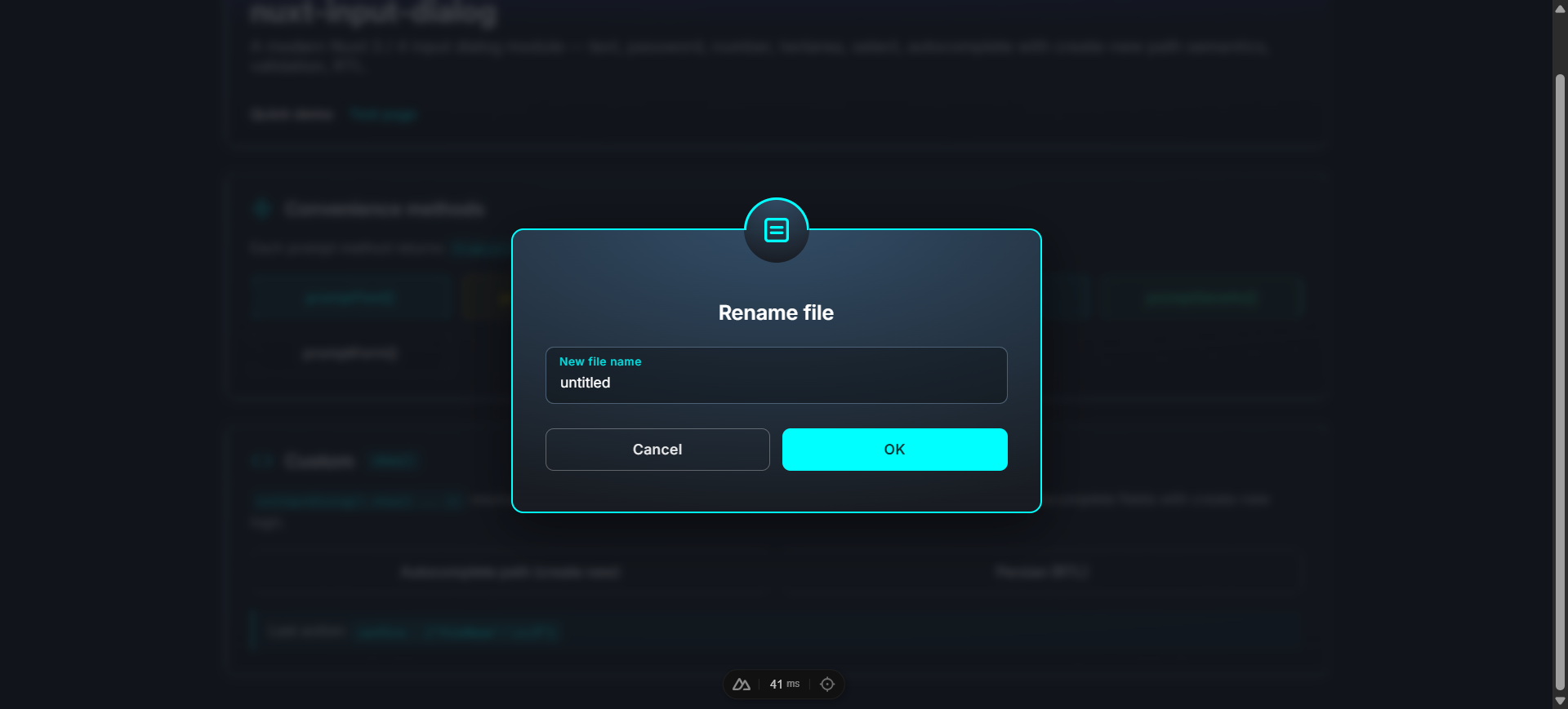
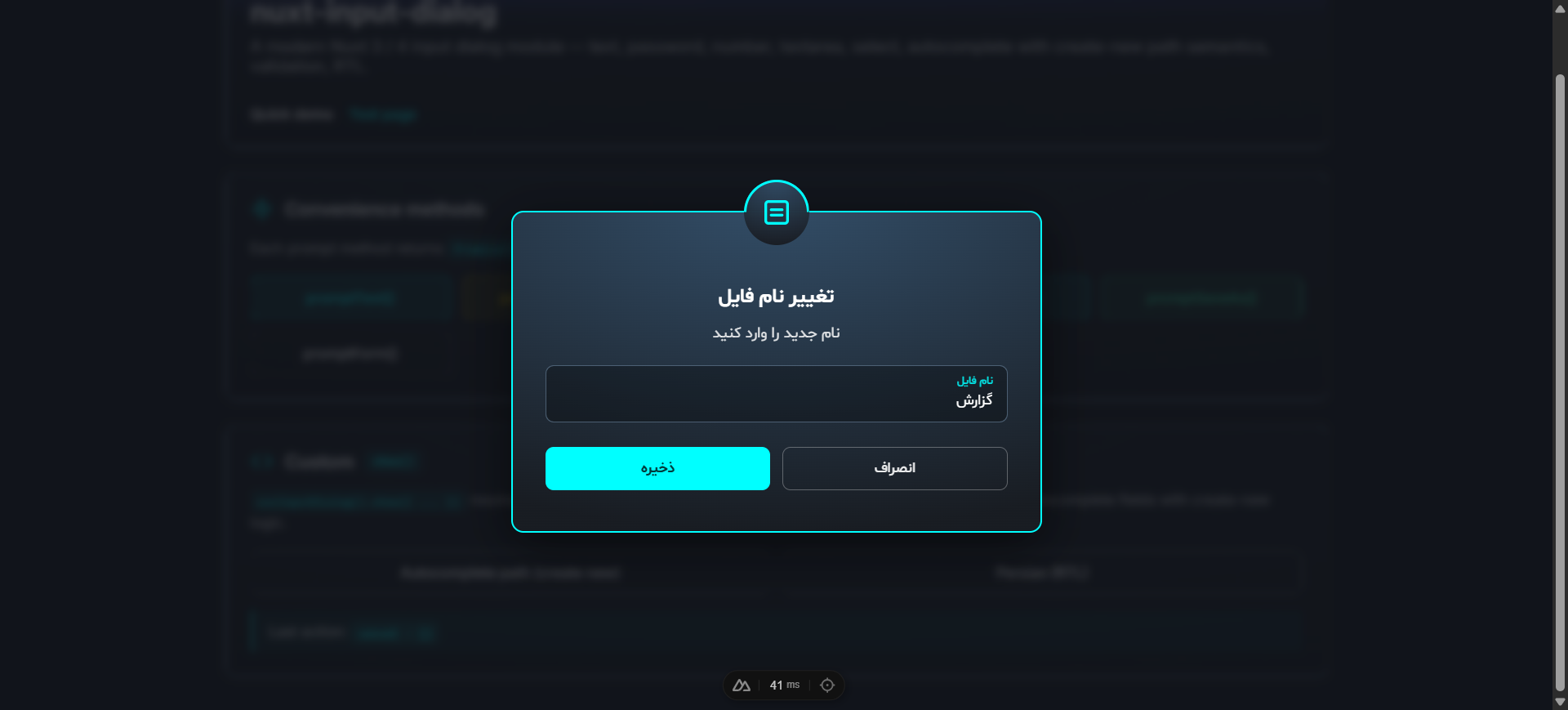
const onRename = async () => {
const newName = await dialog.promptText('Rename file', 'New file name', {
defaultValue: 'untitled',
rules: [v => (typeof v === 'string' && v.length > 0) || 'Name is required'],
})
if (newName !== null) await api.rename(newName)
}
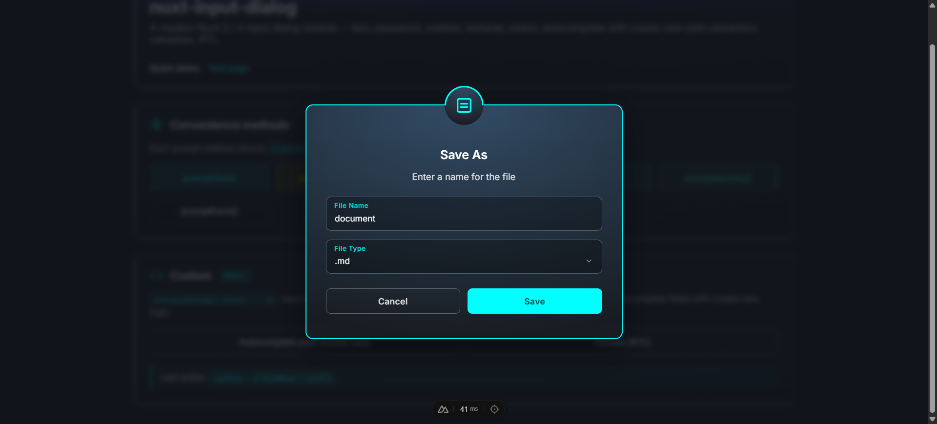
const onSaveAs = async () => {
const result = await dialog.promptSaveAs('document', {
extensions: ['.txt', '.md', '.json'],
defaultExtension: '.md',
})
if (result) await api.save(result.fullName) // 'document.md'
}
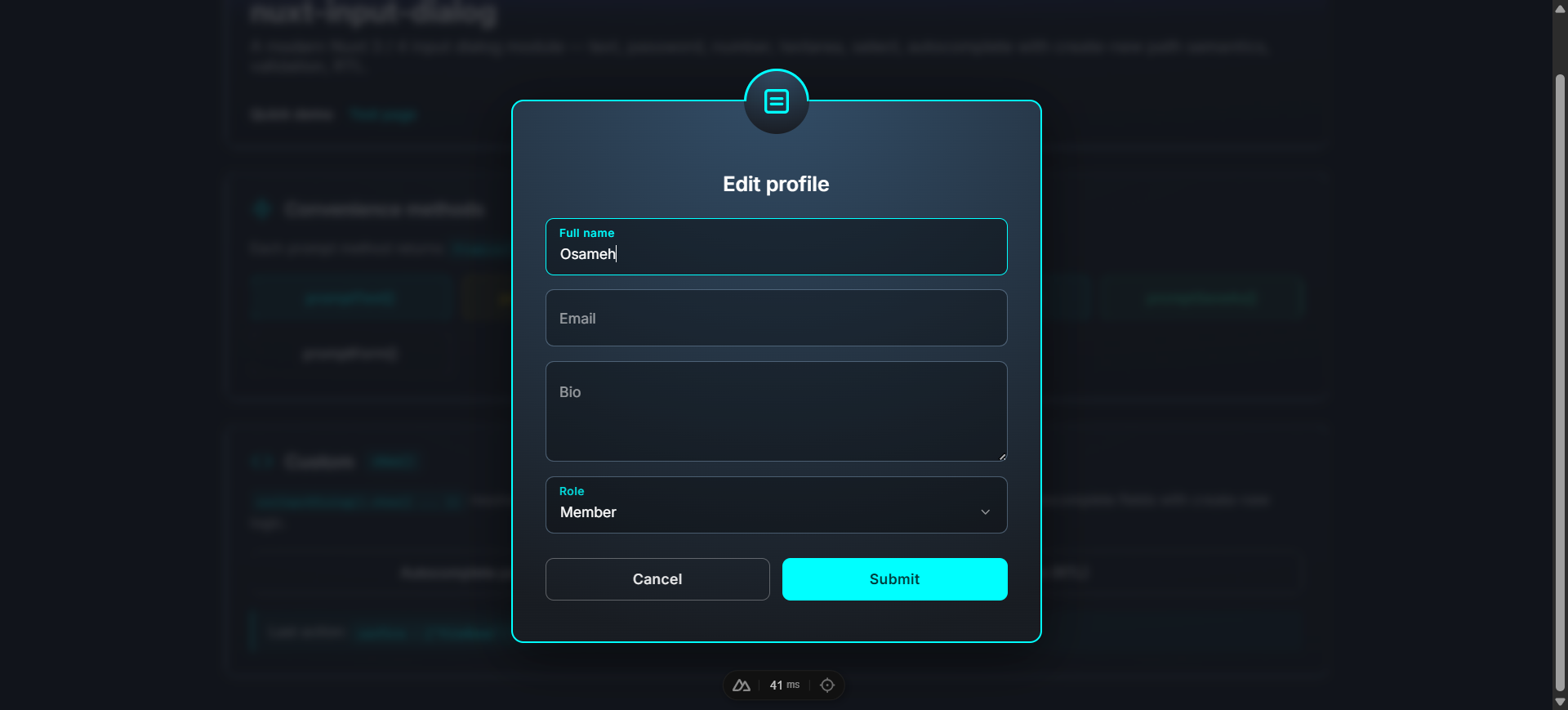
const onSignup = async () => {
const values = await dialog.promptForm('Create account', [
{ key: 'username', type: 'text', label: 'Username', rules: [v => /^[a-z0-9_]{3,20}$/.test(String(v)) || 'Invalid'] },
{ key: 'email', type: 'email', label: 'Email', rules: [v => /\S+@\S+\.\S+/.test(String(v)) || 'Invalid email'] },
{ key: 'password', type: 'password', label: 'Password', rules: [v => String(v).length >= 8 || 'At least 8 chars'] },
{ key: 'role', type: 'select', label: 'Role', items: ['Member', 'Admin'], defaultValue: 'Member' },
])
if (values) await api.signup(values)
}
```
The bundled playground exercises every feature — convenience methods, custom `show()`, validation, autocomplete with create-new, multi-field forms, and Persian RTL:
---
## Module options
Configure under the `inputDialog` key in `nuxt.config.ts`:
```ts
export default defineNuxtConfig({
modules: ['nuxt-input-dialog'],
inputDialog: {
autoMount: true,
closeOnBackdropClick: false,
escapeToCancel: true,
prefix: 'Input',
loadShabnamFont: true,
loadInterFont: true,
},
})
```
| Option | Type | Default | Description |
| ---------------------- | --------- | ----------- | ----------- |
| `autoMount` | `boolean` | `true` | Mounts an `` automatically on the client. |
| `closeOnBackdropClick` | `boolean` | `false` | Backdrop click cancels. Default off so a misclick doesn't lose typed data. |
| `escapeToCancel` | `boolean` | `true` | Escape key cancels. |
| `prefix` | `string` | `'Input'` | Component name prefix. With the default, components are `` and ``. |
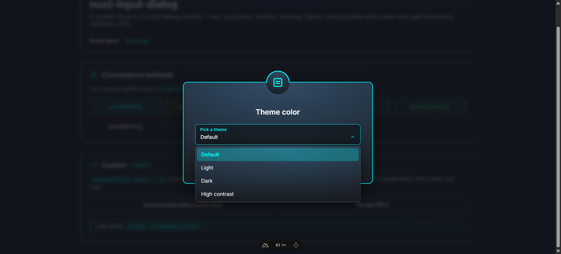
| `theme` | `'dark' \| 'light'` | `'dark'` | Initial visual theme. Switch at runtime with `useInputDialog().setTheme(...)` or override per-container with the `theme` prop. |
| `loadShabnamFont` | `boolean` | `true` | Inject the bundled Persian "Shabnam" font (gated by `unicode-range`). |
| `loadInterFont` | `boolean` | `true` | Add Inter (Google Fonts) via a `` in the head. |
---
## Composable API — `useInputDialog()`
```ts
const dialog = useInputDialog()
```
### `show(options)`
Open a dialog. Returns `Promise<{ action, values }>`. Always resolves, never rejects.
```ts
const { action, values } = await dialog.show({
title: 'Rename',
fields: [{ key: 'name', type: 'text', label: 'New name' }],
})
if (action === 'confirm') console.log(values.name)
```
| Option | Type | Default |
| -------------- | ----------------------------------------------- | ------------- |
| `type` | `'success' \| 'warning' \| 'error' \| 'info'` | `'info'` |
| `title` | `string` | required |
| `message` | `string \| null` | `null` |
| `fields` | `InputField[]` | required |
| `initialValues`| `Record` | `{}` |
| `warningText` | `string \| null` | `null` |
| `confirmText` | `string` | `'Submit'` |
| `cancelText` | `string` | `'Cancel'` |
| `buttons` | `InputDialogButton[] \| null` | `null` |
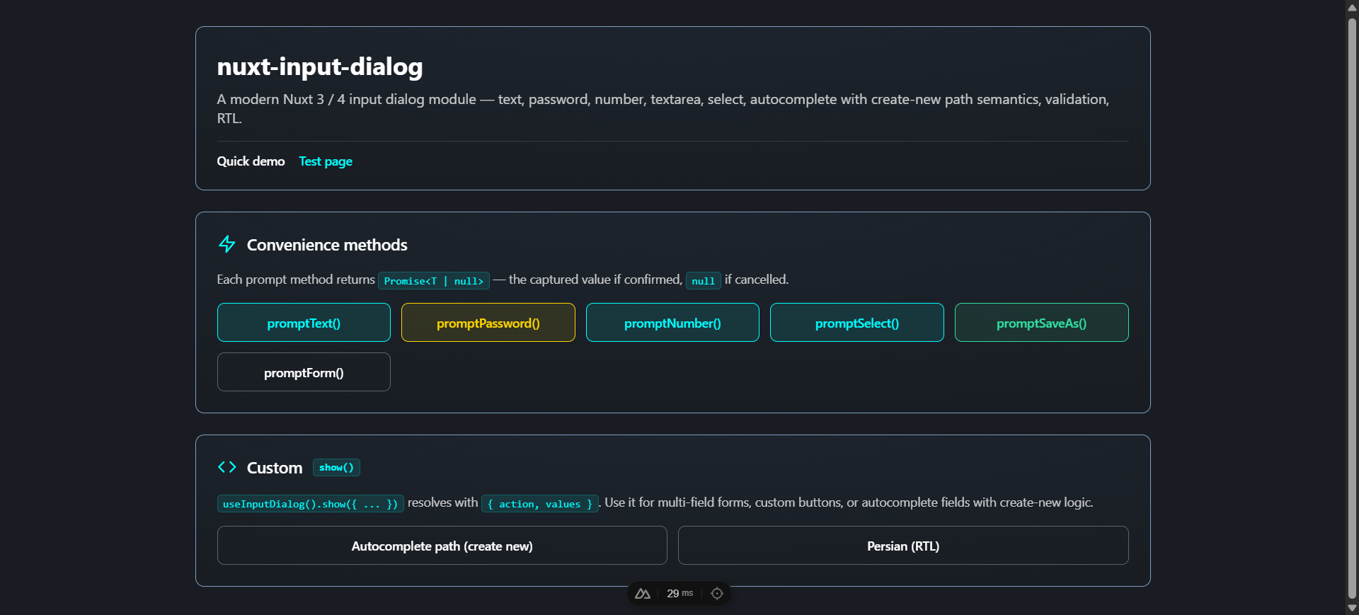
### Convenience methods
All return primitive values (or `null` on cancel) — no boilerplate to extract from `values`:
```ts
const name: string | null = await dialog.promptText('Title', 'Label')
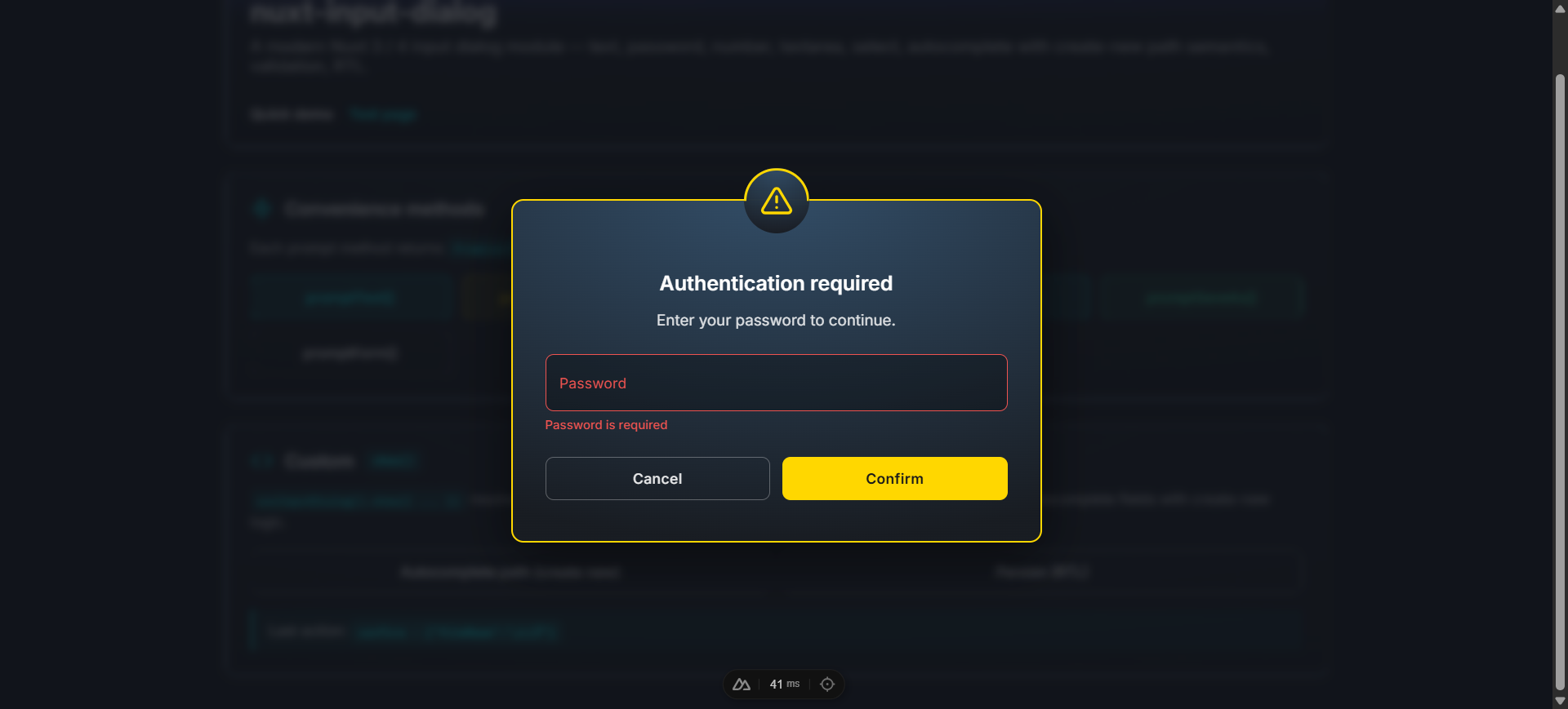
const pwd: string | null = await dialog.promptPassword('Authenticate')
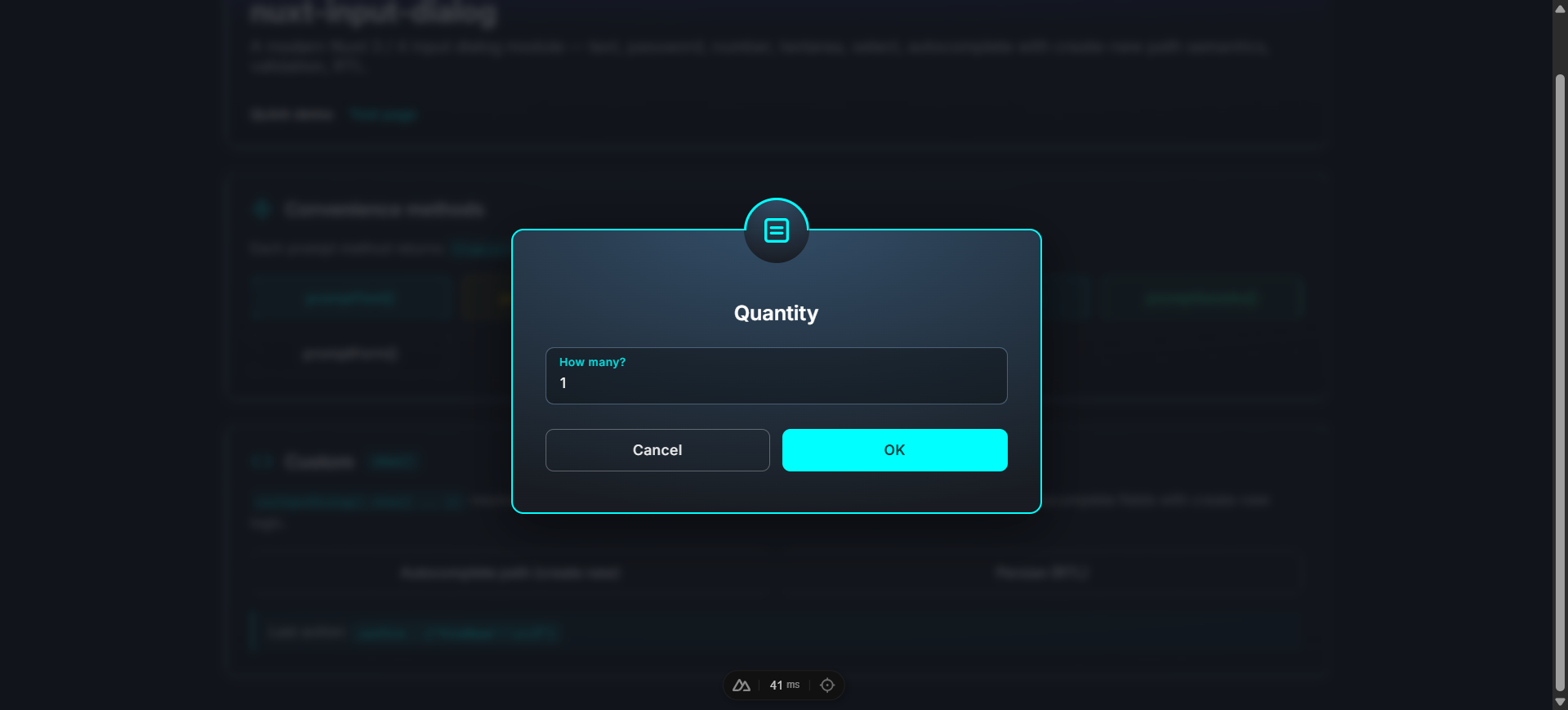
const qty: number | null = await dialog.promptNumber('Quantity', 'How many?')
const color: string | null = await dialog.promptSelect('Color', 'Pick', ['red', 'green', 'blue'])
const file = await dialog.promptSaveAs('document', { extensions: ['.md', '.txt'] })
// ↑ { fileName, extension?, fullName? } | null
const values: Record | null = await dialog.promptForm('Title', [...fields])
```
promptSaveAs (file name + extension select)
promptForm (multi-field form)
---
## Field types
```ts
interface InputField {
key: string
type: 'text' | 'password' | 'email' | 'number' | 'textarea' | 'select' | 'autocomplete'
label: string
placeholder?: string
hint?: string | null
rules?: InputFieldRule[]
defaultValue?: unknown
// for textarea
rows?: number
// for select / autocomplete
items?: unknown[]
// for autocomplete
createNew?: false | 'path' | ((rawValue: string) => string)
}
```
| Type | Renders | Notes |
| ------------- | ------------------ | ----------------------------------------------- |
| `text` | `` | Pressing Enter submits the form |
| `password` | `` | |
| `email` | `` | Use the `@` validation rule of your choice |
| `number` | `` | |
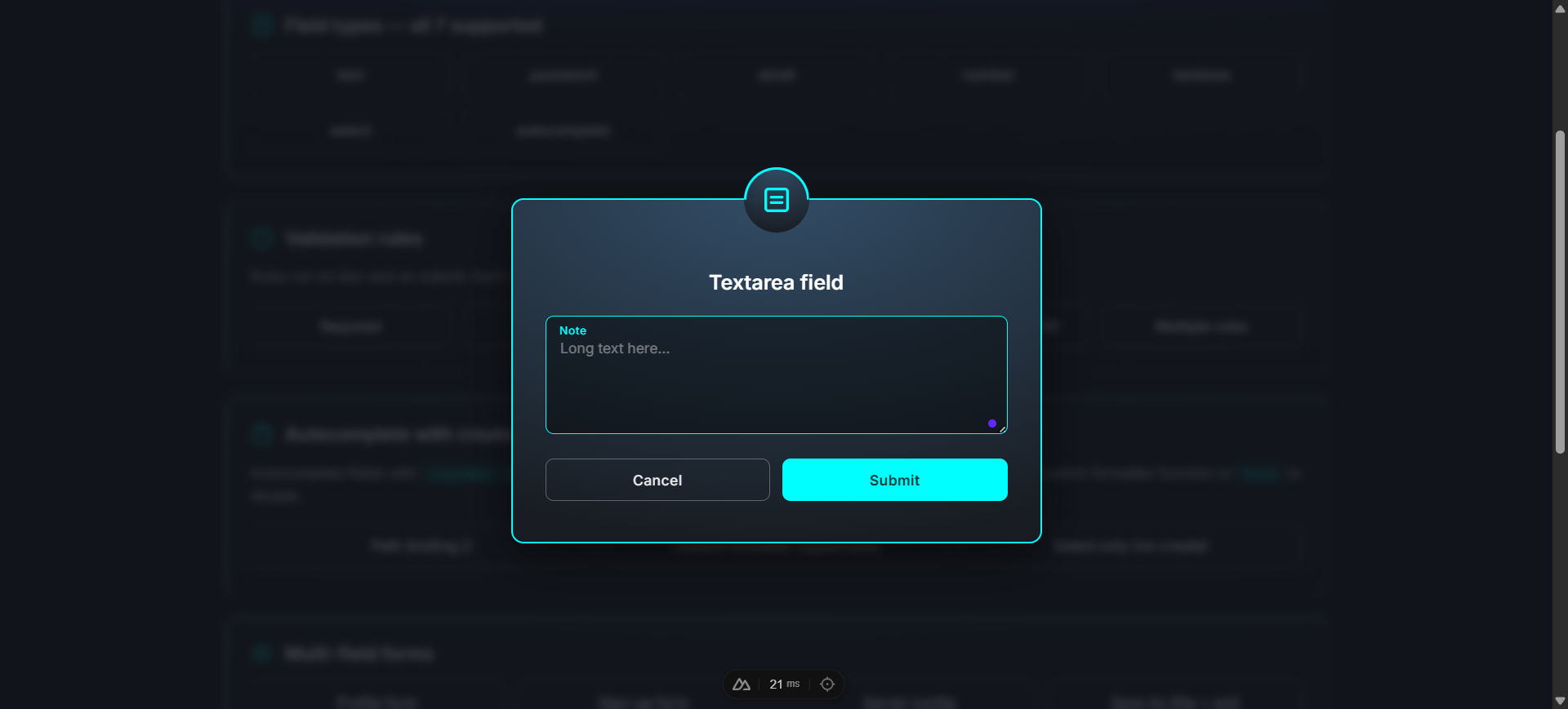
| `textarea` | `` | `rows` controls initial height |
| `select` | Custom dropdown | Single-select from `items` array |
| `autocomplete`| Custom search-box | Filter `items`, optionally suggest a new value |
password (required-rule error)
number
textarea
select (open dropdown)
---
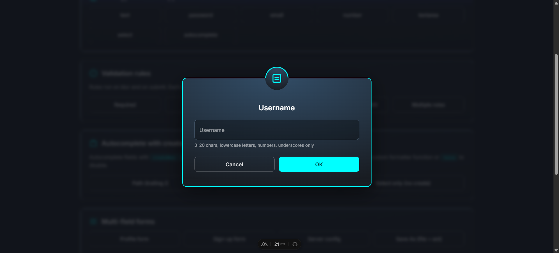
## Validation rules
A rule is a function that takes the value and returns `true` (valid) or a `string` (error message). Multiple rules per field run in order.
```ts
{
key: 'username',
type: 'text',
label: 'Username',
hint: '3–20 chars, lowercase letters, numbers, underscores only',
rules: [
v => (typeof v === 'string' && v.length >= 3) || 'At least 3 chars',
v => (typeof v === 'string' && v.length <= 20) || 'At most 20 chars',
v => /^[a-z0-9_]+$/.test(String(v)) || 'Only lowercase letters, numbers, and underscores',
],
}
```
Rules run **on blur** (after the first interaction) and **on submit** (all fields). Field-level errors render below each field; a form-level error appears under the form when any rules fail on submit.
---
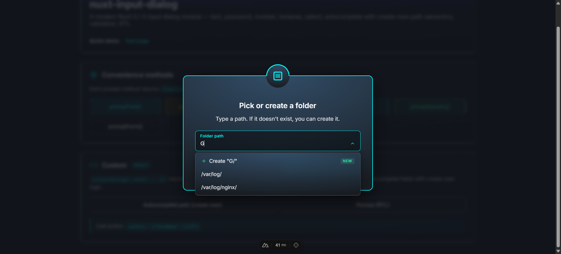
## Autocomplete with create-new
Autocomplete fields can suggest creating a new value when the typed text isn't in `items`. Three modes via the `createNew` option:
```ts
// Mode 1 — disabled (filter-only autocomplete; default)
{ key: 'country', type: 'autocomplete', label: 'Country', items: [...], createNew: false }
// Mode 2 — 'path' formatter (built-in: appends a trailing slash if missing)
{ key: 'folder', type: 'autocomplete', label: 'Folder', items: ['/var/log/'], createNew: 'path' }
// typing '/etc' → Create "/etc/"
// Mode 3 — custom formatter function
{
key: 'name',
type: 'autocomplete',
label: 'Constant',
items: ['MAX_RETRIES'],
createNew: (raw: string) => raw.toUpperCase().replace(/\s+/g, '_'),
}
// typing 'min retries' → Create "MIN_RETRIES"
```
When create-new mode is on, an extra "Create" item appears at the top of the dropdown with a `+` icon and a "New" badge. Press **Enter** in the input to commit the typed (formatted) value, or click the suggestion.
---
## Custom buttons
Pass a `buttons` array to override the default Cancel/Submit pair. Supports 1, 2, or 3 buttons.
```ts
await dialog.show({
title: 'Save changes?',
message: 'You have unsaved edits.',
fields: [{ key: 'note', type: 'textarea', label: 'Note (optional)' }],
buttons: [
{ text: 'Cancel', action: 'cancel', variant: 'outlined', color: 'default' },
{ text: 'Discard', action: 'discard', variant: 'flat', color: 'default' },
{ text: 'Save', action: 'save', variant: 'flat', color: 'info' },
],
})
// resolves with action: 'cancel' | 'discard' | 'save'
```
| Field | Type | Default |
| ---------- | ------------------------------------------------------------- | -------------------------------------- |
| `text` | `string` | required |
| `action` | `string` | `'confirm'` |
| `variant` | `'flat' \| 'outlined'` | `'outlined'` for cancel, else `'flat'` |
| `color` | `'success' \| 'warning' \| 'error' \| 'info' \| 'default'` | dialog `type` for confirm |
| `disabled` | `boolean` | `false` |
---
## Component API
### ``
The container that renders the active dialog. Auto-mounted by default — only use this directly if `autoMount: false`.
| Prop | Type | Default | Description |
| ---------------------- | --------- | ------- | ----------- |
| `teleport` | `boolean` | `true` | Render into `document.body` via `` so the overlay always covers the viewport. |
| `closeOnBackdropClick` | `boolean` | `false` | Backdrop click cancels. |
| `escapeToCancel` | `boolean` | `true` | Escape key cancels. |
### ``
The single-dialog component. You normally don't render this directly — `useInputDialog()` and `` handle it. Exposed for static / non-composable usage with `v-model`.
Emits: `update:modelValue`, `confirm` (with values), `cancel`, `action` (with name + values).
---
## Theme
Ships with a **dark** theme (default) and a **light** theme. Switch globally at runtime, or override per-container.
```ts
// nuxt.config.ts — initial theme
inputDialog: { theme: 'light' }
```
```vue
const dialog = useInputDialog()
console.log(dialog.theme.value) // 'dark' or 'light'
dialog.setTheme('light')
// Optional: follow the user's system preference
const sync = () => dialog.setTheme(
window.matchMedia('(prefers-color-scheme: dark)').matches ? 'dark' : 'light',
)
sync()
window.matchMedia('(prefers-color-scheme: dark)').addEventListener('change', sync)
```
Per-container override:
```vue
```
The `theme` prop, when set, takes precedence over `useInputDialog().theme`. Type-color borders (`#30e0a1` / `#FFD700` / `#DC143C` / `#00FFFF`) stay constant in both themes — only the card, overlay backdrop, input field colors, dropdown panel, and outlined-button neutrals swap.
---
## Customization
The auto-mounted container lives at `#nuxt-input-dialog-root`. Override styles globally by targeting that root:
```css
/* assets/css/main.css */
#nuxt-input-dialog-root .dialog-card {
max-width: 600px;
border-radius: 16px;
}
#nuxt-input-dialog-root .dialog-input {
font-family: ui-monospace, monospace;
}
```
### Fonts
Two fonts loaded by default:
- **Inter** (English / Latin) — Google Fonts via ``. Disable with `loadInterFont: false`.
- **Shabnam** (Persian / Arabic) — bundled woff2 (5 weights), gated by `unicode-range`. Disable with `loadShabnamFont: false`.
### Right-to-left support
When the title, message, warning text, or any field's label/placeholder/hint contains Arabic / Persian script, the dialog auto-switches to `dir="rtl"`. Detection is per-instance — you can mix LTR and RTL dialogs in the same app without configuration.
### Manual mounting
```ts
// nuxt.config.ts
inputDialog: { autoMount: false }
```
```vue
```
The state is global — only one dialog is active at a time, by design. If you mount a container inside an element with `backdrop-filter`, `transform`, `filter`, `perspective`, `will-change`, or `contain`, `` ensures the overlay still covers the viewport.
---
## TypeScript
```ts
import type {
InputDialogType, // 'success' | 'warning' | 'error' | 'info'
InputFieldType, // 'text' | 'password' | 'email' | 'number' | 'textarea' | 'select' | 'autocomplete'
InputField, // single field definition
InputFieldRule, // (value) => true | string
InputDialogButton, // { text, action?, variant?, color?, disabled?, loading? }
InputDialogOptions, // arg to show()
InputDialogResult, // { action, values }
InputDialogInstance, // shape of currentDialog.value
} from 'nuxt-input-dialog'
```
`ModuleOptions` is also exported.
---
## Development
```bash
npm install
npm run dev:prepare
npm run dev # playground at http://localhost:3000
npm run lint
npm run test
npm run prepack # build dist/
```
The playground at `playground/` exercises every field type, every validation pattern, real-world forms (sign-up, server config, save-as), the autocomplete with create-new, and Persian / RTL.
### CI
GitHub Actions runs lint (Node 22) and tests + build (Node 20 and 22) on every push and PR against `main`.
---
## License
[MIT](./LICENSE)