https://github.com/p2pu/p2pu-components
React components shared between p2pu/p2pu-website and p2pu/learning-circles.
https://github.com/p2pu/p2pu-components
Last synced: 6 months ago
JSON representation
React components shared between p2pu/p2pu-website and p2pu/learning-circles.
- Host: GitHub
- URL: https://github.com/p2pu/p2pu-components
- Owner: p2pu
- Created: 2018-05-03T18:24:29.000Z (about 8 years ago)
- Default Branch: master
- Last Pushed: 2024-04-04T12:56:37.000Z (about 2 years ago)
- Last Synced: 2025-02-14T01:39:34.446Z (over 1 year ago)
- Language: JavaScript
- Homepage:
- Size: 23.4 MB
- Stars: 0
- Watchers: 7
- Forks: 2
- Open Issues: 25
-
Metadata Files:
- Readme: readme.md
Awesome Lists containing this project
README
# P2PU Components
These are the React components that are currently being shared between [p2pu/p2pu-website](https://github.com/p2pu/p2pu-website/) and [p2pu/learning-circles](https://github.com/p2pu/learning-circles/).
The main uses are:
- Search interface for learning circles and courses
- Input fields for forms
## Search Interface
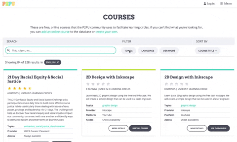
The search interface currently appears on [the learning circles page on P2PU](https://www.p2pu.org/en/learning-circles/), [the courses page on P2PU](https://www.p2pu.org/en/courses/) and the [learning circle creation form](https://learningcircles.p2pu.org/en/studygroup/create/).
### Component structure
The main components are:
- `Search`: the parent component that holds most of the state such as the search parameters and results, as well as the functions for querying the back end.
- `SearchAndFilter`: houses the `SearchBar` and `FiltersSection` components
- `SearchTags`: displays the search summary below the form, which users can also interact with to edit their search.
- `Browse`: shows the search results in an "infinite scroll", and in the case of Learning Circles, split between tabs.
- `LearningCircleCard` and `CourseCard`: displays a search result item
### Styling
The Search component requires the CSS build from `p2pu-components`
### Example
```js
import React from 'react';
import ReactDOM from 'react-dom';
import { Search, BrowseCourses } from 'p2pu-components';
import 'p2pu-components/dist/build.css';
const handleSelectResult = course => {
// do something
}
const elem = document.getElementById('search-courses-component');
const origin = elem.dataset.apiOrigin;
ReactDOM.render(
, document.getElementById('search-courses-component')
);
```
## Input Fields
The input fields are used to standardize the appearance and behaviour of our React forms. The main use case is the form for creating a learning circle. The input fields come with a label, input, help text, and error message (for validation).

### Components
Here's a full list of the available input fields:
| Component | Description |
| :--- | :--- |
| CheckboxWithLabel | Checkbox with an inline label. The label can be to the right or left of the checkbox. |
| CitySelect | A dropdown select for all the cities where learning circles are offered |
| DatePickerWithLabel | Date picker using native date input field with validation for the date format |
| ImageUploader | A file input styled to look like a P2PU button. Shows an image preview when an image is uploaded. |
| InputWithLabel | A basic input field. You can pass through the type prop to change the native input type. |
| LanguageSelect | A dropdown select for languages that allows multiple selections |
| MobileInput | A phone number input using `react-telephone-input`. |
| PlaceSelect | A dropdown select using Algolia to search and retrieve place data. |
| RangeSliderWithLabel | A range slider using `react-rangeslider` |
| RichTextWithLabel | A rich text editor using `@tinymce/tinymce-react` |
| SelectWithLabel | Generic dropdown select using `react-select` |
| SwitchWithLabel | A switch component for boolean inputs that allows you to put labels for the "on" and "off" positions |
| TextAreaWithLabel | Text area input for plain text |
| TimePickerWithLabel | A time picker based on `react-select`. Has preset options at 30 minute intervals and allows text input for custom times.|
| TimeZoneSelect | Time zone selector based on `react-select` that pulls data from [Geonames](https://secure.geonames.org) |
| UrlInputWithLabel | URL input that is basically a text input with additional validation |
| InputWrapper | The component that wraps all the other inputs and provides the label, help text, and error message |
### Common Props
Most of the components listed here have a common API, but check the PropTypes for additional props.
| Prop | Type | Description |
| :--- | :--- | :--- |
| `name` (required) | string | This is used as the `name` and `id` attributes on the input component itself, and the `htmlFor` attribute on the label. It's also used in the return value of the change handler function, which should return the input value as `{ [name]: value }`. |
| `label` (required) | string | The content of the label. This can be text or JSX. |
| `handleChange` (required) | function | The change handler for the input. It will be called with the input name and value as `{ [name]: value }` |
| `value` | varies | The value of the input |
| `required` | boolean | Whether the field is required |
| `disabled` | boolean | Whether the field is disabled |
| `errorMessage` | string | Error message to show below input field |
| `helpText` | string | Help text to show above input field |
| `classes` | string | Classes that will be applied to the wrapper element that contains the label and input |
Check the individual components for additional props. All other props will be passed down to the input component.
## API Helper
In `src/utils` there is an ApiHelper class that abstracts some of the logic for making API calls to the learning circles server. It is mainly used for sending search queries in the Search component. It goes hand in hand with the `src/utils/constants.js` file where we define the allowed API endpoints and search parameters.
The ApiHelper requires a resource type argument in construction, which must be one of the keys in the `API_ENDPOINTS` variable, and optionally the origin URL for the endpoint.
The ApiHelper functions are:
- `generateUrl`: used internally to generate the full endpoint URL
- `fetchResource`: 'GET' using jsonp
- `createResource`: 'POST' using Axios
- `updateResorce`: 'POST' using Axios
All of the above methods take an `options` argument which is an object that includes include the params and callback function. If the API request is successful, the callback function gets called with the response as well as options object.
### Example
```js
import ApiHelper from '../utils/apiHelper'
const apiHelper = new ApiHelper('courses', 'https://learningcircles.p2pu.org')
const params = { q: 'test', limit: 20, offset: 0 };
const callback = (response) => console.log(response)
const opts = { appendResults: true }
const options = { params, callback, ...opts };
apiHelper.fetchResource(options);
```
## Local Development
### Getting Started
Clone or fork the repo:
```git clone git@github.com:p2pu/p2pu-components.git```
Install dependencies
``` cd p2pu-components && npm install```
Run the demo
```npm run start```
Open the demo on http://localhost:3001 to see the courses search componenet
See http://localhost:3001/lc.html for the learning circles search component
See http://localhost:3001/input-fields.html for the input fields
### To build the demo
```
npm run build:demo
```
### To build the main package
```
npm i
npm run build:main
```
### To publish a new version
Make sure you've already built the main package and committed your changes
`npm adduser` (only your first time)
`npm version patch` (or specify a version number)
`npm run deploy`
You'll need the right credentials to publish to p2pu-components.
## TO DO
- split up CSS and package it with each component separately so that individual components can be imported and used without having to include the full CSS build
- allow for easier style customization
- standardize component names of input fields
- reduce build size
- date picker with calendar interface (see Meeting Scheduler in learning-circles)
- better time picker (it was stripped down to reduce build size but it's not great UI)
- right now the Search component holds all the logic for the courses search and learning circle search, but as they start to diverge more (ie. including past learning circles) it's starting to get messy. Consider splitting into separate components.
- we could be using the ApiHelper in `CitySelect` instead of hard-coding the endpoint