https://github.com/pandatecham/web-lib-panda-table
https://github.com/pandatecham/web-lib-panda-table
filter library npm pandtech table
Last synced: about 1 year ago
JSON representation
- Host: GitHub
- URL: https://github.com/pandatecham/web-lib-panda-table
- Owner: PandaTechAM
- License: mit
- Created: 2023-05-11T17:19:17.000Z (about 3 years ago)
- Default Branch: main
- Last Pushed: 2025-04-09T12:48:57.000Z (about 1 year ago)
- Last Synced: 2025-04-09T13:24:26.046Z (about 1 year ago)
- Topics: filter, library, npm, pandtech, table
- Language: TypeScript
- Homepage: https://pandatecham.github.io/table-package/
- Size: 1.03 MB
- Stars: 0
- Watchers: 1
- Forks: 0
- Open Issues: 1
-
Metadata Files:
- Readme: README.md
- License: LICENSE
Awesome Lists containing this project
README
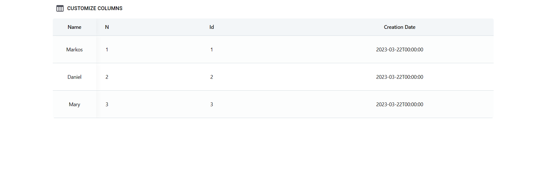
# React App Table
beautiful-react-table is a customizable table component for React applications. It provides a flexible and feature-rich table implementation with various configuration options.
# Installation
To install beautiful-react-table, use the following command:
npm install beautiful-react-table
npm install react-beautiful-dnd
npm install @mui/material
# Usage
Import the necessary components and interfaces from the "beautiful-react-table" package:
```JSX
import { useState } from "react";
import {
IColumnConfig,
IColumnHeader,
IColumnConfigStructure,
IColumnHeaderStructure,
// ... other imports ...
} from "beautiful-react-table";
function App() {
const [data, setData] = useState([
{
id: 1,
agentId: 1,
agentCreationDate: "2023-03-22T00:00:00",
agentName:"Markos",
},
{
id: 2,
agentId: 2,
agentCreationDate: "2023-03-22T00:00:00",
agentName: "Daniel",
},
{
id: 3,
agentId: 3,
agentCreationDate: "2023-03-22T00:00:00",
agentName: "Mary",
},
]);
const [columnHeader] = useState([
{
id: 1,
order: 1,
title: "Id",
},
{
id: 2,
order: 2,
title: "Name",
},
{
id: 3,
order: 3,
title: "Creation Date",
},
]);
const [columnConfig] = useState[]>([
{
id: 1,
title: (row: any, name: string) => (
{row.title}
),
setRow: (row: any) => (
{row.id}
),
isVisible: true,
},
{
id: 2,
title: (row: IColumnHeader, name: string) => (
{row.title}
),
setRow: (row: any) => (
{row.agentName}
),
isVisible: true,
},
{
id: 3,
title: (row: IColumnHeader, name: string) => (
{row.title}
),
setRow: (row: any) => (
{row.agentCreationDate}
),
isVisible: true,
},
]);
const [columnsConfigStructure, setColumnsConfigStructures] = useState<
IColumnConfigStructure
>({
[StructureConfig.Main]: {
name: "Columns",
items: columnConfig,
},
[StructureConfig.Freezed]: {
name: "Freezed",
items: [],
},
});
const [columnsHeaderStructure, setColumnHeaderStructures] =
useState({
[StructureConfig.Main]: {
name: "Columns",
items: columnHeader,
},
[StructureConfig.Freezed]: {
name: "Freezed",
items: [],
},
});
return (
);
}
export default App;
```
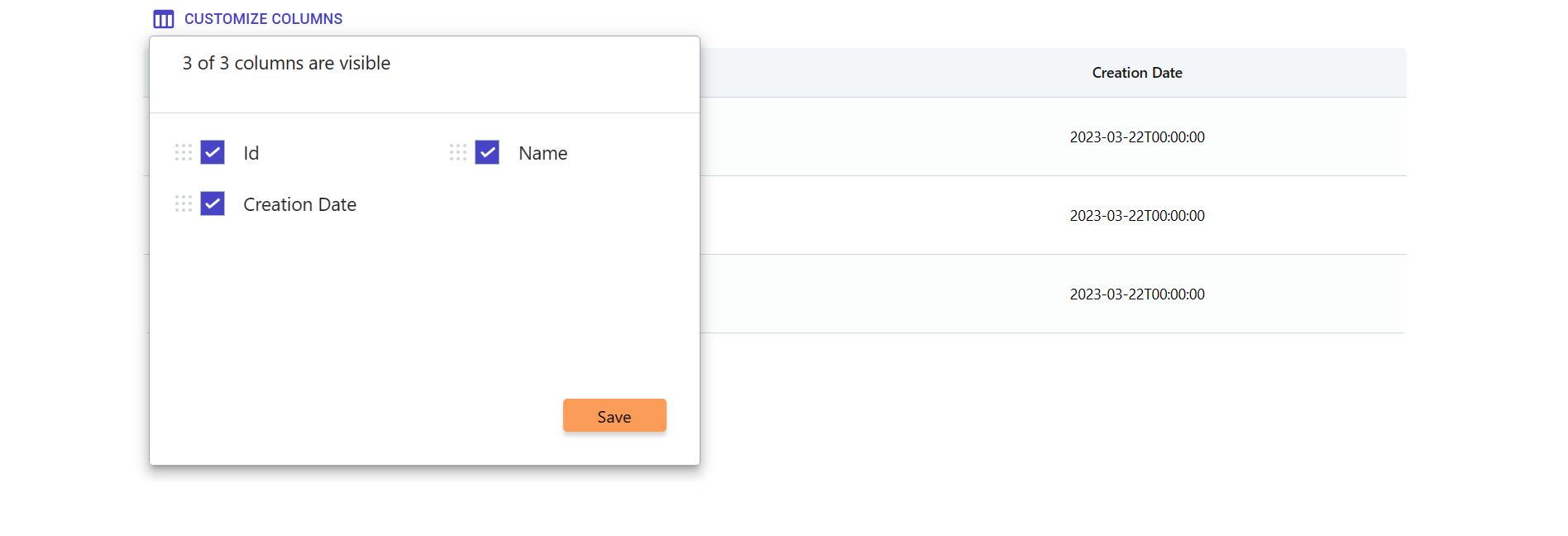
# Table Structure
We can drag, hide and dock columns vertically and horizontally.
Add the "draggableColumns" details, then create the "setColumnsConfigStructure" and "setColumnHeaderStructure" functions.
```JSX
const setColumnsConfigStructure = (option: IColumnConfigStructure) => {
setColumnsConfigStructures(option);
};
const setColumnHeaderStructure = (option: IColumnHeaderStructure) => {
setColumnHeaderStructures(option);
};
```
And if we want to add some functionality to the save button, we need to use the "storeStructure" function.
```JSX
const storeStructure = () => {};
```
Let's add width to the column
```JSX
columnMinWidth={120}
```
# Hovered Row Actions
When we use isHoveredRow props, we need to make actions.
We have default icons, but we can make custom.
```JSX
const [rowActions] = useState([
{
action: (e, item, index) => {
e.stopPropagation();
},
},
{
action: (e, item, index) => {
e.stopPropagation();
},
},
]);
```
# Page Size Config
```JSX
const [pageSize] = useState([
{ id: 1, count: 10 },
{ id: 2, count: 25 },
{ id: 3, count: 50 },
{ id: 4, count: 100 },
]);
```
# Dropdown Menu Config
When we use
```JSX
freezedRightSide={"dropdown"}
```
, we have to make config for list.
```JSX
const [links] = useState([
{
id: 1,
name: "Overpayments",
action: (option: any) => {},
},
{
id: 2,
name: "Estate Owners",
action: (option: any) => {},
},
]);
```
# Right Freezed Column Config
We can create costume freezed columns in right side.
```JSX
const [rightFreezeConfig] = useState[]>([
{
id: 1,
title: (row: IColumnHeader, name: string) => (
{row.title}
),
setRow: () => (
View Details
),
isVisible: true,
},
{
id: 2,
title: (row: IColumnHeader, name: string) => (
{row.title}
),
setRow: () => (
View Details
),
isVisible: true,
},
]);
```
# Aggregates
List for filtering aggregates
Works with PandaTech.IEnumerableFilters nuget
```JSX
const [listForDropdown] = useState([
{
id: 1,
title: "AVG",
},
{
id: 2,
title: "MIN",
},
{
id: 3,
title: "MAX",
},
{
id: 4,
title: "SUM",
},
]);
```
# Filters
Filters works with PandaTech.IEnumerableFilters nuget
```JSX
const [selectedColumnName, setSelectedColumnName] = useState("");
const [pagePerFilterField, setPagePerFilterField] = useState(1);
const [perColumnTotalCount, setPerColumnTotalCount] = useState(0);
const [filterDataForRequest, setFilterDataForRequest] = useState([]);
const [totalPagesCount, setTotalPagesCount] = useState(0);
const [isLoadingFilters, setIsLoading] = useState(false);
const [perColumnListForFilters, setPerColumnListForFilters] = useState();
```
# Functions
```JSX
const setColumnsConfigStructure = (option: IColumnConfigStructure) => {
setColumnsConfigStructures(option);
};
const setColumnHeaderStructure = (option: IColumnHeaderStructure) => {
setColumnHeaderStructures(option);
};
const handleEdit = (option: any) => {};
const handleDelete = (option: any[] | string) => {};
const RightSideSelfAction = (option: number | string) => {};
const storeStructure = () => {};
const getRow = (row: any) => {};
const getPageRowsCountAndCurrentPage = (pageNumber: number, rowsCount: IPageSizes) => {};
const handleChangePagePerFilterField = () => {};
const getFilteredDataForTable = (option?: ItemFields[]) => {};
const getDownloadType = (option: string, checkedRows: any[] | string) => {};
const customHeaderAction = (option: any[] | string) => ReactNode;
```
# Props
The "Table" component accepts the following props:
```TS
data (required): An array of objects representing the table data.
columnsConfigStructure (required): An object representing the column configuration structure.
columnsHeaderStructure (required): An object representing the column header structure.
allDataFromDb (optional): An array of objects representing the complete data set from the database.
columnsTotalStructure (optional): An object representing the column total structure.
pageSize (optional): An array of page sizes for pagination.
links (optional): An array of link items for navigation.
listForDropdown (optional): An array for choosing footer items type.
rowActions (optional): An array of row actions for each table row.
selectedPage (optional): An object representing the currently selected page.
currentPage (optional): The current page number.
totalCount (optional): The total number of items in the table.
multipleCheck (optional): Boolean flag to enable multiple row selection.
isStickyFirstColumn (optional): Boolean flag to enable sticking the first column.
isHoveredRow (optional): Boolean flag to enable highlighting the hovered row.
draggableColumns (optional): Boolean flag to enable column reordering.
freezedRightSideVisible (optional): is dropdown.
FreezeIcon (optional): The icon to display for freezing columns.
headerColor (optional): The color of the table header.
footerColor (optional): The color of the table footer.
freezedLeftSideColor (optional): The color of the left side of the table when frozen.
freezedRightSideColor (optional): The color of the right side of the table when frozen.
freezedRightSide (optional): The right side content of the frozen table.
columnMinWidth (optional): The minimum width of each column.
headerHeight (optional): The height of the table header.
footerHeight (optional): The height of the table footer.
leftFreezedColumnWidth (optional): The width of the left side column when frozen.
rightFreezedColumnWidth (optional): The width of the right side column when frozen.
leftSideIcon (optional): The icon to display for the left side of the table.
RightSideSelfAction (optional): A function to handle the self-action on the right side of the table.
setColumnTotalStructures (optional): A function to set the column total structures.
handleEdit (optional): A function to handle the edit action for a table row.
handleDelete (optional): A function to handle the delete action for multiple table rows.
setColumnsConfigStructure (optional): A function to set the column configuration structure.
setColumnHeaderStructure (optional): A function to set the column header structure.
handleSelectDataSize (optional): A function to handle the selection of data size for pagination.
```