https://github.com/papercups-io/papercups_flutter
Papercups.io Flutter chat widget
https://github.com/papercups-io/papercups_flutter
dart flutter flutter-widget intercom-alternative live-chat papercups papercups-flutter pub widget
Last synced: 5 months ago
JSON representation
Papercups.io Flutter chat widget
- Host: GitHub
- URL: https://github.com/papercups-io/papercups_flutter
- Owner: papercups-io
- License: mit
- Created: 2020-11-17T18:37:43.000Z (over 5 years ago)
- Default Branch: main
- Last Pushed: 2023-03-27T22:08:41.000Z (about 3 years ago)
- Last Synced: 2024-04-13T21:22:50.789Z (about 2 years ago)
- Topics: dart, flutter, flutter-widget, intercom-alternative, live-chat, papercups, papercups-flutter, pub, widget
- Language: Dart
- Homepage: https://papercups-demo.eduardom.dev
- Size: 1.09 MB
- Stars: 27
- Watchers: 4
- Forks: 22
- Open Issues: 7
-
Metadata Files:
- Readme: README.md
- Changelog: CHANGELOG.md
- License: LICENSE
Awesome Lists containing this project
README

[](https://pub.dev/packages/papercups_flutter) [](https://pub.dev/packages/effective_dart)  
[](https://pub.dev/packages/papercups_flutter/score) [](https://pub.dev/packages/papercups_flutter) [](https://pub.dev/packages/papercups_flutter/score)
[](https://papercups-demo.eduardom.dev/) [](https://papercups.io/)
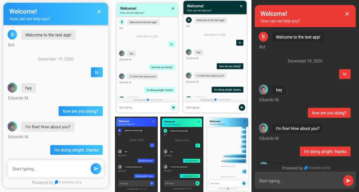
Compatible with **all** platforms: Windows, Android, Linux, MacOS, and iOS
## Installing
To get started simply add `papercups_flutter:` and the latest version to your pubspec.yaml.
Then run `flutter pub get`
🎉 Done, It's that simple.
## Using the widget
Integration with your app requires just a few lines of code, add the following widget wherever you want your papercups chat window to be:
```Dart
import 'package:papercups_flutter/papercups_flutter.dart';
PapercupsWidget(
props: PapercupsProps(
accountId: "xxxxxxxx-xxxxxxx-xxxx-xxxxxx", //Your account id goes here.
),
),
```
That should get you up and running in just a few seconds ⚡️.
## Configuration
### Available `PapercupsWidget` arguments
| Parameter | Type | Value | Default |
| :------------------ | :-------- | :--------------------------------------------------------------------------------------------------------------------------------------- | :-------- |
| **`props`** | `PapercupsProps` | **Required**. This is where all of the config for the chat is contained. | N/A |
| **`dateLocale`** | `String` | Locale for the date, use the locales from the `intl` package. | `"en-US"` |
| **`timeagoLocale`** | `dynamic` | Check [`timeago` messages](https://github.com/andresaraujo/timeago.dart/tree/master/packages/timeago/lib/src/messages) for the available classes. | N/A |
### Available `PapercupsProps` parameters
| Prop | Type | Value | Default |
| :------------------------ | :-------------------------------- | :-------------------------------------------------------------------------------------------------------------------------------- | :------------------- |
| **`accountId`** | `String` | **Required**. Your Papercups account token. | N/A |
| **`baseUrl`** | `String` | The base URL of your API if you're self-hosting Papercups. Ensure you do not include the protocol (https) of a trailing dash (/). | `"app.papercups.io"` |
| **`customer`** | `PapercupsCustomerMetadata` | Identifying information for the customer, including `name`, `email`, `externalId`, and `otherMetadata` (for any custom fields). | N/A |
| **`closeIcon`** | `Widget` | The close button displayed in the header section. | N/A |
| **`closeAction`** | `VoidCallback` | The function to handle closing the widget. If not null, close button will be shown. | N/A |
| **`scrollEnabled`** | `bool` | Whether or not to allow scrolling. | `true` |
| **`floatingSendMessage`** | `bool` | Wether to have the message box floating. | `false` |
| **`requireEmailUpfront`** | `bool` | If you want to require unidentified customers to provide their email before they can message you. Not recommended for apps. | `false` |
| **`sendIcon`** | `Widget` | Message send icon in the chat text field. | N/A |
| **`onMessageBubbleTap`** | `void Function(PapercupsMessage)` | Function to handle message bubble tap action. | N/A |
| **`style`** | `PapercupsStyle` | Class used to customize the widget appearance. | `PapercupsStyle()` |
| **`translations`** | `PapercupsIntl` | If you want to override the default `EN` translations displayed by the widget. | `PapercupsIntl()` |
### Available `PapercupsCustomerMetadata` parameters
| Parameters | Type | Value | Default |
| :------------------ | :--------------------- | :-------------------------------------------------------- | :------ |
| **`email`** | `String` | The customer's email | N/A |
| **`externalId`** | `String` | The customer's external ID | N/A |
| **`name`** | `String` | The customer's name | N/A |
| **`otherMetadata`** | `Map` | Extra metadata to pass such as OS info, app version, etc. | N/A |
### Available `PapercupsStyle` parameters
Parameters
Type
Value
Default
primaryColor
Color
The theme color of the chat widget.
Papercups blue:
Color(0xFF1890FF)
primaryGradient
Gradient
Gradient to specify, should be used instead of primaryColor. DO NOT USE BOTH!
N/A
backgroundColor
Color
Color used in the background of the entire widget.
Theme.of(context).canvasColor
titleStyle
TextStyle
The text style of the title at the top of the chat widget.
TextStyle(
color: textColor, // Using computeLuminance
fontSize: 21,
fontWeight: FontWeight.w600,
)
titleAlign
TextAlign
The widget title alignment.
TextAlign.left
subtitleStyle
TextStyle
The chat widget sub title text style.
TextStyle(
color: props.style.titleStyle?.color?.withOpacity(0.8),
)
headerHeight
double
The chat widget header height.
N/A
headerPadding
EdgeInsetsGeometry
The chat widget header padding.
EdgeInsets.only(
top: 16,
right: 20,
left: 20,
bottom: 12,
)
noConnectionIcon
Widget
The widget displayed in the chat when there's no Internet connection.
Icon(
Icons.wifi_off_rounded,
size: 100,
color: Colors.grey,
)
noConnectionTextStyle
TextStyle
The text style of the text displayed in the chat widget when there's no Internet connection.
Theme.of(context).textTheme.headlineSmall?.copyWith(color: code.grey)
requireEmailUpfrontInputDecoration
InputDecoration
The input decoration of the require email text field.
InputDecoration(
border: UnderlineInputBorder(
borderSide: BorderSide(
color: Theme.of(context).dividerColor,
width: 0.5,
style: BorderStyle.solid,
),
),
enabledBorder: UnderlineInputBorder(
borderSide: BorderSide(
color: Theme.of(context).dividerColor,
width: 0.5,
style: BorderStyle.solid,
),
),
focusedBorder: UnderlineInputBorder(
borderSide: BorderSide(
color: Theme.of(context).dividerColor,
width: 0.5,
style: BorderStyle.solid,
),
),
hintText: widget.props.translations.enterEmailPlaceholder,
hintStyle: widget.props.style.requireEmailUpfrontInputHintStyle,
),
requireEmailUpfrontKeyboardAppearance
Brightness
The keyboard brightness of the require email text field.
Brightness.light
requireEmailUpfrontInputHintStyle
TextStyle
The text style of the require email text field hint.
TextStyle(fontSize: 14)
requireEmailUpfrontInputTextStyle
TextStyle
The text style of the require email text field.
N/A
floatingSendMessageBoxDecoration
BoxDecoration
The box decoration of the message text field when floatingSendMessage prop is true.
BoxDecoration(
borderRadius: BorderRadius.circular(10),
boxShadow: [
BoxShadow(
blurRadius: 10,
color: Theme.of(context).brightness == Brightness.light
? Colors.grey.withOpacity(0.4)
: Colors.black.withOpacity(0.8),
),
],
)
sendMessageBoxDecoration
BoxDecoration
The box decoration of the message text field.
BoxDecoration(
color: Theme.of(context).cardColor,
border: widget.showDivider
? Border(
top: BorderSide(color: Theme.of(context).dividerColor),
)
: null,
boxShadow: [
BoxShadow(
blurRadius: 30,
color: Theme.of(context).shadowColor.withOpacity(0.1),
)
],
)
sendMessageKeyboardAppearance
Brightness
The keyboard brightness of the send message text field.
Brightness.light
sendMessagePlaceholderInputDecoration
InputDecoration
The input decoration of the message text field.
InputDecoration(
border: InputBorder.none,
hintText: widget.props.translations.newMessagePlaceholder,
hintStyle: widget.props.style.sendMessagePlaceholderTextStyle,
)
sendMessagePlaceholderTextStyle
TextStyle
The text style of the message text field input hint text.
TextStyle(fontSize: 14)
sendMessageInputTextStyle
TextStyle
The text style of the message text field input.
N/A
botBubbleBoxDecoration
BoxDecoration
The box decoration of the bot chat bubbles.
BoxDecoration(
color: Theme.of(context).brightness == Brightness.light
? brighten(Theme.of(context).disabledColor, 80)
: const Color(0xff282828,
),
borderRadius: BorderRadius.circular(4),
)
botBubbleTextStyle
TextStyle
The text style of the bot chat bubbles.
TextStyle(
color: Theme.of(context).textTheme.bodyLarge?.color,
)
botAttachmentBoxDecoration
BoxDecoration
The box decoration of the bot attachment (images, files) chat bubbles.
BoxDecoration(
borderRadius: BorderRadius.circular(5),
color: Theme.of(context).brightness == Brightness.light
? brighten(Theme.of(context).disabledColor, 70)
: Color(0xff282828,
),
)
botAttachmentTextStyle
TextStyle
The text style of the bot attachments file name.
TextStyle(
color: Theme.of(context).textTheme.bodyLarge?.color,
)
botBubbleUsernameTextStyle
TextStyle
The text style of bot user name displayed below its chat bubbles.
TextStyle(
color: Theme.of(context).textTheme.bodyLarge?.color?.withOpacity(0.5),
fontSize: 14,
)
userBubbleBoxDecoration
BoxDecoration
The box decoration of the user chat bubbles.
BoxDecoration(
color: widget.props.style.primaryColor,
gradient: widget.props.style.primaryGradient,
borderRadius: BorderRadius.circular(4),
)
userBubbleTextStyle
TextStyle
The text style of the user chat bubbles.
TextStyle(color: widget.textColor)
Depending on the luminance of the provided primaryColor, textColor can be either Colors.black or Colors.white.
userAttachmentBoxDecoration
BoxDecoration
The box decoration of the user attachment (images, files) chat bubbles.
BoxDecoration(
borderRadius: BorderRadius.circular(5),
color: darken(widget.props.style.primaryColor!, 20),
)
userAttachmentTextStyle
TextStyle
The text style of the user attachments file name.
TextStyle(color: widget.textColor)
Depending on the luminance of the provided primaryColor, textColor can be either Colors.black or Colors.white.
userBubbleSentAtTextStyle
TextStyle
The text style of the "Sent x ago" (or "Sending...") text displayed below the latest user chat bubble.
TextStyle(color: Colors.grey)
chatBubbleTimeTextStyle
TextStyle
The text style of the time stamp displayed (on tap) next to the any chat bubble.
TextStyle(
color: Theme.of(context).textTheme.bodyLarge?.color?.withAlpha(100),
fontSize: 10,
)
chatBubbleFullDateTextStyle
TextStyle
The text style of the date displayed centered in the chat before the chat bubbles of a given day.
TextStyle(color: Colors.grey)
chatUploadingAlertTextStyle
TextStyle
The text style of the alert shown when an attachment is being uploaded.
Theme.of(context).textTheme.bodyMedium
chatUploadingAlertBackgroundColor
Color
The background color of the alert shown when an attachment is being uploaded.
BottomAppBarTheme.of(context).color!
chatUploadErrorAlertTextStyle
TextStyle
The text style of the error alert shown when an attachment failed to upload.
Theme.of(context).textTheme.bodyMedium
chatUploadErrorAlertBackgroundColor
Color
The background color of the error alert shown when an attachment failed to upload.
BottomAppBarTheme.of(context).color!
chatNoConnectionAlertTextStyle
TextStyle
The text style of the alert shown when the chat is displayed but no Internet connection is available.
Theme.of(context).textTheme.bodyMedium
chatNoConnectionAlertBackgroundColor
Color
The background color of the alert shown when the chat is displayed but no Internet connection is available.
BottomAppBarTheme.of(context).color!
chatCopiedTextAlertTextStyle
TextStyle
The text style of the alert shown when a chat bubble gets long pressed and its text copied.
Theme.of(context).textTheme.bodyMedium
chatCopiedTextAlertBackgroundColor
Color
The background color of the alert shown when a chat bubble gets long pressed and its text copied.
BottomAppBarTheme.of(context).color!
### Available `PapercupsIntl` parameters
| Parameters | Type | Value | Default |
| :------------------------------ | :------- | :--------------------------------------------------------------------------- | :---------------------------------------------------------------- |
| **`attachmentNamePlaceholder`** | `String` | Text displayed when an attachment doesn't have a file name | `"No Name"` |
| **`attachmentUploadErrorText`** | `String` | Error message displayed when an attachment could not be uploaded | `"Failed to upload attachment"` |
| **`attachmentUploadedText`** | `String` | Text displayed when an attachment has been uploaded | `"Attachment uploaded"` |
| **`attachmentUploadingText`** | `String` | Text displayed when an attachment is been uploaded | `"Uploading..."` |
| **`companyName`** | `String` | Company name to show on greeting | `"Bot"` |
| **`enterEmailPlaceholder`** | `String` | This is the placeholder text in the email input section | `"Enter your email"` |
| **`fileText`** | `String` | Text displayed on the tile where the user decides to upload a file | `"File"` |
| **`greeting`** | `String` | An optional initial message to greet your customers with | N/A |
| **`historyFetchErrorText`** | `String` | Error message displayed when the customer history couldn't be fetched | `"There was an issue retrieving your details. Please try again!"` |
| **`imageText`** | `String` | Text displayed on the tile where the user decides to upload an image | `"Image"` |
| **`loadingText`** | `String` | Text displayed when the chat is loading | `"Loading..."` |
| **`newMessagePlaceholder`** | `String` | The placeholder text in the new message input | `"Start typing..."` |
| **`noConnectionText`** | `String` | The placeholder text in the new message input | `"No Connection"` |
| **`retryButtonLabel`** | `String` | Label used in the retry button when the chat history couldn't be fetched | `"Retry"` |
| **`sendingText`** | `String` | Text to show while message is sending | `"Sending..."` |
| **`sentText`** | `String` | Text to show when the message is sent | `"Sent"` |
| **`subtitle`** | `String` | The subtitle in the header of your chat widget | `"How can we help you?"` |
| **`textCopiedText`** | `String` | Text displayed when a text has been copied after long press on a chat bubble | `"Text copied to clipboard"` |
| **`title`** | `String` | The title in the header of your chat widget | `"Welcome!"` |
| **`uploadedText`** | `String` | Text displayed after the percentage value of an attachment being uploaded | `"uploaded"` |
## Supporters
[](https://github.com/papercups-io/papercups_flutter/stargazers) [](https://github.com/papercups-io/papercups_flutter/network/members)