https://github.com/parkerziegler/reviz
A lightweight engine for generating partial Observable Plot programs from SVG subtrees.
https://github.com/parkerziegler/reviz
data-visualization observable observable-plot reverse-engineering typescript
Last synced: 4 months ago
JSON representation
A lightweight engine for generating partial Observable Plot programs from SVG subtrees.
- Host: GitHub
- URL: https://github.com/parkerziegler/reviz
- Owner: parkerziegler
- License: mit
- Created: 2021-10-22T23:11:44.000Z (over 4 years ago)
- Default Branch: main
- Last Pushed: 2026-02-20T21:10:32.000Z (5 months ago)
- Last Synced: 2026-02-21T02:35:42.878Z (5 months ago)
- Topics: data-visualization, observable, observable-plot, reverse-engineering, typescript
- Language: TypeScript
- Homepage: https://reviz.vercel.app
- Size: 6.98 MB
- Stars: 76
- Watchers: 1
- Forks: 0
- Open Issues: 14
-
Metadata Files:
- Readme: README.md
- Contributing: CONTRIBUTING.md
- License: LICENSE
Awesome Lists containing this project
README

A lightweight engine for reverse engineering data visualizations from the DOM
`reviz` is a lightweight engine for reverse engineering data visualizations from the DOM. Its core goal is to assist in rapid visualization sketching and prototyping by automatically generating partial programs written using [Observable Plot](https://observablehq.com/@observablehq/plot) from input `svg` subtrees. `reviz` can be used directly through the core library, [`@reviz/compiler`](./packages/compiler/README.md), or the Chrome extension, [`@reviz/extension`](./packages/extension/README.md).
For a hands-on, interactive introduction to `reviz`, check out [the `Hello reviz!` notebook on Observable](https://observablehq.com/@parkerziegler/hello-reviz).
To get familiar with the various packages in this codebase, check out their respective READMEs.
- [`@reviz/compiler`](/packages/compiler/README.md) – The core library and compiler.
- [`@reviz/examples`](/packages/examples/README.md) – The [examples site](https://reviz.vercel.app).
- [`@reviz/extension`](/packages/extension/README.md) – The Chrome extension.
- [`@reviz/ui`](/packages/ui/README.md) – Shared UI components used across the `reviz` ecosystem.
## Installation
### Compiler
```sh
npm install @reviz/compiler
```
### Extension
🚧 Under Construction 🚧
## API
The `reviz` API is very small; in fact, it consists of only a single function, `analyzeVisualization`!
```js
import { analyzeVisualization } from '@reviz/compiler';
const viz = document.querySelector('#my-viz');
const { spec, program } = analyzeVisualization(viz);
```
### `analyzeVisualization`
```ts
export declare const analyzeVisualization: (root: SVGSVGElement) => {
spec: VizSpec;
program: string;
};
```
`analyzeVisualization` is a function that takes in an `svg` `Element` as input and returns an `Object` containing two properties, `spec` and `program`.
`spec` refers to the intermediate representation used by `reviz` to generate partial Observable Plot programs. It encodes semantic information about the input `svg` subtree, including its inferred visualization type, geometric attributes of its marks (either `circle` or `rect` elements), and presentational attributes of its marks. `reviz`'s architecture mimics that of a traditional compiler, with `spec` acting as the intermediate representation (IR). It can be useful to examine `spec` to see whether or not `reviz` has inferred the correct visualization type for your input `svg` subtree.
`program` refers to the _partial_ Observable Plot program that `reviz` generates. These programs are intentionally _incomplete_ and contain "holes" represented by the string `'??'`. The presence of a hole indicates that the value for a particular attribute (e.g. the `r` attribute of a bubble chart or the `fill` attribute of a stacked bar chart) should be mapped to a column in a user's input dataset rather than kept static across all data elements. After filling in holes with column names from your input dataset, you'll have a complete visualization program ready to run in the browser!
### By Example
Let's look at an example to see how `reviz` works in practice. We'll use [this visualization](https://www.nytimes.com/interactive/2021/04/17/us/vaccine-hesitancy-politics.html) from the New York Times:
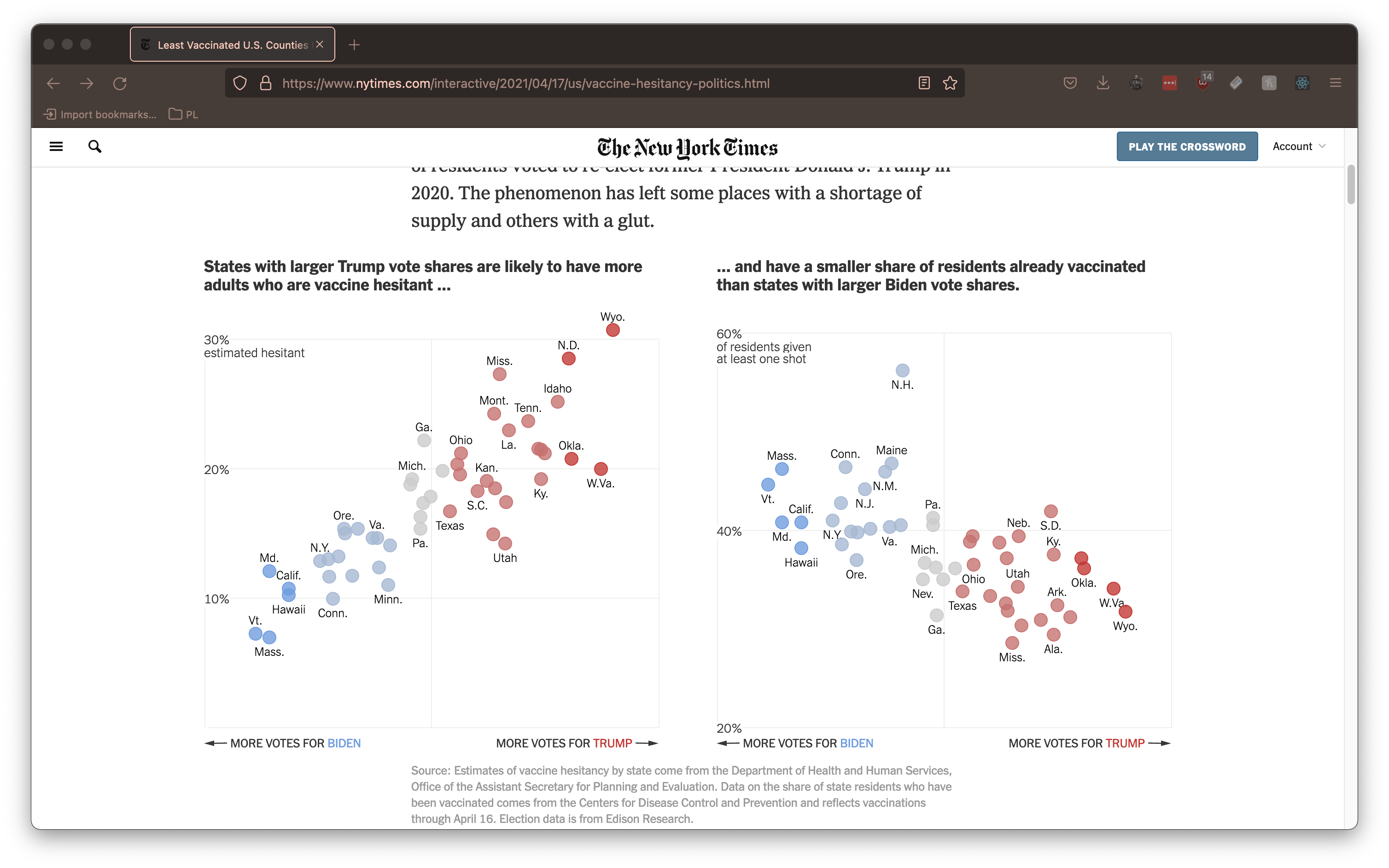
If we point `reviz` at the root `svg` `Element` of this visualization, it generates the following (partial) program:
```js
Plot.plot({
color: {
scale: 'categorical',
range: ['#C67371', '#ccc', '#709DDE', '#A7B9D3', '#C23734'],
},
marks: [
Plot.dot(data, {
fill: '??',
stroke: '??',
fillOpacity: 0.8,
strokeOpacity: 1,
strokeWidth: 1,
x: '??',
y: '??',
r: 7,
}),
],
});
```
Notice that `fill`, `stroke`, `x` and `y` are all inferred to be holes (indicated by`'??'`) that must be mapped to columns of an input dataset. Conversely, attributes like `fillOpacity` and `strokeWidth` are automatically inferred because they are found to be consistent across all mark elements. We can also see that `reviz` has inferred that the visualization is using a [categorical color scale](https://observablehq.com/plot/features/scales#color-scales) and automatically configures the scale for us.
We can now apply this partial program to a new dataset. Let's use [this delightful dataset about penguins](https://observablehq.com/@observablehq/plot-exploration-penguins) from @Fil's Plot Exploration notebook. We can choose input columns from this dataset to "fill in" the holes like so:
```diff
Plot.plot({
color: {
scale: 'categorical',
range: ['#C67371', '#ccc', '#709DDE', '#A7B9D3', '#C23734'],
},
marks: [
Plot.dot(data, {
- fill: '??',
+ fill: 'island',
- stroke: '??',
+ stroke: 'island',
fillOpacity: 0.8,
strokeOpacity: 1,
strokeWidth: 1,
- x: '??',
+ x: 'flipper_length_mm',
- y: '??',
+ y: 'body_mass_g',
r: 7,
}),
],
});
```
The result that we get is a new visualization that takes the _appearance_ of the original New York Times piece and applies it to our data.
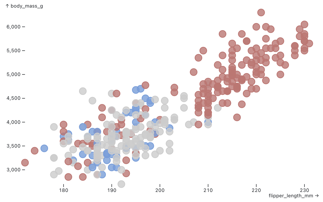
In this way, `reviz` allows end users to quickly experiment with _seeing_ their data in the form of a visualization they encounter anywhere in the wild.
To see more examples of the partial programs `reviz` generates, check out [our examples site](https://reviz.vercel.app). To understand how `reviz` works at a deeper level, consider reading [our paper](/paper/reviz.pdf).
### Supported Visualization Types
`reviz` is restricted to only work on a small subset of visualization types. We hope to extend `reviz` to include more visualization types in the future.
| Visualization Type | Description |
| ------------------------------------------------------------------ | ----------------------------------------------------------------------------------------------------------------------------------------------------------------------------- |
| [Bar Chart](https://reviz.vercel.app/examples/bar-chart) | Old trusty. The bar chart represents data values using the height of each `rect` mark. The data values mapped to the x-axis must be **discrete**, not continuous. |
| [Bubble Chart](https://reviz.vercel.app/examples/bubble-chart) | The bubble chart is similar to the scatterplot, with the radius of each `circle` mark mapped to the square root of a data value. |
| [Histogram](https://reviz.vercel.app/examples/histogram) | Similar to a bar chart, but the data values mapped to the x-axis must be **continuous**, not discrete. Histograms are typically used to visualize distributions in a dataset. |
| [Scatterplot](https://reviz.vercel.app/examples/scatterplot) | The scatterplot places `circle` marks in an x-y coordinate plane, often to show a correlation between two variables. |
| [Stacked Bar Chart](https://reviz.vercel.app/examples/scatterplot) | A dressed up version of the bar chart in which subcategories of data can be compared across groups. |
| [Strip Plot](https://reviz.vercel.app/examples/strip-plot) | Many rows of `circle` marks are placed on the same continous scale to visualize distributions in a dataset. |