https://github.com/pawankolhe/color-calendar
📅 A customizable calendar JavaScript UI widget/component library with the ability to show events.
https://github.com/pawankolhe/color-calendar
calendar calendar-picker calendar-ui calendar-widget color-calendar date-picker javascript
Last synced: over 1 year ago
JSON representation
📅 A customizable calendar JavaScript UI widget/component library with the ability to show events.
- Host: GitHub
- URL: https://github.com/pawankolhe/color-calendar
- Owner: PawanKolhe
- License: mit
- Created: 2020-07-25T11:31:03.000Z (about 6 years ago)
- Default Branch: master
- Last Pushed: 2023-11-01T09:58:30.000Z (over 2 years ago)
- Last Synced: 2025-03-29T03:35:32.341Z (over 1 year ago)
- Topics: calendar, calendar-picker, calendar-ui, calendar-widget, color-calendar, date-picker, javascript
- Language: TypeScript
- Homepage: https://www.npmjs.com/package/color-calendar
- Size: 5.02 MB
- Stars: 178
- Watchers: 4
- Forks: 69
- Open Issues: 40
-
Metadata Files:
- Readme: README.md
- License: LICENSE
Awesome Lists containing this project
README
Color Calendar


[](https://circleci.com/gh/PawanKolhe/color-calendar)
A customizable events calendar component library. Checkout Demo 1, Demo 2 and Demo 3.
- [Features](#features)
- [Getting Started](#getting-started)
- [CDN](#cdn)
- [NPM](#npm)
- [Usage](#usage)
- [Basic](#usage-basic)
- [React](#usage-react)
- [Vue](#usage-vue)
- [Options](#options)
- [Events](#events)
- [Methods](#methods)
- [Types](#types)
- [Themes](#themes)
- [Bug Reporting](#bug)
- [Feature Request](#feature-request)
- [Release Notes](#release-notes)
- [License](#license)
## 🚀 Features
- Zero dependencies
- Add events to calendar
- Perform some action on calendar date change
- Month and year picker built-in
- Themes available
- Fully customizable using CSS variables, passing options parameters while creating calendar, or overriding CSS.
- [Request more features](#feature-request)...
## 📦 Getting Started
### CDN
#### JavaScript
```html
```
Also available on [unpkg](https://unpkg.com/browse/color-calendar/dist/).
#### CSS
Pick a css file according to the theme you want.
```html
<link
rel="stylesheet"
href="https://cdn.jsdelivr.net/npm/color-calendar/dist/css/theme-basic.css"
/>
<!-- or -->
<link
rel="stylesheet"
href="https://cdn.jsdelivr.net/npm/color-calendar/dist/css/theme-glass.css"
/>
```
#### Fonts
Get fonts from [Google Fonts](https://fonts.google.com/)
```html
<link
href="https://fonts.googleapis.com/css2?family=Open+Sans:wght@400;600;700&display=swap"
rel="stylesheet"
/>
```
Check what fonts the [theme](#themes) needs or pass your own fonts in [options](#options-fonts).
### NPM
> _You might need to use a module bundler such as webpack, rollup, parcel, etc._
#### Installation
```bash
npm i color-calendar
```
#### Import
```javascript
import Calendar from "color-calendar";
```
#### CSS
```javascript
import "color-calendar/dist/css/theme-<THEME-NAME>.css";
```
Then add fonts.
<a id="usage"></a>
## 🔨 Usage
<a id="usage-basic"></a>
### Basic
#### JavaScript
```javascript
new Calendar();
```
_Or_ you can pass in **options**.
```javascript
new Calendar({
id: "#color-calendar",
calendarSize: "small",
});
```
#### HTML
```html
<div id="color-calendar"></div>
```
[Example](https://codesandbox.io/s/color-calendar-bnwdu)
<a id="usage-react"></a>
### React
[Example](https://codesandbox.io/s/color-calendar-react-y0cyf?file=/src/CalendarComponent.jsx)
<a id="usage-vue"></a>
### Vue
[Example](https://codesandbox.io/s/color-calendar-vue-byo6e?file=/src/components/ColorCalendar.vue)
<a id="options"></a>
## ⚙️ Options
### `id`
Type: `String`
Default: `#color-calendar`
Selector referencing HTMLElement where the calendar instance will bind to.
### `calendarSize`
Type: `String`
Default: `large`
Options: `small` | `large`
Size of calendar UI.
### `layoutModifiers`
Type: [`LayoutModifier`](#type-layout-modifier)[]
Default: `[]`
Example: `['month-left-align']`
Modifiers to alter the layout of the calendar.
### `eventsData`
Type: [`EventData`](#type-event-data)[]
Default: `null`
```javascript
[
{
start: '2020-08-17T06:00:00',
end: '2020-08-18T20:30:00',
name: 'Blockchain 101'
...
},
...
]
```
Array of objects containing events information.
> Note: Properties `start` and `end` are _required_ for each event in the [ISO 8601](https://en.wikipedia.org/wiki/ISO_8601) date and time format. You can _optionally_ choose to add other properties.
### `theme`
Type: `String`
Default: `basic`
Options: `basic` | `glass`
Choose from available themes.
### `primaryColor`
Type: `String`
Default: _based on theme_
Example: `#1a237e`
Main color accent of calendar. _Pick a color in rgb, hex or hsl format._
### `headerColor`
Type: `String`
Default: _based on theme_
Example: `rgb(0, 102, 0)`
Color of header text.
### `headerBackgroundColor`
Type: `String`
Default: _based on theme_
Example: `black`
Background color of header. _Only works on some themes._
### `weekdaysColor`
Type: `String`
Default: _based on theme_
Color of weekdays text. _Only works on some themes._
### `weekdayDisplayType`
Type: `String`
Default: `short`
Options: [WeekdayDisplayType](#type-weekday-display-type) (`short` | `long-lower` | `long-upper`)
Select how weekdays will be displayed. E.g. M, Mon, or MON.
### `monthDisplayType`
Type: `String`
Default: `long`
Options: [MonthDisplayType](#type-month-display-type) (`short` | `long`)
Select how month will be displayed in header. E.g. Feb, February.
### `startWeekday`
Type: `Number`
Default: `0`
Options: `0` | `1` | `2` | `3` | `4` | `5` | `6`
Starting weekday. Mapping: 0 (Sun), 1 (Mon), 2 (Tues), 3 (Wed), 4 (Thurs), 5 (Fri), 6 (Sat)
<a id="options-fonts"></a>
### `fontFamilyHeader`
Type: `String`
Default: _based on theme_
Example value: `'Open Sans', sans-serif`
Font of calendar header text.
### `fontFamilyWeekdays`
Type: `String`
Default: _based on theme_
Font of calendar weekdays text.
### `fontFamilyBody`
Type: `String`
Default: _based on theme_
Font of calendar days as well as month and year picker text.
### `dropShadow`
Type: `String`
Default: _based on theme_
Set CSS of calendar drop shadow.
### `border`
Type: `String`
Default: _based on theme_
Example value: `5px solid black`
Set CSS style of border.
### `borderRadius`
Type: `String`
Default: `0.5rem`
Set CSS border radius of calendar.
### `disableMonthYearPickers`
Type: `Boolean`
Default: `false`
If month and year picker should be disabled.
### `disableDayClick`
Type: `Boolean`
Default: `false`
If day click should be disabled.
### `disableMonthArrowClick`
Type: `Boolean`
Default: `false`
If month arrows should be disabled.
### `customMonthValues`
Type: `String[]`
Default: `undefined`
Set custom display values for Month.
### `customWeekdayValues`
Type: `String[]`
Default: `undefined`
Set custom display values for Weekdays.
```javascript
["Lun", "Mar", "Mer", "Jeu", "Ven", "Sam", "Dim"];
```
<a id="events"></a>
## 🖱 Events
### `dateChanged`
Type: `Function`
Props:
- `currentDate`
- Type: `Date`
- Currently selected date
- `filteredDateEvents`
- Type: [`EventData`](#type-event-data)[]
- All events on that particular date
```typescript
const options = {
...
dateChanged: (currentDate?: Date, filteredDateEvents?: EventData[]) => {
// do something
};
...
}
```
Emitted when the selected date is changed.
### `selectedDateClicked`
Type: `Function`
Props:
- `currentDate`
- Type: `Date`
- Currently selected date
- `filteredMonthEvents`
- Type: [`EventData`](#type-event-data)[]
- All events on that particular month
Emitted when the selected date is clicked.
### `monthChanged`
Type: `Function`
Props:
- `currentDate`
- Type: `Date`
- Currently selected date
- `filteredMonthEvents`
- Type: [`EventData`](#type-event-data)[]
- All events on that particular month
Emitted when the current month is changed.
<a id="methods"></a>
## 🔧 Methods
### `reset()`
Reset calendar to today's date.
```javascript
// Example
let myCal = new Calendar();
myCal.reset();
```
### `setDate()`
Props:
| Props | Type | Required | Description |
|-------|------|----------|--------------------|
| date | Date | required | New date to be set |
Set new selected date.
```javascript
// Example
myCal.setDate(new Date());
```
### `getSelectedDate()`
Return:
- Type: `Date`
- Description: `Currently selected date`
Get currently selected date.
### `getEventsData()`
Return:
- Type: [EventData](#type-event-data)[]
- Description: `All events`
Get events array.
### `setEventsData()`
Props:
| Props | Type | Required | Description |
|--------|------------|----------|------------------|
| events | [EventData](#type-event-data)[] | required | Events to be set |
Return:
- Type: `Number`
- Description: `Number of events set`
Set a new events array.
### `addEventsData()`
Props:
| Props | Type | Required | Description |
|--------|------------|----------|--------------------|
| events | [EventData](#type-event-data)[] | required | Events to be added |
Return:
- Type: `Number`
- Description: `Number of events added`
Add events of the events array.
### `setWeekdayDisplayType()`
Props:
| Props | Type | Required | Description |
|--------|------------|----------|--------------------|
| weekdayDisplayType | [WeekdayDisplayType](#type-weekday-display-type) | required | New weekday type |
Set weekdays display type.
```javascript
// Example
myCal.setWeekdayDisplayType("short");
```
### `setMonthDisplayType()`
Props:
| Props | Type | Required | Description |
|--------|------------|----------|--------------------|
| monthDisplayType | [MonthDisplayType](#type-month-display-type) | required | New month display type |
Set month display type.
<a id="types"></a>
## 💎 Types
<a id="type-event-data"></a>
### `EventData`
```javascript
{
start: string, // ISO 8601 date and time format
end: string, // ISO 8601 date and time format
[key: string]: any,
}
```
<a id="type-weekday-display-type"></a>
### `WeekdayDisplayType`
`"short"` | `"long-lower"` | `"long-upper"`
```markdown
// "short"
M T W ...
// "long-lower"
Mon Tue Wed ...
// "long-upper"
MON TUE WED ...
```
<a id="type-month-display-type"></a>
### `MonthDisplayType`
`"short"` | `"long"`
```markdown
// "short"
Jan Feb Mar ...
// "long"
January February March ...
```
<a id="type-layout-modifier"></a>
### `LayoutModifier`
`"month-align-left"`
<a id="themes"></a>
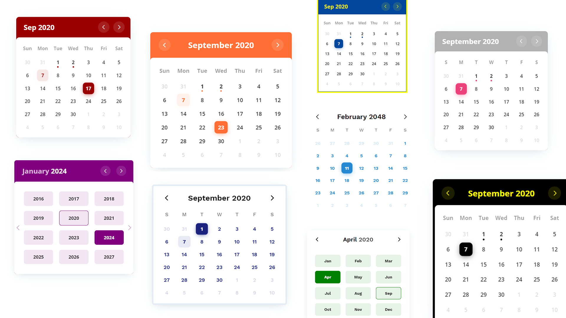
## 🎨 Themes
Currently 2 themes available. More on the way.
### `basic`
<img src="https://raw.githubusercontent.com/PawanKolhe/color-calendar/master/screenshots/theme-basic.PNG" alt="Basic Theme" width="400" />
#### CSS Custom Properties
`--cal-color-primary`: #000000;
`--cal-font-family-header`: "Work Sans", sans-serif;
`--cal-font-family-weekdays`: "Work Sans", sans-serif;
`--cal-font-family-body`: "Work Sans", sans-serif;
`--cal-drop-shadow`: 0 7px 30px -10px rgba(150, 170, 180, 0.5);
`--cal-border`: none;
`--cal-border-radius`: 0.5rem;
`--cal-header-color`: black;
`--cal-weekdays-color`: black;
### `glass`
<img src="https://raw.githubusercontent.com/PawanKolhe/color-calendar/master/screenshots/theme-glass.PNG" alt="Glass Theme" width="400" />
#### CSS Custom Properties
`--cal-color-primary`: #EC407A;
`--cal-font-family-header`: 'Open Sans', sans-serif;
`--cal-font-family-weekdays`: 'Open Sans', sans-serif;
`--cal-font-family-body`: 'Open Sans', sans-serif;
`--cal-drop-shadow`: 0 7px 30px -10px rgba(150, 170, 180, 0.5);
`--cal-border`: none;
`--cal-border-radius`: 0.5rem;
`--cal-header-color`: white;
`--cal-header-background-color`: rgba(0, 0, 0, 0.3);
<a id="bug"></a>
## 🐛 Bug Reporting
Feel free to [open an issue](https://github.com/PawanKolhe/color-calendar/issues) on GitHub if you find any bug.
<a id="feature-request"></a>
## ⭐ Feature Request
- Feel free to [Open an issue](https://github.com/PawanKolhe/color-calendar/issues) on GitHub to request any additional features you might need for your use case.
- Connect with me on [LinkedIn](https://www.linkedin.com/in/kolhepawan/). I'd love ❤️️ to hear where you are using this library.
<a id="release-notes"></a>
## 📋 Release Notes
Check [here](https://github.com/PawanKolhe/color-calendar/releases) for release notes.
<a id="license"></a>
## 📜 License
This software is open source, licensed under the [MIT License](https://github.com/PawanKolhe/color-calendar/blob/master/LICENSE).