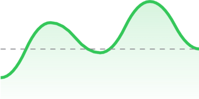
https://github.com/pichukov/LightChart
SwiftUI charts
https://github.com/pichukov/LightChart
Last synced: 8 months ago
JSON representation
SwiftUI charts
- Host: GitHub
- URL: https://github.com/pichukov/LightChart
- Owner: pichukov
- License: mit
- Created: 2020-08-21T11:16:41.000Z (over 5 years ago)
- Default Branch: master
- Last Pushed: 2023-07-12T06:35:50.000Z (over 2 years ago)
- Last Synced: 2025-05-03T06:45:33.413Z (8 months ago)
- Language: Swift
- Size: 17.6 KB
- Stars: 169
- Watchers: 2
- Forks: 11
- Open Issues: 1
-
Metadata Files:
- Readme: README.md
- License: LICENSE
Awesome Lists containing this project
- awesome-swiftui-libraries - LightChart - SwiftUI charts (Chart / Content)
- awesome-swiftui - LightChart
README

**LightChart** is a lightweight **SwiftUI** package with line charts implementation. You can use it when you need only a chart that will perfectly fit into your View. It doesn't have any interaction, titles, different types of diagram or anything else, just a representation of your data set.
Currently `LightChart` have only `line` type of chart with sharp corners or a curved one. That's how it looks in the real application on currency exchange rates example:

## Installation
It's a Swift Package, so you need to do the following:
- Open `File` in Xcode menu
- Open `Swift Packages`
- Choose `Add Package Dependency...` option
- In the `Enter package repository URL` field paste this URL: `https://github.com/pichukov/LightChart`
- Choose any existing version or a `master` branch option
## Usage
Add `import LightChart`
Add `LightChartView` into your SwiftUI code
```swift
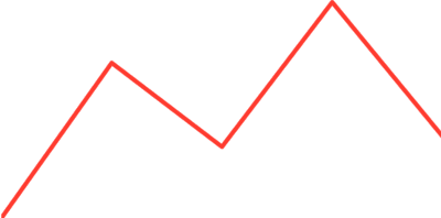
LightChartView(data: [4, 8, 12, 10, 25])
```
By default it will draw a red line chart:
To customize it you can use several properties:
#### type
The type of chart, it's an `enum` with two cases:
- `.line` is a default type that will draw a chart presented above
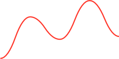
- `.curved` will draw a curved chart, for example:
```swift
LightChartView(data: [2, 17, 9, 23, 10], type: .curved)
```
#### visualType
The visual part of the chart. An `enum` with three cases:
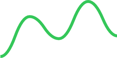
- `.outline(color: Color, lineWidth: CGFloat)` to specify a `color` and `lineWidth` for `stroke`
```swift
LightChartView(data: [2, 17, 9, 23, 10],
type: .curved,
visualType: .outline(color: .green, lineWidth: 5))
```
- `.filled(color: Color, lineWidth: CGFloat)` use stroke color to fill the chart with a gradient
```swift
LightChartView(data: [2, 17, 9, 23, 10],
type: .curved,
visualType: .filled(color: .green, lineWidth: 5))
```

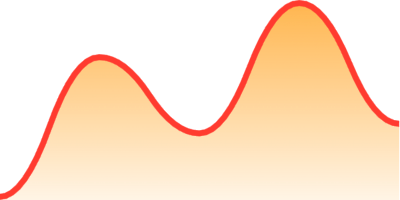
- `.customFilled(color: Color, lineWidth: CGFloat, fillGradient: LinearGradient)` also provides an option to change the fill gradient
```swift
LightChartView(data: [2, 17, 9, 23, 10],
type: .curved,
visualType: .customFilled(color: .red,
lineWidth: 3,
fillGradient: LinearGradient(
gradient: .init(colors: [Color.orange.opacity(0.7), Color.orange.opacity(0.1)]),
startPoint: .init(x: 0.5, y: 1),
endPoint: .init(x: 0.5, y: 0)
)))
```
#### offset
By default the `offset` is `0` and it means that the chart takes up the entire area of the parent view. You can move the chart line up with changing the `offset` value. For example if you will use the `offset: 0.2` you chart line will move up and take only 80% of the parent view
```swift
LightChartView(data: [2, 17, 9, 23, 10],
type: .curved,
visualType: .filled(color: .green, lineWidth: 3),
offset: 0.2)
```
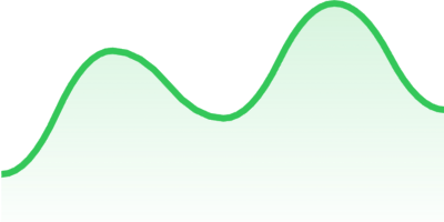
As you can see on picture above the offset effects only the chart line but not the fill gradient
#### currentValueLineType
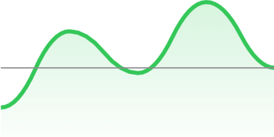
There is an option to add a horizontal line that will point the last value of the data set. A `currentValueLineType` is an `enum` that has three cases:
- `.none` is a default value that doesn't show any line
- `.line(color: Color, lineWidth: CGFloat)` adds a line with `color` and `lineWidth` for a `stroke`
```swift
LightChartView(data: [2, 17, 9, 23, 10],
type: .curved,
visualType: .filled(color: .green, lineWidth: 3),
offset: 0.2,
currentValueLineType: .line(color: .gray, lineWidth: 1))
```
- `.dash(color: Color, lineWidth: CGFloat, dash: [CGFloat])` adds a dashed line
```swift
LightChartView(data: [2, 17, 9, 23, 10],
type: .curved,
visualType: .filled(color: .green, lineWidth: 3),
offset: 0.2,
currentValueLineType: .dash(color: .gray, lineWidth: 1, dash: [5]))
```
