https://github.com/pksilen/semantic-ui-react-datetimeinput
Date and time input control with step buttons for Semantic UI React
https://github.com/pksilen/semantic-ui-react-datetimeinput
date input javascript-library picker react semantic-ui time
Last synced: 6 months ago
JSON representation
Date and time input control with step buttons for Semantic UI React
- Host: GitHub
- URL: https://github.com/pksilen/semantic-ui-react-datetimeinput
- Owner: pksilen
- License: mit
- Created: 2019-08-20T12:27:41.000Z (almost 6 years ago)
- Default Branch: master
- Last Pushed: 2023-10-18T20:13:37.000Z (over 1 year ago)
- Last Synced: 2024-10-10T22:33:27.006Z (8 months ago)
- Topics: date, input, javascript-library, picker, react, semantic-ui, time
- Language: TypeScript
- Homepage: https://pksilen.github.io/semantic-ui-react-datetimeinput/
- Size: 4.99 MB
- Stars: 3
- Watchers: 1
- Forks: 1
- Open Issues: 3
-
Metadata Files:
- Readme: README.md
- Funding: .github/FUNDING.yml
- License: LICENSE
Awesome Lists containing this project
README
# semantic-ui-react-datetimeinput
Time and Date input controls with step buttons for [Semantic UI React]
[![version][version-badge]][package]
[![build][build]][circleci]
[![Downloads][downloads]][package]
[![coverage][coverage]][codecov]
[](https://sonarcloud.io/dashboard?id=pksilen_semantic-ui-react-datetimeinput)
[](https://sonarcloud.io/dashboard?id=pksilen_semantic-ui-react-datetimeinput)
[](https://sonarcloud.io/dashboard?id=pksilen_semantic-ui-react-datetimeinput)
[![MIT License][license-badge]][license]
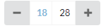
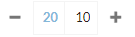
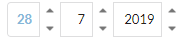
DateInput

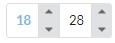
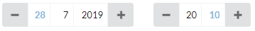
TimeInput
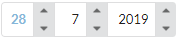
DateInput
TimeInput
Controls with large + and - buttons are ideal for mobile sites. These controls are specifically designed for analytics purposes
where you want to specify "start" date/time and "end" date/time. These can be specified with valueType prop of the components.
Double-clicking "start" type input value, sets its value to minimum value and double-clicking "end" type input value sets its value to maximum value.
Additionally, for example, Time input control can be configured to increment/decrement minutes by 5, 10 or 15 minutes whichever is mostly suitable for
your analytics need. Similarly Date input control by default decrements/increments day value on double click by one week (7 days) and month value
on double click by one quarter (3 months). All of these increment/decrement amounts for each part of time and date are fully configurable.
## Prerequisites
"react": "^16.0.0",
"react-dom": "^16.0.0",
"semantic-ui-react": "^0.87.0"
## Installation
npm install --save semantic-ui-react-datetimeinput
## Demo
TimeInput, DateInput and DateTimeInput [demo]
## Example usage
```jsx
import React from 'react';
import { DateInput, TimeInput } from 'semantic-ui-react-datetimeinput';
class DateAndTimeInputExample extends React.Component {
constructor(props) {
super(props);
this.state = {
dateValue: new Date()
};
}
changeDateValue = (newDateValue) => {
this.setState({ dateValue: newDateValue });
}
render() => {(
)};
}
```
Render TimeInput, DateInput or DateTimeInput with step buttons on outside of control (this is default behavior, if buttonPlacement is not specified)
```jsx
```
Render TimeInput, DateInput or DateTimeInput with step buttons inside control
```jsx
```
More examples in `demo/demo.tsx` file
## Mandatory TimeInput, DateInput and DateTimeInput properties
dateValue: Date,
onDateValueChange: (newDateValue: Date) => void,
## Common optional properties
| property | description |
| --------------------------| -------------------------------------------------------------------------------------------------------------------------------|
| buttonPlacement | Specifies how step buttons are placed |
| focusColor | Specifies color for focused input text |
| doubleClickDelayInMillis | Specifies button double click delay in milliseconds |
| showTooltipDelayInMillis | Specifies a delay in milliseconds for showing a tooltip |
| showTooltips | Specifies if tooltips are shown |
| size | Specifies the size of the control |
| valueType | Specifies if value type, ie. start or end time/date or unspecified |
## Common optional property types
```ts
buttonPlacement: 'buttonsInside' | 'buttonsOutside',
focusColor: string,
doubleClickDelayInMillis: number,
showTooltipDelayInMillis: number,
showTooltips: boolean,
size: 'mini' | 'small' | 'large' | 'big' | 'huge' | 'massive',
valueType: 'start' | 'end' | 'unspecified'
```
## Default values for common optional properties
```js
buttonPlacement: 'buttonsOutside',
focusColor: '#85b7d9',
doubleClickDelayInMillis: 250,
showTooltipDelayInMillis: 500,
showTooltips: true,
size: 'small',
valueType: 'start'
```
## TimeInput optional properties
| property | description |
| ----------------------------| -------------------------------------------------------------------------------------------------------------------------------------|
| hourSingleClickStepCount | Specifies how many hours a single click of a button increments or decrements current date value |
| hourDoubleClickStepCount | Specifies how many hours a double click of a button increments or decrements current date value, zero value disables double clicks |
| minuteSingleClickStepCount | Specifies how many minutes a single click of a button increments or decrements current date value |
| minuteDoubleClickStepCount | Specifies how many minutes a double click of a button increments or decrements current date value, zero value disables double clicks|
## TimeInput optional property types
```ts
hourSingleClickStepCount: number,
hourDoubleClickStepCount: number,
minuteSingleClickStepCount: number,
minuteDoubleClickStepCount: number
```
## Default values for TimeInput optional properties
```js
hourSingleClickStepCount: 1,
hourDoubleClickStepCount: 4,
minuteSingleClickStepCount: 1,
minuteDoubleClickStepCount: 5
```
## DateInput optional properties
| property | description |
| ----------------------------| ------------------------------------------------------------------------------------------------------------------------------------|
| daySingleClickStepCount | Specifies how many days a single click of a button increments or decrements current date value |
| dayDoubleClickStepCount | Specifies how many days a double click of a button increments or decrements current date value, zero value disables double clicks |
| monthSingleClickStepCount | Specifies how many months a single click of a button increments or decrements current date value |
| monthDoubleClickStepCount | Specifies how many months a double click of a button increments or decrements current date value, zero value disables double clicks|
| yearSingleClickStepCount | Specifies how many years a single click of a button increments or decrements current date value |
| yearDoubleClickStepCount | Specifies how many years a double click of a button increments or decrements current date value, zero value disables double clicks |
## TimeInput optional property types
```ts
daySingleClickStepCount: number,
dayDoubleClickStepCount: number,
monthSingleClickStepCount: number,
monthDoubleClickStepCount: number,
yearhSingleClickStepCount: number,
yearDoubleClickStepCount: number
```
## Default values for TimeInput optional properties
```js
daySingleClickStepCount: 1,
dayDoubleClickStepCount: 7,
monthSingleClickStepCount: 1,
monthDoubleClickStepCount: 3,
yearSingleClickStepCount: 1,
yearhDoubleClickStepCount: 5
```
## Keyboard actions
Following keyboard actions are available when a certain input is focused
|key |action |
|---------------|---------------------------------------------------|
|ArrowUp | Increments value like a button single click |
|ArrowDown | Decrements value like a button single click |
|+ | Increments value like a button single click |
|- | Decrements value like a button single click |
|PageUp | Increments value like a button double click |
|PageDown | Decrements value like a double button click |
|Home | Sets value to minimum value |
|End | Sets value to maximum value |
|Ctrl+ArrowUp | Increments value like a button double click |
|Ctrl+ArrowDown | Decrements value like a button double click |
|Ctrl + + | Increments value like a button double click |
|Ctrl + - | Decrements value like a button double click |
## Styling example
styles.css
```css
.timeInput .ui.button, .dateInput .ui.button {
background-color: transparent;
}
.dateTimeInput {
display: flex;
}
.dateTimeInput .timeInput {
margin-left: 2em;
}
```
Applying CSS using className
```jsx
```
## License
MIT License
[license-badge]: https://img.shields.io/badge/license-MIT-green
[license]: https://github.com/pksilen/semantic-ui-react-datetimeinput/blob/master/LICENSE
[version-badge]: https://img.shields.io/npm/v/semantic-ui-react-datetimeinput.svg?style=flat-square
[package]: https://www.npmjs.com/package/semantic-ui-react-datetimeinput
[downloads]: https://img.shields.io/npm/dm/backk
[build]: https://img.shields.io/circleci/project/github/pksilen/semantic-ui-react-datetimeinput/master.svg?style=flat-square
[circleci]: https://circleci.com/gh/pksilen/semantic-ui-react-datetimeinput/tree/master
[coverage]: https://img.shields.io/codecov/c/github/pksilen/semantic-ui-react-datetimeinput/master.svg?style=flat-square
[codecov]: https://codecov.io/gh/pksilen/semantic-ui-react-datetimeinput
[demo]: https://pksilen.github.io/semantic-ui-react-datetimeinput/
[Semantic UI React]: https://react.semantic-ui.com/