https://github.com/pksilen/semantic-ui-react-lineinput
Line input control with validation support for Semantic UI React
https://github.com/pksilen/semantic-ui-react-lineinput
input javascript javascript-library library line react semantic-ui text validation
Last synced: 11 months ago
JSON representation
Line input control with validation support for Semantic UI React
- Host: GitHub
- URL: https://github.com/pksilen/semantic-ui-react-lineinput
- Owner: pksilen
- License: mit
- Created: 2019-09-04T12:35:40.000Z (almost 7 years ago)
- Default Branch: master
- Last Pushed: 2023-10-18T14:00:29.000Z (over 2 years ago)
- Last Synced: 2024-10-31T17:20:05.453Z (over 1 year ago)
- Topics: input, javascript, javascript-library, library, line, react, semantic-ui, text, validation
- Language: TypeScript
- Homepage: https://pksilen.github.io/semantic-ui-react-lineinput
- Size: 4.04 MB
- Stars: 2
- Watchers: 1
- Forks: 1
- Open Issues: 2
-
Metadata Files:
- Readme: README.md
- Funding: .github/FUNDING.yml
- License: LICENSE
Awesome Lists containing this project
README
# semantic-ui-react-lineinput
Line input control with validation support for [Semantic UI React]
[![version][version-badge]][package]
[![build][build]][circleci]
[![Downloads][downloads]][package]
[![coverage][coverage]][codecov]
[][sonarcloud]
[][sonarcloud]
[][sonarcloud]
[![MIT License][license-badge]][license]


## Prerequisites
"react": "^16.0.0",
"react-dom": "^16.0.0",
"semantic-ui-react": "^0.87.0"
## Installation
npm install --save semantic-ui-react-lineinput
## Demo
LineInput [demo]
## Example usage
```jsx
import React from 'react';
import LineInput from 'semantic-ui-react-lineinput';
class LineInputExample extends React.Component {
constructor(props) {
super(props);
this.state = {
value: ""
};
}
changeValue = (newValue) => {
this.setState({ value: newValue });
}
render() => {(
)};
}
```
LineInput with predefined validations
```jsx
```
LineInput with regular expression validation
```jsx
const regExp = /^\d{3,4}$/;
```
LineInput with validation function
```jsx
const isEvenNumber = (valueStr) => {
const value = parseInt(valueStr, 10);
return value % 2 === 0;
}
```
LineInput with list of allowed values validation (case sensitive)
```jsx
const allowedValues = ['value1', 'value2', 'value3'];
```
More examples can be found in `demo/demo.tsx` file.
## Mandatory properties
value: string,
onValueChange: (newValue: string) => void,
## Optional properties
| property | description |
| --------------------------| -------------------------------------------------------------------------------------------------------------------------------------------------------------------|
| allowEmptyValue | Specifies if empty value for input is allowed |
| className | class names for outer div |
| countryCode | Default country code ISO 3166-1 Alpha-2 code for phone number validation, if not supplied, browser's country code is used |
| creditCardNumber | Credit card number for CVC validation |
| disabled | Specified if input is enabled or disabled |
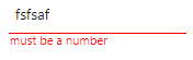
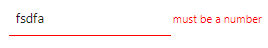
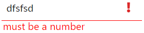
| errorText | Text shown if validation fails |
| errorTextPosition | Position where error text is shown |
| focus | Input has initial focus style |
| icon | Name of Semantic UI icon to be shown in input, is overridden by validationErrorIcon or validationSuccessIcon, has no effect for validation type 'creditCardNumber |
| iconColor | Color for icon (red, orange, yellow, olive, green, teal, blue, violet, purple, pink, brown, grey, black |
| iconPosition | Position where the icon is shown |
| maxLength | Maximum number of characters allowed for input control value |
| maxValue | Maximum allowed value when validation is 'number' or 'integer' |
| minLength | Minimum number of characters needed for input control value |
| minValue | Minimum allowed value when validation is 'number' or 'interger' |
| placeholder | Placeholder value for input control |
| size | Size of control |
| type | HTML input type, if undefined, sets type automatically according to validation or otherwise 'text' |
| validation | Validation keyword, a regular expression or a validation function |
| validationErrorIcon | Semantic UI icon name to be shown if validation fails, overrides icon set by icon prop, has no effect for validation type 'creditCardNumber' |
| validationSuccessIcon | Semantic UI icon name to be shown if validation succeeds, overrides icon set by icon prop, has no effect for validation type 'creditCardNumber' |
## Optional property types
```ts
allowEmptyValue: boolean,
className: string,
countryCode: string,
creditCardNumber: string,
disabled: boolean,
errorText: string,
errorTextPosition: 'bottom' | 'right',
focus: boolean,
icon: string,
iconColor: string,
iconPosition: 'left' | 'right',
maxLength: number,
maxValue: number,
minLength: number,
minValue: number,
placeholder: string,
size: 'mini' | 'small' | 'large' | 'big' | 'huge' | 'massive',
type: string,
validation: RegExp | string[] | (inputString: string) => boolean | 'url' | 'emailAddress' | 'creditCardNumber' | 'creditCardExpiration' | 'creditCardVerificationCode' | 'number' | 'integer' | 'alphaNumeric' | 'usZipCode' | 'caPostCode' | 'ukPostCode' | 'phoneNumber' | 'usSSN' | 'ipAddress' | 'ipv4Address' | 'ipv6Address' | 'hexColor'
```
## Default values for optional properties
```js
allowEmptyValue: false,
className: undefined,
countryCode: '',
creditCardNumber: '',
disabled: false,
errorText: '',
errorTextPosition: 'bottom',
focus: false,
icon: '',
iconColor: undefined,
iconPosition: 'left',
maxLength: undefined,
maxValue: undefined,
minLength: undefined,
minValue: undefined,
placeholder: '',
size: 'small',
type: undefined,
validation: undefined
```
## Styling example


styles.css
```css
.expiration {
margin-left: 0.5em;
}
.expiration input {
width: 4.9em;
}
.cvc {
margin-left: 0.5em;
}
.cvc input {
margin-left: 0.5em;
width: 3.5em;
}
```
Applying CSS using className
```jsx
```
## Credit card validations
Supported cards
* American Express
* Dankort
* Diners Club
* Discover
* JCB
* Laser
* Maestro
* MasterCard
* UnionPay
* Visa
* Visa Electron
Credit card number must pass Luhn check
Credit card expiration is supported in format 'MM / YY'
Credit card verification code (CVC) can validated with two options
* Without credit card number: it must be 3-4 digits
* With credit card number: it must be 3-4 digits depending on the supplied credit card type
## License
MIT License
[license-badge]: https://img.shields.io/badge/license-MIT-green
[license]: https://github.com/pksilen/semantic-ui-react-lineinput/blob/master/LICENSE
[version-badge]: https://img.shields.io/npm/v/semantic-ui-react-lineinput.svg?style=flat-square
[package]: https://www.npmjs.com/package/semantic-ui-react-lineinput
[downloads]: https://img.shields.io/npm/dm/semantic-ui-react-lineinput
[build]: https://img.shields.io/circleci/project/github/pksilen/semantic-ui-react-lineinput/master.svg?style=flat-square
[circleci]: https://circleci.com/gh/pksilen/semantic-ui-react-lineinput/tree/master
[coverage]: https://img.shields.io/codecov/c/github/pksilen/semantic-ui-react-lineinput/master.svg?style=flat-square
[codecov]: https://codecov.io/gh/pksilen/semantic-ui-react-lineinput
[sonarcloud]: https://sonarcloud.io/dashboard?id=pksilen_semantic-ui-react-lineinput
[demo]: https://pksilen.github.io/semantic-ui-react-lineinput/
[Semantic UI React]: https://react.semantic-ui.com/