https://github.com/pktintali/flutter_custom_cards
Flutter Custom Cards help developers to create beautiful custom cards and 3D cards with flutter.
https://github.com/pktintali/flutter_custom_cards
custom-card dart flutter flutter-package flutter-widget pub
Last synced: 4 months ago
JSON representation
Flutter Custom Cards help developers to create beautiful custom cards and 3D cards with flutter.
- Host: GitHub
- URL: https://github.com/pktintali/flutter_custom_cards
- Owner: pktintali
- License: mit
- Created: 2020-12-11T09:10:03.000Z (over 5 years ago)
- Default Branch: main
- Last Pushed: 2021-11-21T05:31:04.000Z (over 4 years ago)
- Last Synced: 2024-05-03T03:25:59.490Z (about 2 years ago)
- Topics: custom-card, dart, flutter, flutter-package, flutter-widget, pub
- Language: Dart
- Homepage: https://pub.dev/packages/flutter_custom_cards
- Size: 353 KB
- Stars: 4
- Watchers: 2
- Forks: 0
- Open Issues: 0
-
Metadata Files:
- Readme: README.md
- Changelog: CHANGELOG.md
- License: LICENSE
Awesome Lists containing this project
README
# Flutter Custom Cards
Flutter Custom Cards help developers to create beautiful custom cards and 3D cards with flutter.


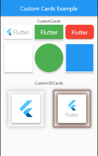
## Demo Screenshot
## Getting Started
Add the package In your pubspec.yaml
```yaml
flutter_custom_cards: ^0.2.1
```
Import and use
```dart
import 'package:flutter_custom_cards/flutter_custom_card.dart'
```
## Basic Usages
To create a `CustomCard`
```dart
CustomCard(
borderRadius: 10,
color: Colors.yellow,
hoverColor: Colors.indigo,
onTap: () {},
child: Text('Flutter'),
),
```
To Create a `Custom3DCard`
```dart
Custom3DCard(
elevation: 4,
child: SizedBox(
height: 100,
width: 100,
child: Center(
child: FlutterLogo(size: 65),
),
),
),
```
>For Full Uses See [Example](https://pub.dev/packages/flutter_custom_cards/example) Section
## Major Changes
On version 0.2 the following major changes were done on the release
- `TextCard`, `ImageCard` and `WidgetCard` have been merged into single card named `CustomCard`.
- Now new CustomCards supports onTap, hoverColor, height, width and more.
- `Custom3DCard` is introduced in this version that was not in the previous version.
- Now there are only two cards `CustomCard` and `Custom3DCard`
## CustomCard Options
The following options are available on `CustomCard`
| Property | Type | Description |
| --------------| --------- |--------------|
| borderColor | Color |Border color of card
| borderRadius | double |Radius of the card
| borderWidth | double | Border width of card
| child | Widget |child Widget of card
| childPadding | double | Padding for the child widget (default is 5)
| color | Color |Background `Color` for card
| elevation | double | Elevation for the card (default is 3)
| height | double | Height of the card (if null the height will be according to child widget)
| hoverColor | Color | Hover color of card (only visible if `onTap` is not null)
| key | Key | Key is an identifier for card
| onTap | GestureTapCallback |Signature for when a tap has occurred.
| shadowColor | Color | Shadow color of card
| splashColor | Color |Splash color of card (only visible if `onTap` is not null
| width | double |Width of the card (if null the width will be according to child widget)
## Custom3DCard Options
The following options are available on `Custom3DCard`
| Property | Type | Description |
| --------------| --------- |--------------|
| borderOnForeground | bool |If false, the border will be painted behind the child (default true)
| child | Widget | Child widget of card
| color | Color | Color of card
| elevation | double |Elevation of card
| key | Key |Key is an identifier for card
| margin | EdgeInsetsGeometry |The empty space that surrounds the card
| semanticContainer | bool |Whether this widget represents a single semantic container (default true)
| shadowColor | Color |The color to paint the shadow below the card.
| shadowSpread | double | Spread distance of `shadow` below card (default is 10)
| shape | ShapeBorder | The shape of the card
## Upcoming
The following features will rollout soon
- `onTap` option on `Custom3DCard` as well
- `onHover` option in both of the cards
- `onLongPressed` and `onDoubleTap` option in both of the cards
- `style` property in `Custom3DCard` using this we can create different types of 3d cards.
## License
This project is licensed under the MIT license. See [LICENSE](https://github.com/pktintali/flutter_custom_cards/blob/main/LICENSE) for details.
