https://github.com/pleerock/ngx-select-controls
Checkbox group and radio group control for your angular2 applications using bootstrap3.
https://github.com/pleerock/ngx-select-controls
Last synced: about 1 year ago
JSON representation
Checkbox group and radio group control for your angular2 applications using bootstrap3.
- Host: GitHub
- URL: https://github.com/pleerock/ngx-select-controls
- Owner: pleerock
- Archived: true
- Created: 2016-03-08T08:01:56.000Z (about 10 years ago)
- Default Branch: master
- Last Pushed: 2017-05-19T13:12:15.000Z (almost 9 years ago)
- Last Synced: 2025-03-30T13:03:55.429Z (about 1 year ago)
- Language: TypeScript
- Size: 206 KB
- Stars: 46
- Watchers: 4
- Forks: 17
- Open Issues: 6
-
Metadata Files:
- Readme: README.md
Awesome Lists containing this project
- awesome-angular-components - ng2-select-controls - Checkbox group and radio group control for your angular2 applications using bootstrap3. (Uncategorized / Uncategorized)
- angular-awesome-list - ng-radio-group
README
> This repository is for demonstration purposes of how it can be implemented in Angular and is not maintaned. Please fork and maintain your own version of this repository.
# ng2-radio-group
Ultimate set of select components that you ever need. All with angular2, no jquery.
Checkbox group and radio group control for your angular2 applications. Does not depend of jquery.
Please star a project if you liked it, or create an issue if you have problems with it.

## Installation
1. Install npm module:
`npm install ng2-radio-group --save`
2. If you are using system.js you may want to add this into `map` and `package` config:
```json
{
"map": {
"ng2-radio-group": "node_modules/ng2-radio-group"
},
"packages": {
"ng2-radio-group": { "main": "index.js", "defaultExtension": "js" }
}
}
```
## Simple checkboxes and radio boxes
If you need a simple checkbox for your variable:
```html
remember me?
```
* `ngModel` is a model you are trying to change (rememberMe is a boolean variable in your component)
* `value` is a value that should be written to the model when checkbox is checked. Default is **true**.
* `uncheckedValue` is a value that should be written to the model when checkbox is unchecked. Default is **false**.
* `required` you can set it to required, and you can use it with forms
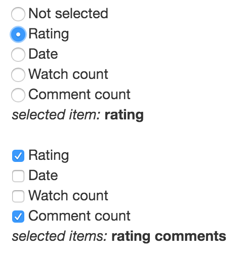
If your model is an array and you want to push multiple items into it, you can use it with this component:
```html
Rating
Date
Watch count
Comment count
```
Don't forget to initialize your `orderBy` array.
If you need to select only one item from the multiple options, you need a radio boxes:
```html
Rating
Date
Watch count
Comment count
```
## Checkbox and Radio groups
To simplify this selection you can use checkbox and radio groups:
```html
Rating
Date
Watch count
Comment count
Rating
Date
Watch count
Comment count
```
If you want to go deeper and make better (but less customizable) radio groups, then use radio-groups in composition
with radio-items:
```html
Rating
Date
Watch count
Comment count
Rating
Date
Watch count
Comment count
```
Last method allows you to click on labels and you click will treat like you clicked on a checkbox itself.
## Select items component
tbd
## Select dropdown component
tbd
## Autocomplete component
tbd
## Select tags component
tbd
## Sample
Complete example of usage:
```typescript
import {Component} from "@angular/core";
import {RADIO_GROUP_DIRECTIVES} from "ng2-radio-group";
@Component({
selector: "app",
template: `
Is something enabled: (non-multiple checkbox)
isSomethingEnabled value: {{ isSomethingEnabled }}
Order by: (multiple check boxes)
Rating
Date
Watch count
Comment count
selected items: {{ order }}
Sort by: (simple radio boxes)
Rating
Date
Watch count
Comment count
selected item: {{ sortWithoutGroup }}
Sort by: (radio boxes wrapped in the group)
Rating
Date
Watch count
Comment count
selected item: {{ sortBy }}
Order by: (check boxes wrapped in the group)
Rating
Date
Watch count
Comment count
selected items: {{ order }}
Sort by: (check boxes in group, less flexible, but simpler and the whole component is clickable)
Rating
Date
Watch count
Comment count
selected item: {{ sortBy }}
Order by: (radio boxes in group, less flexible, but simpler and the whole component is clickable)
Rating
Date
Watch count
Comment count
selected items: {{ order }}
Example with form:
Not selected
Rating
Date
Watch count
Comment count
Sort by is required
Rating
Date
Watch count
Comment count
Order by is required
`,
directives: [RADIO_GROUP_DIRECTIVES]
})
export class App {
rememberMe: boolean = false;
sortBy: string = "date";
orderBy: string[] = ["rating", "comments"];
}
```
Take a look on samples in [./sample](https://github.com/pleerock/ng2-radio-group/tree/master/sample) for more examples of
usages.
## Release notes
**0.0.5**
* `[(model)]` now should be `[(ngModel)]`
* component now can be used with forms and validation can be applied (like `required`)
* `check-box` and `radio-box` has been removed, now you simply need to make your input as checkbox or radio:
`` or ``