https://github.com/plurid/css-space
CSS Space Layout Module Proposal [Desearch Concept]
https://github.com/plurid/css-space
css user-interface
Last synced: about 14 hours ago
JSON representation
CSS Space Layout Module Proposal [Desearch Concept]
- Host: GitHub
- URL: https://github.com/plurid/css-space
- Owner: plurid
- License: mit
- Created: 2019-01-18T16:30:38.000Z (over 6 years ago)
- Default Branch: master
- Last Pushed: 2020-09-10T09:18:01.000Z (about 5 years ago)
- Last Synced: 2025-05-19T01:38:07.290Z (5 months ago)
- Topics: css, user-interface
- Homepage:
- Size: 1.22 MB
- Stars: 0
- Watchers: 2
- Forks: 0
- Open Issues: 0
-
Metadata Files:
- Readme: README.md
- License: LICENSE
Awesome Lists containing this project
README
# CSS Space Layout Module Proposal
Proposal of the `CSS Space` Layout Module.
+ [Abstract](#abstract)
+ [Status Of This Document](#status-of-this-document)
+ [1. Introduction](#1-introduction)
+ [Notes](#notes)
## Abstract
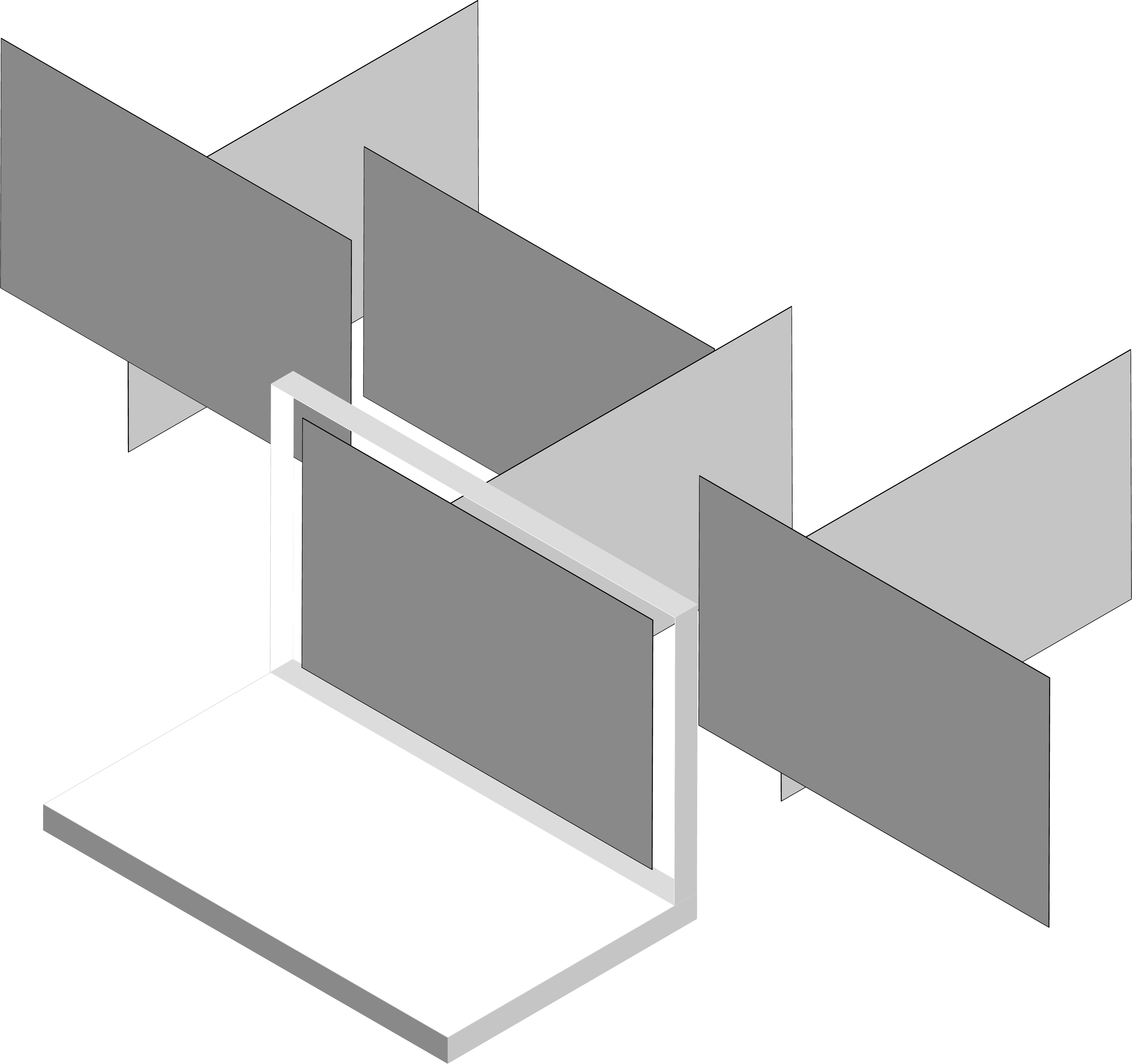
The `CSS Space` module defines a three-dimensional layout system, optimized for user interface design. In the space layout model, the children of a space container can be positioned at a predefined spatial location.
## Status Of This Document
This document is NOT part of the current CSS standards and is merely a proposal, as implemented in the [`plurid`](https://github.com/plurid/plurid) framework.
The document is being written keeping an eye open on the formalization, practices, and discourse of the [CSS Grid Layout Module](https://www.w3.org/TR/css-grid-1/) and the [CSS Flexible Box Layout Module](https://www.w3.org/TR/css-flexbox-1/).
## 1. Introduction
This section is not normative.
Space Layout is a layout model for CSS that grants the abilities to control the sizing and positioning of 2-dimensional planes and their contents within a 3-dimensional structure. Unlike [Grid Layout](https://www.w3.org/TR/css-grid-1/), which is optimized for 2-dimensional layouts, and [Flexible Box Layout](https://www.w3.org/TR/css-flexbox-1/), which is single-axis–oriented, Space Layout is optimized for 3-dimensional layouts: those in which alignment of content is desired in three dimensions.
Space Layout is not meant as a replacement of Grid or Flexible Box Layout, but is the logical extension into the third dimension of the layout interface. The 2-dimensional planes in fact should rely on Grid and Flexible Box Layout, as well as all the other standard CSS rules, to obtain the desired design.
// Example 1
// CSS
#space {
display: space;
/*
vp - viewport units
*/
space-template-columns: 1vp 0.3vp
// space-template-rows: ???
/*
to use 'sheaf' <-> 'sheaves' as the 3-dimensional equivalent to rows and columns?
*/
space-template-sheaves: ???
}
// HTML
## Notes
### Quantization
To "break" the space into `quanta`, `sheaves`?.
:root {
space-quantize: pre;
space-quantize: post;
}
To speak of `clusters`, linked plurid-pages independent of other linked plurid-pages.
### Modifiiers
:root {
space-modifier-rotation: shift;
space-modifier-translation: alt | option;
space-modifier-scale: control | ctrl | command | cmd;
}