https://github.com/portiesp/markupwidgets
This is a set of customizable widgets as react components
https://github.com/portiesp/markupwidgets
component-library components next nextjs react tags widgets widgets-bundle
Last synced: 3 months ago
JSON representation
This is a set of customizable widgets as react components
- Host: GitHub
- URL: https://github.com/portiesp/markupwidgets
- Owner: PortiESP
- Created: 2022-07-17T22:13:39.000Z (almost 4 years ago)
- Default Branch: main
- Last Pushed: 2023-05-21T16:49:56.000Z (about 3 years ago)
- Last Synced: 2025-06-30T13:54:32.781Z (about 1 year ago)
- Topics: component-library, components, next, nextjs, react, tags, widgets, widgets-bundle
- Language: SCSS
- Homepage: https://porti.dev
- Size: 213 KB
- Stars: 2
- Watchers: 1
- Forks: 0
- Open Issues: 0
-
Metadata Files:
- Readme: README.md
Awesome Lists containing this project
README
# MarkupWidgets docs 📖
The MarkupWidgets module is a packet of React components (widgets) that provides more tags for building web SubPages that the programmer can use as default but also customize the base component.
[*Go to widgets*](#widgets-list)
### Features
- 🎨 Fully customizable
- 🕹️ Interactive widgets
- 💼 Prop | wrap based content
- 😍 Nice designs
- 🏷️ Styles, IDs, etc...
### *Example SubPage:*
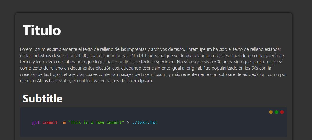
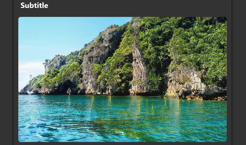
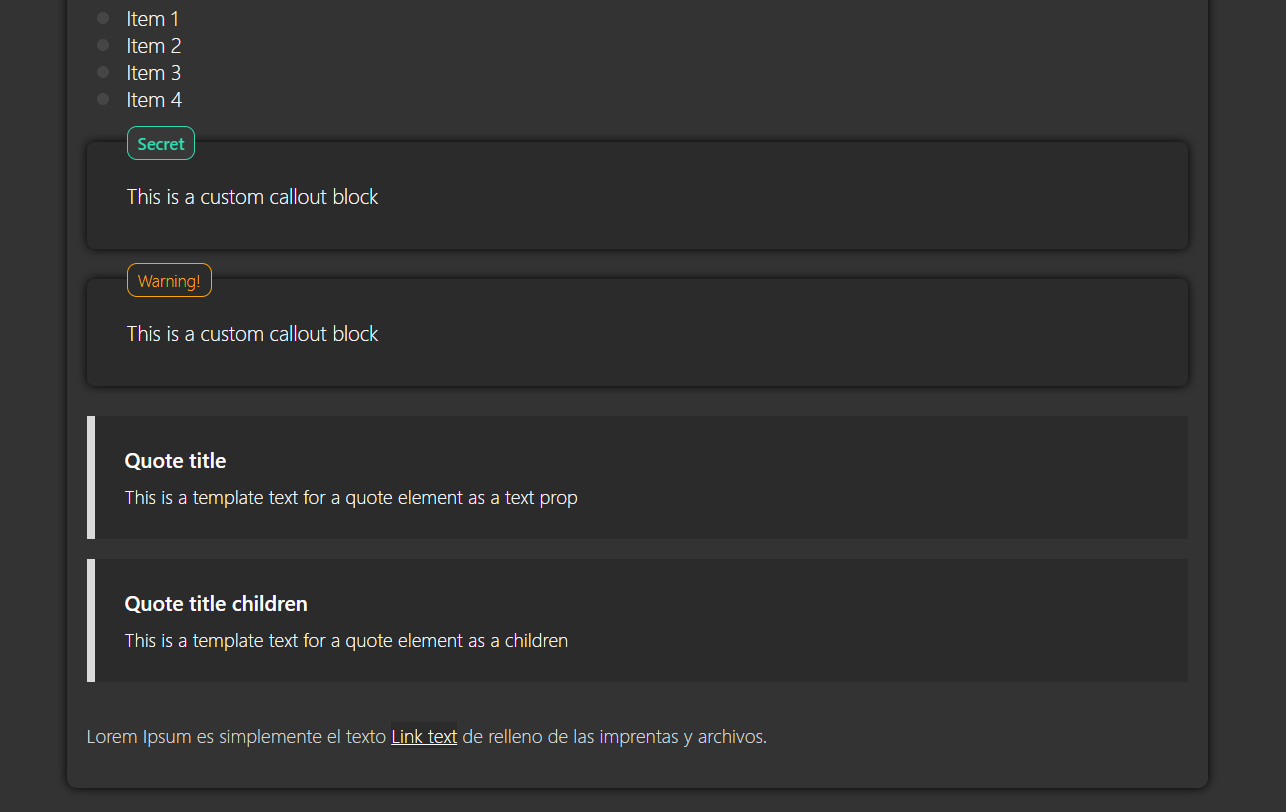
Example screenshoots 🖼️
Example syntax 📟
#### Code of the screenshoots above...
```js
<>
Title
Lorem Ipsum es simplemente el texto de relleno de las imprentas y archivos de texto. Lorem Ipsum ha sido el texto de relleno estándar de las industrias desde el año 1500, cuando un impresor (N. del T. persona que se dedica a la imprenta) desconocido usó una galería de textos y los mezcló de tal manera que logró hacer un libro de textos especimen. No sólo sobrevivió 500 años, sino que tambien ingresó como texto de relleno en documentos electrónicos, quedando esencialmente igual al original. Fue popularizado en los 60s con la creación de las hojas Letraset, las cuales contenian pasajes de Lorem Ipsum, y más recientemente con software de autoedición, como por ejemplo Aldus SubPageMaker, el cual incluye versiones de Lorem Ipsum.
Subtitle
// Escaping collons
git commit -m {'"This is a new commit"'} > ./text.txt
Subtitle
This is a custom callout block
This is a custom callout block
This is a template text for a quote element as a children
Lorem Ipsum es simplemente el texto Link text de relleno de las imprentas y archivos.
>
```
------------------------------------------------
## How to use the widgets?
### Download the module 📥
Navigate to the path of the folder where you want to install the module and clone from the github
```sh
git clone https://github.com/PortiESP/MarkupWidgets.git
```
### Import the module 🧩
Import the module from the file where you want to have access to the components, the module is structured in a way that the components can be imported in 3 diferent ways
- Import directly from the component file
- Import each component from the `./Tags.js`
- Import the default object of the file `./Tags.js`
```javascript
// Import component directly
import Paragraph from "./MarkupWidgets/tags/Paragraph"
// Import each component separately
import {Title, Paragraph, Code, Callout} from "./MarkupWidgets/Tags"
// Import all components as an object
import Tags from "./MarkupWidgets/Tags"
```
### Use the widgets 🖨️
Using the widgets in the return of a React component
```javascript
import Tags from "./MarkupWidgets/Tags"
import {Code, Callout}
export default function MyComponent(){
return (
<>
// Using the component from the default imported object
Example title
// Using the component from the specific export
sudo chmod +x myScript.sh
>
)
}
```
### Wrapper & prop based widgets 💼
Most of the widget in the module are compatible with both, *wrapper* and *prop* based tags
***Wrapper based tag***
```html
This is the title content
```
***Prop based tag***
```html
```
*If both options are used, the wrapper content will be priorized over the prop value*
But other widget like the `Img`, `UList`, *etc...*, this ones only support props to handle their content
### Styling the widgets
All the widgets support the `style` prop to handle the component style, anyways there are a few widgets that offer a bit more advanced features to style the diferent parts of the component
```html
```
### FAQs
- **How do is escape characters inside a component**:
```js
// The inner collons are parsed as part of a JS string and the interpolated in the JSX code
<> This is an {'"example"'} string >
```
- **How do I add a new line in my paragraph, code, callout, etc...**:
```js
// The code is parsed as normal text but the
will be parsed as HTML
const myArray = {
elem1,
elem2,
elem3
}
```
----------------------------------------------------------------
## Widgets list
- [`Title`](#title)
- [`Paragraph`](#paragraph)
- [`Link`](#link)
- [`Img`](#img)
- [`Code`](#code)
- [`UList`](#ulist)
- [`Callout`](#callout)
- [`Quote`](#quote)
- [`Colors`](#colors)
- [`Hr`](#hr)
- [`italic`/`bold`](#italic--bold-styles)
- [`Button`](#button)
- [`Toggle`](#toggle)
- [`Block`](#block)
- [`Url`](#url)
- [`SubPage`](#SubPage)
- [`Section`](#section)
- [`KbdKey`](#kbdkey)
- [`Comment`](#comment)
- [`MindMap`](#mindmap)
## Title
There are 4 types of titles/headings: *h1, h2, h3, h4* as *Title1, Title2, ...*
> ### **Props**
> - `background` - Add a background for the title
> - `text` - Text content
> - `style` - Styles object
> - `id` - Add an ID attribute
```html
Text template title
```
*H1*

*H2*

*H3*

[*Go to widgets*](#widgets-list)
## Paragraph
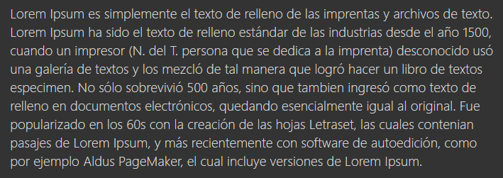
Clasic paragraph to write text, also we can write special characters by adding them inside a JS string
> ### **Props**
> - `text` - Text content
> - `style` - Styles object
> - `id` - Add an ID attribute
```html
Lorem Ipsum es simplemente el texto de relleno de las imprentas y
archivos de texto. Lorem {'"Ipsum"'} ha sido el texto de relleno estándar de
las industrias desde el año 1500.
```
[*Go to widgets*](#widgets-list)
## Link
The link widget is the same as the `` tag but with its own styles
> ### **Props**
> - `href` - Target location of the link
> - `title` - Add a *title* attribute to the tag
> - `target` - Add *target* attribute to the tag
> - `dynamic` - Flag for dynamic URLs on the same host
> - `text` - Text content
> - `style` - Styles object
> - `id` - Add an ID attribute
```html
Lorem Ipsum Link text de relleno.
```

[*Go to widgets*](#widgets-list)
## Img
Display an image, this component can be used in 3 diferent ways based on the props
- Passing an image object imported from a path
- Passing the image path, the image will fit the parent container
- Passing the image path and the `height` and `width` props
> The image aspect-ratio will respected no matter the option used
> ### **Props**
> - `src` - Image object/path
> - `alt` - Alt text
> - `title` - Add a *title* attribute
> - `ratio` - Aspect ratio of the image (default 16/9)
> - `hideCaption` - Hides the caption text shown when clicking the image
> - `style` - Styles object
> - `id` - Add an ID attribute
```javascript
import testImg from "./exampleImage.jpg"
```

[*Go to widgets*](#widgets-list)
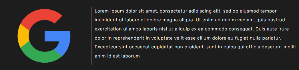
## ImgTextAside
Display an image with an aside section for text or other tags
> Use the `ratio` prop to adjust the image postion and size
> ### **Props**
> - `src` - Image object/path
> - `title` - Add a the *alt* and *title* value
> - `ratio` - Aspect ratio of the image (default 1/1)
> - `imgProportion` - Porcetage of the block that will be reserved for the image
> - `separator` - Adds a separation line between the img and the aside section
> - `style` - Styles object
> - `id` - Add an ID attribute
```javascript
import testImg from "./exampleImage.jpg"
```
[*Go to widgets*](#widgets-list)
## Code
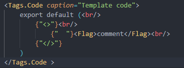
The code widget provides a snippet of some piece of code, if you *hover* into the block an icon will appear at the *bottom-right* corner that you can click to copy the code to the clipboard, a copy message will appear when the button is clicked
There are also 3 decorative buttons at the *top-right* corder, this buttons are just decorative and dont have any action
> ### **Props**
> - `inline` - Flag for code string
> - `color` - Color for the inline code
> - `caption` - Add a caption text for the code snippet
> - `output` - Add an nested div to print some kind of command output
> - `text` - Text content
> - `style` - Styles object
> - `id` - Add an ID attribute
```html
// Example from the first image
git commit -m "This is a new commit" ./text.txt
// Example for second image
// This is how we parse special characters, new lines and tabs
{`
export default (
{"<>"}
{" "}comment
{">"}
)
`}
// Example with text prop
```
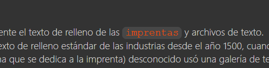
There is also an alternative prop to use this component for writtring *inline code*
```html
// Example from the second image
This is some content npm install react blablaba
This is some content npm install react blablaba
```
> To add a new line in your code just type
as the HTML tag
> Both options **allow** custom styles with the *style* prop

[*Go to widgets*](#widgets-list)
## UList
This widget take an array as a prop to generate the list
> ### **Props**
> - `items` - Array of the item strings
> - `itemStyle` - Style of the idividual items
> - `style` - Styles object
> - `id` - Add an ID attribute
```html
```

[*Go to widgets*](#widgets-list)
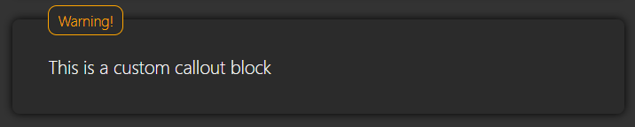
## Callout
This widget creates a text block to spotlight some text, it also can take a `label` prop to show a small text at the top of the block (*as show in the screenshoots*)
This widget can take 3 styles:
- **No label**, only the text
- **Predefined labels**, The `label` value can the following values (*warning, info, tip, danger*) with predefined styles
- **Custom label**, The label with custon text & color, but also custom styles
> ### **Props**
> - `label` - Text shown at the top in an outter block
> - `labelData` - Text, color, style (*Data taken here only when label='custom'*)
> - `text` - Text content
> - `style` - Styles object
> - `id` - Add an ID attribute
```html
This is a custom callout block
// Basic callout
// Callout with label
// Callout with custom label with default styles
// Callout with custom label with custom styles
```



[*Go to widgets*](#widgets-list)
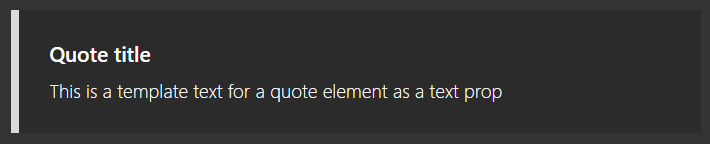
## Quote
> ### **Props**
> - `title` Add a *title* attribute
> - `text` - Text content
> - `style` - Styles object
> - `color` - Theme color of the box
> - `id` - Add an ID attribute
Quote block, colors can be personalized with the `style` props
```html
This is a template text for a quote element as a text prop
```
[*Go to widgets*](#widgets-list)
## Colors
We can apply color styles to some piece of text by using the components of the `./tags/Colors.js`, this file contains the color components to apply colors to the wrapped text
> This file is not exported by the `./Tags.js` file and it needs to be imported manualy
There are 3 types of color here based on their component name:
- **Colors**: Colors by name (*`Yellow`, `Blue`, `Red`, etc...*)(*not all colors included*)
- **Color of context**: Colors that represent the meaning of the text, (*`Str`, `Cmd`, `Opt`, `Flag`*)
- **Custom color**: Personalized color (*`Color`*)
### Import module
```js
// Import necesary colors
import {Blue, Red, Orange, Color, Flag} from "./MarkupWidgets/Tags/Colors"
// Import default component: `Color`
import MyColor from "./MarkupWidgets/Tags/Colors"
```
If you want to rename the components you can use the *import as*
```js
import {
Red as R,
Blue as B,
Green as G,
Color as C,
Flag as F
} from "./MarkupWidgets/Tags/Colors"
```
```html
// Example
This is an example text to try the colors
// Nested
This is an example text to try the colors
```
> Remember that we have imported the component colors as its initial letter
If we use the `Color` component we can pass only the CSS color name or the prop `color` with the value
```html
Lets colour the example text
Lets colour the example text
Lets colour the example text
```
*Example of the colors usage in a code widget*

*Syntax of the screenshoot*

[*Go to widgets*](#widgets-list)
## Hr
Creates a simple horizontal line to divide content, it can also take parameter `small` to create a shorter line
> ### **Props**
> - `small` - Make shorter line
> - `style` - Styles object
> - `id` - Add an ID attribute
```js
```


[*Go to widgets*](#widgets-list)
## Italic & Bold styles
To apply *italic* or *bold* styles to some text you can add it as you will do in HTML:
```js
This is an italic word
```
[*Go to widgets*](#widgets-list)
## Button
Adds custommizable button, with optional icon and easy-access styling props for the most common attributes, for more specific ones use the `style` prop
Text content can be passed as a wrapped child or by the `text` prop, if
text is **not** passed as a wrapped child the prop text must be passed
> ### **Props**
>
> *All of the props are optional*
>
> - `text` - Text content of the button
> - `icon` - This props receives an image as an object from an `import` statement
> - `id` - Add an ID attribute to the widget
> - `callback` - Callback function triggered when the button is clicked
> - `href` - URL to navigate when the button is clicked
>
> *Button*
>
> - `borderRadius` - Round the corners (px)
> - `background` - Background style of the button
>
> *Icon*
>
> - `iconScale` - Multiplier of the icon size (%): *Ex: 120%*
> - `iconInvert` - Invert the colors of the icon (0-100)
> - `iconBackground` - Background of the icon
>
> *Text*
>
> - `fontSize` - Size of the text (px)
> - `color` - Color of the text
>
> *Object styles*
>
> - `style` - Global styles of the widget, (*styles not recommended here*)
> - `styleButton` - Style of the inner div, (*button styles are recommentded here*)
> - `styleIcon` - Style of the icon image div
> - `styleText` - Style of the text div
> - `styleHover` - Style of the button when hover (***css syntax***)
> - `styleActive` - Style of the button when active (***css syntax***)
```js
// Import icon from path
import icon from "./myIcon.png"
```
[*Go to widgets*](#widgets-list)
## Toggle
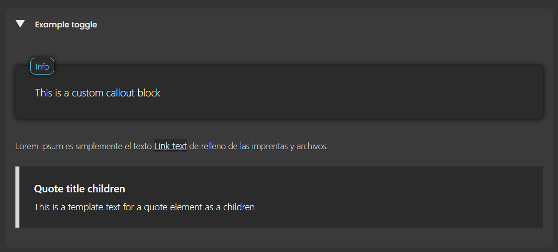
This widget can expand to show more content
> ### **Props**
> - `title` - The title is shown always, wont be hided
> - `background` - Background of the container
> - `backgroundHover` - Background of the header when hover
> - `arrowColor` - Color of the toggle arrow
> - `arrowSize` - size of the toggle arrow (*use units*)
> - `color` - Color of the title text
> - `fontSize` - Font size of the title (*use units*)
> - `style` - Styles wrapper object
> - `id` - Add an ID attribute
```js
This is a custom callout block
Lorem Ipsum es simplemente el texto Link text de relleno de las imprentas y archivos.
This is a template text for a quote element as a children
```

[*Go to widgets*](#widgets-list)
## Block
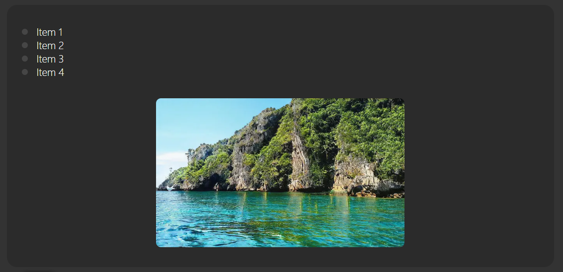
This widget is really simple, it just wraps content in a box to diferenciate from the code around
> ### **Props**
> - `background` - Background of the block
> - `bulletColor` - Item bullet color
> - `style` - Styles object
> - `id` - Add an ID attribute
```js
```
[*Go to widgets*](#widgets-list)
## Url
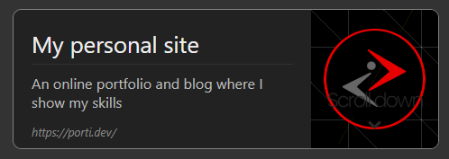
This widget takes and url and a few information to create a card to make the URL stand out, this widgets will show a title, description, url and a screenshoot of the URL
> ### **Props**
> - `src` - URL we want to embed
> - `img` - Image we want to show
> - `title` - Title for the URL card
> - `description` - Description of the URL content
> - `style` - Styles object
> - `id` - Add an ID attribute
```js
```
[*Go to widgets*](#widgets-list)
## SubPage
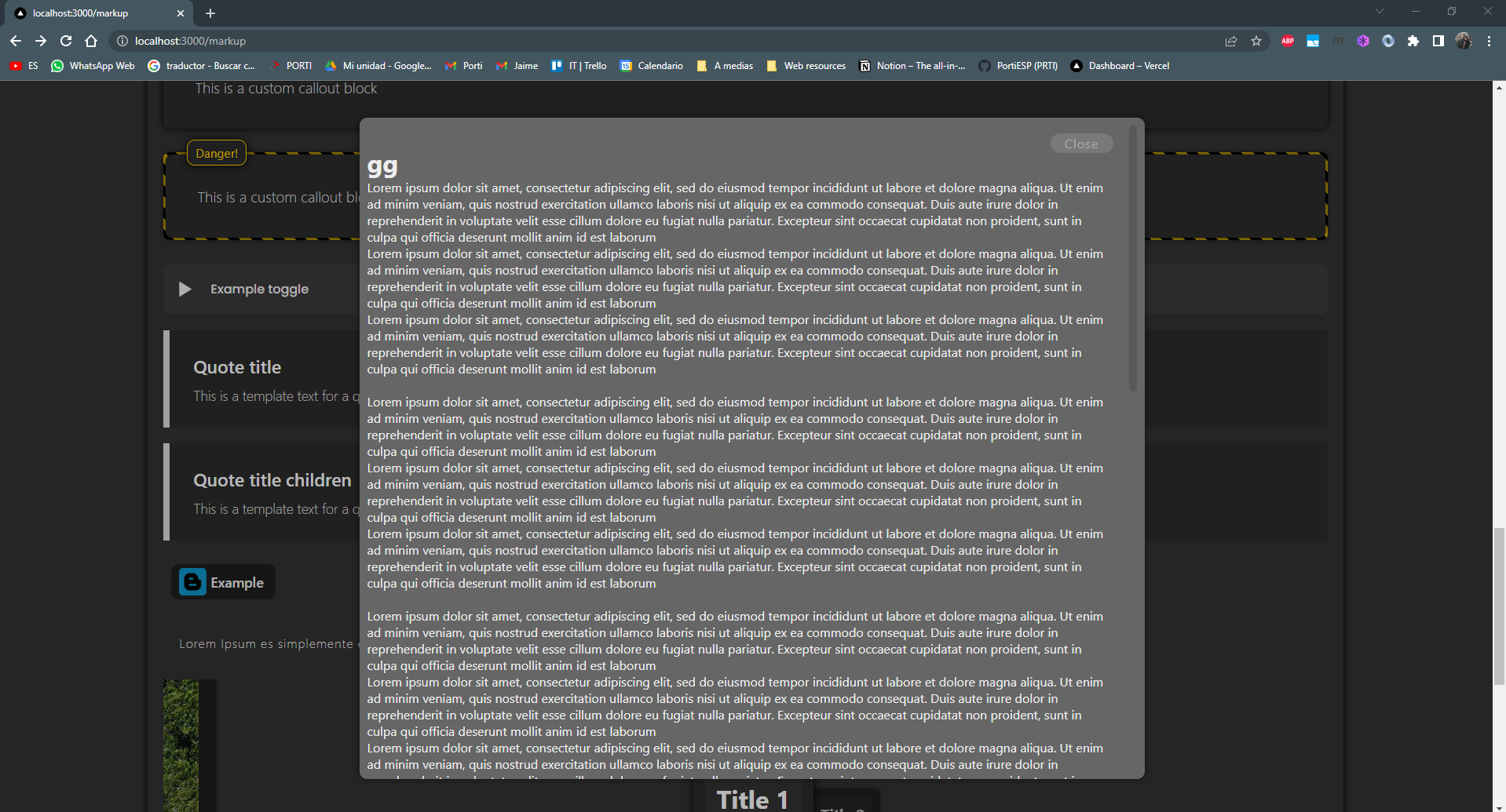
This widget can hold content and display it as a popup on click event
> ### **Props**
> - `title` - Title for the SubPage card
> - `description` - Description of the SubPage content
> - `style` - Styles object
> - `id` - Add an ID attribute
> - `small` - Smmaller version of the widget without preview
```js
gg
Lorem ipsum dolor sit amet, consectetur adipiscing elit, sed do eiusmod tempor incididunt ut labore et dolore magna aliqua. Ut enim ad minim veniam
Lorem ipsum dolor sit amet, consectetur adipiscing elit, sed do eiusmod tempor incididunt ut labore et dolore magna aliqua. Ut enim ad minim veniam
```


[*Go to widgets*](#widgets-list)
## Section
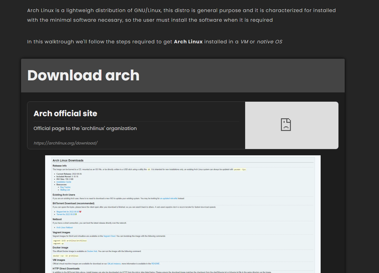
This widget is just a section with styles and a preformated title
> ### **Props**
> - `title` - Add an h2 at the beggining of the section
> - `sticky` - Make titles stick to the top of the viewport
> - `style` - Styles object
> - `id` - Add an ID attribute
```js
gg
Lorem ipsum dolor sit amet, consectetur adipiscing elit, sed do eiusmod tempor incididunt ut labore et dolore magna aliqua. Ut enim ad minim veniam
Lorem ipsum dolor sit amet, consectetur adipiscing elit, sed do eiusmod tempor incididunt ut labore et dolore magna aliqua. Ut enim ad minim veniam
```
[*Go to widgets*](#widgets-list)
## KbdKey
This widget adds a styled keyboard key as an inline tag
> ### **Props**
> - `title` - The key value as a props
> - `style` - Styles object
> - `id` - Add an ID attribute
```js
WIN
```


[*Go to widgets*](#widgets-list)
## Comment
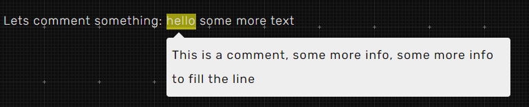
This widget adds a comment for some text, the comment appears when we hover to pointer over the commented string
> ### **Props**
> - `message` - The key value as a props
```js
Lets comment something: hello some more text
```
[*Go to widgets*](#widgets-list)
## MindMap
This widget displays a canvas to navigate over an SVG file, it also provides a menu where we can change the structure of the SVG to make an interactive canvas.
> **Features**
>
> - **ZoomIn**/**ZoomOut** with the mouse wheel
> - **Navigate** by *dragging* with *right-click*
> - The scale is shown as '%' at the bottom-right corner, click it to reset to *100%*
> - The menu can be hidden by clicking the header
> - The menu provides 2 type of buttons *toggle* and *chamber*
> - The *toggle* allows to hide/show a list of HTML tags with an id in a list
> - The *chamber* does something similar but we can rotate between multiple views, only one shown at a time. This one can be also toggled
> **INFO**
>
> - The *MinMap* tag fits the parents box, so you should give a width and height to the parent of the *MinMap* tag
> - Page scroll is **blocked** while hoveing the canvas
> - Also remember that JSX uses the *camelCase* naming convention while some SVG attributes have dashes in its name, so you should replace all thoose names such as: *stroke-width* to *strokeWidth*
> ### **Props**
> - `width` - The max width of the SVG
> - `height` - The max height of the SVG
> - `controls` - The list of options that will be shown in the menu
> - `children` (*wrapped*) - The SVG code **without the `svg` tag, just the child**
```js
const controls = [
{ // Example of toggle type
label: "test1", // Label shown in the menu
type: "toggle", // Type of item [toggle|chamber]
title: "test title", // Hint shown while hovering over the item (optional)
ids: ["Ellipse1", "Ellipse2"], // List if IDs that will be affected by this item
initial: true, // The toggle will be activated by default (optional)
controls: [{}] // Recursive submenus (same structure as the main one)
},
{ // Simplified example of toggle type
label: "test3",
type: "toggle",
ids: ["Ellipse1"]
},
{ // Example of chamber type
label: "test2",
type: "chamber",
title: "chamber title",
initial: true, // The toggle will be activated by default (optional)
idsGroups: [ // List of options show in the select
{
label: "opt 1", // Label of the option 1 (default)
ids: ["rect1", "rect2"], // List if IDs that will be affected by this option
controls: [{}] // Recursive submenus when this option is selected (same structure as the main one)
},
{
label: "opt 2",
ids: ["rect3", "rect4"]
},
{
label: "opt 3",
ids: ["rect5", "rect6"]
},
]
},
]
```
```js
// WRONG CODE
{/* <--- DO NOT PALCE THIS TAG */}
{/* <--- DO NOT PALCE THIS TAG */}
// RIGHT CODE
```
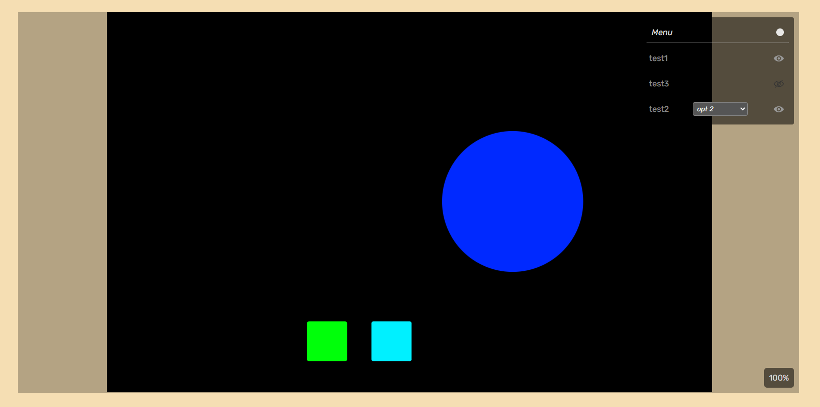
> [View MindMap GIF](https://i.gyazo.com/936fb287fb535a37bdefbb6f48623e08.mp4 "MindMap GIF")
[*Go to widgets*](#widgets-list)