https://github.com/pratik20gb/shorilabs
Beautiful CSS & Tailwind components for modern web projects. 269+ components including Patterns, Buttons, Cards, Inputs, Badges, Loaders, Avatars, Toggles, and Dividers
https://github.com/pratik20gb/shorilabs
cli npm patterns patterns-design typescript ui
Last synced: 5 months ago
JSON representation
Beautiful CSS & Tailwind components for modern web projects. 269+ components including Patterns, Buttons, Cards, Inputs, Badges, Loaders, Avatars, Toggles, and Dividers
- Host: GitHub
- URL: https://github.com/pratik20gb/shorilabs
- Owner: pratik20gb
- License: mit
- Created: 2025-12-26T03:46:15.000Z (6 months ago)
- Default Branch: main
- Last Pushed: 2025-12-27T04:52:37.000Z (6 months ago)
- Last Synced: 2025-12-28T19:38:45.586Z (6 months ago)
- Topics: cli, npm, patterns, patterns-design, typescript, ui
- Language: TypeScript
- Homepage: https://www.shorilabs.xyz/
- Size: 1.5 MB
- Stars: 0
- Watchers: 0
- Forks: 0
- Open Issues: 0
-
Metadata Files:
- Readme: README.md
- Contributing: CONTRIBUTING.md
- License: LICENSE
Awesome Lists containing this project
README
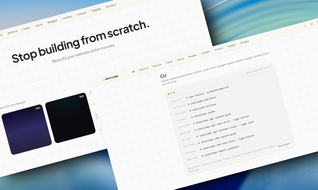

Beautiful CSS & Tailwind components for modern web projects
269+ components • Patterns • Buttons • Cards • Inputs • Badges • Loaders • Avatars • Toggles • Dividers


---
## ✨ Features
### 🎨 269+ Components Available
- **105 Patterns** - Gradients, geometric shapes, decorative effects, and more
- **29 Buttons** - Primary, secondary, outline, ghost, animated, 3D, and neon styles
- **26 Cards** - Modern card designs with various styles
- **17 Inputs** - Beautiful form input styles
- **21 Badges** - Badge variants for labels and tags
- **18 Loaders** - Loading animations and spinners
- **20 Avatars** - Avatar styles and variations
- **13 Toggles** - Toggle switches and checkboxes
- **20 Dividers** - Divider styles and separators
### 🚀 Core Features
- 📋 **One-Click Copy** - CSS and Tailwind CSS versions for every component
- 👁️ **Live Preview** - Preview components directly on the website
- ❤️ **Favorites System** - Save your favorite components locally
- 🔍 **Search & Filter** - Find components quickly by name or category
- 📱 **Fully Responsive** - Beautiful on all screen sizes
- 🚀 **Fast & Lightweight** - Built with Vite and optimized for performance
- 💻 **CLI Tool** - Install components directly from the command line
## 🚀 Quick Start
### Prerequisites
- Node.js 18+ and npm
### Installation
```bash
# Clone the repository
git clone https://github.com/pratik20gb/shorilabs.git
# Navigate to project directory
cd shorilabs
# Install dependencies
npm install
# Start development server
npm run dev
```
Visit `http://localhost:8080` to see the app running locally, or check out the [live website](https://shorilabs.xyz)!
### CLI Installation
Install the CLI tool globally from npm:
```bash
npm install -g @shorilabs/cli
```
Then use it:
```bash
# List all component types
shorilabs patterns
shorilabs buttons
shorilabs cards
shorilabs inputs
shorilabs badges
shorilabs loaders
shorilabs avatars
shorilabs toggles
shorilabs dividers
# Get a specific component
shorilabs get aurora-glow
shorilabs get neon-blue --type button
shorilabs get card-gradient --type card
# Search across all components
shorilabs search gradient
```
## 📦 Build
```bash
# Production build
npm run build
# Preview production build
npm run preview
```
## 🎯 Usage
1. **Browse Components** - Scroll through all 9 component types on the home page
2. **Filter by Category** - Click category pills to filter components by type
3. **Search** - Use the search bar to find specific components across all types
4. **Preview Components** - Click "Preview" to see components in action
5. **Copy Code** - View CSS and Tailwind code, then copy to clipboard with one click
6. **Save Favorites** - Click the heart icon to save components you love
## 🛠️ Tech Stack
- **Framework:** React 18
- **Build Tool:** Vite 5
- **Language:** TypeScript
- **Styling:** Tailwind CSS
- **UI Components:** shadcn/ui
- **Animations:** Framer Motion
- **Icons:** Lucide React
## 📂 Project Structure
```
src/
├── components/
│ ├── ui/ # shadcn/ui components
│ ├── Header.tsx # Main header with navigation
│ ├── HeroSection.tsx # Landing page hero
│ ├── PatternCard.tsx # Individual pattern card
│ ├── PatternGrid.tsx # Pattern grid with filtering
│ ├── ButtonCard.tsx # Individual button card
│ ├── ButtonGrid.tsx # Button grid with filtering
│ ├── CLISection.tsx # CLI documentation section
│ └── Footer.tsx # Footer with links
├── data/
│ ├── patterns.ts # All 105 pattern data
│ ├── buttons.ts # All 29 button data
│ ├── cards.ts # All 26 card data
│ ├── inputs.ts # All 17 input data
│ ├── badges.ts # All 21 badge data
│ ├── loaders.ts # All 18 loader data
│ ├── avatars.ts # All 20 avatar data
│ ├── toggles.ts # All 13 toggle data
│ └── dividers.ts # All 20 divider data
├── contexts/
│ └── BackgroundPatternContext.tsx # Global pattern preview state
├── pages/
│ ├── Index.tsx # Home page
│ └── NotFound.tsx # 404 page
├── lib/
│ ├── utils.ts # Utility functions
│ └── patternUtils.ts # Pattern parsing utilities
└── App.tsx # App root with providers
```
## 🎨 Component Categories
### Patterns (105)
- **Gradients** - Aurora, sunset, neon, arctic, forest, and more
- **Geometric** - Grids, dots, hexagons, triangles, isometric cubes
- **Decorative** - Noise, spotlights, waves, starbursts, blobs
- **Effects** - Blur orbs, glass morphism, mesh gradients, holographic
### Buttons (29)
- **Primary** - Solid, prominent call-to-action buttons
- **Secondary** - Subtle, secondary action buttons
- **Outline** - Border-only buttons with hover fill
- **Ghost** - Minimal buttons for tertiary actions
- **Animated** - Buttons with hover animations
- **3D** - Buttons with depth and shadow effects
- **Neon** - Glowing, cyberpunk-style buttons
### Cards (26)
- Modern card designs with various styles and effects
- Glass morphism, gradient borders, shadows, and more
### Inputs (17)
- Form input styles including text, email, password, and search inputs
- Various border styles, focus states, and modern designs
### Badges (21)
- Badge variants for labels, tags, and status indicators
- Different shapes, colors, and styles
### Loaders (18)
- Loading animations and spinners
- Various styles including spinners, dots, bars, and more
### Avatars (20)
- Avatar styles and variations
- Different shapes, sizes, and border styles
### Toggles (13)
- Toggle switches and checkboxes
- Various styles including iOS-style, material, and custom designs
### Dividers (20)
- Divider styles and separators
- Horizontal and vertical dividers with various styles
## 💻 CLI Usage
```bash
# List all component types
shorilabs patterns
shorilabs buttons
shorilabs cards
shorilabs inputs
shorilabs badges
shorilabs loaders
shorilabs avatars
shorilabs toggles
shorilabs dividers
# Filter by category
shorilabs patterns --category gradients
shorilabs buttons --category neon
# Get component CSS
shorilabs get aurora-glow
shorilabs get neon-blue --type button
shorilabs get card-gradient --type card
# Add to project
shorilabs add aurora-glow --file styles.css
shorilabs add neon-blue --type button --file buttons.css
shorilabs add card-gradient --type card --file cards.css
# Search all components
shorilabs search gradient
# Show CLI info
shorilabs info
```
## 📝 Adding New Components
### Adding Patterns
Edit `src/data/patterns.ts`:
```typescript
{
id: "your-pattern-id",
name: "Your Pattern Name",
category: "gradients" | "geometric" | "decorative" | "effects",
isNew: true,
css: `background: your-css-here;`,
tailwind: `bg-[your-tailwind-classes]`,
}
```
### Adding Other Components
Edit the respective data file (`src/data/buttons.ts`, `cards.ts`, `inputs.ts`, etc.):
```typescript
{
id: "your-component-id",
name: "Your Component Name",
category: "category-name",
isNew: true,
css: `your-css-here`,
tailwind: `your-tailwind-classes`,
}
```
After adding components, export them for the CLI:
```bash
npm run export-patterns
```
## 📦 Packages
- **[@shorilabs/cli](https://www.npmjs.com/package/@shorilabs/cli)** - CLI tool to browse and install all component types (patterns, buttons, cards, inputs, badges, loaders, avatars, toggles, dividers)
## 🤝 Contributing
Contributions are welcome! Please feel free to submit a Pull Request.
1. Fork the repository
2. Create your feature branch (`git checkout -b feature/AmazingFeature`)
3. Commit your changes (`git commit -m 'Add some AmazingFeature'`)
4. Push to the branch (`git push origin feature/AmazingFeature`)
5. Open a Pull Request
## 📄 License
This project is open source and available under the [MIT License](LICENSE).
## 🔗 Links
- **Website:** [shorilabs.xyz](https://shorilabs.xyz)
- **npm Package:** [@shorilabs/cli](https://www.npmjs.com/package/@shorilabs/cli)
- **GitHub:** [github.com/pratik20gb/shorilabs](https://github.com/pratik20gb/shorilabs)
- **X:** [@sage_pratik](https://twitter.com/sage_pratik)
---