https://github.com/preethi-dev/modern-layouts
50 Extremely Modern Layouts Using CSS Grid✨
https://github.com/preethi-dev/modern-layouts
Last synced: 5 months ago
JSON representation
50 Extremely Modern Layouts Using CSS Grid✨
- Host: GitHub
- URL: https://github.com/preethi-dev/modern-layouts
- Owner: Preethi-Dev
- Created: 2023-10-20T13:56:26.000Z (over 1 year ago)
- Default Branch: main
- Last Pushed: 2023-10-20T15:36:31.000Z (over 1 year ago)
- Last Synced: 2025-01-08T22:54:26.863Z (6 months ago)
- Homepage:
- Size: 6.84 KB
- Stars: 0
- Watchers: 1
- Forks: 0
- Open Issues: 0
-
Metadata Files:
- Readme: README.md
Awesome Lists containing this project
README
# Modern Layouts
Modern layouts strengthen skills in thinking of complex grid layouts with a responsive nature. I used various native CSS Grid techniques. `The ASCII-Art Method` and `the Named grid line technique` tempted me to develop around **50 modern layouts**. In fact, I wrote a dedicated article for the [ASCII-Art Method](https://css-tricks.com/using-grid-named-areas-to-visualize-and-reference-your-layout/) at CSS-TRICKS (It received significant attention from fellow developers and was even featured as "POPULAR OF THE MONTH).
_50 days challenge on Modern Layouts using CSS Grid._
## Modern Layouts - 01/50 (#Made-In-CSS-Grid)
[Source Code](https://github.com/Preethi-Dev/Modern-Layout-01) - [Live Preview](https://preethi-dev.github.io/Modern-Layout-01/)

```
❌ No Absolute or Relative positioning
✅ Use a 12-column grid layout
✅ Responsive to each breakpoint
```
## Modern Layouts - 02/50 (#Made-In-CSS-Grid)
[Source Code](https://github.com/Preethi-Dev/Modern-Layout-02) - [Live Preview](https://preethi-dev.github.io/Modern-Layout-02/)

```
❌ No Absolute or Relative positioning
✅ Use a 12-column grid layout
✅ Responsive to each breakpoint
✅ Placing items using Named Template Areas
```
## Modern Layouts - 03/50 (#Made-In-CSS-Grid)
[Source Code](https://github.com/Preethi-Dev/Modern-Layout-03) - [Live Preview](https://preethi-dev.github.io/Modern-Layout-03/)

```
❌ No Absolute or Relative positioning
✅ Use Line-based placement
✅ Responsive to each breakpoint
✅ Using the power of Grid Auto-Placement Rule
```
## Modern Layouts - 04/50 (#Made-In-CSS-Grid)
[Source Code](https://github.com/Preethi-Dev/Modern-Layout-04) - [Live Preview](https://preethi-dev.github.io/Modern-Layout-04/)

```
✅ Use Line-based placement
✅ Responsive to each breakpoint
```
## Modern Layouts - 05/50 (#Made-In-CSS-Grid)
[Source Code](https://github.com/Preethi-Dev/Modern-Layout-05) - [Live Preview](https://preethi-dev.github.io/Modern-Layout-05/)

```
✅ Use Named Grid Lines Placement
✅ Responsive to each breakpoint
```
## Modern Layouts - 06/50 (#Made-In-CSS-Grid)
[Source Code](https://github.com/Preethi-Dev/Modern-Layout-06) - [Live Preview](https://preethi-dev.github.io/Modern-Layout-06/)

```
❌ No Absolute or Relative positioning
✅ Use Named Grid Lines Placement
✅ Responsive to each breakpoint
✅ Use a 12-column grid for desktop Breakpoint
✅ Use an 8-column grid for Large Tablet and Laptop Breakpoint
✅ Use a 4-column grid for Mobile Breakpoint
```
## Modern Layouts - 07/50 (#Made-In-CSS-Grid)
[Source Code](https://github.com/Preethi-Dev/Modern-Layout-07) - [Live Preview](https://preethi-dev.github.io/Modern-Layout-07/)

```
✅ Use Named Grid Lines Placement
✅ Responsive to each breakpoint
✅ Use a 12-column grid
```
## Modern Layouts - 08/50 (#Made-In-CSS-Grid)
[Source Code](https://github.com/Preethi-Dev/Modern-Layout-08) - [Live Preview](https://preethi-dev.github.io/Modern-Layout-08/)

```
✅ Use Named Template Area Placement
✅ ASCII-ART method of grid layout
✅ Responsive to each breakpoint
✅ Use a 12-column grid
```
## Modern Layouts - 09/50 (#Made-In-CSS-Grid)
[Source Code](https://github.com/Preethi-Dev/Modern-Layout-09) - [Live Preview](https://preethi-dev.github.io/Modern-Layout-09/)

```
❌ No Absolute or Relative positioning
✅ Use Line-based placement
✅ Responsive to each breakpoint
✅ Use a 12-column grid
```
## Modern Layouts - 10/50 (#Made-In-CSS-Grid)
[Source Code](https://github.com/Preethi-Dev/Modern-Layout-10) - [Live Preview](https://preethi-dev.github.io/Modern-Layout-10/)
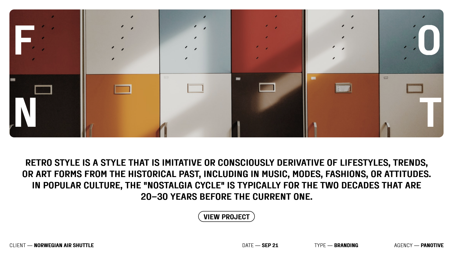
```
❌ No Absolute or Relative positioning
✅ Use Line-based placement
✅ Responsive to each breakpoint
```
## Modern Layouts - 11/50 (#Made-In-CSS-Grid)
[Source Code](https://github.com/Preethi-Dev/Modern-Layout-11) - [Live Preview](https://preethi-dev.github.io/Modern-Layout-11/)

```
✅ Use Named Grid Lines Placement
✅ Responsive to each breakpoint
✅ Use a 12-column grid
```
## Modern Layouts - 12/50 (#Made-In-CSS-Grid)
[Source Code](https://github.com/Preethi-Dev/Modern-Layout-12) - [Live Preview](https://preethi-dev.github.io/Modern-Layout-12/)
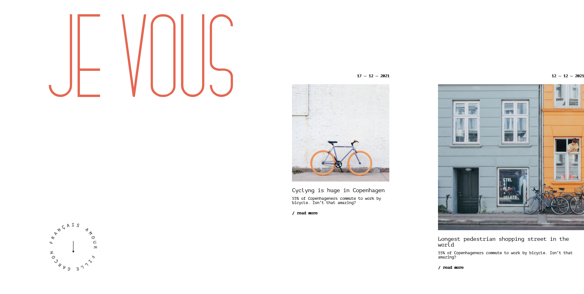
```
✅ Use Named Template Area Placement
✅ ASCII-ART method of grid layout
✅ Responsive to each breakpoint
✅ Use a 12-column grid
```
## Modern Layouts - 13/50 (#Made-In-CSS-Grid)
[Source Code](https://github.com/Preethi-Dev/Modern-Layout-13) - [Live Preview](https://preethi-dev.github.io/Modern-Layout-13/)

```
❌ No Absolute or Relative positioning
✅ Use Line-based placement
✅ Responsive to each breakpoint
✅ Use a 12-column grid
```
## Modern Layouts - 14/50 (#Made-In-CSS-Grid)
[Source Code](https://github.com/Preethi-Dev/Modern-Layout-14) - [Live Preview](https://preethi-dev.github.io/Modern-Layout-14/)

```
✅ Use Named Grid Lines Placement
✅ Responsive to each breakpoint
✅ Use a 12-column grid
```
## Modern Layouts - 15/50 (#Made-In-CSS-Grid)
[Source Code](https://github.com/Preethi-Dev/Modern-Layout-15) - [Live Preview](https://preethi-dev.github.io/Modern-Layout-15/)

```
✅ Use Line Based Placement
✅ Responsive to each breakpoint
✅ Use a 12-column grid
```
## Modern Layouts - 16/50 (#Made-In-CSS-Grid)
[Source Code](https://github.com/Preethi-Dev/Modern-Layout-16) - [Live Preview](https://preethi-dev.github.io/Modern-Layout-16/)

```
❌ No Absolute or Relative positioning
✅ Use Line-based placement
✅ Responsive to each breakpoint
✅ Use a 12-column grid
```
## Modern Layouts - 17/50 (#Made-In-CSS-Grid)
[Source Code](https://github.com/Preethi-Dev/Modern-Layout-17) - [Live Preview](https://preethi-dev.github.io/Modern-Layout-17/)

```
✅ Use Line-based placement
✅ Responsive to each breakpoint
✅ Use the power of Grid Auto Placement Rule
```
## Modern Layouts - 18/50 (#Made-In-CSS-Grid)
[Source Code](https://github.com/Preethi-Dev/Modern-Layout-18) - [Live Preview](https://preethi-dev.github.io/Modern-Layout-18/)

```
✅ Use Line-based placement
✅ Responsive to each breakpoint
❌ No Absolute or Relative positioning
```
## Modern Layouts - 19/50 (#Made-In-CSS-Grid)
[Source Code](https://github.com/Preethi-Dev/Modern-Layout-19) - [Live Preview](https://preethi-dev.github.io/Modern-Layout-19/)

```
✅ Use Named Grid Lines placement
✅ Responsive to each breakpoint
❌ No Absolute or Relative positioning
```
## Modern Layouts - 20/50 (#Made-In-CSS-Grid)
[Source Code](https://github.com/Preethi-Dev/Modern-Layout-20) - [Live Preview](https://preethi-dev.github.io/Modern-Layout-20/)

```
✅ Use FlexBox
✅ Responsive to each breakpoint
❌ No Absolute or Relative positioning
```
## Modern Layouts - 21/50 (#Made-In-CSS-Grid)
[Source Code](https://github.com/Preethi-Dev/Modern-Layout-21) - [Live Preview](https://preethi-dev.github.io/Modern-Layout-21/)

```
✅ Use Line Based placement
✅ Responsive to each breakpoint
✅ Use a 12-column grid layout
❌ No Absolute or Relative positioning
```
## Modern Layouts - 22/50 (#Made-In-CSS-Grid)
[Source Code](https://github.com/Preethi-Dev/Modern-Layout-22) - [Live Preview](https://preethi-dev.github.io/Modern-Layout-22/)
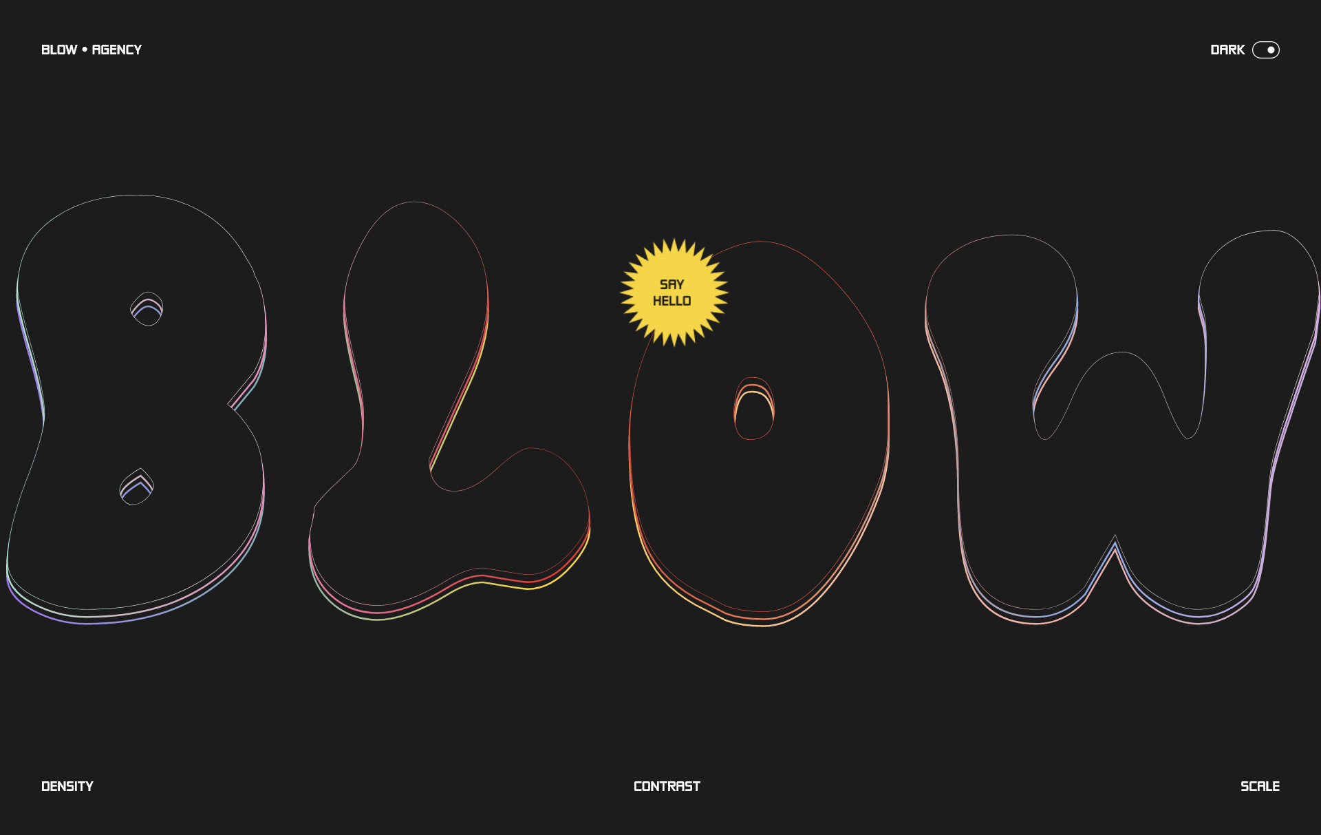
```
✅ Use FlexBox
✅ Responsive to each breakpoint
```
## Modern Layouts - 23/50 (#Made-In-CSS-Grid)
[Source Code](https://github.com/Preethi-Dev/Modern-Layout-23) - [Live Preview](https://preethi-dev.github.io/Modern-Layout-23/)

```
✅ Use Named Grid Lines Placement
✅ Responsive to each breakpoint
✅ Use a 12-column grid
❌ No Absolute or Relative positioning
```
## Modern Layouts - 24/50 (#Made-In-CSS-Grid)
[Source Code](https://github.com/Preethi-Dev/Modern-Layout-24) - [Live Preview](https://preethi-dev.github.io/Modern-Layout-24/)
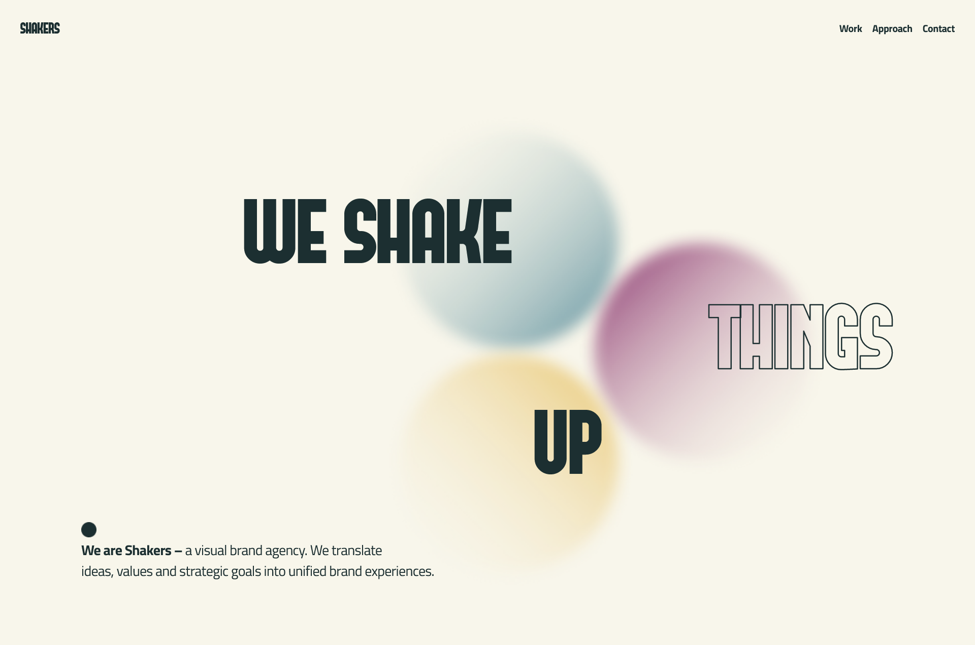
```
✅ Use Named Grid Template areas Placement
✅ Responsive to each breakpoint
✅ Use a 12-column grid
❌ No Absolute or Relative positioning
```
## Modern Layouts - 25/50 (#Made-In-CSS-Grid)
[Source Code](https://github.com/Preethi-Dev/Modern-Layout-25) - [Live Preview](https://preethi-dev.github.io/Modern-Layout-25/)

```
✅ Use CSS Grid line-based placement
✅ Use a 12-column grid
✅ Responsive to each breakpoint
```
## Modern Layouts - 26/50 (#Made-In-CSS-Grid)
[Source Code](https://github.com/Preethi-Dev/Modern-Layout-26) - [Live Preview](https://preethi-dev.github.io/Modern-Layout-26/)

```
✅ Use ASCII ART METHOD of CSS Grid
✅ Responsive to each breakpoint
✅ Use a 12-column grid
❌ No Absolute or Relative positioning
```
## Modern Layouts - 27/50 (#Made-In-CSS-Grid)
[Source Code](https://github.com/Preethi-Dev/Modern-Layout-27) - [Live Preview](https://preethi-dev.github.io/Modern-Layout-27/)

```
✅ Use Line Based Placement
✅ Responsive to each breakpoint
✅ Use Single Column grid
❌ No Absolute or Relative positioning
```
## Modern Layouts - 28/50 (#Made-In-CSS-Grid)
[Source Code](https://github.com/Preethi-Dev/Modern-Layout-28) - [Live Preview](https://preethi-dev.github.io/Modern-Layout-28/)

```
✅ Use CSS Grid line-based placement
✅ Use a 12-column grid
✅ Responsive to each breakpoint
```
## Modern Layouts - 29/50 (#Made-In-CSS-Grid)
[Source Code](https://github.com/Preethi-Dev/Modern-Layout-29) - [Live Preview](https://preethi-dev.github.io/Modern-Layout-29/)

```
✅ Use CSS Grid line-based placement
✅ Responsive to each breakpoint
```
## Modern Layouts - 30/50 (#Made-In-CSS-Grid)
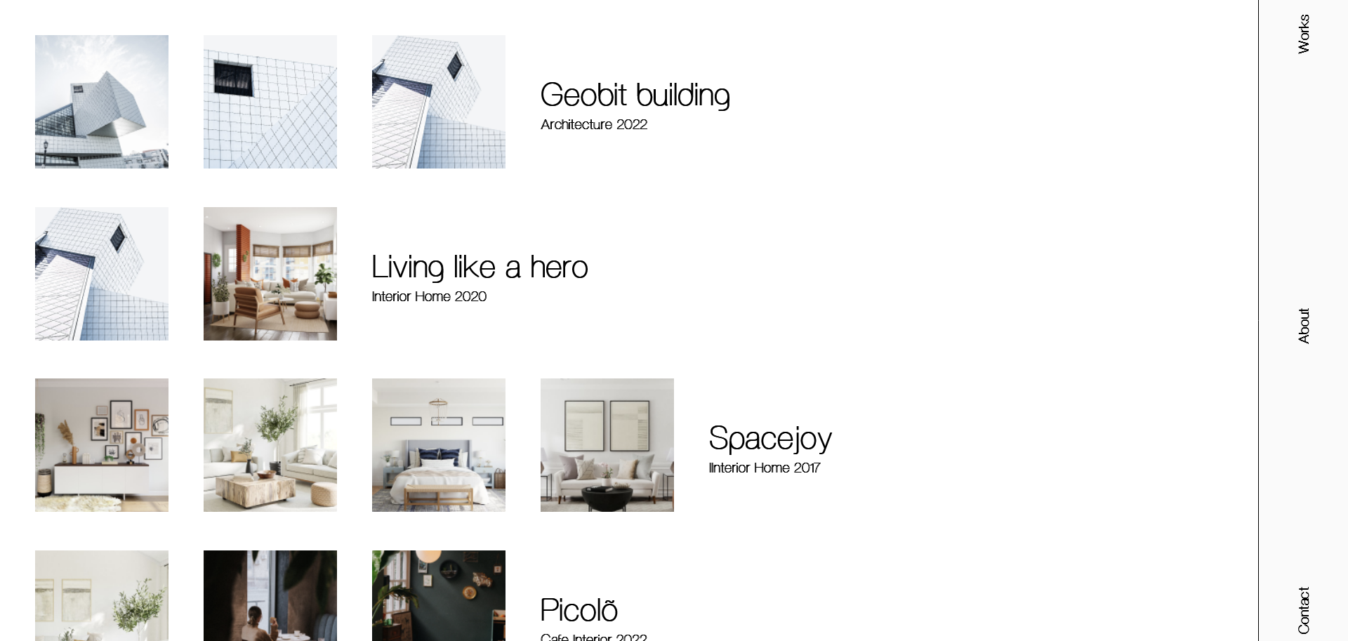
[Source Code](https://github.com/Preethi-Dev/Modern-Layout-30) - [Live Preview](https://preethi-dev.github.io/Modern-Layout-30/)
```
✅ Use CSS Grid line-based placement
✅ Use the power of Grid's Auto Placement Algorithm.
✅ Responsive to each breakpoint
```
## Modern Layouts - 31/50 (#Made-In-CSS-Grid)
[Source Code](https://github.com/Preethi-Dev/Modern-Layout-31) - [Live Preview](https://preethi-dev.github.io/Modern-Layout-31/)

```
✅ Use FlexBox
✅ Responsive to each breakpoint
❌ No Absolute or Relative positioning
```
## Modern Layouts - 32/50 (#Made-In-CSS-Grid)
[Source Code](https://github.com/Preethi-Dev/Modern-Layout-32) - [Live Preview](https://preethi-dev.github.io/Modern-Layout-32/)

```
✅ Use CSS Grid line-based placement
✅ Use 12-column grid
✅ Responsive to each breakpoint
```
## Modern Layouts - 33/50 (#Made-In-CSS-Grid)
[Source Code](https://github.com/Preethi-Dev/Modern-Layout-33) - [Live Preview](https://preethi-dev.github.io/Modern-Layout-33/)

```
✅ Use CSS Grid line-based placement
✅ Use 12-column grid
✅ Responsive to each breakpoint
```
## Modern Layouts - 34/50 (#Made-In-CSS-Grid)
[Source Code](https://github.com/Preethi-Dev/Modern-Layout-34) - [Live Preview](https://preethi-dev.github.io/Modern-Layout-34/)

```
✅ Use Single Column Grid
✅ FlexBox Enriched Layout
✅ Responsive to each breakpoint
```
## Modern Layouts - 35/50 (#Made-In-CSS-Grid)
[Source Code](https://github.com/Preethi-Dev/Modern-Layout-35) - [Live Preview](https://preethi-dev.github.io/Modern-Layout-35/)

```
✅ Use Named Grid Lines Placement
✅ Responsive to each breakpoint
✅ Use a 12-column grid
```
## Modern Layouts - 36/50 (#Made-In-CSS-Grid)
[Source Code](https://github.com/Preethi-Dev/Modern-Layout-36) - [Live Preview](https://preethi-dev.github.io/Modern-Layout-36/)

```
✅ Use Named Grid Lines Placement
✅ Responsive to each breakpoint
✅ Use a 12-column grid
```
## Modern Layouts - 37/50 (#Made-In-CSS-Grid)
[Source Code](https://github.com/Preethi-Dev/Modern-Layout-37) - [Live Preview](https://preethi-dev.github.io/Modern-Layout-37/)

```
✅ Use Line Based Placement
✅ Responsive to each breakpoint
✅ Use a 12-column grid
```
## Modern Layouts - 38/50 (#Made-In-CSS-Grid)
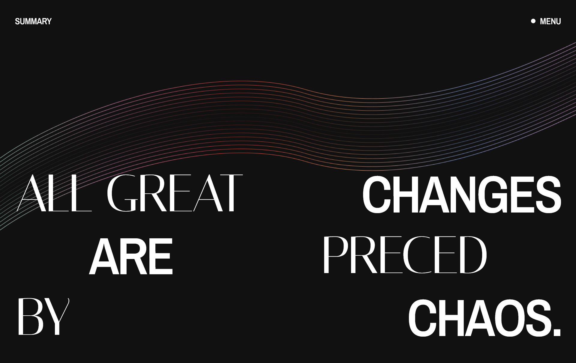
[Source Code](https://github.com/Preethi-Dev/Modern-Layout-38) - [Live Preview](https://preethi-dev.github.io/Modern-Layout-38/)
```
✅ Use Line Based Placement
✅ Responsive to each breakpoint
✅ Use 12-column grid
```
## Modern Layouts - 39/50 (#Made-In-CSS-Grid)
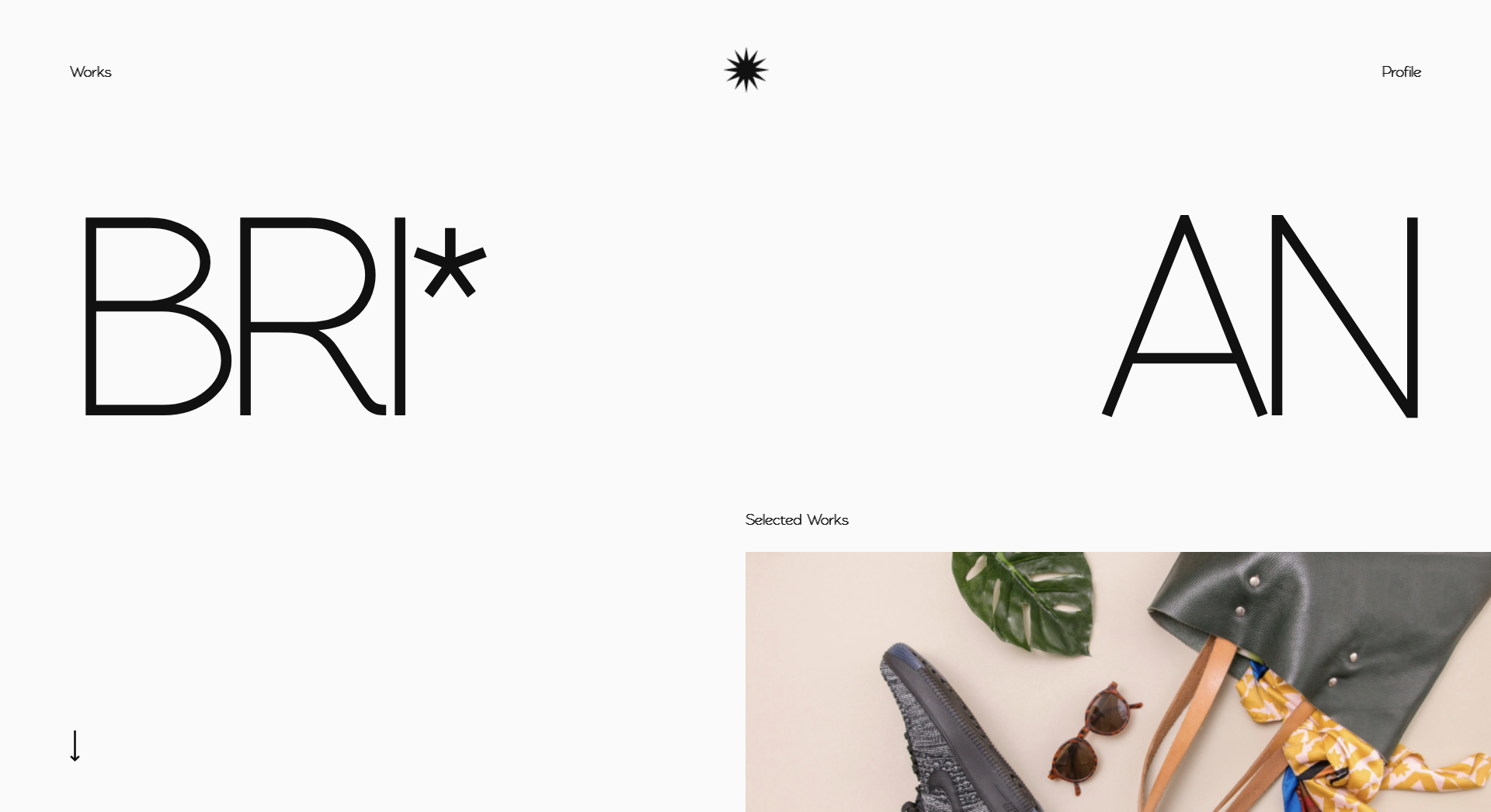
[Source Code](https://github.com/Preethi-Dev/Modern-Layout-39) - [Live Preview](https://preethi-dev.github.io/Modern-Layout-39/)
```
✅ Use Named Grid Lines Placement
✅ Responsive to each breakpoint
✅ Use a 12-column grid
```
## Modern Layouts - 40/50 (#Made-In-CSS-Grid)
[Source Code](https://github.com/Preethi-Dev/Modern-Layout-40) - [Live Preview](https://preethi-dev.github.io/Modern-Layout-40/)

```
✅ Use Named Grid Lines Placement
✅ Responsive to each breakpoint
✅ Use a 12-column grid
```
## Modern Layouts - 41/50 (#Made-In-CSS-Grid)
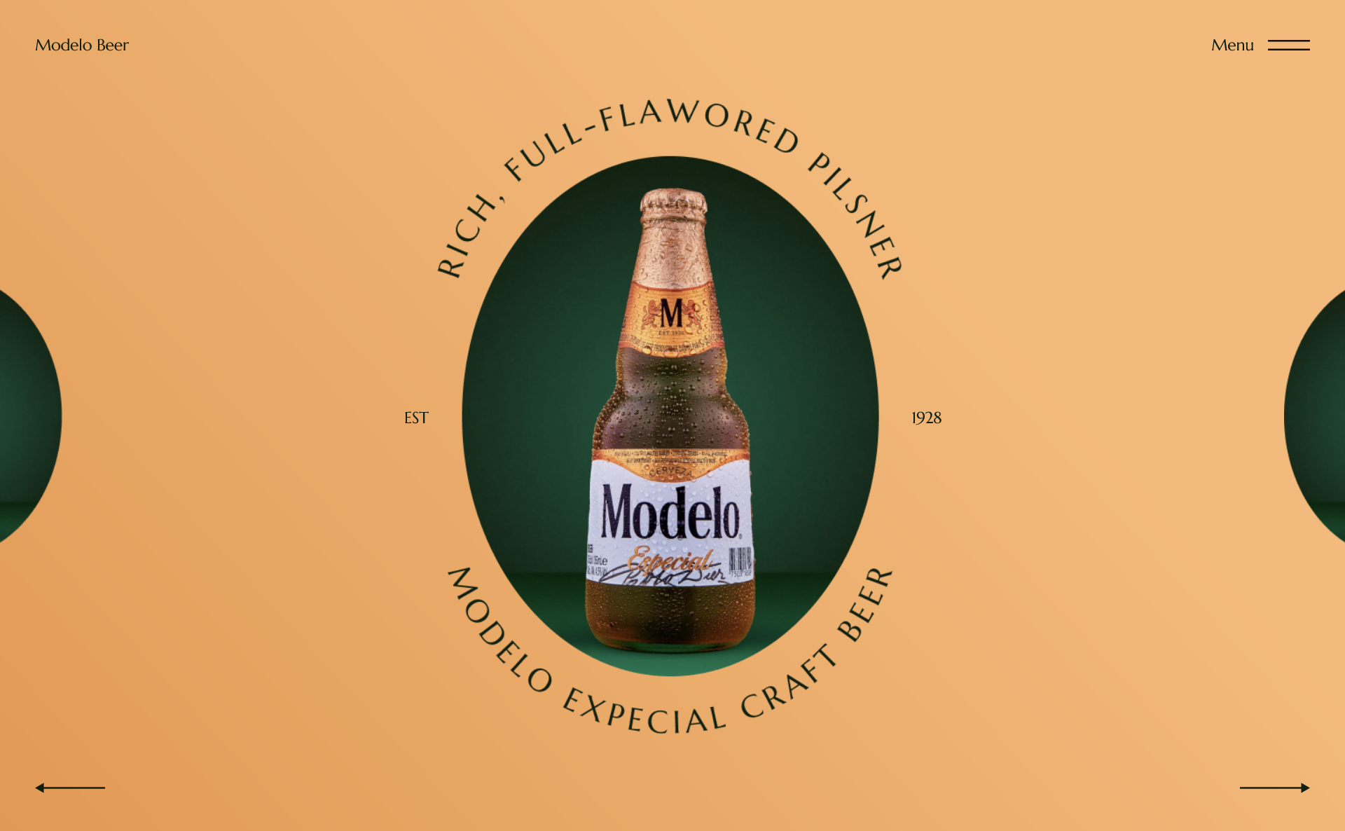
[Source Code](https://github.com/Preethi-Dev/Modern-Layout-41) - [Live Preview](https://preethi-dev.github.io/Modern-Layout-41/)
```
✅ Use FlexBox
✅ Responsive to each breakpoint
❌ No Absolute or Relative positioning
```
## Modern Layouts - 42/50 (#Made-In-CSS-Grid)
[Source Code](https://github.com/Preethi-Dev/Modern-Layout-42) - [Live Preview](https://preethi-dev.github.io/Modern-Layout-42/)

```
✅ Use CSS Grid line-based placement
✅ Use the power of Grid's Auto Placement Algorithm.
✅ Responsive to each breakpoint
```
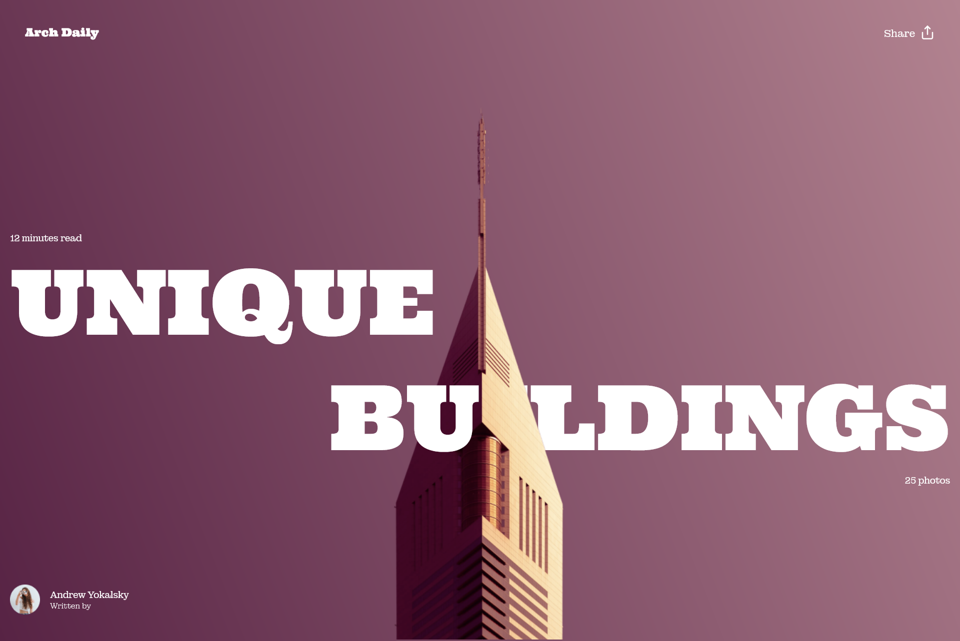
## Modern Layouts - 43/50 (#Made-In-CSS-Grid)
[Source Code](https://github.com/Preethi-Dev/Modern-Layout-43) - [Live Preview](https://preethi-dev.github.io/Modern-Layout-43/)
```
✅ Use CSS Grid line-based placement
✅ Responsive to each breakpoint
```
## Modern Layouts - 44/50 (#Made-In-CSS-Grid)
[Source Code](https://github.com/Preethi-Dev/Modern-Layout-44) - [Live Preview](https://preethi-dev.github.io/Modern-Layout-44/)

```
✅ Use CSS Grid line-based placement
✅ Use a 12-column Grid
✅ Responsive to each breakpoint
```
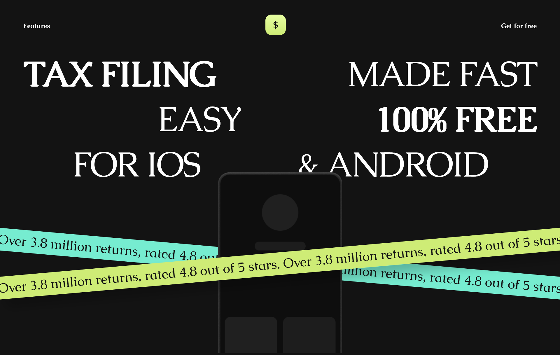
## Modern Layouts - 45/50 (#Made-In-CSS-Grid)
[Source Code](https://github.com/Preethi-Dev/Modern-Layout-45) - [Live Preview](https://preethi-dev.github.io/Modern-Layout-45/)
```
✅ Use Named Grid Lines Placement
✅ Responsive to each breakpoint
✅ Use a 12-column grid
```
## Modern Layouts - 46/50 (#Made-In-CSS-Grid)
[Source Code](https://github.com/Preethi-Dev/Modern-Layout-46) - [Live Preview](https://preethi-dev.github.io/Modern-Layout-46/)

```
✅ Use CSS Grid Line Based Placement
✅ Use a 12-Column Grid.
✅ Responsive to each breakpoint
```
## Modern Layouts - 47/50 (#Made-In-CSS-Grid)
[Source Code](https://github.com/Preethi-Dev/Modern-Layout-47) - [Live Preview](https://preethi-dev.github.io/Modern-Layout-47/)

```
✅ Use Named Grid Lines Placement
✅ Responsive to each breakpoint
✅ Use a 12-column grid
```
## Modern Layouts - 48/50 (#Made-In-CSS-Grid)
[Source Code](https://github.com/Preethi-Dev/Modern-Layout-48) - [Live Preview](https://preethi-dev.github.io/Modern-Layout-48/)

```
✅ Use Named Grid Lines Placement
✅ Responsive to each breakpoint
✅ Use a 12-column grid
```
## Modern Layouts - 49/50 (#Made-In-CSS-Grid)
[Source Code](https://github.com/Preethi-Dev/Modern-Layout-49) - [Live Preview](https://preethi-dev.github.io/Modern-Layout-49/)

```
✅ Use CSS Grid Line Based Placement
✅ Use a 12-column grid.
✅ Responsive to each breakpoint
```
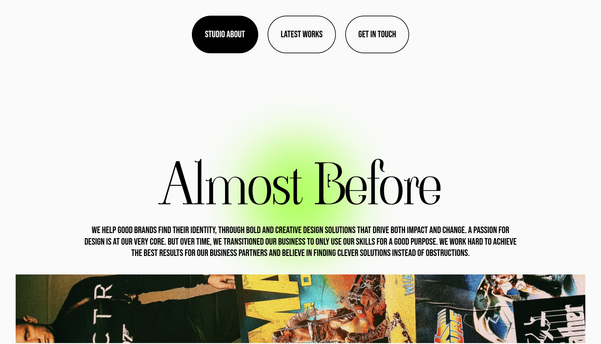
## Modern Layouts - 50/50 (#Made-In-CSS-Grid)
[Source Code](https://github.com/Preethi-Dev/Modern-Layout-50) - [Live Preview](https://preethi-dev.github.io/Modern-Layout-50/)
```
✅ Use CSS Grid Line Based Placement
✅ Use a 12-Column Grid.
✅ Responsive to each breakpoint
```