https://github.com/pyozer/flutter_material_color_picker
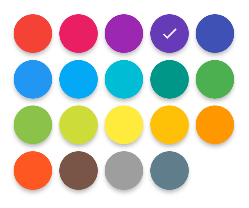
Material color picker, you can customize colors. Selection in two step, first main color and after shades.
https://github.com/pyozer/flutter_material_color_picker
android color-picker dart dart2 flutter ios material-design widget
Last synced: 2 months ago
JSON representation
Material color picker, you can customize colors. Selection in two step, first main color and after shades.
- Host: GitHub
- URL: https://github.com/pyozer/flutter_material_color_picker
- Owner: Pyozer
- License: mit
- Created: 2018-08-19T17:12:45.000Z (almost 7 years ago)
- Default Branch: master
- Last Pushed: 2023-05-31T13:29:26.000Z (about 2 years ago)
- Last Synced: 2025-05-06T18:07:20.215Z (2 months ago)
- Topics: android, color-picker, dart, dart2, flutter, ios, material-design, widget
- Language: Dart
- Homepage: https://pub.dartlang.org/packages/flutter_material_color_picker
- Size: 1.27 MB
- Stars: 75
- Watchers: 3
- Forks: 35
- Open Issues: 4
-
Metadata Files:
- Readme: README.md
- Changelog: CHANGELOG.md
- License: LICENSE
Awesome Lists containing this project
README
# Flutter Material Color Picker [](https://pub.dartlang.org/packages/flutter_material_color_picker)
Material Color picker is a Flutter widget, that can be customizable.
By default, it's Material Colors, but you can define your own colors.
You can also use CircleColor widget to display color in your app.
Example, you can set the color picker in a dialog and display the selected color in a ListTile, for settings.
## How to use it
These examples use a static color for 'selectedColor', but you can use a variable (state)
### Add to your Flutter project
You just need to add `flutter_material_color_picker` as a [dependency in your pubspec.yaml file](https://flutter.io/using-packages/).
```yaml
flutter_material_color_picker: ^1.2.0
```
### Import
```dart
import 'package:flutter_material_color_picker/flutter_material_color_picker.dart';
```
### Basic
```dart
MaterialColorPicker(
onColorChange: (Color color) {
// Handle color changes
},
selectedColor: Colors.red
)
```
### Listen main color changes
```dart
MaterialColorPicker(
onColorChange: (Color color) {
// Handle color changes
},
onMainColorChange: (ColorSwatch color) {
// Handle main color changes
},
selectedColor: Colors.red
)
```
### Disallow Shades
```dart
MaterialColorPicker(
allowShades: false, // default true
onMainColorChange: (ColorSwatch color) {
// Handle main color changes
},
selectedColor: Colors.red
)
```
If `allowShades` is set to `false` then only main colors will be shown and allowed to be selected.
`onColorChange` will not be called, use `onMainColorChange` instead.
### Custom colors
In this example, custom colors are a list of Material Colors (class who extend of ColorSwatch).
But you can create your own list of ColorSwatch.
```dart
MaterialColorPicker(
onColorChange: (Color color) {
// Handle color changes
},
selectedColor: Colors.red,
colors: [
Colors.red,
Colors.deepOrange,
Colors.yellow,
Colors.lightGreen
],
)
```
## Screenshot
### Color selection
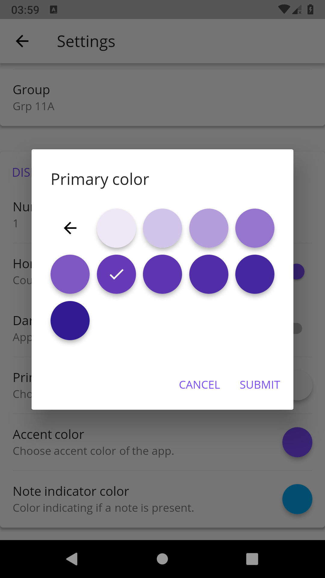
There is two step, first choose the main color, and when you press it, you have to choose a shade of the main color.
By default it's all **Material Colors**, but you can define custom colors, a **list of ColorSwatch**.


### Example of usages
You can insert the color picker into a **Dialog**


### Display color
You can use CircleColor widget, to display the selected color into your settings for example.
