https://github.com/qeepsake/react-native-action-tips
Cross platform tooltip for React Native (with TypeScript)
https://github.com/qeepsake/react-native-action-tips
javascript popup react-native tooltip tooltips
Last synced: 11 months ago
JSON representation
Cross platform tooltip for React Native (with TypeScript)
- Host: GitHub
- URL: https://github.com/qeepsake/react-native-action-tips
- Owner: Qeepsake
- Created: 2018-08-28T07:49:04.000Z (almost 8 years ago)
- Default Branch: master
- Last Pushed: 2022-06-10T00:54:31.000Z (about 4 years ago)
- Last Synced: 2025-08-29T07:30:43.238Z (11 months ago)
- Topics: javascript, popup, react-native, tooltip, tooltips
- Language: TypeScript
- Homepage: https://lukebrandonfarrell.com
- Size: 12.7 MB
- Stars: 7
- Watchers: 2
- Forks: 0
- Open Issues: 10
-
Metadata Files:
- Readme: README.md
Awesome Lists containing this project
README
# react-native-action-tips
[](#contributors-)
[](https://www.npmjs.com/package/react-native-action-tips)
[](https://npmjs.org/package/react-native-action-tips)
[](https://npmjs.org/package/react-native-action-tips)
Cross platform tooltip for React Native.

## Install
To get started install via npm:
```sh
npm install react-native-action-tips --save
```
## Usage
Import:
```js
import ActionTip from 'react-native-action-tips';
```
You can use the imperative API to control the action tip:
```js
const actionTipRef = useRef(null);
someMethod() {
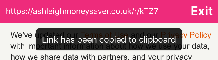
actionTipRef.current.show("Link has been copied");
}
```
The declarative API for controlling the action tip:
```js
const [isVisible, setIsVisible] = useState(false);
```
## Notes
The action tip exposes imperative `show()` and `hide()` functions.
The position of the component can be customised through the `position` prop by passing an object as such `{ top: 0, bottom: 0, left: 0, right: 0 }`. By default the component uses `"absolute"` positioning. This can be changed by passing style through the `containerStyle` prop.

## Props
| Prop | Type | Optional | Default | Description |
| --------------- | ------------- | --------- | -------------------- | --------------------------------------------------------------------------------------- |
| ref | string | Yes | | ref allows you to call the `show()` and `hide()` methods. |
| text | string | Yes | | Text which is displayed inside the action tip.
| visible | boolean | Yes | | Controls the tooltip visibility. |
| duration | number | Yes | 2000 ms | Duration until the action tip dismisses. |
| animationInDuration | number | Yes | 150 ms | Duration of fade-in animation. |
| animationOutDuration | number | Yes | 700 ms | Duration of fade-out animation. |
| opacity | number | Yes | 0.85 | Maximum opacity the tip should animate to. |
| position | object | Yes | 0 | Absolute positioning of the component. | |
| containerStyle | style | Yes | | Style applied to the action tip container. |
| textStyle | style | Yes | | Style applied to the action tip text. |
| onHide | function | Yes | | Callback when tooltip is hidden |
## Contributing
If you want to issue a PR, go ahead ;)
## Authors
* [**Luke Brandon Farrell**](https://lukebrandonfarrell.com/) - *Author*
* [**Aspect One**](https://github.com/aspect-one/) - *Organization*
## License
This project is licensed under the MIT License
## Contributors ✨
Thanks goes to these wonderful people ([emoji key](https://allcontributors.org/docs/en/emoji-key)):

Luke Brandon Farrell
📖

Gabriel Ribeiro
🐛
This project follows the [all-contributors](https://github.com/all-contributors/all-contributors) specification. Contributions of any kind welcome!