https://github.com/quavo19/rn-story
https://github.com/quavo19/rn-story
Last synced: 3 months ago
JSON representation
- Host: GitHub
- URL: https://github.com/quavo19/rn-story
- Owner: quavo19
- License: mit
- Created: 2023-06-29T11:58:24.000Z (almost 2 years ago)
- Default Branch: main
- Last Pushed: 2023-07-02T23:20:37.000Z (almost 2 years ago)
- Last Synced: 2025-02-04T04:29:31.150Z (4 months ago)
- Language: TypeScript
- Size: 24.4 KB
- Stars: 0
- Watchers: 1
- Forks: 0
- Open Issues: 0
-
Metadata Files:
- Readme: README.md
- License: LICENSE
Awesome Lists containing this project
README
rn-story
### Lightweight React Native component for stories like Instagram, Whatsapp and Snapchat.
---
## Installation
```sh
npm install rn-story
```
## Features
- Typescript support.
- Expo support.
- Video stories support.
- Next and previous callbacks.
- mute/unmute support.
- Video volume modification support.
- See more url support.
- Custom header support.
- Support for custom loading component.
## Usage
```jsx
import Stories from 'rn-story';
//minimal usage
```
[Full example](#example)
## Props
| Property | Type | Default | Description |
| ---------------------- | --------------- | ------------------------- | ------------------------------------------------------------------------------------------------------------------------------------------------------------------- |
| `stories` | StoryType[] | `required` | An array of story objects [StoryType object](#story-object)
| **Optional props** | ⭐️ | ⭐️ | ⭐️ |
| `currentIndex` | number | `0` | Set the current story index |
| `isMuted` | boolean | `false` | Switch to mute video story |
| `videoVolume` | number | `1.0` | Control the volume of video |
| `isAnimationBarRounded` | boolean | `true` | Switch to changed the shape from rectangular animation bar to rounded
| `animationBarHeight` | number | `2` | Modify the height of animation bar |
| `animationBarColor` | string | `#fff` | Modify the color of animation bar |
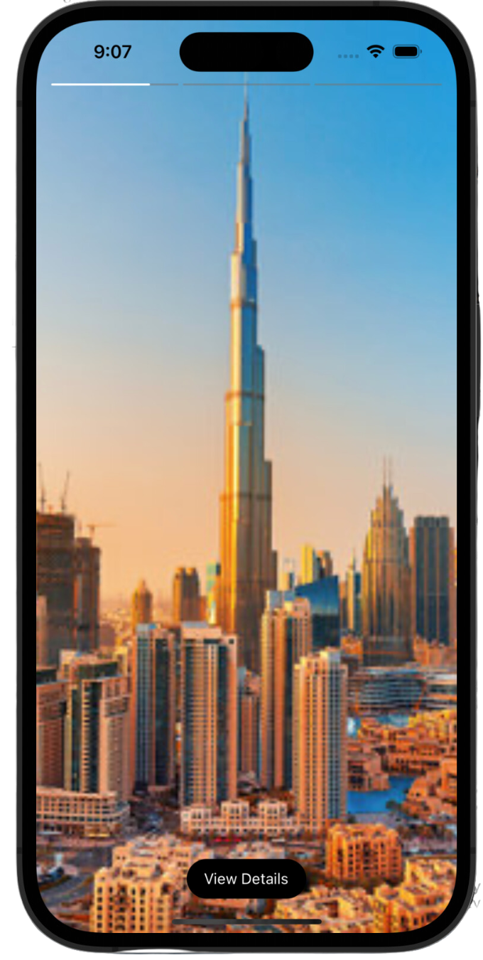
| `seeMoreText` | string | "View Details" | Change the text of **See More** button, *required `seeMoreUrl` to be set is Story Object.* |
| `seeMoreStyles` | ViewStyle | `{}` | Override the styles of **See More** button container, *required `seeMoreUrl` to be set is Story Object.* |
| `seeMoreTextStyles` | TextStyle | `{}` | Override the styles of **See More** button text, *required `seeMoreUrl` to be set is Story Object.* |
| `onPrevious` | Function | - | Callback when the user taps/press to go back to the previous story |
| `onPreviousFirstStory` | Function | - | Callback when the user taps/press to go back to the previous story but you are on the first story, i.e there are no more stories to go back (suitable for closing story view or update index to show previous profile story) |
| `onNext` | Function | - | Callback when the user taps/press to proceed to the next story |
| `onAllStoriesEnd` | Function | - | Callback when the user taps/press to proceed to next story but you are on the last story, i.e there are no more stories to go forward (suitable for closing story view or update index to show next story) |
| `loadingComponent` | JSX Component | - | Override default loading component with custom loading component |
### Story object
A simple 'story object' needs to be passed in the `stories` array.
| Property | Description |
| ------------------ | --------------------------------------------------------------------------------------------------------------------------------------------- |
| `media` | The url of the resource, be it image or video. |
| `mediaType` | Type of the story. type: 'video' or 'image' | 'image'`. Type `video` is necessary for a video story. |
| `duration?` | Optional. Duration for which a story should persist.
| `header?` | Optional. Header component which will be displayed just below animation bars, ideal for avatar, close button and linear gradient.
| `seeMoreUrl?` | Optional. Shows the See More button at the bottom and adds the url for that button as well.
## Example
### Just copy and paste the following code.
```jsx
import { LinearGradient } from 'expo-linear-gradient';
import { useEffect, useState } from 'react';
import { StyleSheet, SafeAreaView, Pressable, View, Image, Text, Dimensions, StatusBar, ScrollView, Platform } from 'react-native';
import Stories from 'rn-story';
const { width } = Dimensions.get('window');
export default function App() {
const [data, setData] = useState([
{
profileImage:
'https://shorturl.at/fhUV1',
profileName: 'Abdullah Ansari',
viewed: false,
id: 1,
stories: [
{
media: 'https://shorturl.at/mpwQ1',
mediaType: 'image',
seeMoreUrl: 'https://abdullahansari.me'
},
{
media: 'https://shorturl.at/jpJ58',
mediaType: 'image',
duration: 12000
},
{
media: 'https://shorturl.at/ckvyT',
mediaType: 'image',
},
]
},
{
profileImage:
'https://shorturl.at/fhUV1',
profileName: 'Abdullah Ansari 2',
viewed: false,
id: 2,
stories: [
{
media: 'https://shorturl.at/DEKP1',
mediaType: 'video',
},
{
media: 'https://shorturl.at/pJZ28',
mediaType: 'image',
}
]
}
]);
//setting this state to null will close the story view
const [currentStoryIndex, setCurrentStoryIndex] = useState(null);
useEffect(() => {
//we are adding header to each story item
const _tempData = [...data];
_tempData.forEach((story) => {
story.stories.forEach((storyItem) => {
storyItem.header =
{/* THE AVATAR AND USERNAME */}
{story?.profileName}
{/* END OF THE AVATAR AND USERNAME */}
{/* THE CLOSE BUTTON */}
setCurrentStoryIndex(null)}>
{/* You can replace it with a close icon */}
Close
{/* END OF CLOSE BUTTON */}
});
});
setData(_tempData);
}, []);
return (
{/* you can also use FlatList here */}
{data.map((story, index) => (
setCurrentStoryIndex(index)}
style={[styles.storyContainer]}>
{story?.profileName}
))}
{currentStoryIndex !== null &&
console.log("next")}
//called when user taps on previous
onPrevious={() => console.log("previous")}
// close story view if there are no more stories to go next to
onAllStoriesEnd={() => setCurrentStoryIndex(null)}
//close story view if there are no more stories to go back to
onPreviousFirstStory={() => setCurrentStoryIndex(null)}
//custom loading component
loadingComponent={Custom Loading...}
/>}
);
}
const styles = StyleSheet.create({
storyContainer: {
alignItems: 'center'
},
imageContainer: {
borderWidth: 2,
borderRadius: 50,
padding: 3
},
newStory: {
borderColor: '#25D366',
},
viewedStory: {
borderColor: '#D3D3D3'
},
storyImage: {
height: 64,
width: 64,
borderRadius: 50
},
profileNameHorizontal: {
width: Dimensions?.get('window')?.width / 5,
textAlign: 'center',
},
avatarAndIconsContainer: {
height: 50,
flexDirection: 'row',
justifyContent: 'space-between',
alignItems: 'center'
},
linearGradient: {
position: 'absolute',
left: 0,
right: 0,
top: Platform.OS === "ios" ? -64 : 0,
height: 60,
width: Dimensions?.get('window')?.width,
},
avatarAndProfileContainer: {
flexDirection: 'row',
alignItems: 'center',
marginLeft: 12
},
profileImage: {
height: 36,
width: 36,
borderRadius: 25
},
profileName: {
color: "#fff",
marginLeft: 12
},
uploadedAt: {
color: "#fff",
marginLeft: 12
},
iconContainer: {
flexDirection: 'row',
justifyContent: 'space-between',
marginRight: 12
},
});
export type Data = {
profileName: string;
profileImage: string;
id: string | number;
stories: Story[];
viewed: boolean;
}
export type Story = {
media: string;
mediaType: "image" | "video";
duration?: number;
header?: JSX.Element;
seeMoreUrl?: string
}
```
[Full soure code for the example available here](https://github.com/AbdullahAnsarii/rn-story/tree/master/example)
## Upcoming Features
- Support for custom see more component.
- SafeAreaView toggle
## Contributing
See the [contributing guide](CONTRIBUTING.md) to learn how to contribute to the repository and the development workflow.
## License
MIT © [AbdullahAnsarii](https://github.com/AbdullahAnsarii)
Check out more projects at https://abdullahansari.me