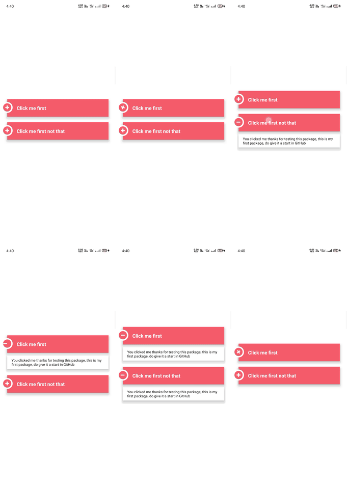
https://github.com/radhakishan404/react-native-stylish-accordion
This is react native accordion for those who wanted to style accordion according to there requirements.
https://github.com/radhakishan404/react-native-stylish-accordion
accordion accordion-package collapsible-accordion react react-native react-native-accordion react-native-stylish-accordion
Last synced: 3 months ago
JSON representation
This is react native accordion for those who wanted to style accordion according to there requirements.
- Host: GitHub
- URL: https://github.com/radhakishan404/react-native-stylish-accordion
- Owner: radhakishan404
- License: mit
- Created: 2020-10-31T11:16:45.000Z (over 4 years ago)
- Default Branch: main
- Last Pushed: 2020-10-31T14:13:41.000Z (over 4 years ago)
- Last Synced: 2024-11-23T02:50:14.620Z (6 months ago)
- Topics: accordion, accordion-package, collapsible-accordion, react, react-native, react-native-accordion, react-native-stylish-accordion
- Language: Java
- Homepage:
- Size: 2.51 MB
- Stars: 10
- Watchers: 2
- Forks: 0
- Open Issues: 0
-
Metadata Files:
- Readme: README.md
- License: LICENSE
Awesome Lists containing this project
README
# react-native-stylish-accordion
Simple Stylish React Native Accordion
## Table of Contents
- [Install](#install)
- [Usage](#usage)
- [License](#license)
# Install
```sh
$ npm install react-native-stylish-accordion
```
or
```sh
$ yarn add react-native-stylish-accordion
```
Now we need to install react-native-reanimated and react-native-animatable.
If you are using Expo, to ensure that you get the compatible versions of the libraries, run:
```
expo install react-native-reanimated react-native-gesture-handler react-native-redash
```
If you are not using Expo, run the following:
```
yarn add react-native-reanimated react-native-gesture-handler react-native-redash
```
## Note
This is created with the help of "react-native-accordion-view" package.
## Usage

```
import StylishAccordion from 'react-native-stylish-accordion'
export default function App() {
const [firstOpen, setFirstOpen] = useState(false);
const [secondOpen, setSecondOpen] = useState(false);
return (
setFirstOpen(!firstOpen)}
titleStyle={{ fontSize: 18, fontWeight: "bold" }}
headerStyle={[styles.accordionHeader]}
subContainerStyle={[styles.accordionSubContainer]}
timingTransition={150}
iconSize={14}
>
You clicked me thanks for testing this package, this is my first package, do give it a start in GitHub
setSecondOpen(!secondOpen)}
titleStyle={{ fontSize: 18, fontWeight: "bold" }}
headerStyle={[styles.accordionHeader]}
subContainerStyle={[styles.accordionSubContainer]}
timingTransition={150}
iconSize={14}
>
You clicked me thanks for testing this package, this is my first package, do give it a start in GitHub
);
}
const styles = StyleSheet.create({
container: {
flex: 1,
backgroundColor: '#fff',
alignItems: 'center',
justifyContent: 'center',
},
accordionHeader: {
backgroundColor: "#ff9d9d",
borderTopLeftRadius: 12,
borderTopRightRadius: 12,
marginLeft: 5,
marginRight: 5,
marginBottom: 10,
shadowColor: '#000',
shadowOffset: { width: 0, height: 2 },
shadowOpacity: 0.8,
shadowRadius: 2,
elevation: 8,
},
accordionSubContainer: {
backgroundColor: "#fff",
marginLeft: 5,
marginRight: 5,
shadowColor: '#000',
shadowOffset: { width: 0, height: 2 },
shadowOpacity: 0.8,
shadowRadius: 2,
elevation: 8,
marginBottom: 13,
},
});
```
## Props
- **title** (string)
- **titleStyle** (TextStyle)
- **iconSize** (number)
- **headerStyle** (ViewStyle)
- **subContainerStyle** (ViewStyle)
- **style** (ViewStyle)
- **headerComponent** (ReactNode)
- **open** (boolean)
- **onPress** (void)
- **timingTransition** (number default:400) opening speed
- **containerRadius** (number)
## License
[MIT © Radhakishan Jangid](https://radhakishan.vpran.in)