https://github.com/radusalagean/info-bar-compose
An Android Jetpack Compose library for displaying on-screen messages. (simplified Snackbar alternative)
https://github.com/radusalagean/info-bar-compose
android android-library android-ui jetpack-compose kotlin material-design snackbar
Last synced: 7 months ago
JSON representation
An Android Jetpack Compose library for displaying on-screen messages. (simplified Snackbar alternative)
- Host: GitHub
- URL: https://github.com/radusalagean/info-bar-compose
- Owner: radusalagean
- License: apache-2.0
- Created: 2021-07-23T07:37:34.000Z (about 5 years ago)
- Default Branch: main
- Last Pushed: 2025-05-30T09:30:57.000Z (about 1 year ago)
- Last Synced: 2025-09-29T00:32:18.988Z (10 months ago)
- Topics: android, android-library, android-ui, jetpack-compose, kotlin, material-design, snackbar
- Language: Kotlin
- Homepage:
- Size: 1.5 MB
- Stars: 131
- Watchers: 2
- Forks: 8
- Open Issues: 0
-
Metadata Files:
- Readme: README.md
- License: LICENSE
Awesome Lists containing this project
- jetpack-compose-awesome - info-bar-compose - Display Snackbar-style messages, the easy way. (Libraries / UI)
README
[](https://search.maven.org/artifact/com.radusalagean/info-bar-compose)
[]( https://android-arsenal.com/details/1/8254)
# InfoBar Compose
An **Android Jetpack Compose library** for displaying **on-screen messages**. Unlike the built-in `Snackbar` from the Compose Material library, the `InfoBar` can be properly displayed **without additional requirements**, like `Scaffold`, `SnackbarHost` / `SnackbarHostState`, or manually starting new coroutines to show the on-screen message.
Although the **InfoBar** composable is inspired by the Snackbar, it does not aim to entirely copy its design or behavior.
**Test drive this library, demo app available on [Google Play](https://play.google.com/store/apps/details?id=com.radusalagean.infobarcompose.sample)!**


## Usage
Include the library in your module-level `build.gradle` file:
```
repositories {
mavenCentral()
}
dependencies {
implementation 'com.radusalagean:info-bar-compose:1.0.0'
}
```
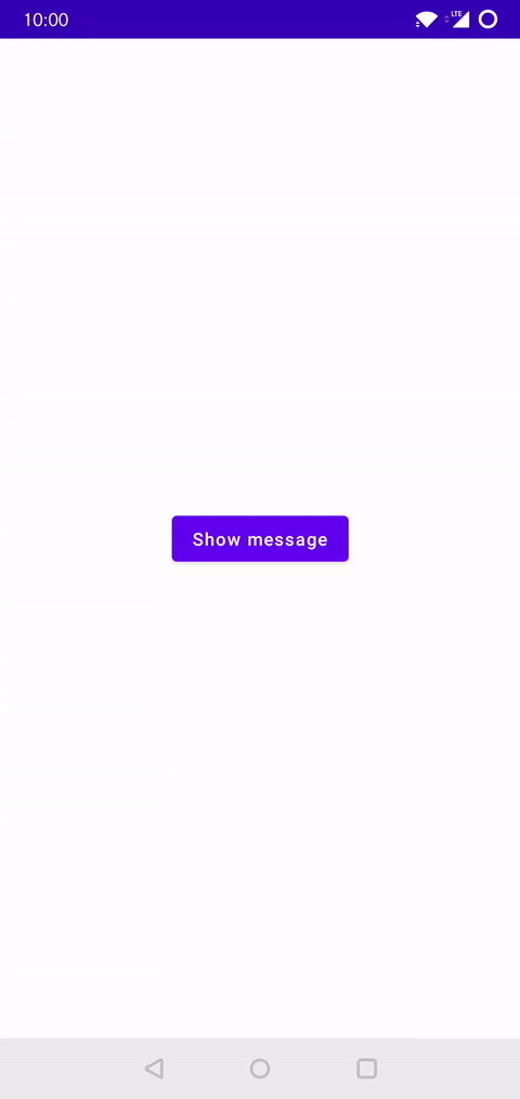
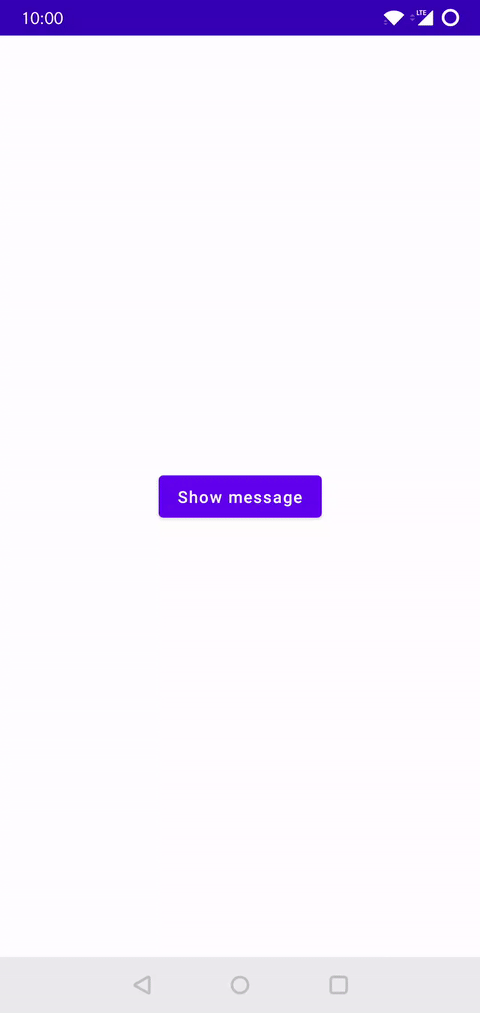
The **simplest configuration** of an `InfoBar` is showcased below:
```kotlin
var message: InfoBarMessage? by remember { mutableStateOf(null) }
// Assign the message on an event callback (button click, download complete, message received, etc.):
// message = InfoBarMessage(text = "Example message")
InfoBar(offeredMessage = message) {
// ⚠️ Important step: We are nulling out the message in the trailing lambda (onDismiss function)
message = null
}
```
A **complete working example**:
```kotlin
setContent {
YourAppTheme {
Box(Modifier.fillMaxSize().padding(16.dp)) {
var message: InfoBarMessage? by remember { mutableStateOf(null) }
Button(
modifier = Modifier.align(Alignment.Center),
onClick = { message = InfoBarMessage(text = "Example message") }
) {
Text("Show message")
}
InfoBar(offeredMessage = message) {
message = null
}
}
}
}
```
## `InfoBar` types
The `InfoBar` composable has 2 signatures:
- One for a **standard** version, which already has a layout defined, inspired by the Material design `Snackbar`. This composable has multiple parameters exposed, allowing for increased customizability of the predefined standard layout.
- One for a **generic** version, allowing to pass a composable layout defined in the client app.
## Configuration parameters
### **`InfoBar` composable:**
| S | G |
| --- | --- |
| Available in the **Standard** `InfoBar` | Available in the **Generic** `InfoBar` |
| Parameter | Description | Type | S | G |
| --- | --- | --- | --- | --- |
| `modifier` | Modifier to be applied to the `InfoBar` surface | `Modifier` | ✔️ | ✔️ |
| `offeredMessage` | `InfoBarMessage` or `BaseInfoBarMessage` subclass instance, describing the message that should be displayed | `InfoBarMessage?` | ✔️ | ✔️ |
| `elevation` | Elevation to be applied to the `InfoBar` surface | `Dp` | ✔️ | ✔️ |
| `shape` | Shape to be applied to the `InfoBar` surface | `Shape` | ✔️ | ✔️ |
| `backgroundColor` | Background color to be applied to the `InfoBar` surface | `Color?` | ✔️ | ✔️ |
| `content` | The content composable to use in the `InfoBar` surface | `@Composable (T) -> Unit` | ❌ | ✔️ |
| `textVerticalPadding` | Vertical padding for the message text | `Dp` | ✔️ | ❌ |
| `textColor` | Color for the message text | `Color?` | ✔️ | ❌ |
| `textFontSize` | Font size for the message text | `TextUnit` | ✔️ | ❌ |
| `textFontStyle` | Font style for the message text | `FontStyle?` | ✔️ | ❌ |
| `textFontWeight` | Font weight for the message text | `FontWeight?` | ✔️ | ❌ |
| `textFontFamily` | Font family for the message text | `FontFamily?` | ✔️ | ❌ |
| `textLetterSpacing` | Letter spacing for the message text | `TextUnit` | ✔️ | ❌ |
| `textDecoration` | Decoration for the message text | `TextDecoration?` | ✔️ | ❌ |
| `textAlign` | Alignment for the message text | `TextAlign?` | ✔️ | ❌ |
| `textLineHeight` | Line height for the message text | `TextUnit` | ✔️ | ❌ |
| `textMaxLines` | Maximum number of lines for the message text | `Int` | ✔️ | ❌ |
| `textStyle` | Style for the message text | `TextStyle` | ✔️ | ❌ |
| `actionColor` | Color for the action button text | `Color?` | ✔️ | ❌ |
| `fadeEffect` | Use fading effect when the message appears and disappears? (controls the `alpha` property) | `Boolean` | ✔️ | ✔️ |
| `fadeEffectEasing` | Easing style of the fade effect | `InfoBarEasing` | ✔️ | ✔️ |
| `scaleEffect` | Use scaling effect when the message appears and disappears? (controls the `scaleX` / `scaleY` properties) | `Boolean` | ✔️ | ✔️ |
| `scaleEffectEasing` | Easing style of the scale effect | `InfoBarEasing` | ✔️ | ✔️ |
| `slideEffect` | Which sliding effect to use when the message appears and disappears? (controls the `translationY` property) | `InfoBarSlideEffect` | ✔️ | ✔️ |
| `slideEffectEasing` | Easing style of the slide effect | `InfoBarEasing` | ✔️ | ✔️ |
| `enterTransitionMillis` | Enter animation duration in milliseconds | `Int` | ✔️ | ✔️ |
| `exitTransitionMillis` | Exit animation duration in milliseconds | `Int` | ✔️ | ✔️ |
| `wrapInsideExpandedBox` | Maintain the shadow of the `InfoBar` even when animating the `alpha` property, by wrapping the `InfoBar` content inside a `Box` layout that fills the maximum available space. The `alpha` property is then animated on the outer `Box` instead of the `InfoBar` surface, thus not clipping the shadow when `alpha` is less than `1f`. **Note: Any modifier you pass from the outside is applied to the `InfoBar` surface, not the outer `Box` layout!** | `Boolean` | ✔️ | ✔️ |
| `onDismiss` | Function which is called when the `InfoBar` is either timed out or dismissed by the user. **Don't forget to always null out the `InfoBarMessage` / `BaseInfoBarMessage` subclass instance here!** (see usage example from above) | `() -> Unit` | ✔️ | ✔️ |
### **`InfoBarMessage` class:**
| Parameter | Description | Type |
| --- | --- | --- |
| `text` | Message as string | `String?` |
| `textStringResId` | Message as string resource id | `Int?` |
| `textStringResArgs` | Arguments for `textStringResId` | `Array?` |
| `textColor` | Color for the message text (overrides `textColor` set in the `InfoBar` composable) | `Color?` |
| `action` | Action as string | `String?` |
| `actionStringResId` | Action as string resource id | `Int?` |
| `actionStringResArgs` | Arguments for `actionStringResId` | `Array?` |
| `actionColor` | Color for the action button text (overrides `actionColor` set in the `InfoBar` composable) | `Color?` |
| `backgroundColor` | Background color to be applied to the `InfoBar` surface (overrides `backgroundColor` set in the `InfoBar` composable) | `Color?` |
| `displayTimeSeconds` | The number of seconds to display the message (excluding animation time). Pass `-1` if you don't want the message to time out. | `Int?` |
| `onAction` | Function which is called when the user presses the action button | `(() -> Unit)?` |
## Using the generic composable
If the standard `InfoBar` signature does not entirely meet your requirements in terms of layout, you can use the **generic** `InfoBar` signature, which allows you to pass a custom layout composable:
1. **Extend the `BaseInfoBarMessage` abstract class** and define your custom message data structure:
```kotlin
class CustomMessage(
val textString: String,
val icon: ImageVector,
val iconColor: Color,
val textColor: Color = Color.Unspecified,
override val backgroundColor: Color? = null,
override val displayTimeSeconds: Int? = 4,
) : BaseInfoBarMessage() {
override val containsControls: Boolean = false
}
```
1. **Declare the `content` composable** that defines your layout:
```kotlin
val content: @Composable (CustomMessage) -> Unit = { message ->
Row {
Icon(
modifier = Modifier.padding(8.dp).align(Alignment.CenterVertically),
imageVector = message.icon,
contentDescription = null,
tint = message.iconColor
)
Text(
modifier = Modifier.align(Alignment.CenterVertically),
text = message.textString,
color = message.textColor
)
}
}
```
1. **Display** the message:
```kotlin
setContent {
YourAppTheme {
Box(Modifier.fillMaxSize().padding(16.dp)) {
var message: CustomMessage? by remember { mutableStateOf(null) }
Button(
modifier = Modifier.align(Alignment.Center),
onClick = {
message = CustomMessage(
textString = "This is a custom message",
textColor = Color(0xFF414141),
icon = Icons.Rounded.Info,
iconColor = Color(0xFF27C54D),
backgroundColor = Color(0xFFE3F1E6)
)
}
) {
Text("Show message")
}
InfoBar(offeredMessage = message, content = content) {
message = null
}
}
}
}
```
## Sample App
More complex usage examples are available in the **sample app**. [Download from Google Play](https://play.google.com/store/apps/details?id=com.radusalagean.infobarcompose.sample).
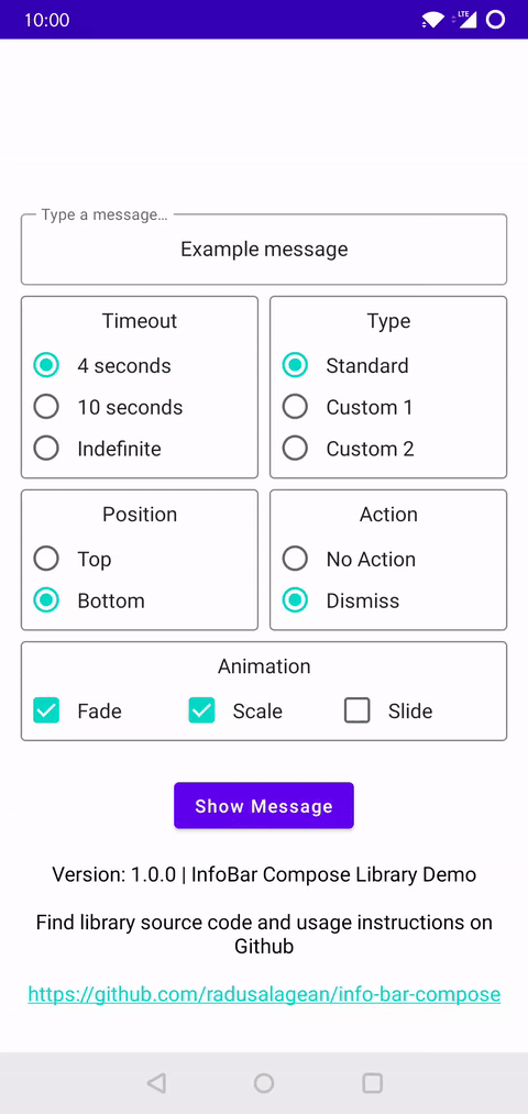
**Photo credits:** The sample app contains 2 photos, used under [Pexels](https://www.pexels.com/license/) license. The authors of these photos are [Kittichai Chumanee](https://www.pexels.com/@kittichai-chumanee-3743016) and [Karolina Grabowska](https://www.pexels.com/@karolina-grabowska).
## Contributions
Found a bug or have a suggestion? Please open an [issue](https://github.com/radusalagean/info-bar-compose/issues).
## Support
If you use this library and enjoy it, please support it by **starring** it on GitHub. 🌟
## Further reading
There is an [article](https://radusalagean.com/jetpack-compose-snackbar-alternative-infobar-compose-library/) available that showcases this library in a bit more detail.
## License
Apache License 2.0, see the [LICENSE](LICENSE) file for details.