https://github.com/railly/shadcn-ui-customizer
shadcn/ui themes with color pickers
https://github.com/railly/shadcn-ui-customizer
color-picker color-scheme shadcn shadcn-ui shadcnui theme-ui ui-components ui-library
Last synced: about 1 year ago
JSON representation
shadcn/ui themes with color pickers
- Host: GitHub
- URL: https://github.com/railly/shadcn-ui-customizer
- Owner: Railly
- License: mit
- Created: 2023-08-08T23:47:50.000Z (almost 3 years ago)
- Default Branch: main
- Last Pushed: 2025-02-15T05:22:40.000Z (over 1 year ago)
- Last Synced: 2025-05-08T20:08:02.643Z (about 1 year ago)
- Topics: color-picker, color-scheme, shadcn, shadcn-ui, shadcnui, theme-ui, ui-components, ui-library
- Language: TypeScript
- Homepage: https://shadcn-ui-customizer.vercel.app
- Size: 1.1 MB
- Stars: 334
- Watchers: 2
- Forks: 27
- Open Issues: 7
-
Metadata Files:
- Readme: README.md
- License: LICENSE
Awesome Lists containing this project
README
# shadcn/ui customizer
This is an open-source extension of [shadcn/ui](https://github.com/shaddcn-ui/ui) themes for customizing the theme.
> [!IMPORTANT]
> Original theme customizer: [https://ui.shadcn.com/themes](https://ui.shadcn.com/themes)
## Screenhsots
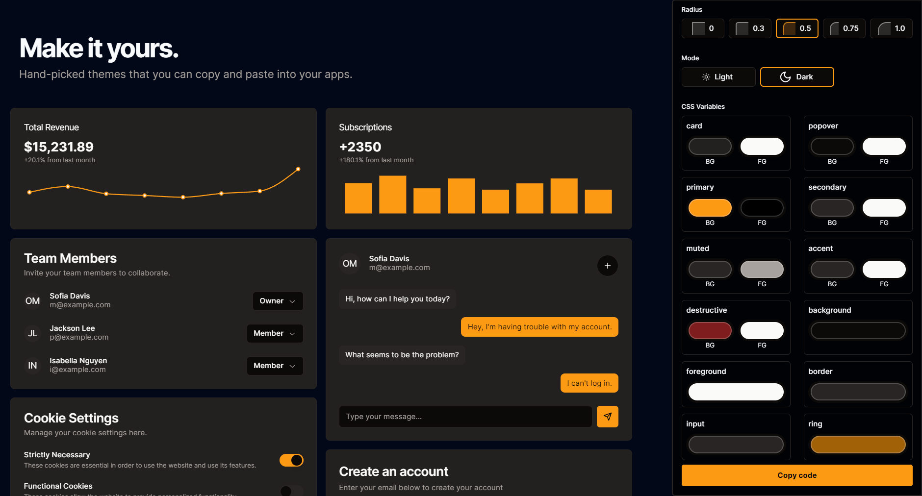
## Features
### Customizing CSS Variables
With shadcn/ui customizer, you can tweak and customize the following CSS variables:
- `--background`
- `--foreground`
- `--card`
- `--card-foreground`
- `--popover`
- `--popover-foreground`
- `--primary`
- `--primary-foreground`
- `--secondary`
- `--secondary-foreground`
- `--muted`
- `--muted-foreground`
- `--accent`
- `--accent-foreground`
- `--destructive`
- `--destructive-foreground`
- `--border`
- `--input`
- `--ring`
- `--radius`