https://github.com/ramxcodes/anime-hunt
Anime Hunt is a simple website showcasing popular anime and manga titles. It provides a clean and user-friendly interface to explore information about various series.
https://github.com/ramxcodes/anime-hunt
Last synced: about 1 year ago
JSON representation
Anime Hunt is a simple website showcasing popular anime and manga titles. It provides a clean and user-friendly interface to explore information about various series.
- Host: GitHub
- URL: https://github.com/ramxcodes/anime-hunt
- Owner: ramxcodes
- Created: 2024-03-05T17:30:50.000Z (about 2 years ago)
- Default Branch: main
- Last Pushed: 2024-03-09T17:39:38.000Z (about 2 years ago)
- Last Synced: 2025-02-05T13:51:20.753Z (over 1 year ago)
- Language: CSS
- Homepage: https://ramxcodes.github.io/Anime-Hunt/
- Size: 28.3 KB
- Stars: 1
- Watchers: 1
- Forks: 0
- Open Issues: 0
-
Metadata Files:
- Readme: README.md
Awesome Lists containing this project
README
# Anime Hunt Website
Anime Hunt is a simple website showcasing popular anime and manga titles. It provides a clean and user-friendly interface to explore information about various series.
## Table of Contents
1. [Introduction](#introduction)
2. [Features](#features)
3. [Installation / Fork](#installation--fork)
4. [Star the GitHub Repo](#star-the-github-repo)
5. [Code of the Website](#code-of-the-website)
---
## Introduction
Anime Hunt is a simple website showcasing popular anime and manga titles. It provides a clean and user-friendly interface to explore information about various series.
---
## Features
- **Navigation Menu:**
- Easy-to-use navigation menu with quick access to different sections.
- Weekly updates, best manga, anime news, and more.
- **Content Display:**
- Display of popular anime titles with corresponding images.
- Each title is presented in a visually appealing format.
- **Responsive Design:**
- The website is designed to be responsive, providing a seamless experience across different devices.
---
## Installation / Fork
To set up the Anime Hunt website locally or fork it for your own modifications, follow these steps:
1. Clone the repository:
```bash
git clone https://github.com/ramxcodes/anime-hunt.git
```
2. Open the `index.html` file in a web browser to view the website locally.
3. Customize the content, styles, or scripts according to your preferences.
4. Make sure to update the repository URL in the cloned version:
```bash
git remote set-url origin https://github.com/ramxcodes/anime-hunt.git
```
5. Push the changes to your GitHub repository:
```bash
git push origin master
```
---
## Star the GitHub Repo
If you find the Anime Hunt website interesting or useful, consider starring the GitHub repository. Your support is highly appreciated!
---
## Code of the Website
Below is the HTML and CSS code that constitutes the Anime Hunt website. Feel free to explore and modify the code as needed.
### HTML (index.html)
```html
Anime Hunt
JP EN
Weekly Update
Best Manga
Anime Hunt
Anime News
News
Upcoming
Goodies
Tiers
Authors
Swags
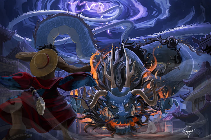
One Piece
Solo Leveling
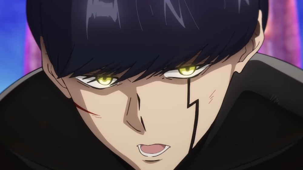
Jujustu Kaisen
Attack on titan
Mashel OP
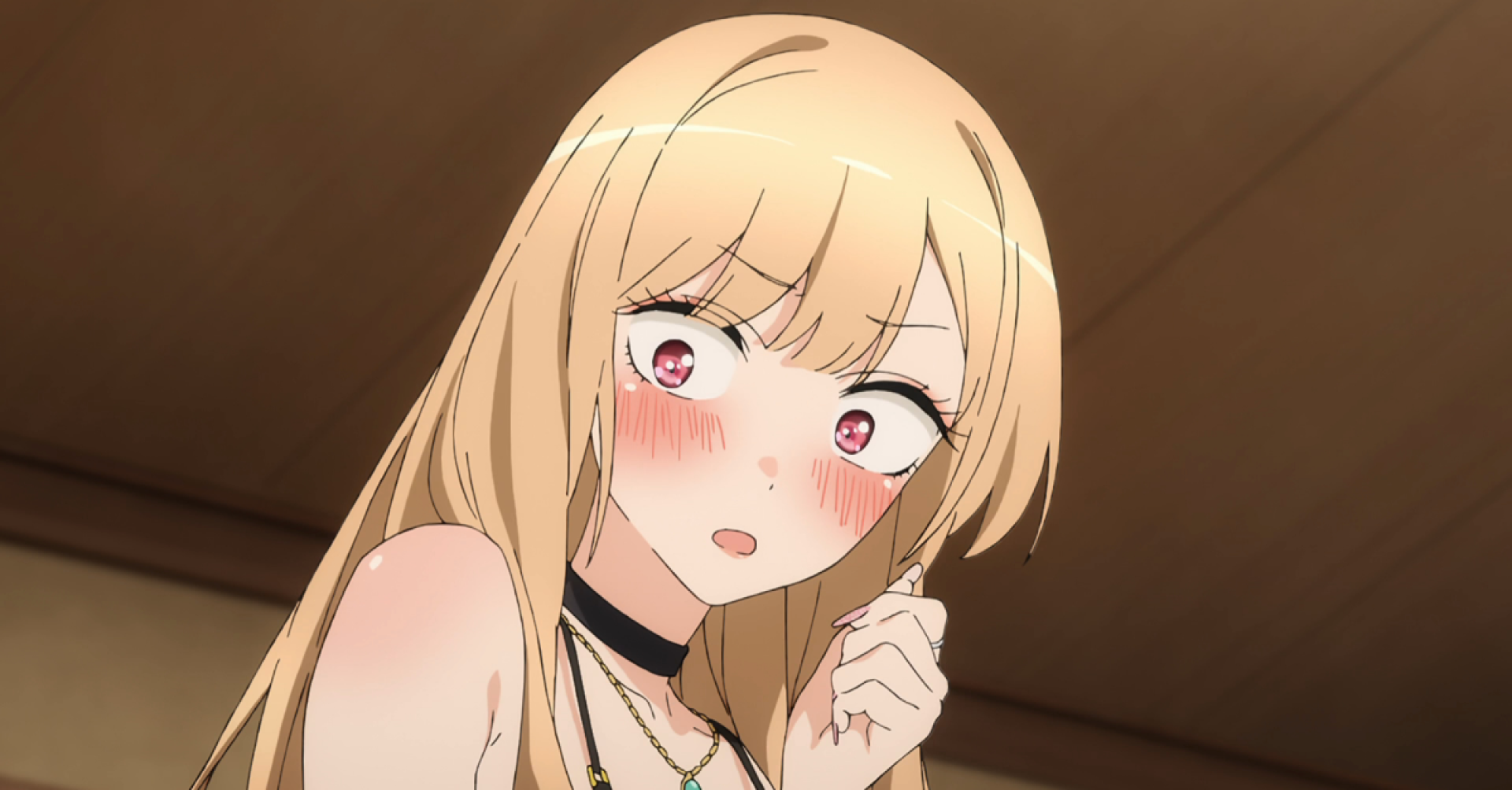
Dress up darling
Demon Slayer
Black Clover
Classroom of elite
Naruto


```
### CSS (style.css)
```css
*{
margin: 0;
padding: 0;
box-sizing: border-box;
font-family: 'gilroy';
}
html,body{
height: 100%;
width: 100%;
overflow: hidden;
}
#main{
height: 100%;
width: 100%;
/* background: red; */
}
#nav{
height: 80px;
width: 100%;
/* background-color: red; */
display: flex;
align-items: center;
justify-content: space-between;
padding: 0 40px;
}
#nav-part1{
display: flex;
align-items: center;
justify-content: center;
gap: 2px;
}
#nav-part2{
display: flex;
align-items: center;
justify-content: center;
gap: 40px;
}
#nav-part2 h4{
font-size: 16px;
font-weight: 600;
}
#nav h5{
display: none;
}
#nav-part2 h4 span{
color: blueviolet;
margin-left: 10px;
}
.gola{
height: 20px;
width: 20px;
background-color: black;
border-radius: 50%;
}
#nav2{
height: 70px;
width: 100%;
/* background-color: RED; */
display: flex;
align-items: center;
gap: 60px;
padding: 0px 30px;
}
#nav2 h3{
font-size: 16px;
text-transform: capitalize;
font-weight: 700;
}
#content{
height: calc(100% - 150px);
width: 100%;
/* background-color: aquamarine; */
}
#text-content{
height: 40%;
width: 100%;
/* background-color: burlywood; */
display: flex;
flex-wrap: nowrap;
overflow-x: auto;
}
#text-content::-webkit-scrollbar{
background-color: transparent;
height: 7px;
}
#text-content::-webkit-scrollbar-thumb{
background-color: blueviolet;
}
.elem{
flex-shrink: 0;
height: 100%;
width: 60%;
/* background-color: red; */
display: flex;
align-items: center;
justify-content: center;
}
.elem h1{
font-size: 7vw;
font-weight: 400;
}
#image-content{
height: 60%;
width: 100%;
/* background-color: red; */
display: flex;
overflow-x: auto;
}
#image-content::-webkit-scrollbar{
display: none;
}
#image-content img{
flex-shrink: 0;
height: 100%;
width: 100%;
object-fit: cover;
object-position: center;
}
@media (max-width:600px) {
#nav{
height: 70px;
padding: 0 20px;
}
#nav-part2{
align-items: center;
gap: 25px;
}
#nav-part2 h4{
font-size: 13px;
display: none;
font-weight: 600;
}
#nav-part2 h4:nth-child(1){
display: initial;
margin-right: 20px;
}
#nav-part2 h4 span{
color: blueviolet;
margin-left: 10px;
}
.gola{
height: 12px;
width: 12px;
background-color: black;
border-radius: 50%;
}
#nav i{
font-size: 20px;
}
#nav h5{
display: initial;
}
#nav2{
height: 70px;
width: 100%;
/* background-color: RED; */
display: flex;
align-items: center;
justify-content: space-between;
gap: 15px;
padding: 0px 15px;
}
#nav2 h3{
font-size: 2.8vw;
text-transform: capitalize;
font-weight: 500;
color: #444;
}
#content{
height: calc(100% - 140px);
width: 100%;
/* background-color: aquamarine; */
}
#text-content{
height: 35%;
width: 100%;
/* background-color: burlywood; */
display: flex;
flex-wrap: nowrap;
overflow-x: auto;
}
#text-content::-webkit-scrollbar{
background-color: transparent;
height: 5px;
}
#text-content::-webkit-scrollbar-thumb{
background-color: blueviolet;
}
.elem{
flex-shrink: 0;
height: 100%;
width: fit-content;
margin-right: 30px;
/* background-color: red; */
display: flex;
align-items: center;
justify-content: center;
}
.elem h1{
font-size: 15vw;
white-space: nowrap;
font-weight: 400;
}
#image-content{
height: 65%;
width: 100%;
/* background-color: red; */
display: flex;
overflow-x: auto;
}
#image-content::-webkit-scrollbar{
display: none;
}
#image-content img{
flex-shrink: 0;
height: 100%;
width: 100%;
object-fit: cover;
object-position: center;
}
}
```
---
Feel free to explore and customize the code to suit your preferences.
Made with ❤️ by [Ram](https://github.com/ramxcodes).