https://github.com/raphox/trinity_expo
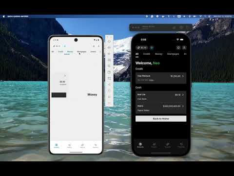
Trinity Bank is a concept validation project inspired by the cyber-reality of The Matrix. Designed as a sandbox for testing new technologies and user experiences.
https://github.com/raphox/trinity_expo
expo gluestack react react-hook-form react-native tailwind zod
Last synced: 4 months ago
JSON representation
Trinity Bank is a concept validation project inspired by the cyber-reality of The Matrix. Designed as a sandbox for testing new technologies and user experiences.
- Host: GitHub
- URL: https://github.com/raphox/trinity_expo
- Owner: raphox
- License: mit
- Created: 2025-10-15T15:19:18.000Z (9 months ago)
- Default Branch: main
- Last Pushed: 2025-10-17T20:17:56.000Z (9 months ago)
- Last Synced: 2025-10-26T09:51:51.531Z (9 months ago)
- Topics: expo, gluestack, react, react-hook-form, react-native, tailwind, zod
- Language: TypeScript
- Homepage: https://trinity-expo.web.app/
- Size: 1.88 MB
- Stars: 0
- Watchers: 0
- Forks: 0
- Open Issues: 0
-
Metadata Files:
- Readme: README.md
- License: LICENSE
Awesome Lists containing this project
README
          # Welcome to your Trinity app 👋

This is an [Expo](https://expo.dev) project created with [`create-expo-app`](https://www.npmjs.com/package/create-expo-app).

I built it as a personal challenge to explore new ideas, test design concepts, and experiment with performance patterns — while proving I can move from zero to prototype quickly.

The goal was simple: build something that looks and feels real, while pushing my creativity and coding speed to the limit.

I’m excited about the results — clean design, smooth navigation, and modern animations that make the experience feel truly next-gen.


   Youtube Video


## Get started

1. Install dependencies

   ```bash

   npm install

   ```

2. Start the app

   ```bash

   npx expo start

   ```

In the output, you'll find options to open the app in a

- [development build](https://docs.expo.dev/develop/development-builds/introduction/)

- [Android emulator](https://docs.expo.dev/workflow/android-studio-emulator/)

- [iOS simulator](https://docs.expo.dev/workflow/ios-simulator/)

- [Expo Go](https://expo.dev/go), a limited sandbox for trying out app development with Expo

You can start developing by editing the files inside the **app** directory. This project uses [file-based routing](https://docs.expo.dev/router/introduction).

## Get a fresh project

When you're ready, run:

```bash

npm run reset-project

```

This command will move the starter code to the **app-example** directory and create a blank **app** directory where you can start developing.

## Learn more

To learn more about developing your project with Expo, look at the following resources:

- [Expo documentation](https://docs.expo.dev/): Learn fundamentals, or go into advanced topics with our [guides](https://docs.expo.dev/guides).

- [Learn Expo tutorial](https://docs.expo.dev/tutorial/introduction/): Follow a step-by-step tutorial where you'll create a project that runs on Android, iOS, and the web.

## Join the community

Join our community of developers creating universal apps.

- [Expo on GitHub](https://github.com/expo/expo): View our open source platform and contribute.

- [Discord community](https://chat.expo.dev): Chat with Expo users and ask questions.

## Packages Used in This Project

This project leverages several powerful packages to enhance development and user experience. Below is a list of the key packages, their benefits, and how they are utilized in this project:

### `@gluestack-ui/core` and `@gluestack-ui/utils`

- **Benefits**: These packages provide a robust and customizable UI component library and utility functions for building consistent and reusable UI elements.

- **Usage**: Used to create a cohesive design system and streamline the development of UI components across the app.

### `@hookform/resolvers`

- **Benefits**: Simplifies the integration of validation libraries like `zod` with `react-hook-form`.

- **Usage**: Used to validate form inputs seamlessly, ensuring data integrity and user-friendly error handling.

### `expo` and `expo-router`

- **Benefits**: Expo simplifies the development of React Native apps by providing a managed workflow, while `expo-router` enables file-based routing for better navigation management.

- **Usage**: Core to the app's structure, enabling cross-platform development and intuitive navigation.

### `lucide-react-native`

- **Benefits**: Offers a collection of beautifully designed, customizable icons.

- **Usage**: Used to enhance the app's visual appeal with high-quality icons.

### `nativewind`

- **Benefits**: Brings the power of Tailwind CSS to React Native, enabling rapid styling with utility-first classes.

- **Usage**: Used to style components efficiently and maintain a consistent design language.

### `react` and `react-dom`

- **Benefits**: The foundation of the app, providing a declarative and component-based approach to building user interfaces.

- **Usage**: Core libraries for rendering the app on web and mobile platforms.

### `react-aria`

- **Benefits**: Provides accessible UI primitives to ensure the app is usable by everyone, including those with disabilities.

- **Usage**: Used to enhance accessibility features across the app.

### `react-hook-form`

- **Benefits**: A performant and flexible library for managing forms in React.

- **Usage**: Used to handle form state and validation efficiently.

### `react-native` and `react-native-web`

- **Benefits**: `react-native` enables building mobile apps using React, while `react-native-web` extends this capability to the web.

- **Usage**: Core frameworks for developing a truly cross-platform application.

### `react-native-chart-kit`

- **Benefits**: Simplifies the creation of beautiful and interactive charts.

- **Usage**: Used to visualize data in the app, such as insights and analytics.

### `react-native-gesture-handler` and `react-native-reanimated`

- **Benefits**: Enable smooth and responsive gestures and animations.

- **Usage**: Used to create a dynamic and engaging user experience.

### `react-native-safe-area-context`

- **Benefits**: Handles safe area insets for notched devices.

- **Usage**: Ensures the app layout adapts to various screen sizes and device types.

### `react-native-screens`

- **Benefits**: Optimizes memory usage and performance by managing screens efficiently.

- **Usage**: Used to improve navigation performance.

### `react-native-svg`

- **Benefits**: Enables the use of scalable vector graphics (SVGs) in React Native.

- **Usage**: Used for rendering icons and other vector-based graphics.

### `react-native-tab-view`

- **Benefits**: Provides a customizable tab view component.

- **Usage**: Used to implement tab-based navigation in the app.

### `tailwindcss`

- **Benefits**: A utility-first CSS framework for rapid UI development.

- **Usage**: Used in conjunction with `nativewind` to style components consistently and efficiently.

### `zod`

- **Benefits**: A TypeScript-first schema declaration and validation library.

- **Usage**: Used to define and validate data schemas, ensuring type safety and data integrity.