https://github.com/rbalet/ngx-mat-date-input
Designing a better date Input with Material design
https://github.com/rbalet/ngx-mat-date-input
angular angular-material
Last synced: 9 months ago
JSON representation
Designing a better date Input with Material design
- Host: GitHub
- URL: https://github.com/rbalet/ngx-mat-date-input
- Owner: rbalet
- License: mit
- Created: 2023-11-21T16:04:57.000Z (over 2 years ago)
- Default Branch: main
- Last Pushed: 2025-02-22T07:28:02.000Z (over 1 year ago)
- Last Synced: 2025-02-22T07:36:13.430Z (over 1 year ago)
- Topics: angular, angular-material
- Language: TypeScript
- Homepage:
- Size: 1.33 MB
- Stars: 1
- Watchers: 0
- Forks: 1
- Open Issues: 1
-
Metadata Files:
- Readme: README.md
- Funding: .github/FUNDING.yml
Awesome Lists containing this project
README
# NgxMatDateInput
An Angular Material library for entering a date.

[](https://www.npmjs.com/package/ngx-mat-date-input)


1. Split a date into 3 input fields, day, month and year, then reassemble and save them into a given formControl.
2. **Automatically add `0`** in front of the day/month number.
3. Control the form value with the max number for day & month
4. **Remove `.` and `e`** from the possible input.
5. Does **automatically focus the next field** when needed.
6. Based on the [Vitaly Friedman](https://www.smashingmagazine.com/author/vitaly-friedman/) article, [Designing Birthday Picker UX: Simpler Is Better](https://www.smashingmagazine.com/2021/05/frustrating-design-patterns-birthday-picker/#designing-a-better-birthday-input)
| fill | outlined |
| ----------------------------------------------------------------------------------------------------- | ------------------------------------------------------------------------------------------------------- |
| 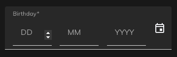 | 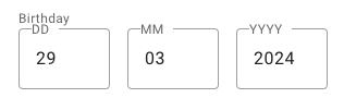 |
**Supports:**
- Angular >=15
- Angular Material >=15
## Demo
- https://stackblitz.com/~/github.com/rbalet/ngx-mat-date-input
## Installation
`npm i ngx-mat-date-input`
## Usage
### Import
Add `NgxMatDateInputComponent` to your component file:
```ts
imports: [NgxMatDateInputComponent];
```
## Example
* Add `floatLabel` to your `mat-form-field`
* Use a preset `formControlName`
* This `formControlName` will be automatically updated, therefore giving you the possibility to add your own `mat-error` _see the comment_
```html
```
## Options
| Options | Type | Default | Description |
| --------------- | ----------------------------------------------- | -------------------------------------- | -------------------------------------- |
| formControlName | `FormControl` | `undefined` | Control to be updated |
| autocomplete | `"on" or "off"` | `"on"` | Use the default browser autofill |
| labels | `string[]` | `["DD", "MM", "YYYY"]` | Label used by the mat-input |
| placeholders | `string[]` | `["", "", ""]` | with an *s* |
| required | `boolean` | `undefined` | |
| disabled | `boolean` | `undefined` | |
| min | `date` | `undefined` | Activate min validators on each fields |
| fields | `{day: boolean, month: boolean, year: boolean}` | `{day: true, month: true, year: true}` | Show specifies fields |
## Css variable
| Name | Default | Explanation |
| ------------------------------ | ------- | --------------------------------- |
| `--ngx-mat-date-input-gap` | `16px` | Change the gap between the inputs |
| `--ngx-mat-date-input-padding` | `0` | Padding around the form |
## Auto formatting
### Month
- Max 12
### Day
- Month: 2 -> max 29
- Month: 4, 6, 9 & 11 -> max 30
- Month: else -> max 31
## Authors and acknowledgment
* maintainer [Raphaël Balet](https://github.com/rbalet)
[](https://www.buymeacoffee.com/widness)