https://github.com/react-component/calendar
React Calendar
https://github.com/react-component/calendar
Last synced: 6 months ago
JSON representation
React Calendar
- Host: GitHub
- URL: https://github.com/react-component/calendar
- Owner: react-component
- License: mit
- Created: 2014-12-10T03:10:20.000Z (over 11 years ago)
- Default Branch: 9.x
- Last Pushed: 2024-01-01T14:41:41.000Z (over 2 years ago)
- Last Synced: 2025-05-08T01:05:41.956Z (12 months ago)
- Language: JavaScript
- Homepage: http://react-component.github.io/calendar/
- Size: 29.8 MB
- Stars: 1,707
- Watchers: 51
- Forks: 496
- Open Issues: 143
-
Metadata Files:
- Readme: README.md
- Changelog: HISTORY.md
- License: LICENSE.md
Awesome Lists containing this project
- awesome-react-components-all - rc-calendar - React Calendar. (Uncategorized / Uncategorized)
- awesome-list - rc-calendar - React Calendar. (Demos / Form Components)
- awesome-react-components - rc-calendar - React Calendar. (UI Components / Form Components)
- awesome-list - rc-calendar - component) (DatePickers)
- awesome - react-component / calendar
README
# rc-calendar
---
React Calendar
[![NPM version][npm-image]][npm-url]
[![build status][travis-image]][travis-url]
[![Test coverage][codecov-image]][codecov-url]
[![gemnasium deps][gemnasium-image]][gemnasium-url]
[![npm download][download-image]][download-url]
[![Code Quality: Javascript][lgtm-badge]][lgtm-badge-url]
[![Total alerts][lgtm-alerts]][lgtm-alerts-url]
[npm-image]: http://img.shields.io/npm/v/rc-calendar.svg?style=flat-square
[npm-url]: http://npmjs.org/package/rc-calendar
[travis-image]: https://img.shields.io/travis/react-component/calendar.svg?style=flat-square
[travis-url]: https://travis-ci.org/react-component/calendar
[codecov-image]: https://img.shields.io/codecov/c/github/react-component/calendar/master.svg?style=flat-square
[codecov-url]: https://codecov.io/gh/react-component/calendar/branch/master
[gemnasium-image]: http://img.shields.io/gemnasium/react-component/calendar.svg?style=flat-square
[gemnasium-url]: https://gemnasium.com/react-component/calendar
[node-image]: https://img.shields.io/badge/node.js-%3E=_0.10-green.svg?style=flat-square
[node-url]: http://nodejs.org/download/
[download-image]: https://img.shields.io/npm/dm/rc-calendar.svg?style=flat-square
[download-url]: https://npmjs.org/package/rc-calendar
[lgtm-badge]: https://img.shields.io/lgtm/grade/javascript/g/react-component/calendar.svg?logo=lgtm&logoWidth=18
[lgtm-badge-url]: https://lgtm.com/projects/g/react-component/calendar/context:javascript
[lgtm-alerts]: https://img.shields.io/lgtm/alerts/g/react-component/calendar.svg?logo=lgtm&logoWidth=18
[lgtm-alerts-url]: https://lgtm.com/projects/g/react-component/calendar/alerts
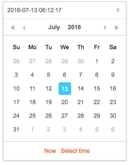
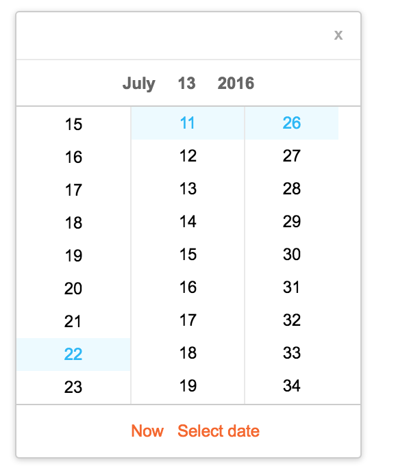
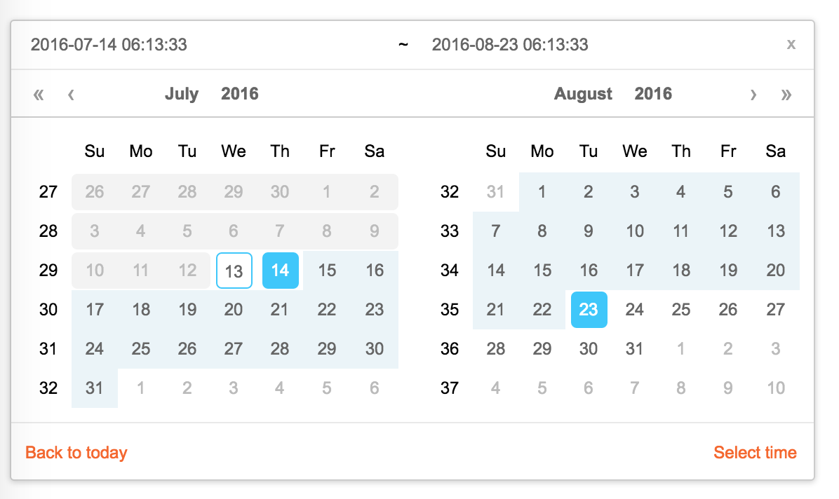
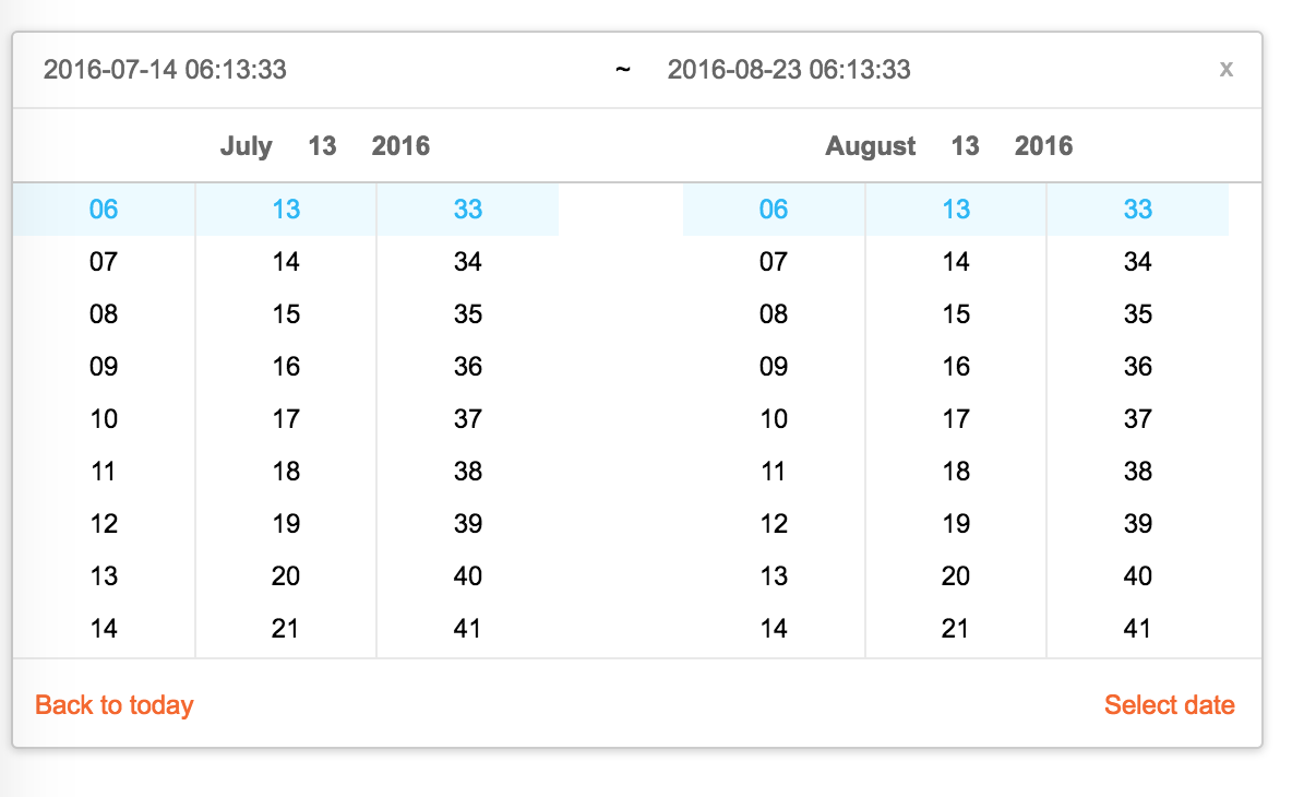
## Screenshots


## Feature
* support ie9,ie9+,chrome,firefox,safari
* support date, month, year, decade select panel
* support week number
* support en_US and zh_CN locale(UI), use moment.utcOffset to set timezone
* support aria and keyboard accessibility
### Keyboard
* Previous month (PageUp)
* Next month (PageDown)
* tab into hour input: Last hour(Up), Next hour(Down)
* tab into hour input: Last minute(Up), Next minute(Down)
* tab into hour input: Last second(Up), Next second(Down)
* Last year (Control + left)
* Next year (Control + right)
## install
[](https://npmjs.org/package/rc-calendar)
## Usage
```js
import Calendar from 'rc-calendar';
import React from 'react';
import ReactDOM from 'react-dom';
ReactDOM.render(, container);
```
## Development
```
npm install
npm start
```
## Example
http://localhost:8002/examples/
online example:
http://react-component.github.io/calendar/examples/index.html
## API
### rc-calendar props
name
type
default
description
prefixCls
String
prefixCls of this component
className
String
additional css class of root dom node
style
Object
additional style of root dom node
dateRender
(current, value) => React.Node
date cell
renderSidebar
() => React.Node
side bar
renderFooter
(mode) => React.Node
extra footer
value
moment
current value like input's value
defaultValue
moment
defaultValue like input's defaultValue
locale
Object
import from 'rc-calendar/lib/locale/en_US'
calendar locale
format
String | String[]
depends on whether you set timePicker and your locale
use to format/parse date(without time) value to/from input.
When an array is provided, all values are used for parsing and first value for display.
disabledDate
Function(current:moment):Boolean
whether to disable select of current date
disabledTime
Function(current:moment):Object
a function which return a object with member of disabledHours/disabledMinutes/disabledSeconds according to rc-time-picker
showDateInput
Boolean
true
whether to show input on top of calendar panel
showWeekNumber
Boolean
false
whether to show week number of year
showToday
Boolean
true
whether to show today button
showOk
Boolean
auto
whether has ok button in footer
timePicker
React Element
rc-timer-picker/lib/module/panel element
onSelect
Function(date: moment)
called when a date is selected from calendar
onClear
Function()
called when a date is cleared from calendar
onChange
Function(date: moment)
called when a date is changed inside calendar (next year/next month/keyboard)
onOk
Function(date: moment)
called when ok button is pressed, only if it's visible
dateInputPlaceholder
String
date input's placeholder
mode
enum('time', 'date', 'month', 'year', 'decade')
'date'
control which kind of panel should be shown
onPanelChange
Function(date: moment, mode)
called when panel changed
clearIcon
ReactNode
specific the clear icon.
inputMode
string
text
Change the keyboard in mobile device
### rc-calendar/lib/RangeCalendar props
name
type
default
description
prefixCls
String
prefixCls of this component
className
String
additional css class of root dom node
style
Object
additional style of root dom node
renderSidebar
() => React.Node
side bar
renderFooter
() => React.Node
extra footer
selectedValue
moment[]
current selected value range. with two elements.
defaultSelectedValue
moment[]
default selected value range
locale
Object
import from 'rc-calendar/lib/locale/en_US'
calendar locale
format
String
depends on whether you set timePicker and your locale
use to format/parse date(without time) value to/from input
disabledDate
Function(current:moment):Boolean
whether to disable select of current date
showWeekNumber
Boolean
false
whether to show week number of year
showToday
Boolean
true
whether to show today button
showOk
Boolean
auto
whether has ok button in footer
showClear
Boolean
false
whether has clear button in header
timePicker
React Element
rc-timer-picker/lib/module/panel element
onSelect
Function(date: moment[])
called when a date range is selected from calendar
onInputSelect
Function(date: moment[])
called when a valid date entered in input
onClear
Function()
called when a date range is cleared from calendar
onChange
Function(date: moment[])
called when a date range is changed inside calendar (next year/next month/keyboard)
onOk
Function(date: moment)
called when ok button is pressed, only if it's visible
dateInputPlaceholder
String[]
range date input's placeholders
disabledTime
Function(current: moment[], type:'start'|'end'):Object
a function which return a object with member of disabledHours/disabledMinutes/disabledSeconds according to rc-time-picker
showDateInput
Boolean
true
whether to show date inputs on top of calendar panels
type
enum('both','start', 'end')
both
whether fix start or end selected value. check start-end-range example
mode
enum('date', 'month', 'year', 'decade')[]
['date', 'date']
control which kind of panels should be shown
onPanelChange
Function(date: moment[], mode)
called when panels changed
hoverValue
moment[]
control hover value
onHoverChange
Function(hoverValue: moment[])
called when hover value change
clearIcon
ReactNode
specific the clear icon.
### rc-calendar/lib/MonthCalendar props
name
type
default
description
prefixCls
String
prefixCls of this component
className
String
additional css class of root dom node
style
Object
additional style of root dom node
value
moment
current value like input's value
defaultValue
moment
defaultValue like input's defaultValue
locale
Object
import from 'rc-calendar/lib/locale/en_US'
calendar locale
disabledDate
Function(current:moment):Boolean
whether to disable select of current month
onSelect
Function(date: moment)
called when a date is selected from calendar
monthCellRender
function
Custom month cell render method
monthCellContentRender
function
Custom month cell content render method,the content will be appended to the cell.
onChange
Function(date: moment)
called when a date is changed inside calendar (next year/next month/keyboard)
renderFooter
() => React.Node
extra footer
### rc-calendar/lib/Picker props
name
type
default
description
prefixCls
String
prefixCls of this component
calendar
Calendar React Element
disabled
Boolean
whether picker is disabled
placement
String|Object
one of ['left','right','top','bottom', 'topLeft', 'topRight', 'bottomLeft', 'bottomRight']
align
Object: alignConfig of [dom-align](https://github.com/yiminghe/dom-align)
value will be merged into placement's align config.
animation
String
index.css support 'slide-up'
transitionName
String
css class for animation
value
moment|moment[]
current value like input's value
defaultValue
moment|moment[]
defaultValue like input's defaultValue
onChange
Function
called when select a different value
onOpenChange
(open:boolean) => void
called when open/close picker
open
Boolean
current open state of picker. controlled prop
getCalendarContainer
() => HTMLElement
() => {return document.body;}
dom node where calendar to be rendered into
dropdownClassName
string
additional className applied to dropdown
### rc-calendar/lib/FullCalendar props
name
type
default
description
prefixCls
String
prefixCls of this component
Select
React Component Class
rc-select Component Class
value
moment
current value like input's value
defaultValue
moment
defaultValue like input's defaultValue
defaultType
string
date
default panel type: date/month
type
string
panel type: date/month
onTypeChange
function(type)
called when panel type change
fullscreen
bool
false
monthCellRender
function
Custom month cell render method
dateCellRender
function
Custom date cell render method
monthCellContentRender
function
Custom month cell content render method,the content will be appended to the cell.
dateCellContentRender
function
Custom date cell content render method,the content will be appended to the cell.
onSelect
Function(date: moment)
called when a date is selected from calendar
## Test Case
```
npm test
```
## Coverage
```
npm run coverage
```
open coverage/ dir
## License
rc-calendar is released under the MIT license.