https://github.com/react-component/cascader
cascade select in one box
https://github.com/react-component/cascader
Last synced: 5 months ago
JSON representation
cascade select in one box
- Host: GitHub
- URL: https://github.com/react-component/cascader
- Owner: react-component
- License: mit
- Created: 2015-12-21T03:12:56.000Z (over 10 years ago)
- Default Branch: master
- Last Pushed: 2026-01-22T08:37:04.000Z (5 months ago)
- Last Synced: 2026-01-23T22:43:46.610Z (5 months ago)
- Language: TypeScript
- Homepage: https://cascader-react-component.vercel.app/
- Size: 4.27 MB
- Stars: 233
- Watchers: 6
- Forks: 145
- Open Issues: 56
-
Metadata Files:
- Readme: README.md
- Changelog: CHANGELOG.md
- Funding: .github/FUNDING.yml
- License: LICENSE.md
Awesome Lists containing this project
README
# @rc-component/cascader
React Cascader Component.
[![NPM version][npm-image]][npm-url]
[![npm download][download-image]][download-url]
[![build status][github-actions-image]][github-actions-url]
[![Codecov][codecov-image]][codecov-url]
[![bundle size][bundlephobia-image]][bundlephobia-url]
[![dumi][dumi-image]][dumi-url]
[npm-image]: https://img.shields.io/npm/v/@rc-component/cascader.svg?style=flat-square
[npm-url]: https://npmjs.org/package/@rc-component/cascader
[travis-image]: https://img.shields.io/travis/react-component/cascader/master?style=flat-square
[travis-url]: https://travis-ci.com/react-component/cascader
[github-actions-image]: https://github.com/react-component/cascader/actions/workflows/main.yml/badge.svg
[github-actions-url]: https://github.com/react-component/cascader/actions/workflows/main.yml
[codecov-image]: https://img.shields.io/codecov/c/github/react-component/cascader/master.svg?style=flat-square
[codecov-url]: https://app.codecov.io/gh/react-component/cascader
[david-url]: https://david-dm.org/react-component/cascader
[david-image]: https://david-dm.org/react-component/cascader/status.svg?style=flat-square
[david-dev-url]: https://david-dm.org/react-component/cascader?type=dev
[david-dev-image]: https://david-dm.org/react-component/cascader/dev-status.svg?style=flat-square
[download-image]: https://img.shields.io/npm/dm/@rc-component/cascader.svg?style=flat-square
[download-url]: https://npmjs.org/package/@rc-component/cascader
[bundlephobia-url]: https://bundlephobia.com/package/@rc-component/cascader
[bundlephobia-image]: https://badgen.net/bundlephobia/minzip/@rc-component/cascader
[dumi-url]: https://github.com/umijs/dumi
[dumi-image]: https://img.shields.io/badge/docs%20by-dumi-blue?style=flat-square
## Browser Support
| [ ](http://godban.github.io/browsers-support-badges/)
IE / Edge | [ ](http://godban.github.io/browsers-support-badges/)
Firefox | [ ](http://godban.github.io/browsers-support-badges/)
Chrome | [ ](http://godban.github.io/browsers-support-badges/)
Safari | [ ](http://godban.github.io/browsers-support-badges/)
Electron |
| --- | --- | --- | --- | --- |
| IE11, Edge | last 2 versions | last 2 versions | last 2 versions | last 2 versions |
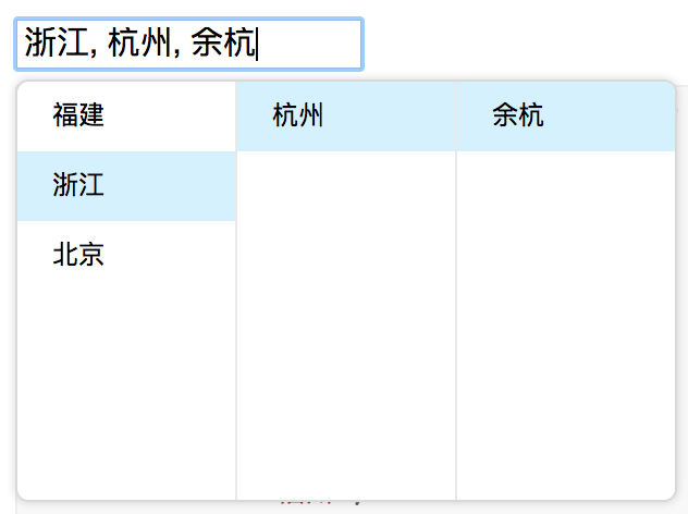
## Screenshots
## Example
https://cascader-react-component.vercel.app
## Install
[](https://npmjs.org/package/@rc-component/cascader)
```bash
$ npm install @rc-component/cascader --save
```
## Usage
```js
import React from 'react';
import Cascader from '@rc-component/cascader';
const options = [{
'label': '福建',
'value': 'fj',
'children': [{
'label': '福州',
'value': 'fuzhou',
'children': [{
'label': '马尾',
'value': 'mawei',
}],
}, {
'label': '泉州',
'value': 'quanzhou',
}],
}, {
'label': '浙江',
'value': 'zj',
'children': [{
'label': '杭州',
'value': 'hangzhou',
'children': [{
'label': '余杭',
'value': 'yuhang',
}],
}],
}, {
'label': '北京',
'value': 'bj',
'children': [{
'label': '朝阳区',
'value': 'chaoyang',
}, {
'label': '海淀区',
'value': 'haidian',
}],
}];
React.render(
...
, container);
```
## API
### props
name
type
default
description
options
Object
The data options of cascade
value
Array
selected value
defaultValue
Array
initial selected value
onChange
Function(value, selectedOptions)
callback when finishing cascader select
changeOnSelect
Boolean
false
change value on each selection
loadData
Function(selectedOptions)
callback when click any option, use for loading more options
expandTrigger
String
'click'
expand current item when click or hover
open
Boolean
visibility of popup overlay
onPopupVisibleChange
Function(visible)
callback when popup overlay's visibility changed
transitionName
String
transition className like "slide-up"
prefixCls
String
rc-cascader
prefix className of popup overlay
popupClassName
String
additional className of popup overlay
popupPlacement
String
bottomLeft
use preset popup align config from builtinPlacements:bottomRight topRight bottomLeft topLeft
getPopupContainer
function(trigger:Node):Node
() => document.body
container which popup select menu rendered into
dropdownMenuColumnStyle
Object
style object for each cascader pop menu
fieldNames
Object
{ label: 'label', value: 'value', children: 'children' }
custom field name for label and value and children
expandIcon
ReactNode
>
specific the default expand icon
loadingIcon
ReactNode
>
specific the default loading icon
hidePopupOnSelect
Boolean
>true
hide popup on select
showSearch
boolean | object
false
Whether show search input in single mode
### showSearch
| Property | Description | Type | Default | Version |
| --- | --- | --- | --- | --- |
| autoClearSearchValue | Whether the current search will be cleared on selecting an item. Only applies when checkable| boolean | true |
| filter | The function will receive two arguments, inputValue and option, if the function returns true, the option will be included in the filtered set; Otherwise, it will be excluded | function(inputValue, path): boolean | - | |
| limit | Set the count of filtered items | number \| false | 50 | |
| matchInputWidth | Whether the width of list matches input, ([how it looks](https://github.com/ant-design/ant-design/issues/25779)) | boolean | true | |
| render | Used to render filtered options | function(inputValue, path): ReactNode | - | |
| sort | Used to sort filtered options | function(a, b, inputValue) | - | |
| searchValue | The current input "search" text | string | - | - |
| onSearch | called when input changed | function | - | - |
### option
name
type
default
description
label
String
option text to display
value
String
option value as react key
disabled
Boolean
disabled option
children
Array
children options
## Development
```bash
$ npm install
$ npm start
```
## Test Case
```bash
$ npm test
```
## Coverage
```bash
$ npm run coverage
```
## License
@rc-component/cascader is released under the MIT license.
## 🤝 Contributing
