https://github.com/react-component/m-tooltip
React Tooltip for mobile
https://github.com/react-component/m-tooltip
Last synced: 3 months ago
JSON representation
React Tooltip for mobile
- Host: GitHub
- URL: https://github.com/react-component/m-tooltip
- Owner: react-component
- License: mit
- Created: 2017-09-20T13:25:35.000Z (almost 9 years ago)
- Default Branch: master
- Last Pushed: 2021-07-26T21:15:42.000Z (almost 5 years ago)
- Last Synced: 2023-04-09T06:37:03.646Z (about 3 years ago)
- Language: TypeScript
- Size: 471 KB
- Stars: 8
- Watchers: 4
- Forks: 2
- Open Issues: 9
-
Metadata Files:
- Readme: README.md
- Changelog: HISTORY.md
- License: LICENSE
Awesome Lists containing this project
README
# rmc-tooltip
---
React Tooltip
[![NPM version][npm-image]][npm-url]
[![build status][travis-image]][travis-url]
[![Test coverage][coveralls-image]][coveralls-url]
[![gemnasium deps][gemnasium-image]][gemnasium-url]
[![node version][node-image]][node-url]
[![npm download][download-image]][download-url]
[npm-image]: http://img.shields.io/npm/v/rmc-tooltip.svg?style=flat-square
[npm-url]: http://npmjs.org/package/rmc-tooltip
[travis-image]: https://img.shields.io/travis/react-component/m-tooltip.svg?style=flat-square
[travis-url]: https://travis-ci.org/react-component/m-tooltip
[coveralls-image]: https://img.shields.io/coveralls/react-component/m-tooltip.svg?style=flat-square
[coveralls-url]: https://coveralls.io/r/react-component/m-tooltip?branch=master
[gemnasium-image]: http://img.shields.io/gemnasium/react-component/m-tooltip.svg?style=flat-square
[gemnasium-url]: https://gemnasium.com/react-component/m-tooltip
[node-image]: https://img.shields.io/badge/node.js-%3E=_0.10-green.svg?style=flat-square
[node-url]: http://nodejs.org/download/
[download-image]: https://img.shields.io/npm/dm/rmc-tooltip.svg?style=flat-square
[download-url]: https://npmjs.org/package/rmc-tooltip
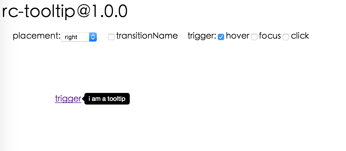
## Screenshot
## Install
[](https://npmjs.org/package/rmc-tooltip)
## Usage
```js
var Tooltip = require('rmc-tooltip');
var React = require('react');
var ReactDOM = require('react-dom');
// By default, the tooltip has no style.
// Consider importing the stylesheet it comes with:
// 'rmc-tooltip/assets/bootstrap_white.css'
ReactDOM.render(tooltip}>hover, container);
```
## Examples
`npm start` and then go to
[http://localhost:8007/examples](http://localhost:8007/examples)
Online examples: [http://react-component.github.io/tooltip/examples/](http://react-component.github.io/tooltip/examples/)
## API
### Props
name
type
default
description
overlayClassName
string
additional className added to popup overlay
overlayStyle
Object
additional style of overlay node
prefixCls
String
rmc-tooltip
prefix class name
transitionName
String
same as https://github.com/react-component/css-transition-group
onVisibleChange
Function
call when visible is changed
afterVisibleChange
Function
call after visible is changed
visible
boolean
whether tooltip is visible
defaultVisible
boolean
whether tooltip is visible initially
placement
String
one of ['left','right','top','bottom', 'topLeft', 'topRight', 'bottomLeft', 'bottomRight']
align
Object: alignConfig of [dom-align](https://github.com/yiminghe/dom-align)
value will be merged into placement's config
onPopupAlign
function(popupDomNode, align)
callback when popup node is aligned
overlay
React.Element | () => React.Element
popup content
arrowContent
React.Node
null
arrow content
getTooltipContainer
function
Function returning html node which will act as tooltip container. By default the tooltip attaches to the body. If you want to change the container, simply return a new element.
destroyTooltipOnHide
boolean
false
whether destroy tooltip when tooltip is hidden
## Note
`Tooltip` requires child node accepts `onClick` event.
## Development
```bash
npm install
npm start
```
## Test Case
```bash
npm test
npm run chrome-test
```
## Coverage
```bash
npm run coverage
```
## License
`rmc-tooltip` is released under the MIT license.