https://github.com/react-component/progress
React Progress Bar
https://github.com/react-component/progress
progress react
Last synced: 11 months ago
JSON representation
React Progress Bar
- Host: GitHub
- URL: https://github.com/react-component/progress
- Owner: react-component
- License: mit
- Created: 2015-04-15T09:13:57.000Z (about 11 years ago)
- Default Branch: master
- Last Pushed: 2024-09-20T06:18:16.000Z (almost 2 years ago)
- Last Synced: 2024-10-29T21:10:43.172Z (over 1 year ago)
- Topics: progress, react
- Language: TypeScript
- Homepage: http://progress.react-component.vercel.app
- Size: 3.36 MB
- Stars: 698
- Watchers: 25
- Forks: 159
- Open Issues: 33
-
Metadata Files:
- Readme: README.md
- Changelog: CHANGELOG.md
- Funding: .github/FUNDING.yml
- License: LICENSE.md
Awesome Lists containing this project
- awesome-list - rc-progress - React Progress Bar. (Demos / Loader)
- awesome-react-components - rc-progress - React Progress Bar. (UI Components / Loader)
README
# @rc-component/progress
Progress Bar.
[![NPM version][npm-image]][npm-url] [](https://github.com/umijs/dumi) [![build status][github-actions-image]][github-actions-url] [![Test coverage][coveralls-image]][coveralls-url] [![npm download][download-image]][download-url] [![bundle size][bundlephobia-image]][bundlephobia-url]
[npm-image]: http://img.shields.io/npm/v/@rc-component/progress.svg?style=flat-square
[npm-url]: http://npmjs.org/package/@rc-component/progress
[github-actions-image]: https://github.com/react-component/progress/workflows/CI/badge.svg
[github-actions-url]: https://github.com/react-component/progress/actions
[circleci-image]: https://img.shields.io/circleci/react-component/progress/master?style=flat-square
[circleci-url]: https://circleci.com/gh/react-component/progress
[coveralls-image]: https://img.shields.io/coveralls/react-component/progress.svg?style=flat-square
[coveralls-url]: https://coveralls.io/r/react-component/progress?branch=master
[david-url]: https://david-dm.org/react-component/progress
[david-image]: https://david-dm.org/react-component/progress/status.svg?style=flat-square
[david-dev-url]: https://david-dm.org/react-component/progress?type=dev
[david-dev-image]: https://david-dm.org/react-component/progress/dev-status.svg?style=flat-square
[download-image]: https://img.shields.io/npm/dm/@rc-component/progress.svg?style=flat-square
[download-url]: https://npmjs.org/package/@rc-component/progress
[bundlephobia-url]: https://bundlephobia.com/result?p=@rc-component/progress
[bundlephobia-image]: https://badgen.net/bundlephobia/minzip/@rc-component/progress
## Example
https://progress.react-component.vercel.app/
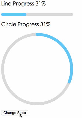
## Screenshots
## Browsers
* support IE9+, Chrome, Firefox, Safari
## Install
[](https://npmjs.org/package/@rc-component/progress)
## Usage
```js
import { Line, Circle } from '@rc-component/progress';
export default () => (
<>
>
);
```
## Compatibility
| [ ](http://godban.github.io/browsers-support-badges/)
IE / Edge | [ ](http://godban.github.io/browsers-support-badges/)
Firefox | [ ](http://godban.github.io/browsers-support-badges/)
Chrome | [ ](http://godban.github.io/browsers-support-badges/)
Safari | [ ](http://godban.github.io/browsers-support-badges/)
Electron |
| --- | --- | --- | --- | --- |
| IE11, Edge | last 2 versions | last 2 versions | last 2 versions | last 2 versions |
## API
### props
name
type
default
description
strokeWidth
Number
1
Width of the stroke. Unit is percentage of SVG canvas size.
strokeColor
String
#2db7f5
Stroke color.
railWidth
Number
1
Width of the rail stroke. Unit is percentage of SVG canvas size. Rail is always centered relative to actual progress path. If railWidth is not defined, it is the same as strokeWidth.
railColor
String
#D9D9D9
Color for lighter rail stroke underneath the actual progress path.
strokeLinecap
String
'round'
The shape to be used at the end of the progress bar: can be `butt`, `square` or `round`.
prefixCls
String
rc-progress
prefix className for component
className
String
customized className
style
Object
style object will be added to svg element
percent
Number | Number[]
0
the percent of the progress
gapDegree
Number
0
the gap degree of half circle, 0 - 360
gapPosition
String
top
the gap position: can be `top`, `bottom`, `left`, or `right`.
loading
Boolean
false
If it is true the indeterminate progress will be enabled.
## Installation
```
npm install --save @rc-component/progress
```
## Development
```
npm install
npm start
```
## License
@rc-component/progress is released under the MIT license.